Brand Refresh
Since 2016, Wrike has grown to the most versatile work management platform. We help you do the best work of your life by reducing chaos and complexity through visibility, contextual collaboration, and automation. To bring our new strategy and vision to life, we're updating our user experience and brand identity.
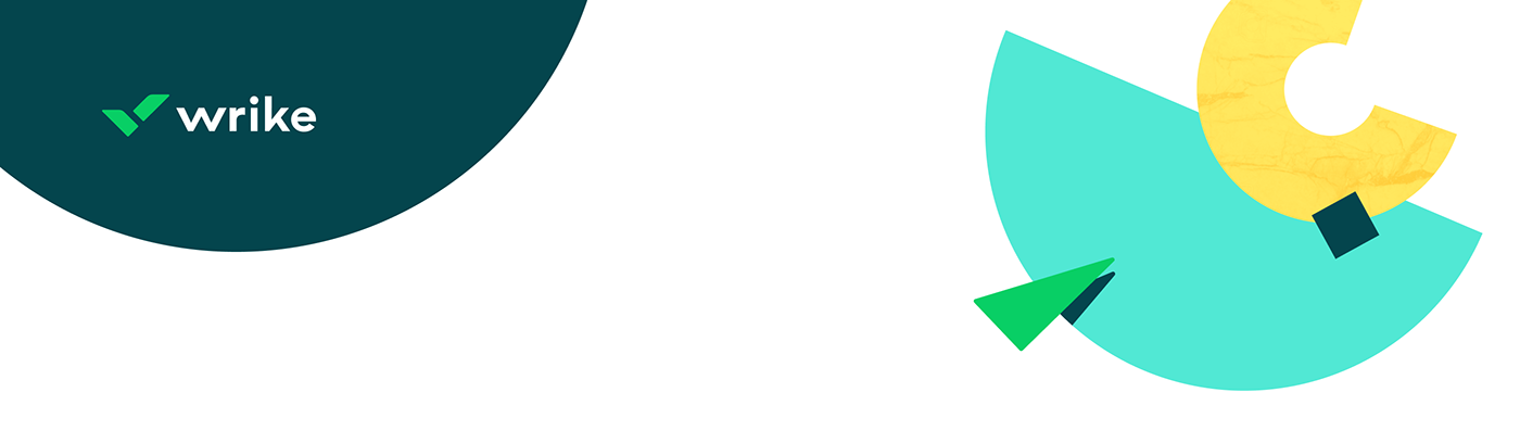
We've thought about the best way to convey our passion and culture through the visual side of our brand and updated our logotype, color palette, typography, and illustrations.
We created a color palette and concept that's soothing and delightful. We also wanted to make it easy for consumers to find and consume information. So we used big, bold fonts with ample whitespace that make it easy to process content with minimal cognitive load.


Wrike’s new look and feel brings to life our high-level story: Standardization + Configurability = Versatility. Standardization comes in many forms — such as process, workflows, automations, artificial intelligence/machine learning, scale, power, and more — while configurability denotes the people or human aspect of the people-process-technology relationship.
In the brand system, shapes are used to depict standardization while hand-drawn patterns denote configurability. We bring these elements together to clearly and elegantly portray the relationship between technology and our customers’ need for versatility. Our ultimate goal is to weave versatility into every thread of our design.

The new visual identity uses both rich illustrations and photography, along with a delightful combination of eye-catching colors, shape, textures, and patterns, to infuse our brand’s personality into the user experience and evoke the right emotive response. The refined brand voice and tone convey our human side, positivity, team focus, pragmatism, and expertise.
We’ve used the new style to create a whole pull of assets: minimalistic but recognizable merchandise, bright illustrations, printed productions, etc.


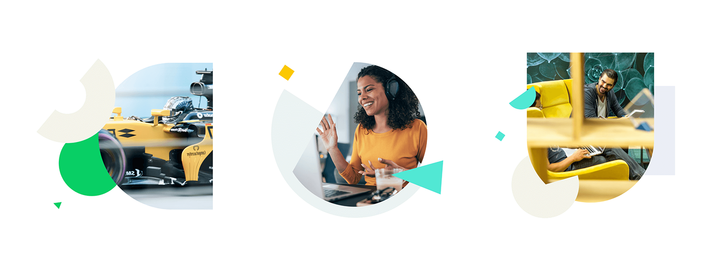

Our refreshed brand works in digital as well. We’ve created a lot of banners, social media posts, emails, landing pages, etc. Each new campaign has a recognizable style and is consistent with the global Wrike brand.
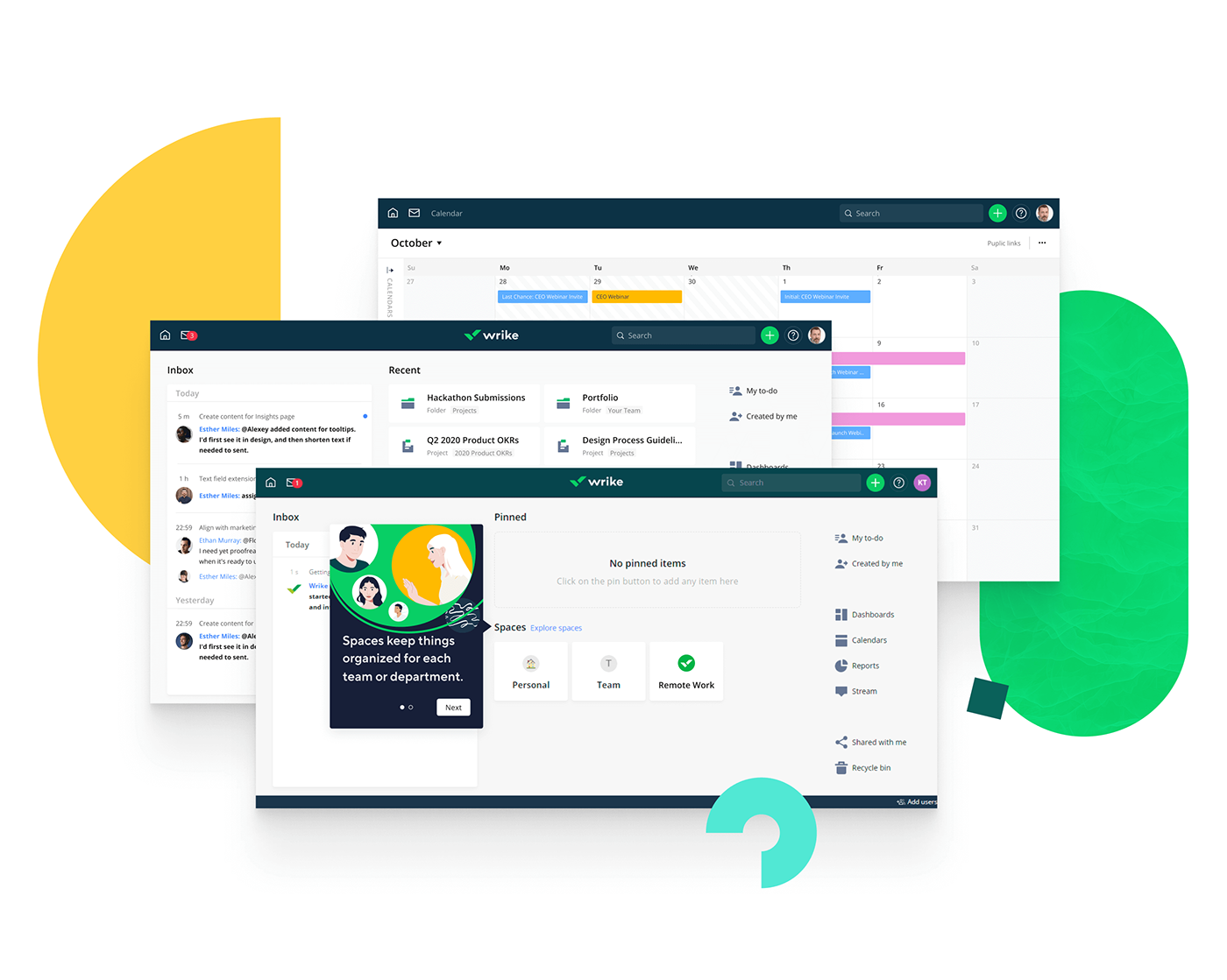
For the main app, we’ve updated the user experience to improve efficiency, ease of use, and adoption. It includes many usability and navigation improvements, including the user’s personalized homepage where they’ll find what they need quickly.

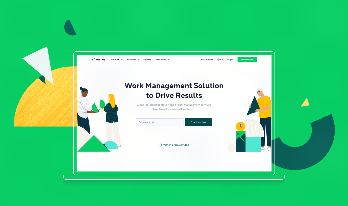

With the new experience and design, our goal is to give every prospect and customer a delightful, intuitive, and unified experience throughout their interaction with our brand. More importantly, we wanted to seed our audiences with positive sentiments and evoke an emotional connection with every engagement. So our customers feel the passion for our solutions from their very first interaction with the Wrike brand.