
'Ayahuasca'- Making a Screenprint
My limited-edition screenprint 'Ayahuasca' was printed by White Duck Editions in Bath. White Duck provided me with extensive photos of the working process, and I've compiled them here for a look into the various steps of the screenprinting process.
A few copies of this print still remain in my online shop.
www.peterdiamond.ca
A few copies of this print still remain in my online shop.
www.peterdiamond.ca

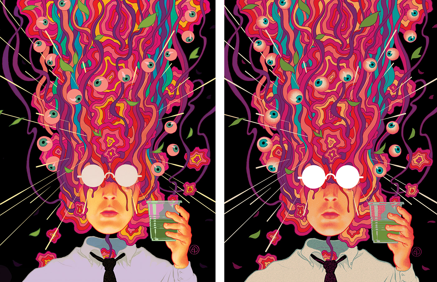
Regular Edition
11 colour screenprint
18in x 24in
Limited edition of 40
11 colour screenprint
18in x 24in
Limited edition of 40

Foil Edition
11 colour screenprint printed on holographic foil paper
18in x 24in
Limited edition of 20
11 colour screenprint printed on holographic foil paper
18in x 24in
Limited edition of 20
Separations:
This artwork, originally made for GQ Deutschland to accompany a reportage on urban Ayahuasca ceremonies, first had to be broken down into its component colours. I managed to reduce it to 11 colours with minimal compromise to the art's original look and feel. Compare the original (left) which was prepared for digital printing, and the separated version (right), and the animated gif below shows how the colours are stacked to produce the final image.
This artwork, originally made for GQ Deutschland to accompany a reportage on urban Ayahuasca ceremonies, first had to be broken down into its component colours. I managed to reduce it to 11 colours with minimal compromise to the art's original look and feel. Compare the original (left) which was prepared for digital printing, and the separated version (right), and the animated gif below shows how the colours are stacked to produce the final image.

Colour Matching:
White Duck mixed inks to match swatches taken from my digital file as closely as possible. This requires a sharp eye, and White Duck have mastered it. It's crucial to the final product, especially when the artist is as finicky about colour as I am.
White Duck mixed inks to match swatches taken from my digital file as closely as possible. This requires a sharp eye, and White Duck have mastered it. It's crucial to the final product, especially when the artist is as finicky about colour as I am.

Printing the Layers:
Once the parts of the image containing a certain colour (Hot Pink in the photos below) have been "burned" out of a light-sensitive sealing layer on the silk screen, that colour can be printed. Careful steps are taken to ensure the layers line up properly ("registration") as each is printed on top of the other.
Once the parts of the image containing a certain colour (Hot Pink in the photos below) have been "burned" out of a light-sensitive sealing layer on the silk screen, that colour can be printed. Careful steps are taken to ensure the layers line up properly ("registration") as each is printed on top of the other.

The green areas are sealed with an emulsion preventing the ink from crossing the mesh onto the paper.
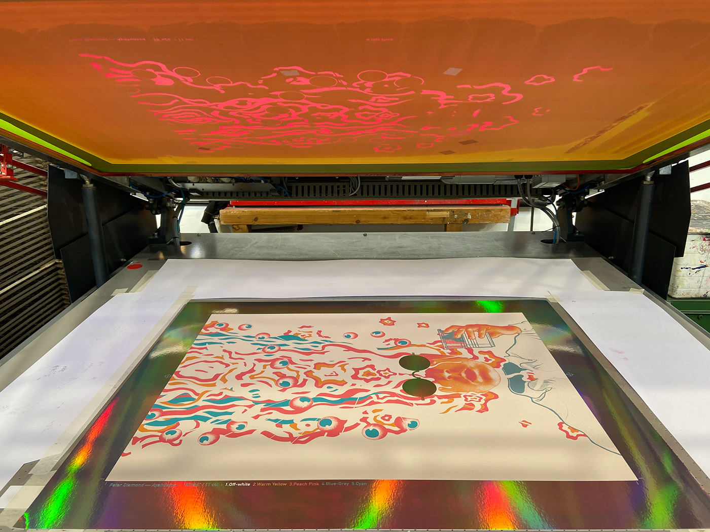
Each layer also contains text indicating the name of the colour and its place in the printing order. These are trimmed away at the end.

A mechanical squeegee pulls the ink evenly across the mesh, pushing it through onto the paper anywhere there is a gap in the emulsion.

The Hot Pink has been printed, passing through the mesh only where it's wanted.

6 down, 5 to go.
Dithering:
Since the ink has to physically pass through a mesh onto the page, any gradations of a colour have to be translated into a dot or dither pattern. That dithering, combined with the amount of colours used, and transparency/opacity of the ink, determine the subtlety of gradations in the final product. In my work I opt for more graphic, comparatively "coarse" gradations; they can be much more photographic.
Since the ink has to physically pass through a mesh onto the page, any gradations of a colour have to be translated into a dot or dither pattern. That dithering, combined with the amount of colours used, and transparency/opacity of the ink, determine the subtlety of gradations in the final product. In my work I opt for more graphic, comparatively "coarse" gradations; they can be much more photographic.
Trapping:
As each layer is printed, the little gaps between the colours begin to disappear, the lighter colours getting "trapped" where the darker colours overlap them.
As each layer is printed, the little gaps between the colours begin to disappear, the lighter colours getting "trapped" where the darker colours overlap them.


Joshua at White Duck extended the second-darkest colour (Red-Purple) to underpin the black, contributing to a richer and more solid black.

The black is the icing on the cake. It pins everything down and sets off the bright colours.


