The idea for this personal project emerged after seeing the MacOS 11 Big Sur redesign and after reading
a few articles on this matter and what it meant for possible future design tendencies.
Here is a short snippet from one of the articles:
"With the redesign of macOS 11 Big Sur, Apple has made many interface changes and updated the appearance of apps. Materials and dimensionality has made its way back into the interface —and every single app icon for every application and utility that Apple ships with macOS has been redesigned with depth, textures and lighting.
This is a big deal. Probably bigger than what most people realise.
As with all big shifts in design, you’re going to get a lot of noise.
People will try to co-opt this new direction and attempt to label it as something it’s not (looking at you neomorphism).
People will find fault with the execution. People will disagree that there’s even a change.
There’ll be snark. There'll be a period of adjustment."
From an article by Michael Flarup
After dwelling on these thoughts I have decided to try and identify a new design style that was different from the usual mainstream concepts such as Skeuomorphism, Flat Design, and the newly appeared Neumorphism.
My goal was to find a look that can balance the Pros of every trend, while still being distinct enough to have a place of its own.
Keep in mind, that for this project I have focused solely on App Icons,
but this exercise can be done with a more User Interface oriented approach.
Before jumping into the visuals, I have prepared a micro-case study to identify
the particular qualities of every design language with their Cons and Pros.
This is a mix of my personal thoughts as well as conclusions from various articles.
(all of the points are focused on visual qualities. UI and UX comments have been excluded,
since this is not the main focus of this particular project.)

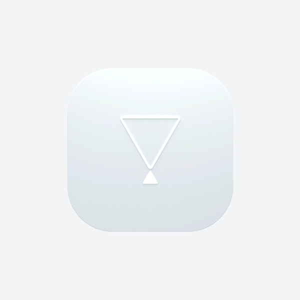
In essence, here is the balance percentage of components that go into the visual language of Statermorphism:
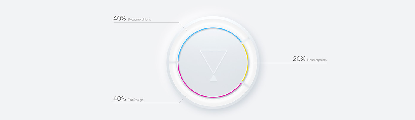
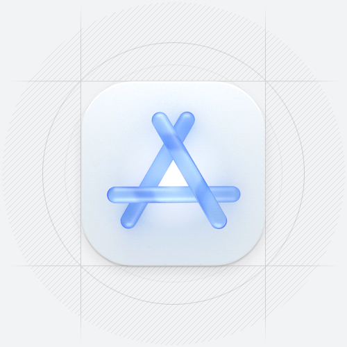
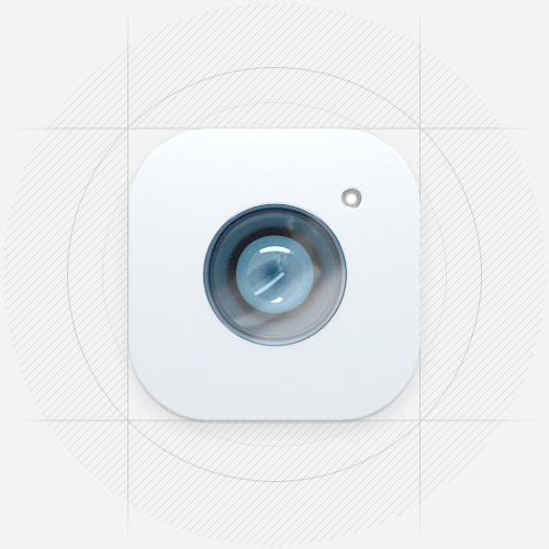
With that in mind, I invite you to have a look at a few icon sets I've designed applying the Stateramorphism visual principles.
App icons heavily favor iOS, however, most of them are cross-platform and can be used on other systems as well.

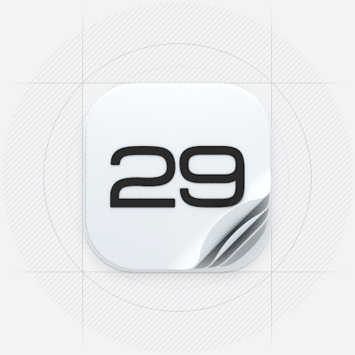
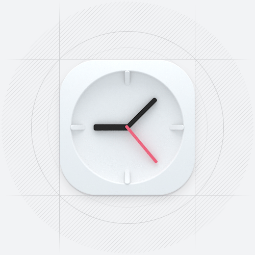
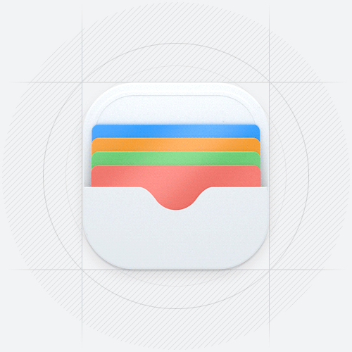
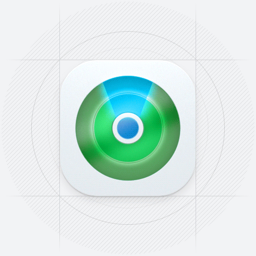
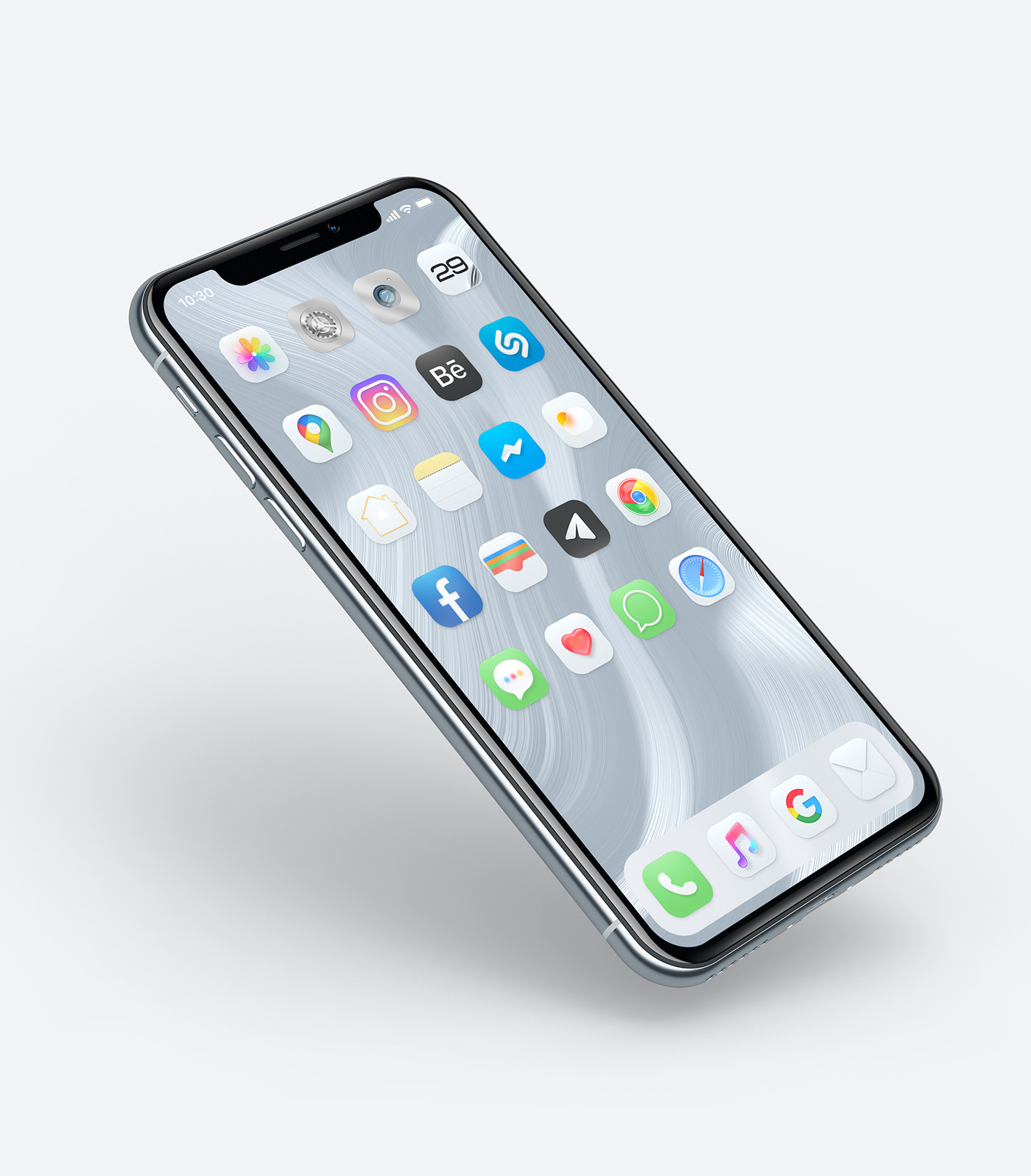
Set 01 changes the initial balance ratio of 40/40/20 to about 35/35/30, where Neumorphism plays a slightly bigger role:
not only do we use softer lighting, colors, and shadows, but we also focus on
a light base for every icon, creating a consistent, minimal, and clean look.
Keep in mind that some of the icons were re-designed to maintain simpler aesthetics,
so do not be surprised if a familiar App icon got simplified.
It will still be recognizable :)

As an extra challenge, I have decided to animate all of the 30 icons.
Most certainly not all of them actually require to be animated in real-world usage, but it was fun to explore, plus it showcases a potential use for notifications, updates, or, most likely - to indicate
if an App uses your data or keeps on working in the background.


Set 02 adheres to the initial balance ratio and showcases that Stateramorhism icons work well with every color palette.
In this case, I've used the familiar, although slightly less vibrant color schemes.
(except when the classic color scheme actually coincided with the Set 01 - in that case, no changes were made.)


Set 03 was made purely for fun to explore the minimalistic dark color scheme with subtle splashes of color.
I think it would be great if "dark mode" actually made everything dark, all of the App icons included.

That's it for this one, hope you've liked it.
Let me know if Stateramorhism has enough under its hood to be considered as a new design concept,
or do you think it completely falls under an already existing style?
Share your thoughts in the comment section and take care :)