GoPro has a bigger future, not only making the action camera but also creating a platform for people to share and watch how others grow as professionals.
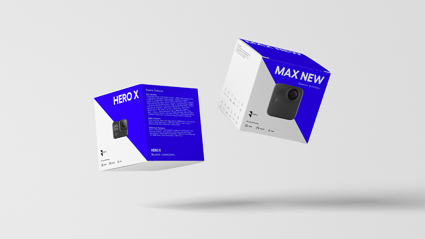
The new identity of two triangles implies the movement of moving up, betterment, and ultimately becoming pros. By stacking two triangles in an unusual way, it also signifies the dynamism of the challenges that users would be capturing. Geometric logotype compliments with the hard-angled shape triangles. These new angles from both elements represent the new angle of how we see the world through the lens of GoPro.
Recognition:
2021 International Design Awards (IDA 20) - Honorable Mention
2020 UCDA Design Awards - Excellence Award
2020 Communication Arts - Design Shortlist
2020 UCDA Design Awards - Excellence Award
2020 Communication Arts - Design Shortlist


To push the brand slogan "Be a Hero" further, the "10 thousand hours makes a hero." was curated and created. It is a visually-rich documentary film that documents the stories of the most influential professional in a variety of disciplines in the world. To be a hero is not a result; it is all about the process.


Instructor: Simon Johnston
Designer: Ching-Fa Lung
Thank you!
Designer: Ching-Fa Lung
Thank you!