
Walmart I Redesign
Date: 2017 - 2018
Walmart's redesign wasn't based off what normally would spark a common redesign; to improve our customer's experience. In fact, Walmart's initial focus was to improve upon their fashion vertical by completing the acquisition of Lord & Taylor; a huge high-end retail franchise. The successful acquisition not only spirited a new fashion vertical redesign but it also created a fantastic opportunity to completely overhaul Walmart's e-commerce presence.
This fantastic opportunity also allowed us to look at friction points throughout our end-to-end experience, improve upon ad’s from an e-commerce perspective, reimagine personalization, item level imagery and afford our merchants unique ways to increase conversion.
Case Study | Outline
Team | Individual Contribution
Design Process | An In-depth Look
High Fidelity | A New Look
Result | The Outcome
Team | Individual Contribution
TEAM - 2
Director of Product
Director of Design
POSITION ON TEAM
Director of Design | Visual Design
MY PART (within the redesign)
Led & created all web visionary happy-path screens to help vertical-design leads flesh out primary, secondary and tertiary use-cases for: Home-page, Home & Garden, Fashion, Electronics, Auto and Cart & Checkout)
Created Walmart's first internal design language - Living Design
Introduced Walmart's first design process based around design laws & principles that set new design standards and helped maintain the integrity of their new design language; Living Design
Design Process | An In-depth Look
Below is an in-depth overview that details a design process that helped uncover design problems, find design solutions and solve customers' needs. It afforded ways to create solution sketches, receive peer feedback, build prototypes and get critical feedback from our customers.
Most importantly, through this design process I was able to validate and feel confident conveying my decisions to stake-holders while cleanly managing my day-to-day work flow.
Design Process | Outline
01 Map | Understand the problem
02 Sketch | Sketch solutions
03 Decide | Choose a direction and storyboard
04 Prototype | Design mocks and create a prototype
05 Test | Get feedback on your prototype
Based off Google Ventures design process
01 Map | Understand the Problem
• User Interviews
• User Interviews
• User Stories
OBJECTIVE
During & post acquisition, I partnered with a product manager to review past research to identify customer needs, users behaviors, facts, needs & goals while making assumptions and listing out key actions that users may have want to utilize in their new experience.
During & post acquisition, I partnered with a product manager to review past research to identify customer needs, users behaviors, facts, needs & goals while making assumptions and listing out key actions that users may have want to utilize in their new experience.
During this massive redesign, we certainly focused on what was the problem, who were we trying to solve it for and why the need but this redesign was different. In parallel to the process above, we also had to focus on how to elevate and change Walmart's brand perception for our core & potentially new customer base while creating a new design language Walmart designers can use for years to come.
DELIVERABLES
User Interviews
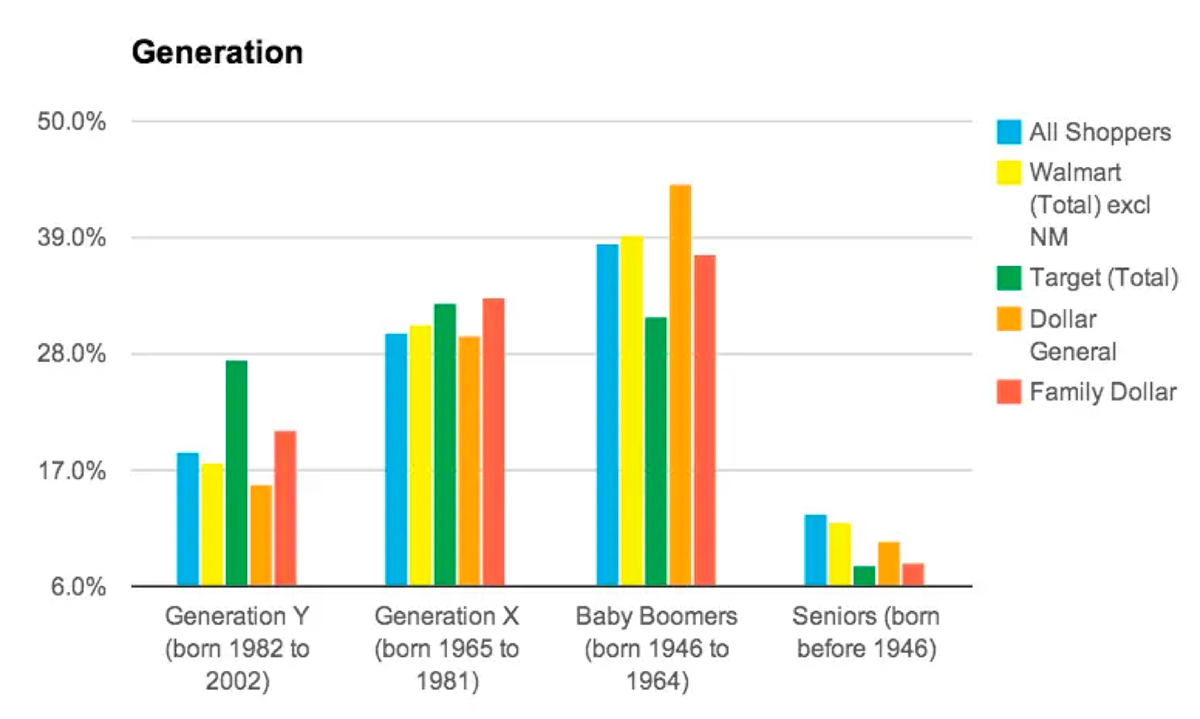
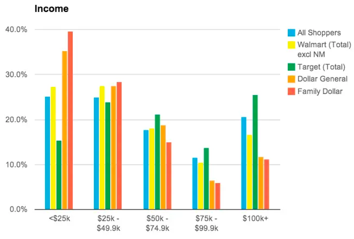
Walmart's acquisition of Lord & Taylor (not publicly known during the redesign), meant Walmart was definitively taking a clear step towards selling higher-end products which could potentially present price points that Walmart's customers' weren't used to seeing and that may appear out of reach. To help us with this hypothesis, we looked at past data around the average age, gender and generation span of our Walmart customer. We also looked at past user-studies, met with research to discuss possible friction points and Walmart's persona's.
Given the enormity and risk of this redesign, we also looked at dashboards to asses primary and secondary metrics, T-leaf sessions to view (recorded) web sessions and click-tale sessions to assess mouse movement and clicks. Lastly, we also conducted a SWOT analysis where we looked at strengths, weaknesses, opportunities and threats of our competitors.
Given the enormity and risk of this redesign, we also looked at dashboards to asses primary and secondary metrics, T-leaf sessions to view (recorded) web sessions and click-tale sessions to assess mouse movement and clicks. Lastly, we also conducted a SWOT analysis where we looked at strengths, weaknesses, opportunities and threats of our competitors.
User Stories
Reading through all this data, we were able to abstractly understand customer's paint points which helped formulate potential design solutions to solve their needs.
RESULTS
The result of these two deliverables helped us understand the needs of our customers, goals (as a team & company) which allowed us to smoothly transition into the Sketch phase. One point that became clear and our motto during the redesign was; we could not design an experience that abandoned our core customer base.

02 Sketch | Sketch Solutions
• Lightning Demo
• Lightning Demo
• Solution Sketches
OBJECTIVE
In the sketching phase my objective is to turn abstract needs into concrete ideas to solve the users needs via Lightning Demos and Solution Sketches.
In the sketching phase my objective is to turn abstract needs into concrete ideas to solve the users needs via Lightning Demos and Solution Sketches.
DELIVERABLES
Lightning Demo
Lightning Demo
In the Sketch phase, we had a little fun by taking advantage of unorthodox approaches to do our research of other products and competitors. It was no secret (internally) that we acquired Lord & Taylor to push over Amazon. In our research, we looked at Amazon but we also looked at Gucci, Louis Vuitton, Christian Louboutin and visited physical stores such as: Barney's, Macy's and Nike. In parallel, we also looked at design languages such as: Materials, Facebook and Amazon (to name some).
Solution Sketches
In the Solution Sketch phase, we also took different approaches not normally done in a traditional product design process. We used mood-boards, group sketch sessions with PM's (product managers), vertical design leads and design associates.
RESULTS
Through this process with the mix of product design, traditional design agency exercises and a little of 'anything goes,' we were able to come away with ideas that would prove to be so valuable moving forward (a hindsight perspective).

03 Decide | Choose Direction and Storyboard
• Getting Feedback
• Getting Feedback
• Storyboard
OBJECTIVE
In the deciding phase, the objectives are to collect feedback and decide which Solution Sketch or Sketches solve the problem best.
In the deciding phase, the objectives are to collect feedback and decide which Solution Sketch or Sketches solve the problem best.
DELIVERABLES
Getting Feedback*
Getting Feedback*
Traditionally speaking, during this stage, I would first explain (to my team) the goal & context and that I'm only looking for two types of feedback; usefulness & usability. Once I've set the stage, I reveal my Solution Sketches to receive critical feedback. In Walmart's redesign, Sr. stakeholders,* pulled this stage within the design process and went towards an unexpected angle.
With the acquisition of Lord & Taylor, green lighting the redesign, an e-commerce competition with Amazon (that we were losing) while desperately trying to retain our core customer base, and with an aggressive redesign deadline set by Walmart's CEO, Sr. stakeholders saw little value in making decisions based on viewing low-fidelity sketches created on stickies with a marker. From their perspective, unable to ignore the issues mentioned above, stakeholder's wanted and preferred high polished mocks to assess.
Before moving forward in this case-study, there is one critical point that needs to be made to complete the delta between Walmart's shift within my design process and their chosen path within the redesign.
Factoring the issues mentioned above that were facing the redesign along with a unique directive given by our CEO which stated, he did not want to test the redesign with our customers in fear of social media leaking and Amazon becoming aware, It was no surprise why rare decisions were being made that in truth, brought discomfort. This meant, zero prototyping and/or user-testing would be applied to redesign** and only high-fidelity mocks would be assessed. From my perspective and for many within Walmart, his decision was extraordinary and perplexing. Yet, the risk that our CEO was willing to take with his decision (of not testing), was strangely fascinating and I was curious to know how this decision would impact Walmart's redesign. Through all of this, I was confident I'd come out of this experience with a lesson learned.
*An action, not a deliverable
Storyboard
The Storyboard deliverable within this stage was not applicable to the redesign of Walmart.
RESULTS
Having completed the first three stages of my design process, it was now time to redesign Walmart.com.
* (Sr. Stakeholders - CEO of Walmart, Sr. Vice President of Product, Sr. Vice President of Engineering, VP of Design & Brand, Sr. Director of Brand and Sr. Directors for all verticals).
** Suite Header (navigation bar) was eventually tested with our customers under an NDA agreement.
04 Prototype | Design Mocks & Create a Prototype
• Design Mockups
• Design Mockups
• Build a Clickable Prototype
OBJECTIVE
With a clear directive hanging over us, we still believed Walmart's success highly depended on our unique e-commerce nav bar*. We feared if Walmarts customers' found it difficult to navigate, Walmart would suddenly then run the risk of losing their core customer base; a price we could not risk paying. Recognizing this potential problem, the clear focus was 'pressure' testing the navigation bar and secretly ignoring the directive for this feature.
* (Walmart's CEO directive stayed in place for all other aspects of the redesign).
DELIVERABLES
Design Mockups
Design Mockups
In parallel, the Home-page team focused on designing mocks to test our nav bar as I continued to focus on redesigning happy-paths* that carried our nav bar for: Home-page, Home & Garden, Fashion, Electronics, Auto and Cart & Checkout.
* (Redesigning all Happy-path mocks continued for a 3 month span. During that span, weekly, sometimes bi-weekly meetings were set to assess mocks.
Build a Clickable Prototype
In this phase, I'm over-saw the nav bar prototypes built by the Home-page and continued my path.
RESULTS
Prototypes are complete and ready for qualitative user-testing.
05 Test | Get Feedback on Prototype
• Run a User Study
• Next Steps
OBJECTIVE
In the testing phase, the research and Home-page team crafted their test to focus on validating the effectiveness of our nav bar. Specifically focusing on uncovering how important a strong existing paradigm within an e-commerce experience was to our customers. The paradigm I'm referring to is recognizing a brand logo or icon being used to navigate back to your home-page experience; a feature our new nav bar would not have. Capturing key insights and organizing the feedback was extremely critical in helping us decide our next steps.
In the testing phase, the research and Home-page team crafted their test to focus on validating the effectiveness of our nav bar. Specifically focusing on uncovering how important a strong existing paradigm within an e-commerce experience was to our customers. The paradigm I'm referring to is recognizing a brand logo or icon being used to navigate back to your home-page experience; a feature our new nav bar would not have. Capturing key insights and organizing the feedback was extremely critical in helping us decide our next steps.
DELIVERABLES
Run a User Study
Run a User Study
All nav bar user studies were completed, synthesized and next steps based off the synthesis were very clear; the e-commerce navigating paradigm was such a strong subconscious interaction for our customers.
Next Steps*
After four separate user study sessions with 24 participants concluded, we had clear definitive next steps and they were:
- Redesign our nav bar that was closer to or followed standard e-commerce interactions.
- Run a smaller user testing session to validate our revised nav bar.
*An action, not a deliverable
RESULTS
Nav Bar
In redesigns, teams tend to push boundaries in directions that may go against a designers past experience or instincts but that's the great part of testing and frankly, our job.
Our new nav bar concept added no value or improved upon the experience. Qualitative studies showed the paradigm was so ingrained into our customers subconscious, 0 out of 24 customers interacted with the spark (Walmart's icon/bug) as a means to navigate throughout Walmart. 100% of users thought it was to go back home; a huge, somewhat silly fail on our part but the pivot was an easy fix and added no additional cost. Looking back, if we were under 'normal' constraints of a redesign, I would've created a separate team to test new nav interaction concepts in parallel to the team responsible for the redesign using conventional interactions.
The new design showcased a hamburger icon resting on the left side of the spark which now allowed the spark to act as it was intended from an e-commerce perspective.
Happy-Path Screens
From a Happy-path perspective, none of our mocks were tested but at this stage they were all approved by our Sr leadership team and ready for hand-off (to design leads). At this stage, I was concentrating in two areas: Organizing our new design language - Living Design and working with vertical design leads to ensure our vision remains in tact as they're solving for primary, secondary and tertiary use-cases.
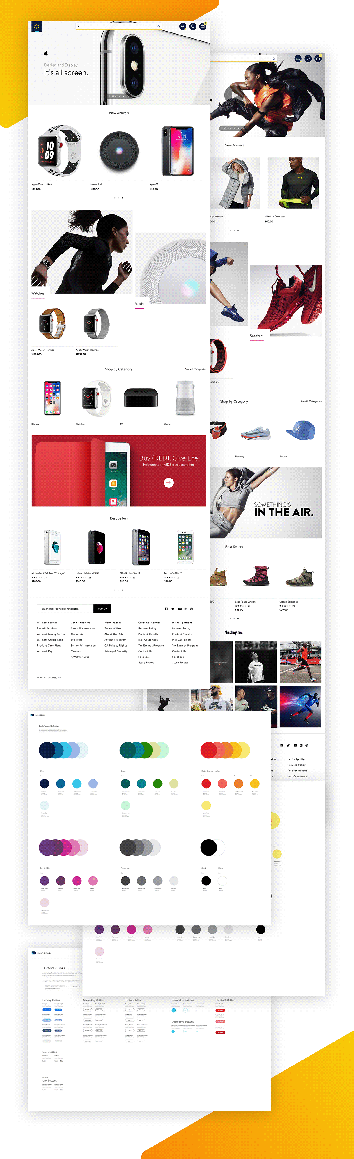
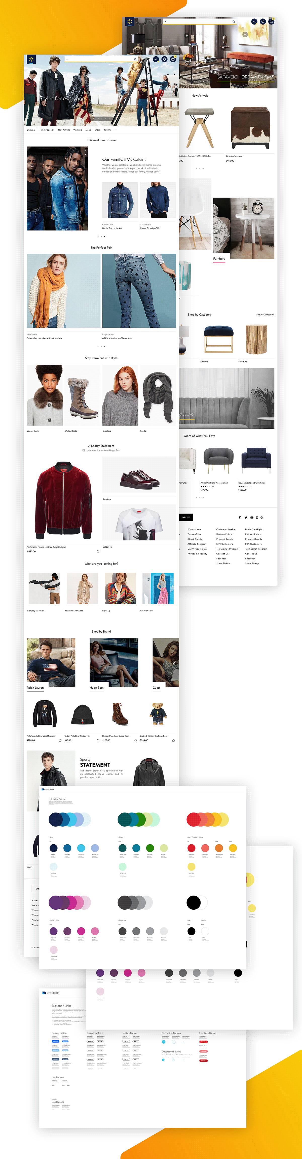
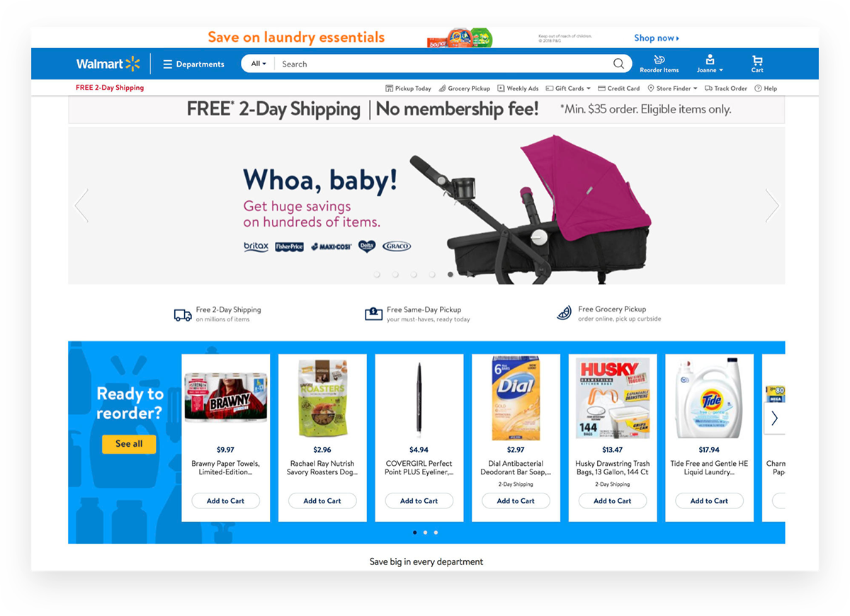
High Fidelity | A New Look
Below showcases the output into creating a new aesthetic for Walmart.com along with snap shots of Walmart's first internal design language; Living Design.
Walmart historically hired design agencies to create and/or design their experiences. For the first time, in its digital history, Walmart and its designers had something to call their own and be proud of for many years to come.
Old Walmart
Final Result | Outcome
WALMART DESIGN RESULTS
I created Walmart's first internal Design Language System; Living Design
I created visionary mocks that helped Walmart designers with designing primary, secondary & tertiary use-cases.
Introduced new design laws, principles and practices for the entire design org; A first at Walmart.
Introduced new design laws, principles and practices for the entire design org; A first at Walmart.
BUSINESS & SCALABILITY RESULTS
A re-imagined, customer-journey, personalized experience that helps .com customers not only convert but also browse better. This increased retention rates and overall shopping satisfaction for Walmart.com
The entire ramp took a month. We slowly ramped our release from 1, 5, 20, 30, 50% to ultimately reaching 100%. Each ramp had criteria's - meaning we could only take so much of a “hit” / breakage of GMV (gross margin value).
For example, with a 5% ramp we could only take up to -20bps (.20%). Upon every ramp, we debugged and triaged issues until there were far and few between. As bug fixing continued, we pushed our code to production while taking daily reads. We continued slowly ramping up until we reached 100% release. This process is what a j-curve process looks like.
After 100% ramp, we made a call to conduct new quantitative studies (via A/B tests) which we studied and iterated on until we eventually reached a positivity metric of over 50bps!