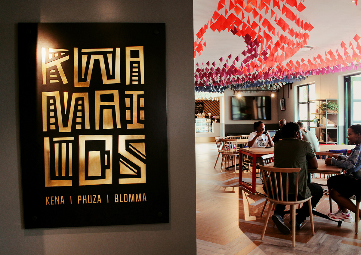
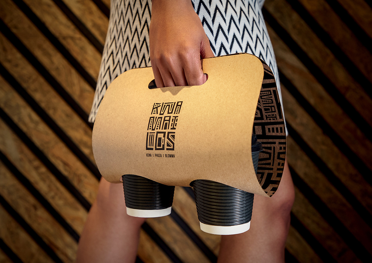
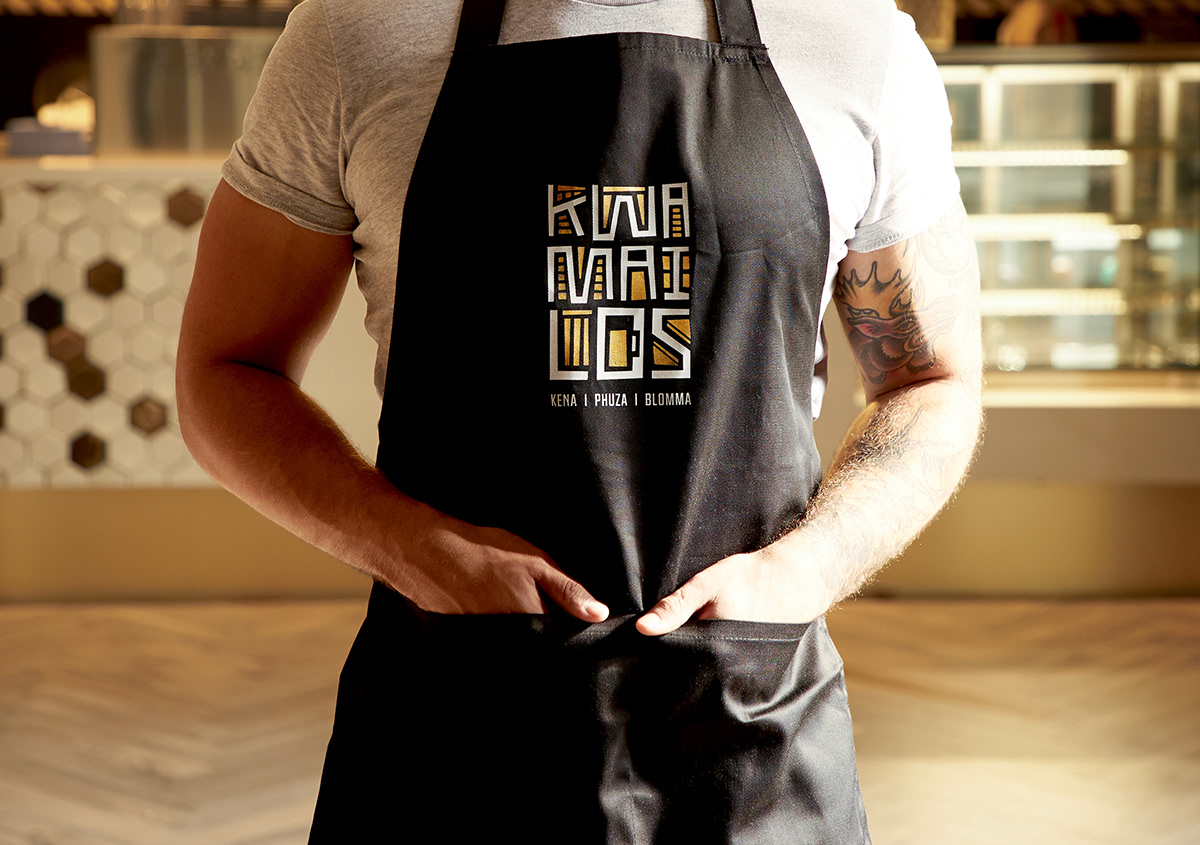
Kwa Mailos
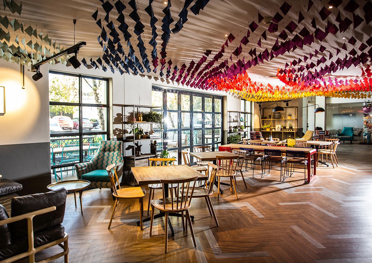
We were asked to brand a café for the people of an agency, where they could think, pause and think again. A place where they felt at home.
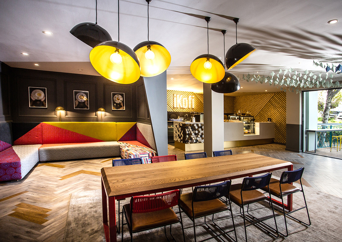
In order to truly make the café feel like home, we honoured the man who did that best for 20 years, the late Mailos Madinane, the warm, welcoming receptionist. We named it “Kwa Mailos”, meaning Mailos’ Place. But when from the heart, it means “Mailos’ Home”.
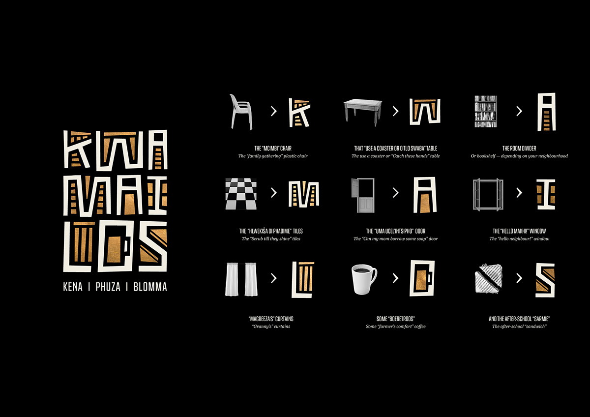
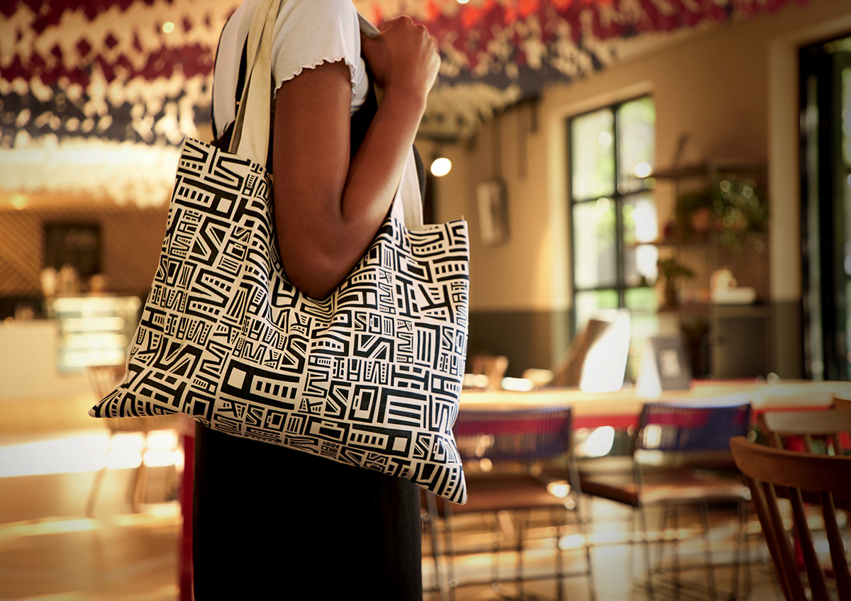
And what does home feel like? We asked people what reminded them of home and built an identity around this. Everything from the mcimbi chair, a style of chair used at large family gatherings to Magreeza’s (Granny’s) curtains, inspired the iconography in the logo.
And what does home feel like? We asked people what reminded them of home and built an identity around this. Everything from the mcimbi chair, a style of chair used at large family gatherings to Magreeza’s (Granny’s) curtains, inspired the iconography in the logo.
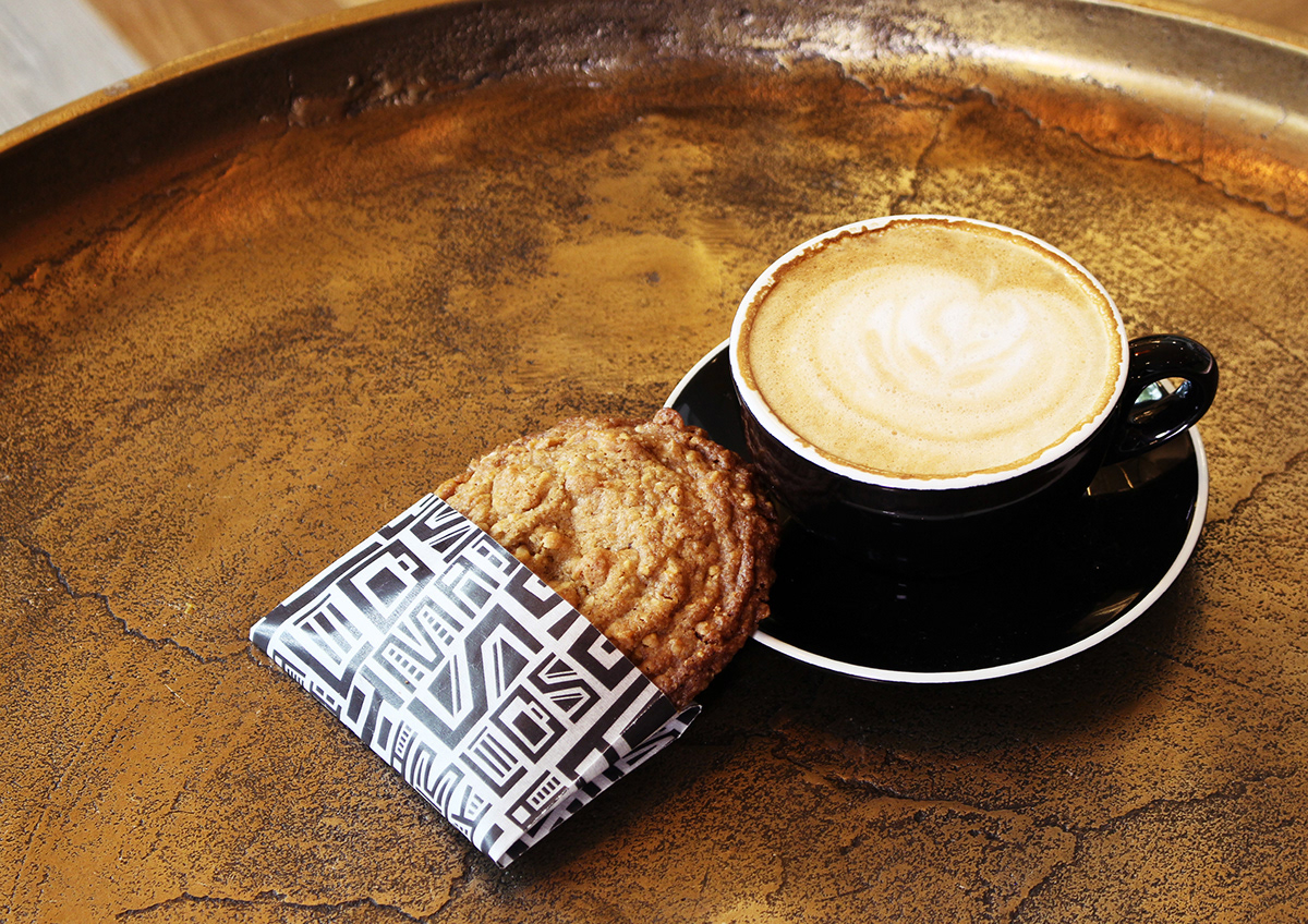
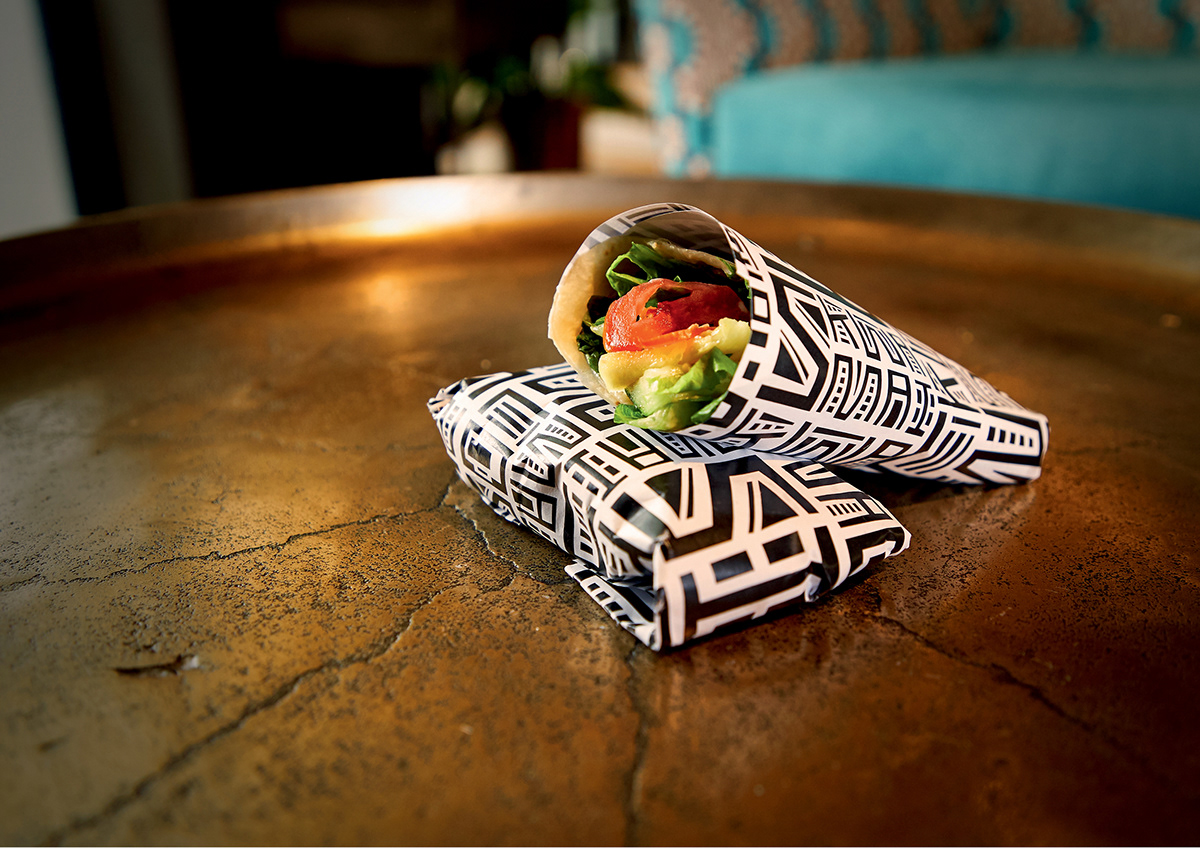
Through the use of a contemporary South African design language, Kwa Mailos became a modern expression of nostalgia. A place where people can Kena. Phuza. Blomma (Come in, drink and chill).


Credits: Head of Design: Liana Liebenberg, Designer: Kyle Light, Art Director: Nobantu Sibeko, Writers: Khanyi Mpumlwana, Kate Davison


