
BACKGROUND
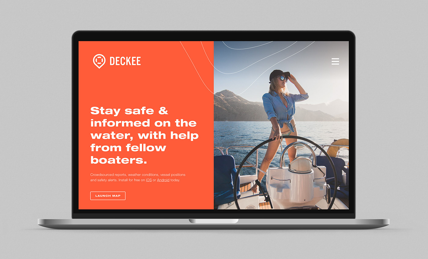
Deckee is a Newcastle founded app that since launch has had over 26,000 total downloads. Their mission is to help people stay safe, informed and connected on the water. The Deckee brand needed to evolve to match their growing community, global ambitions and greater Government responsibilities.
SOLUTION
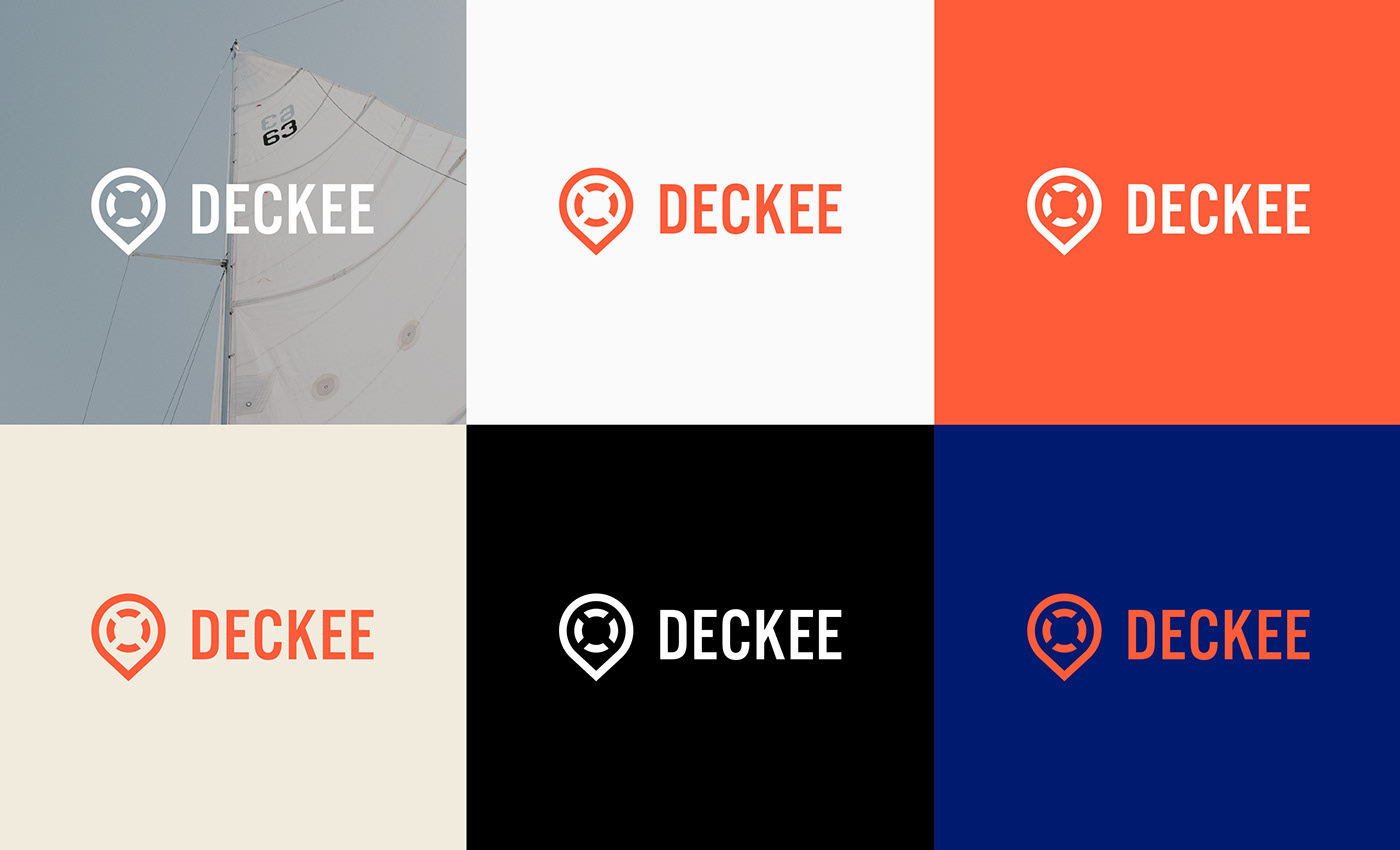
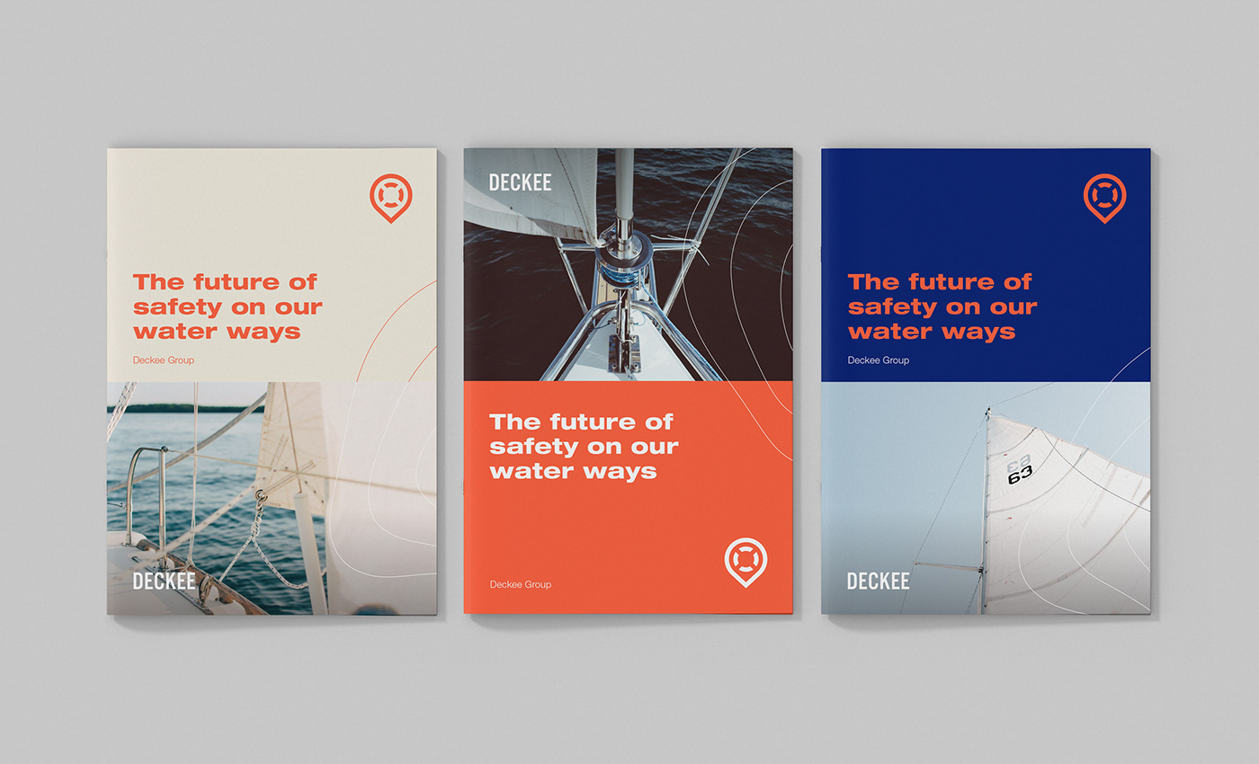
The Deckee brand was in need of an update — however they had some great brand equity in their existing icon and colour palette. Because of this, we approached this project as an evolution, updating the primary mark and establishing a new graphic system and guidelines to take them into the future.

ISOGRAPH SYSTEM
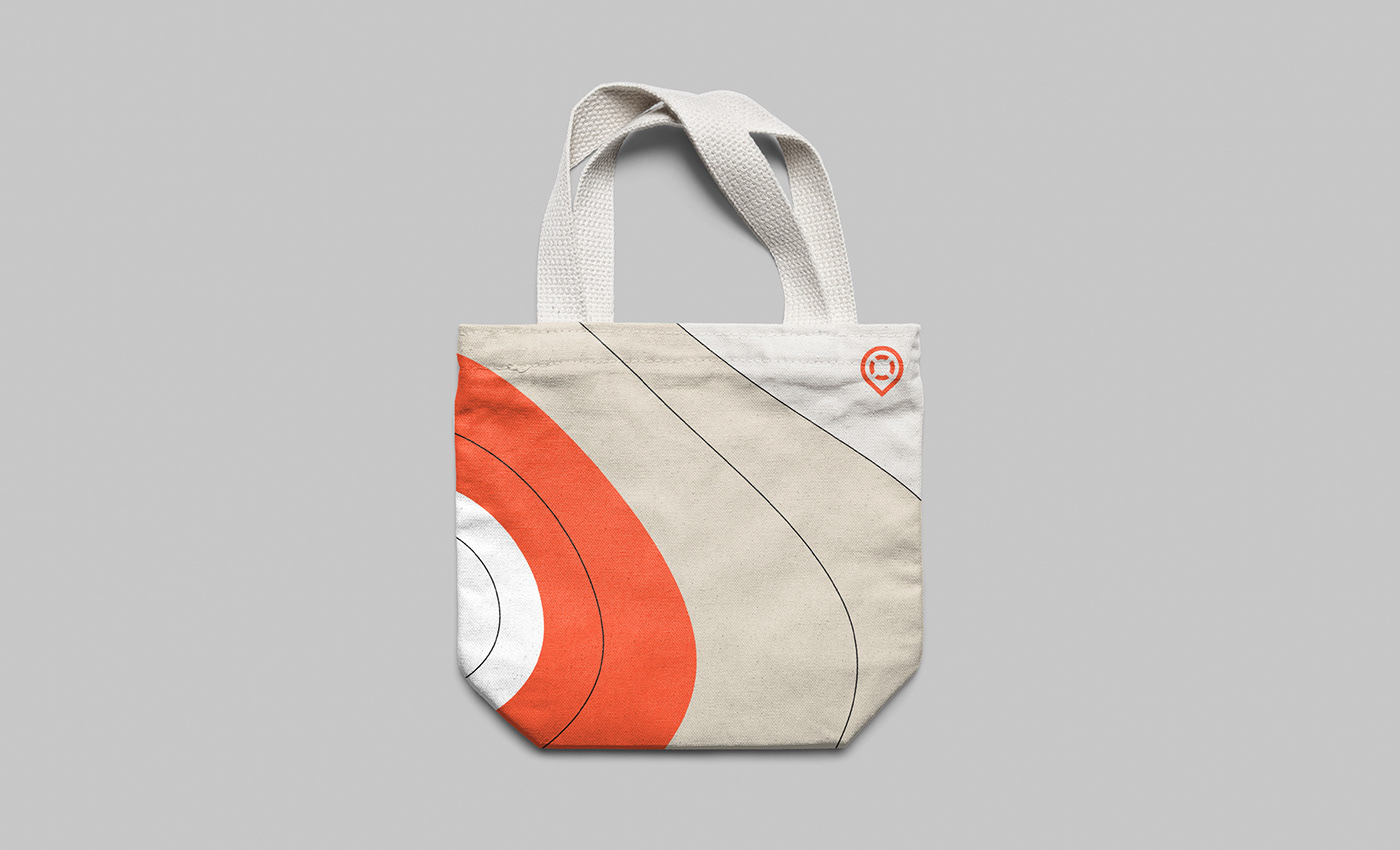
The most popular feature of the Deckee app is weather tracking so it was appropriate we highlighted this feature in the graphic system. Taking direct inspiration from isobar markings on a weather map, the supporting graphics can be utilised in line or solid colour variations, and also integrated with photography for maximum flexibility.

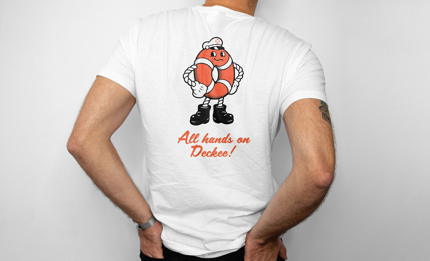
MASCOT
Whilst the overall brand has a focus on safety and reliability, we wanted to introduce a softer element for use with education and fun collateral for events. To do this we worked with illustrator Jace Prasil and developed a Deckee mascot inspired by classic nautical characters like Popeye. His body is a life preserver, (to reference the Deckee symbol), he wears a boating captains hat and has sailing rope inspired arms. Name to be confirmed!