M A Y B E
E D I T O R I A L
BRIEF: Develop a magazine targeting world travellers who revel in curious and obscure destinations
With a background in creative writing and having produced a handful of articles for internal publications, I always had an inkling that I'd enjoy editorial design. I was quick to find that I didn't just enjoy it, I LOVED every second of it.
Maybe Magazine is a project done in two parts, but is - at its core - a publication about traveling to obscure destinations that might not be on the standard tourist's radar. I elected to design an edition about Russia, highlighting some of the stranger, more lurid places a person can visit in this enigmatic country.
I wanted to capture the utilitarian ethos of much of Russia, with its faded, peeling paint signs, bitter winter climes and its bold, undaunted spirit while hinting at its authoritarian tones.
The cover of Maybe features the head of a bear, Russia's national animal icon, a glacier, numerous large cogs and wheels with distorted lines framing the collaged piece. The key-art of the cover is intended as an amalgam of Russia, with the lines representing a journey. Each terminal is steady and straight, but the middle section is not - indicating both risk and adventure.
DISCLAIMER: Concept work for student project

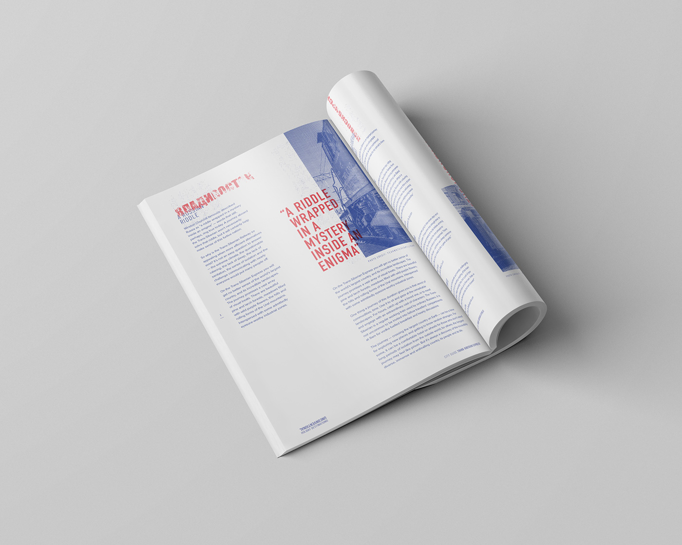
The feature article for the magazine is for the Trans-Siberian Railway, the world's longest journey in conditions that vary wildly. The journey has often been described as taxing and difficult as it is intriguing.
The main heading for the article borrows heavily from the constructivism movement, championed by Russian designers in 1915. With the railway itself being completed in 1916, the addition of such an iconic Russian design approach helps not only echo the cultural background of the piece, but the time period that saw its inception.
The article itself is structured, almost militantly so, by a grid which pays note to the structured rule of order in Russia. The colour scheme borrows from the Russian flag while the heavy use of negative space helps to enforce the feeling of the landscape, cold and just a little barren. Halftone was chosen as an image treatment for its grittiness and for its utilitarian look and feel.
The overprinting pull quotes in bright red are a subtle nod to the authoritarian, commanding air of both current and past Russian governments.