
Greenhouse Gas Emissions in Visuals
Carbon dioxide and other greenhouse gas emissions are the primary driver of climate change. In this work I apply an artistic approach to visualizing trends in global emissions over time for 195 countries. For detailed references on greenhouse gases and how to limit their release, I recommend the work of Hannah Ritchie/Max Roser and the Intergovernmental Panel on Climate Change (IPCC).
Part I – Context
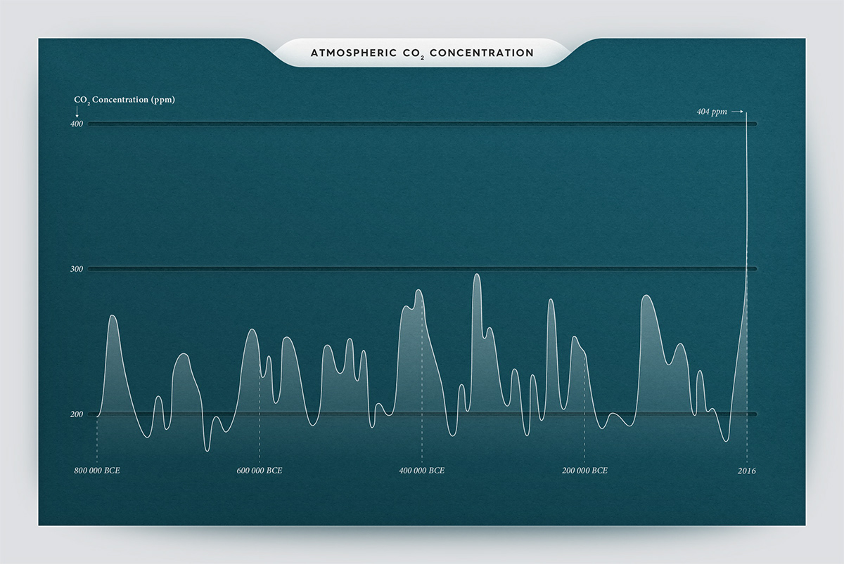
As the IPCC state in their 2014 report: “Anthropogenic greenhouse gas emissions have increased since the pre-industrial era, driven largely by economic and population growth, and are now higher than ever. This has led to atmospheric concentrations of carbon dioxide, methane, and nitrous oxide that are unprecedented in at least the last 800 000 years. Their effects, together with those of other anthropogenic drivers, have been detected throughout the climate system and are extremely likely to have been the dominant cause of the observed warming since the mid-20th century.“
In the charts below we see that over the last few decades temperatures have risen sharply to about 0.8 °C higher than the 1961-1990 baseline, and that carbon dioxide (CO2) concentrations are now over 400 ppm. This is concomitant with the Industrial Revolution and rise of human emissions from burning fossil fuels. This sudden shift will give species and ecosystems very little time to adapt to potential ecological, physical, and health impacts that come with a changing climate. To slow down the rising of global temperatures we need to stabilize concentrations of greenhouse gases in Earth’s atmosphere. Yet, to date, they continue to accumulate.

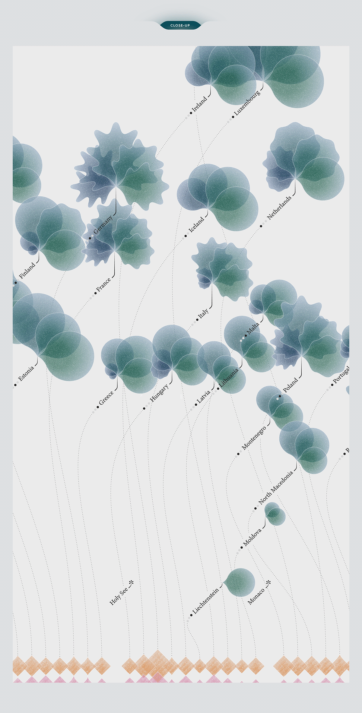
Part II – Greenhouse Gas Emissions
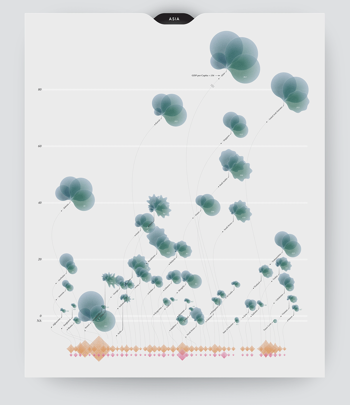
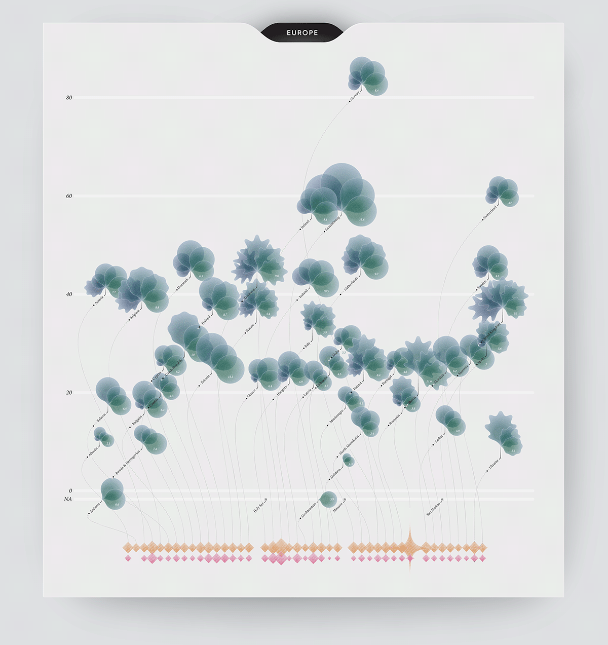
As of 2016, the African continent still has very low per capita – or per person – CO2 emissions. Most countries in Africa have been responsible for less than 0.01 % of all emissions over the last 250 years. On the other hand, Asia is by far the largest regional emitter at 53% of global emissions, but is also home to 60 % of humans, meaning that per capita emissions are still lower than the global average at 4.5 tonnes in 2016. In Europe, emissions at the country level are generally not far from the global average, with differences mostly due to the choice of energy sources.
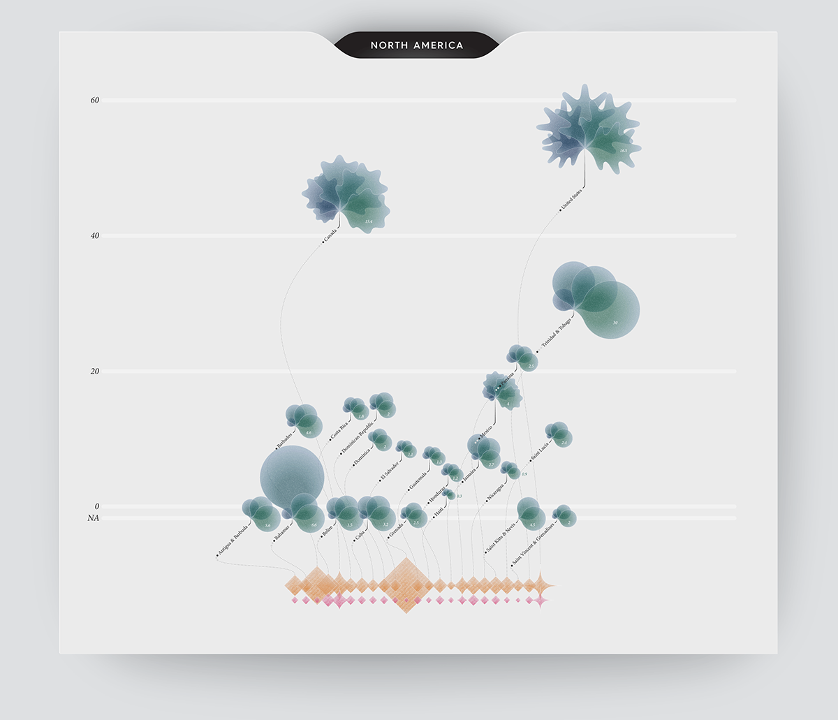
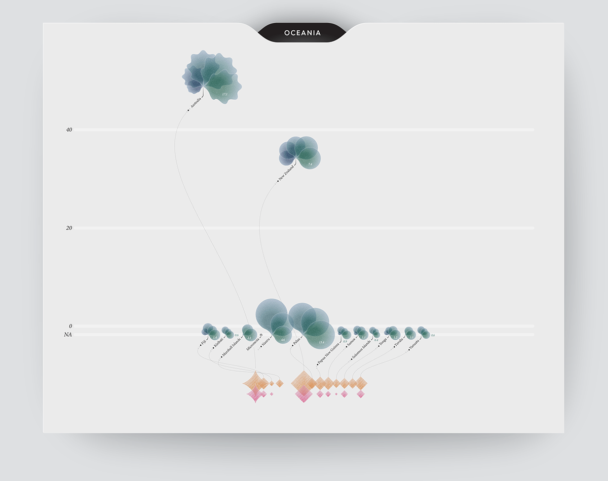
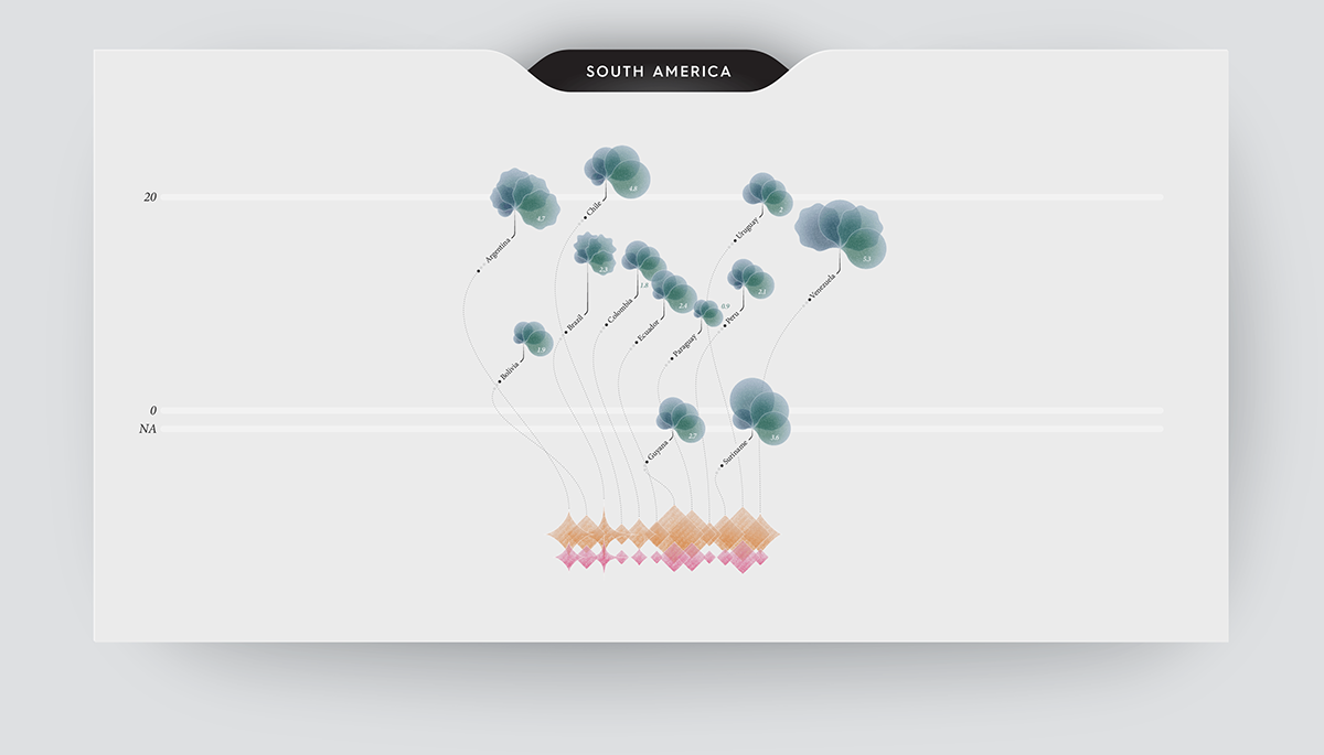
Whilst being home to only 5 % of the world population, North America is the second largest emitter at 18 % of global emissions. The average North American emits 17 times more CO2 than the average African. Similarly, Oceania accounts for 3-4 % of the global share whilst hosting 0.5 % of humans. Despite a significant increase in greenhouse gas emissions over the past few decades, the South American continent remains a small contributor relative to its large population. These are all regional trends and you can see which individual country emits what in the infographics below.


Part III – Future Directions
Countries with high standards of living tend to emit high levels of CO2. However, a number of these including the United States, France, and the United Kingdom have recently managed to reduce emissions whilst increasing their gross domestic product (GDP). But are these improvements going fast enough to limit global warming to "acceptable" levels?
Global warming scenarios help understanding how much we need to commit to achieve such targets. The most common models are: No climate policies are implemented, temperatures rise of 4.1 to 4.8 °C; Current policies in place continue (rise of 2.7 - 3.1 °C); Countries deliver on emission reduction pledges (rise of 2.3 - 2.6 °C); Countries comply with the necessary measures to limit warming (rise of 1.3 - 1.7 °C). As we see in the second visual below, if our aim is to keep global warming below 2 °C – as is laid out in the Paris Agreement – we are clearly far off-track. Instead, models show that urgent and rapid reductions in emissions would be needed to meet this objective. More on this at www.ourworldindata.com.


Part IV – Behind the Scenes
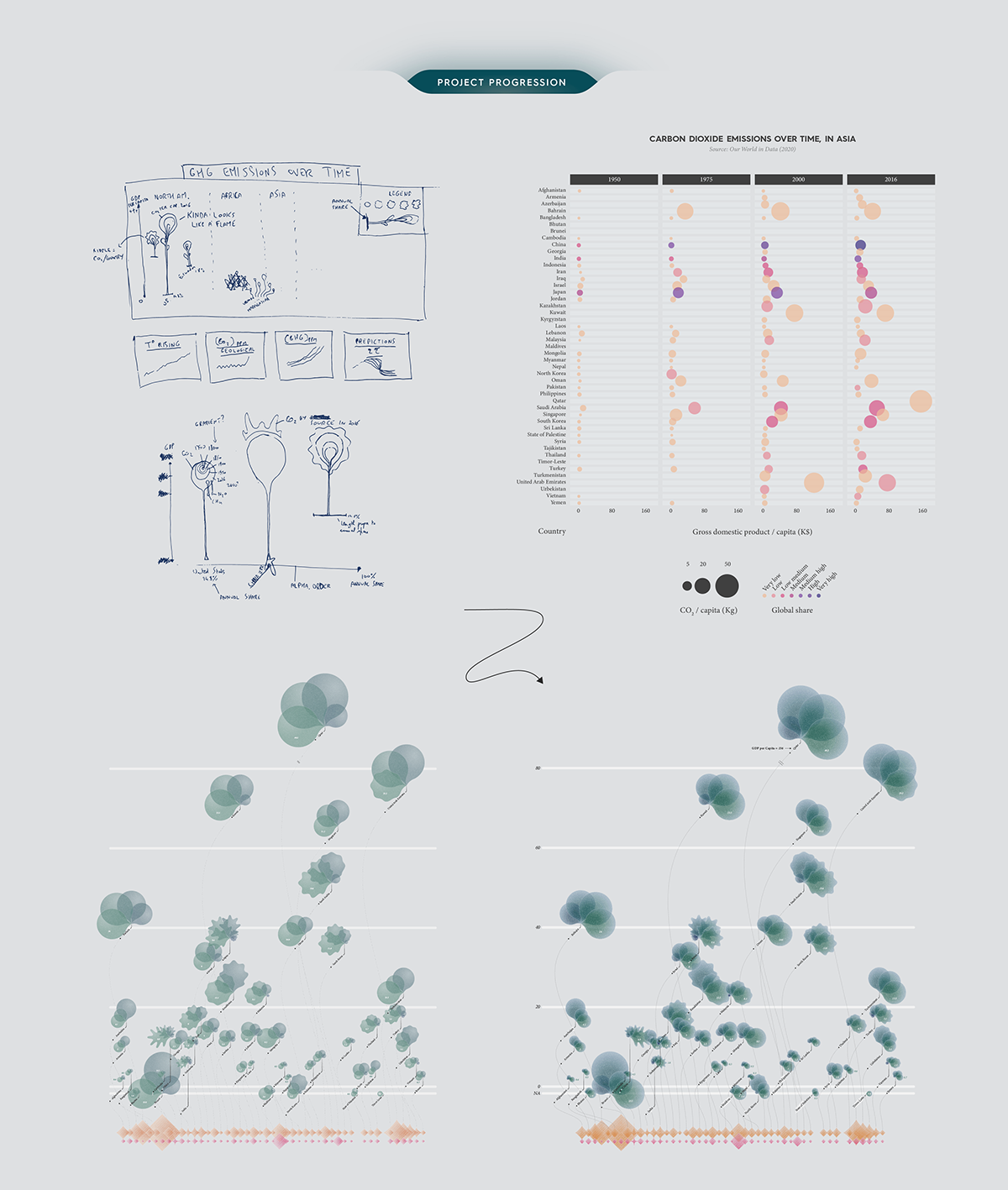
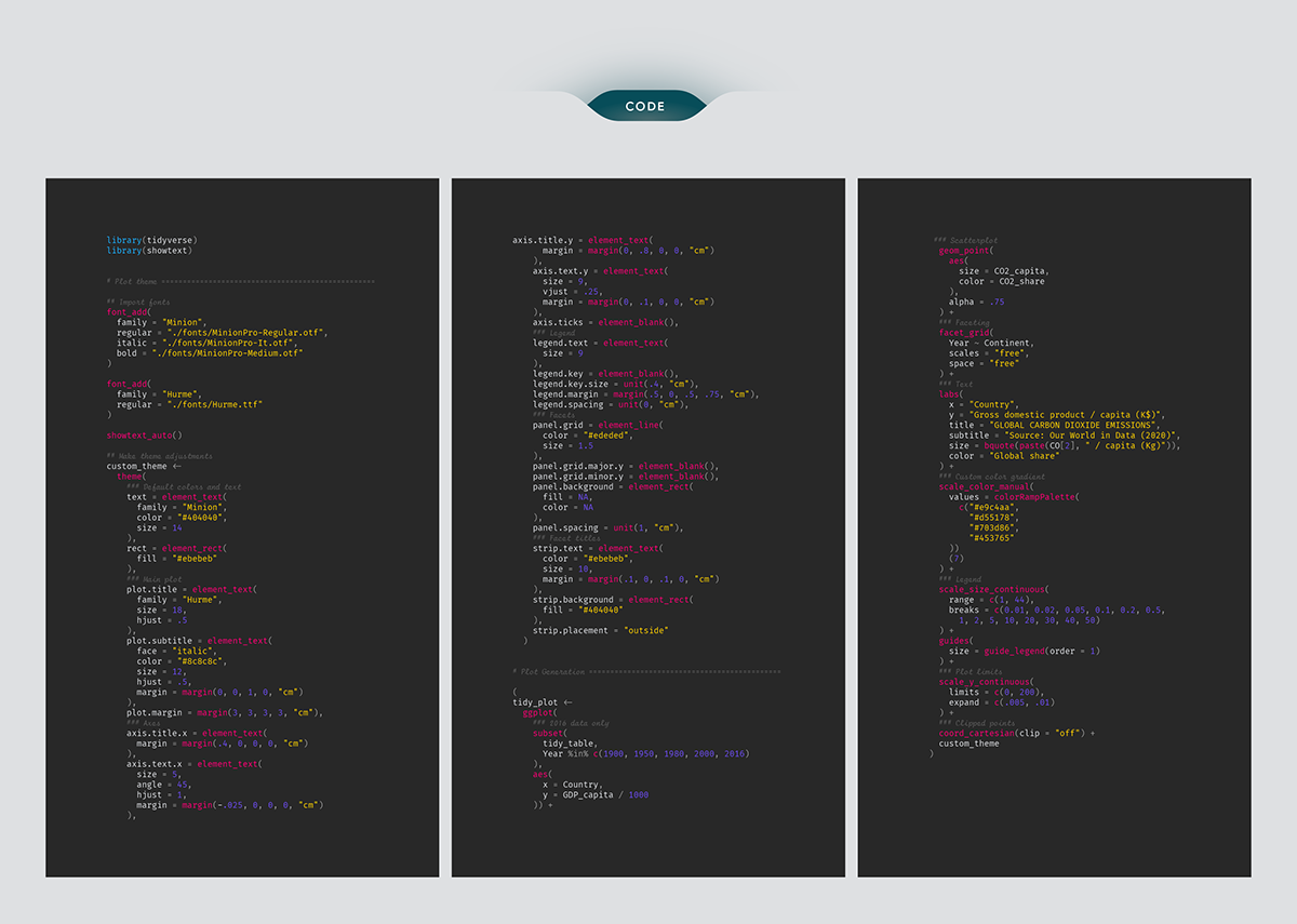
I wanted a mix of organic and industrial styles in the infographics, this is why I came up with plant-like structures where leaves seem to be lit by a burning gas source. Once satisfied with the layout, I coded a script in R language to generate quick graphs from the data. This helped identifying trends that are otherwise hard to see in raw data tables, enabling me to improve the design. After a few cycles of data analysis/layout adjustments I exported graphs into Illustrator and Photoshop for further layout changes and to work on textures.
Sources
Global temperature anomaly*: Met Office Hadley Centre (Public sector information licensed under the Open Government Licence v1.0)
Atomospheric CO2 concentration*: NOAA / ESRL
Population data**: Gapminder
Greenhouse gas data* **: Our World in Data; Global Carbon Project; Carbon Dioxide Information Analysis Centre
Gross Domestic Product data* **: World Bank
Global warming scenarios*: Climate Action Tracker (Updated December 2020)
* chart
* infographics


