

Leonardi Immobiliare & Associati
Story & Task
Recently, the Italian real estate agency "Leonardi Immobiliare & Associati" contacted with our studio and offered us to redesign their current logo, as well as develop a corporate identity for their brand.
The client had several mandatory wishes for the sign:
1. To use in the logo the first letter of the surname of the "Leonardi" agency's founder;
1. To use in the logo the first letter of the surname of the "Leonardi" agency's founder;
2. To use in the logo the first letter of the second word in the naming of the agency – "Immobiliare";
3. To convey through the logo the agency's involvement in the real estate sector.
I propose to see the result "before and after", and then delve into the description of our solution.

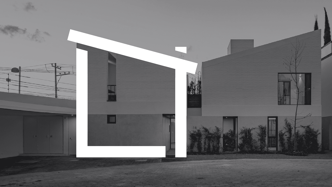
At the beginning of the work on the sign, we inspired by various architectural solutions. To do this, we created a moodboard from images of houses, which helped us with the first sketches of the logo. After going through many options, we settled on this.

The trapezoidal shape of the facade was able to accommodate all the client's wishes for the sign.

There were other sketches, but we abandoned them in favor of the chosen option.


The typeface of the logo was also changed. In the previous version of the logo, the mark was integrated into the font. We decided to separate these entities so that "sign + font" came out as a result. This allowed us to introduce new solutions with typography into the brand identity.

We designed the new sign on the basis of a modular grid developed by us, which gave it rigor and laconicism.


Our decision to separate the typeface and the sign from each other allowed us to introduce animation into the identity. With the help of it, we can show the adaptability of the sign to changing conditions, as well as breathe dynamics into the brand identity.


For advertising promotion of the agency, we suggested using illustrations stylized as a sign. This solution will allow you to create unique content that must attract attention. It is simple, concise and doesn't require large financial costs from the client.


The sign looks great in miniature, as for example on the profile picture on Instagram. Even when greatly reduced, the logo looks neat and recognizable.