
CORE2291 Design Lab 1: Project 2 Illustrator techniques
Project Requirements:
This project required a demonstration of knowledge of Adobe Illustrator's tools and features. Also it required an understanding of visual balance and hierarchy when designing three or more elements to be used in a pattern. Making sure not to waste time on unnecessary details that would be lost when viewed as a pattern, or the way in which the elements were arranged in order to give each design room to breath, these were the concepts required for the project.
Coca Cola Redraw Process:
I first sized the reference photo down to fit into the frame of the art board using the "Free Transform Tool". Then, I lowered the opacity of the background image to 30%, allowing me to see my line work more effectively. Then I placed a circle around the image.

With the stage set, I began going through with the "Pen Tool", dragging anchor points and utilizing the "Curvature Tool" in order to smooth some the more intricate turns in the design.

After a bit of time, I penned in the rest of the type, separated into organized labeled groups.


Once I had the main design laid out, I used the "Type on a Path" feature to curve the "Trade Mark Registered" type. I found a font that was close to the original, but it wasn't exact.

Then lastly, I removed the stroke color on the lettering and circle, and used the "Gradient Tool" to apply a gradient to the inside of the circle. The colors I used were selected directly from the sample photo at 100% opacity using the "Eye Dropper Tool."

And here is the final result of the redraw:

Visual Exploration:

Pitch:
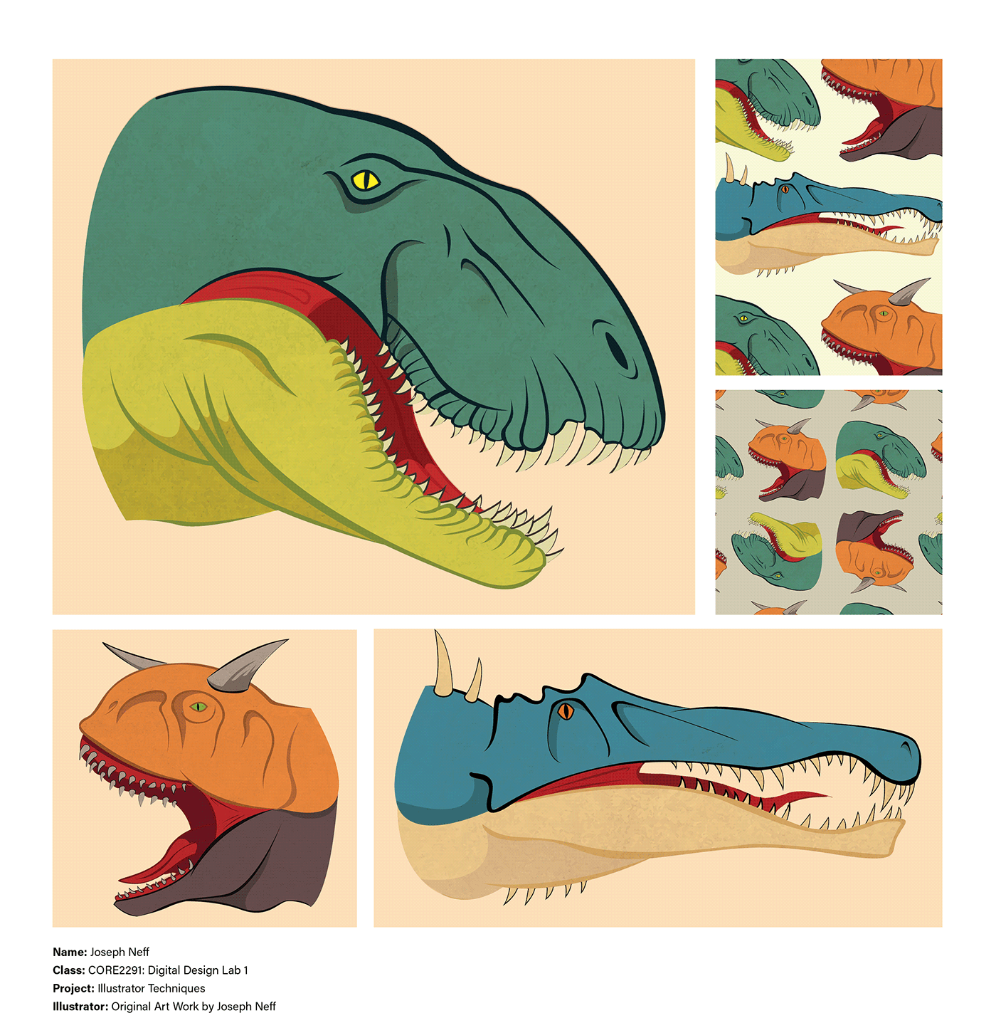
This is my Visual Exploration for Project 2. I'm going to do a dinosaur pattern design with a more realistic style, but not realistically rendered. Why dinosaurs? Well, really it's because I had a hard time finding something I was interested in related to Coca-Cola. I mean, it's my favorite drink, but a lot of the iconography has been done time and again, and I found myself staring blankly at the page, devoid of ideas. I needed to pick something I was interested in, something I could put my heart and soul into. So, I chose dinosaurs. They remind me so much of my childhood, and they lead me down this road to becoming a professional illustrator, so it seemed like a good place to go to. Besides, in my ideal world, the Coca-Cola company would for sure do a sweet promo featuring dinosaurs. But not just any dinosaurs, get out of the way Tyrannosarus Rex, it's time for some underdogs to take the stage. My plan was to create three portraits of some under-represented carnivores. One is a Dimetrodon, another is a Carnotaurus, and finally the Spinosaurus. Along with the portraits there'd be raptor claws, palm leaves and footprints breaking up the space in between. These would be drawn and colored in Adobe Illustrator with a focus on shape and line. My goal was to create three unique, distinct portraits, that I could incorporate into a pattern design, but also that stand on their own individually. This would be a challenge of knowing when to simplify, and when to add detail.
Sketches:
In the sketches I toyed around with doing scales, but it wasn't the right call for a pattern design. It would've gotten lost when shrunk down to size and it would've muddled the profiles. I also planned on incorporating the footprints and claws and whatnot, but due to time constraints, I had to cut them out of the final. I can always revisit it and add them in later.


Process:
When I went in to do the final line art, I tried a number of different approaches. I went to download some Illustrator brushes, but I didn't like that I couldn't affect the smoothing, and some of the lines didn't connect in a pleasing way. I then tried the pen tool, using line alone, but I wasn't a fan of the stroke styles that were available to me. Finally, I settled on using the pen tool to create controlled, closed shapes as the line art.This took entirely too long, but it resulted in something I was happy with. So I stuck with it.

I knew I wanted to use colored line along with black, in order to create a more organic visual hierarchy. Instead of blocking everything in with a harsh black outline, I took the lower jaw and colored it green to make the bottom half feel softer than the top. I did this with each of the three designs to some degree, though for the Carnotaurus I swapped the colored line to the top half rather than the bottom.

I knew I wanted some bright colors, to capture that childhood imagination. I kept the colors pretty simple, but unique within each dinosaur to give them some personality. Once I started blocking in the colors, I wasn't happy with the level of depth in the jaw. So I added some shadows to accentuate certain areas and make the drawing feel more three dimensional.

Here were the results. I didn't like how the shadows buried the line-art, but I had a plan to bring them out and make the colors shine relative to each visual element.

It was now that i decided to place the paper texture in. I tried all of the different layer styles, but I settled on "Overlay." I placed the line art above the texture in order to have them be visible on top of the shadow. From there, I spent some time adjusting the color of the jaw to brighten it up.

From this point on, everything began to fall into place. The "Overlay" layer brightened up the colors in such a nice way, and all of the nice line art was visible, so I finished up the coloring process.

Lastly, I made a clipping mask the shape of the head, and isolated the paper texture onto the drawing itself. I followed the same method for the other two dinosaurs.
Final Colors:
I'm a detail oriented individual, I knew I wanted some sort of textural detail in the absence of scales, lovingly rendered by hand. I wanted to play to Adobe Illustrator's strengths, so I used a rough paper texture to get that grit that I like in my drawings. Although the shape and line is controlled, the texture adds another element of complexity when viewed up close, and from afar, it doesn't distract. It was the perfect solution to my problem.


Final Patterns:
When figuring out where to place everything, I tried to focus on the negative space created by the dinosaur's different contours. When looking at the space in between, everything just naturally fit into place. The down turned nose of the Dimetrodon acted as a leading line pointing towards the Carnotaurus's gaping jaw, which in turn pointed towards the Spinosaurus's long, slender snout, creating a nice triangular design leading the viewer's eye through the pattern in a subtle, natural way.

For the second pattern design, I wanted to create a design that could be viewed from the top or the bottom. I thought about the applications of having such a feature, bed sheets, a notebook cover, a birthday card, etc. I liked the idea and this is what I came up with.

Conclusion:
Here's my final presentation board with a large scale version of the Dimetrodon to show the techniques used in greater detail. I only included the dinosaur artwork seeing how I went off in my own direction. I added background rectangles to help contain the images in a more organized manner.


