O Cultura Natural é um restaurante preocupado em oferecer refeições saudáveis, trabalhando apenas com ingredientes naturais. Além de contribuir para um estilo de vida saudável, o restaurante carrega a missão de inspirar e transformar a vida das pessoas através de ações que incentivam bem estar e sustentabilidade.
–
The Cultura Natural is a healthy food restaurant, working only with natural ingredients. In addition to contributing to a healthy lifestyle, the restaurant carries out a mission to inspire and transform people's lives through actions that encourage well-being and sustainability.

Concept
A proposta do restaurante de oferecer não só comida saudável, mas também inspirar seus os clientes através do impacto positivo de suas ações sustentáveis, norteou na criação de um conceito muito mais profundo. Após muitos estudos, decidi usar a folha como ponto de partida, porém mesclada com com outros elementos que tornariam o símbolo único e que, acima de tudo, transmitiriam a essência da marca.
–
The restaurant's proposal to offer not only healthy food, but also to inspire its customers through the positive impact of its sustainable actions, guided the creation of a much deeper concept. After many studies, I decided to use the leaf as a starting point, but mixed with other elements that would make the symbol unique and that, above all, would convey the essence of the brand.

Grid
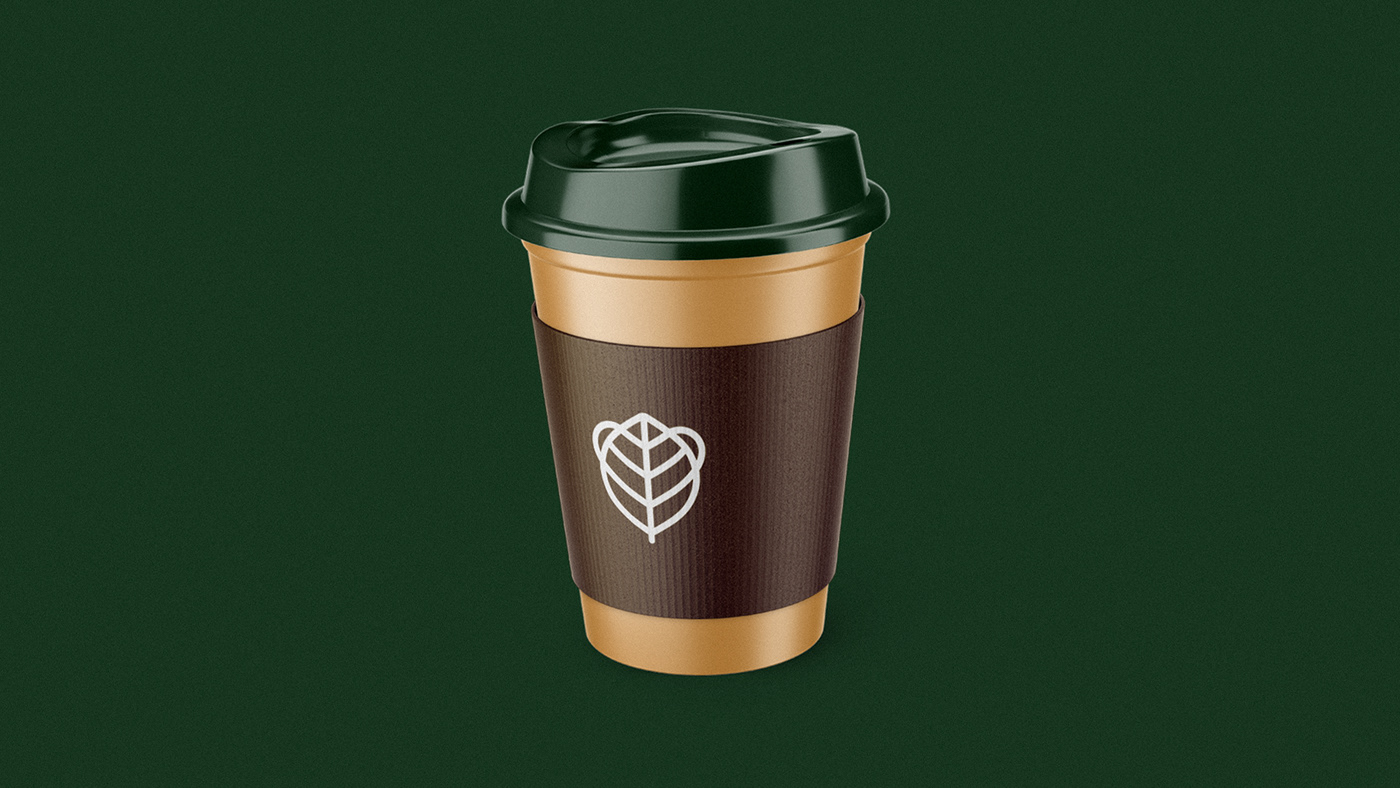
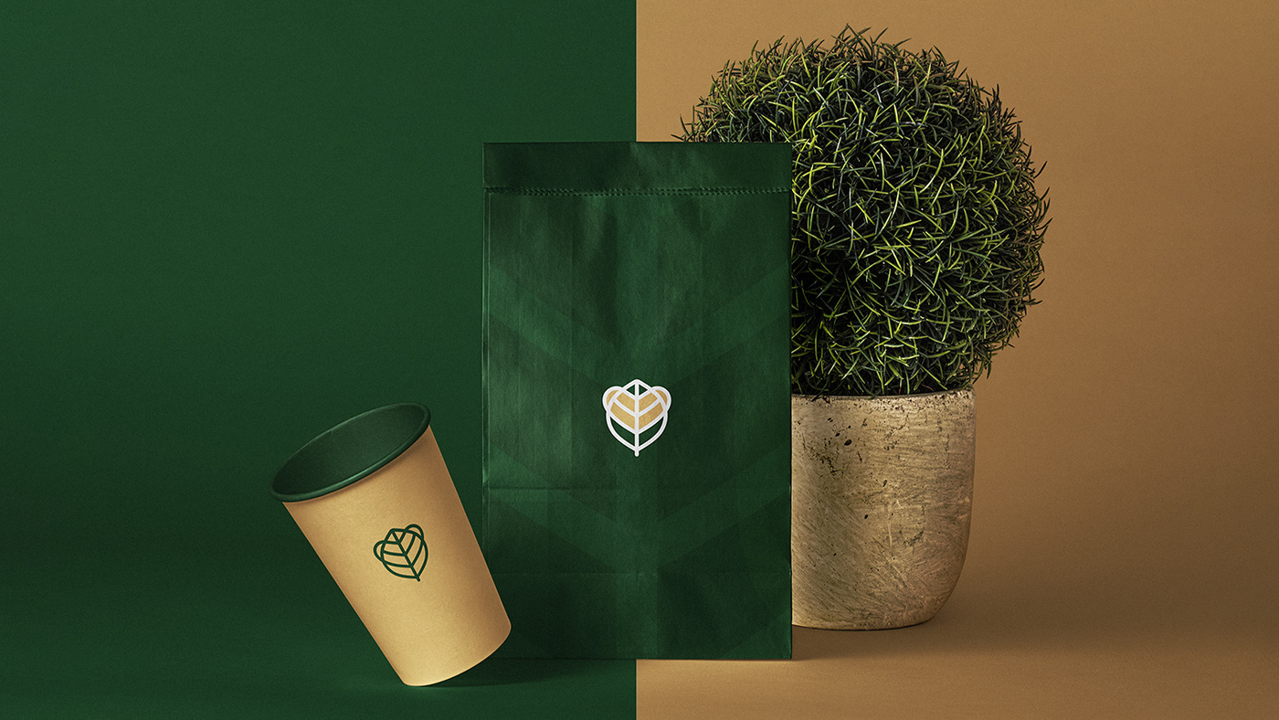
O grid para este projeto foi criado através do formato da folha e serviu como base para a construção das demais partes do logotipo. A semente foi criada a partir do contorno da folha. O coração, criado a partir das nervuras secundárias. E o mamífero, a partir do formato da semente e as curvas do coração.
–
The grid for this project was created through the format of the sheet and service as a basis for the construction of the other parts of the logo. The seed was created from the leaf outline. The heart was created from the secondary veins. And the mammal was created from the shape of the seed and the curves of the heart.
The grid for this project was created through the format of the sheet and service as a basis for the construction of the other parts of the logo. The seed was created from the leaf outline. The heart was created from the secondary veins. And the mammal was created from the shape of the seed and the curves of the heart.

Colors & Type
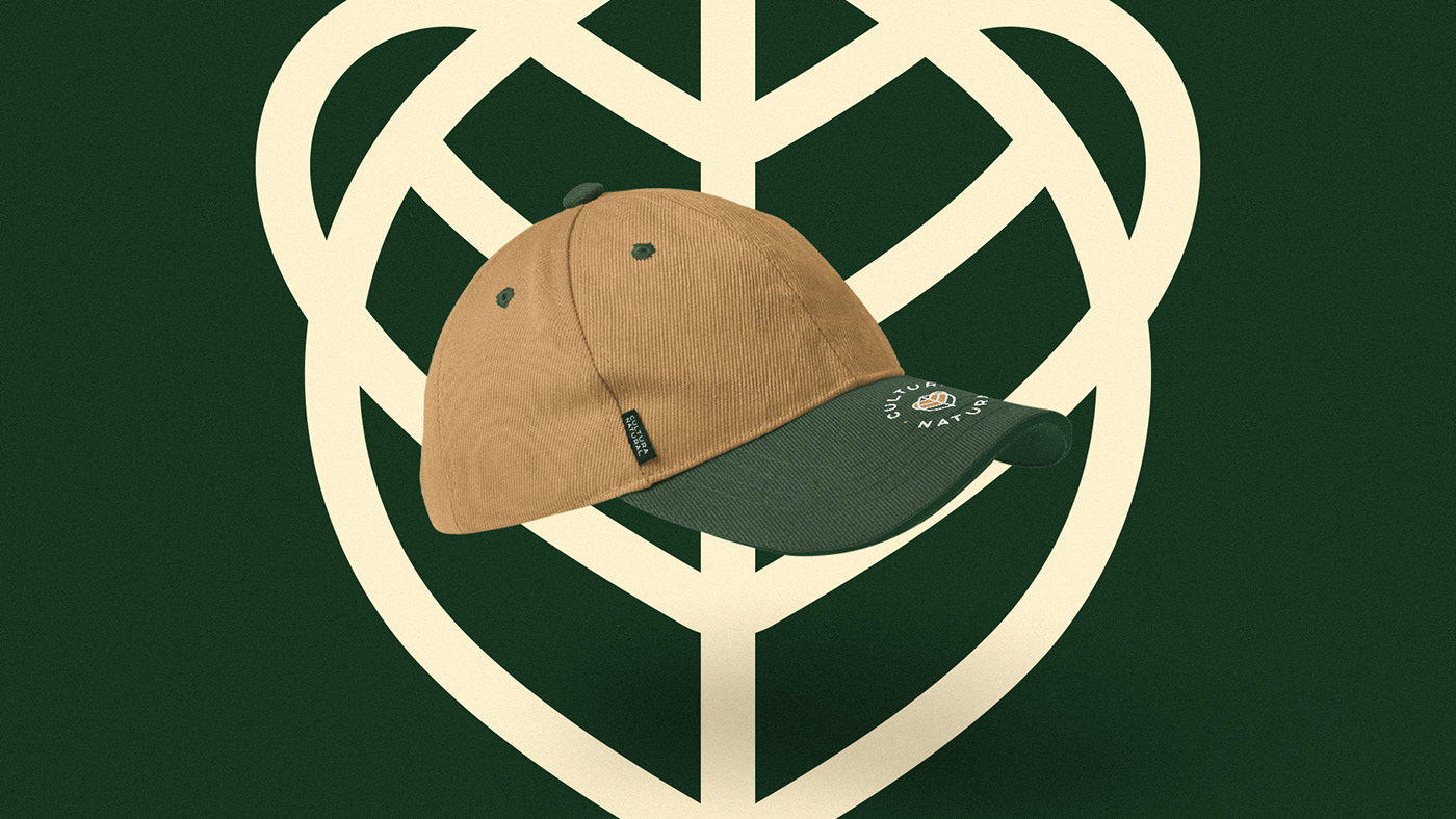
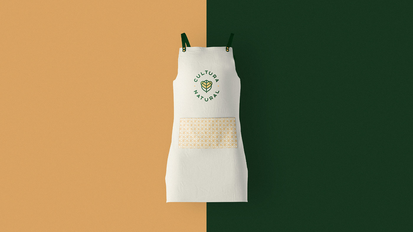
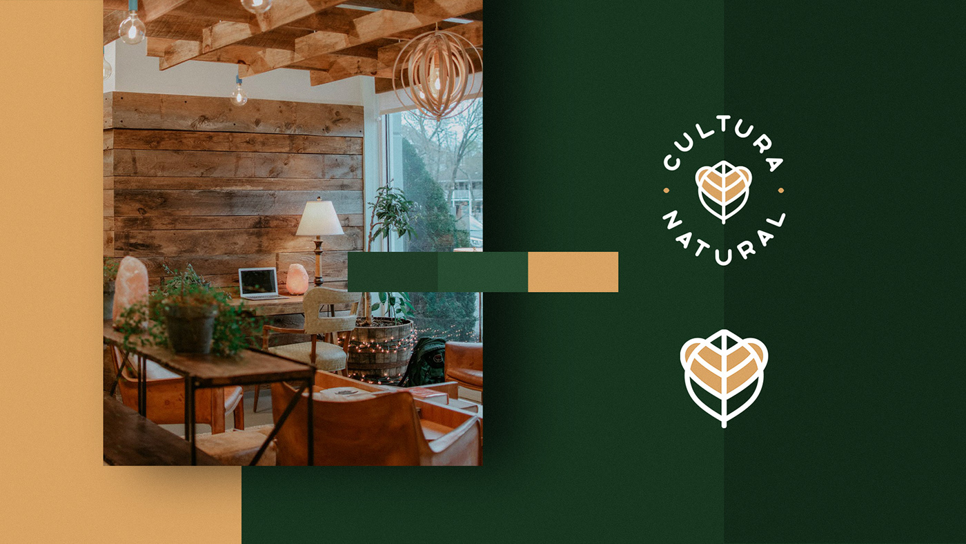
Para a identidade visual, decidi usar as cores predominantes na arquitetura do restaurante, encontradas na decoração marcada pelo uso de peças de madeira e arranjos de plantas, reforçando ainda mais o posicionamento da marca. A tipografia escolhida dialoga com o símbolo através de formas curvas e espaçadas, trazendo uma grande harmonia entre símbolo e tipografia.
–
For the visual identity, I decided to use the predominant colors in the restaurant's architecture, found in the decoration marked by the use of wooden pieces and plant arrangements, further reinforcing the brand's positioning. The chosen typography dialogues with the symbol through curved and spaced shapes, bringing a great harmony between symbol and typography.
Feedback
"Sem dúvidas, essa identidade deixou muito mais claro para o público quem nós somos e o que oferecemos. Foi um divisor de águas no nosso negócio. Obrigado Salatiel. Você estará eternizado em nossa história."
–"Certainly, that identity made it much clearer to the public who we are and what we offer. It was a watershed in our business. Thank you Salatiel. You will be immortalized in our history."