


Minimalism in Corporate Identity in Twenty First Century
This is the graduation project of Postgraduate Project lesson of Işık University - Institute of Social Sciences - Visual Communication Design which is conducted by post graduate student Nuket GÜNER ÇORLAN, under the consultancy of Assoc. Dr. Sibel AVCI TUĞAL. I would like to thank to my dear teacher Assoc. Dr. Sibel AVCI TUĞAL for her contribution.
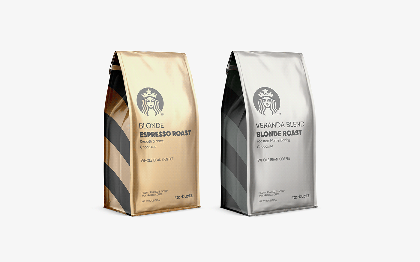
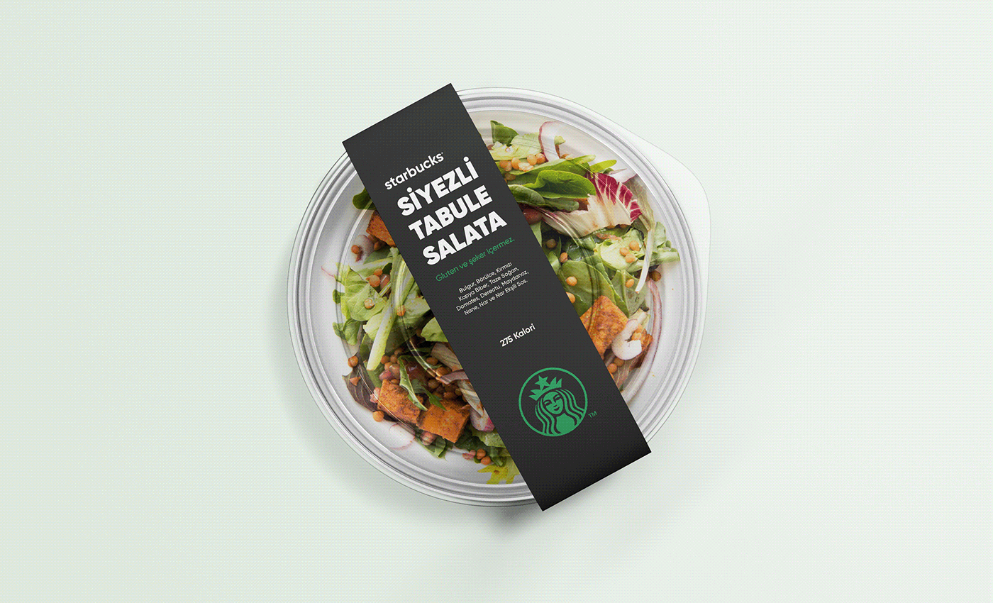
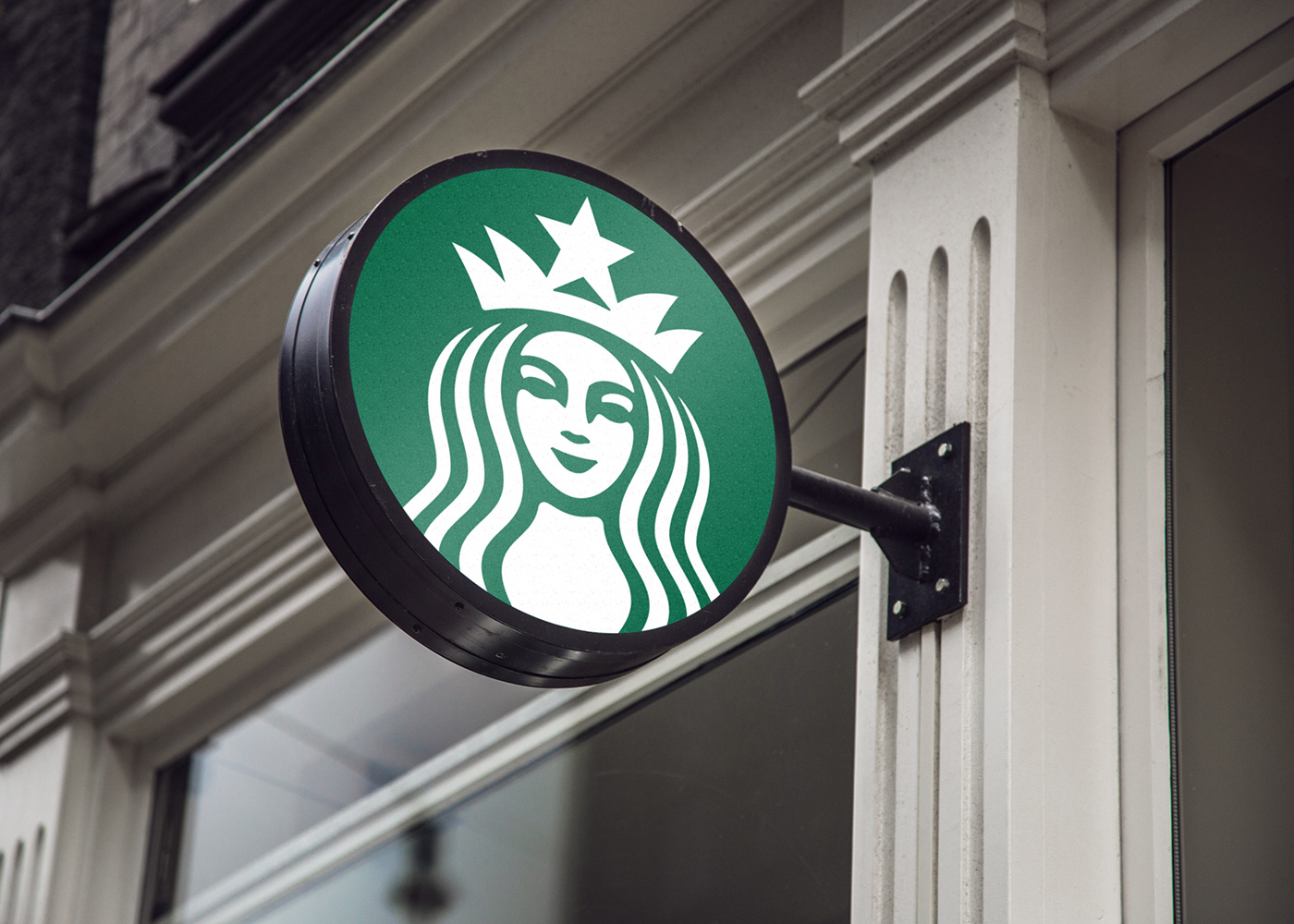
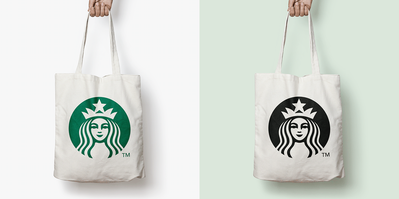
As famous designer Paul Rand said, when a logo shrinks, it is important not to lose its details and to be visible in all areas (https://99designs.com/blog/famous-design/4-principles-by-paul-rand-that-may-surprise-you/). Along with these values; as a result of the survey, the corporate identity design of the Starbucks brand, which is considered to be the most preferred, more pictorial and more prone to minimalization because it contains more details, was examined semiotically and the application was made by trying to handle it with a minimal approach.
Choosing the design elements and the goal of the study:
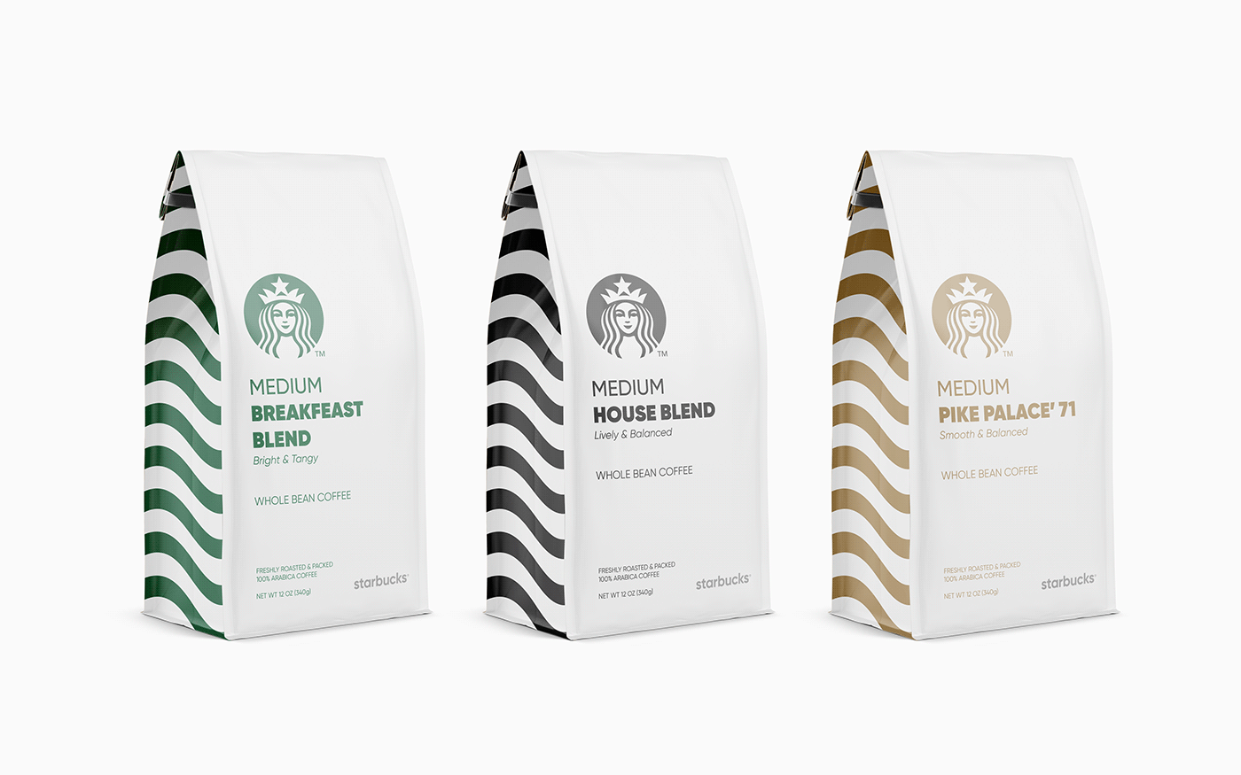
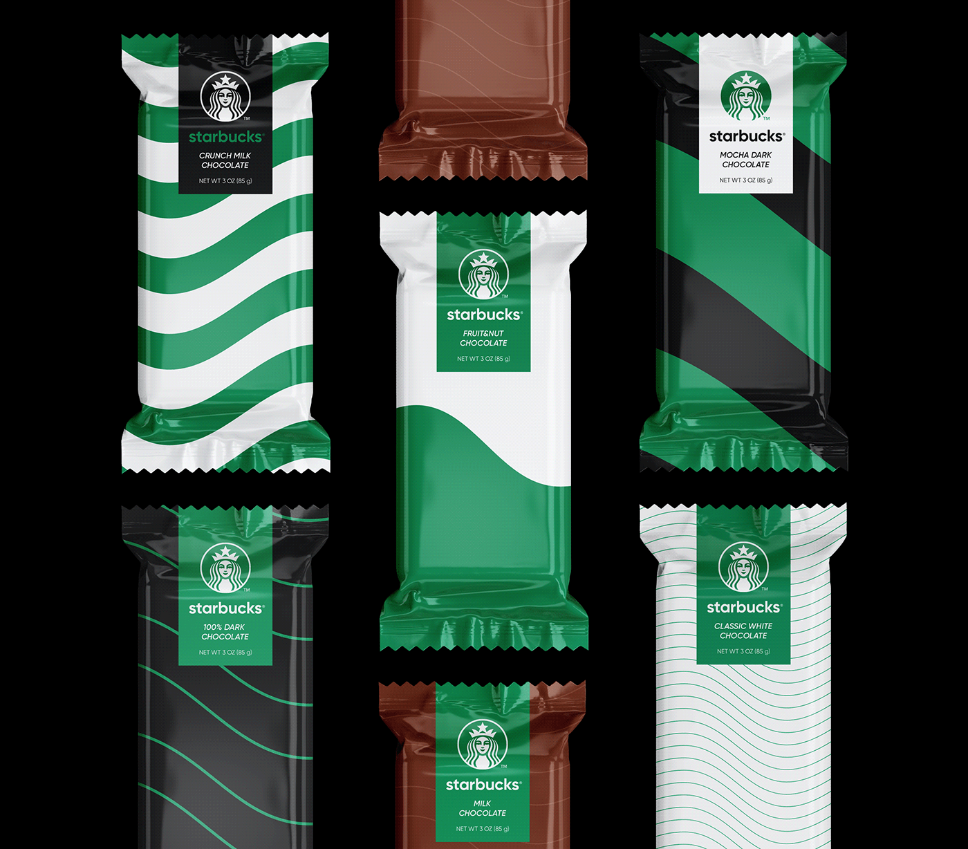
As declared in The Laws of Simplicity book of Maeda, the best way to achieve simplicity is to remove the right elements from the design (Maeda, 2012, p.112). There are multiple details in the Starbucks logo. These are the face, the crown, the edges of the crown, the star, the hair, the body, the dashed lines and the tail of the mermaid Siren. It can be said that the most important detail of these is the face of Siren. Because, removing the facial detail will not be considered appropriate by the consumer and will not remind the existing logo. Also, when it is continued only with the tail, this could represent a fisherman, restaurant, or a different logo.
In this sense, three methods in the reforming process in The Runaway Species book are examined. These are; bending, shredding and blending methods (Eagleman, Brandt, 2019, p.48-49).
1. Bending; it means that the real state of the design has been changed, and to create a different phenomenon by breaking its form.
2. Shredding; it helps to obtain a new perspective by shredding the existing forms in design. This allows some parts to be discarded.
3. Blending; it is to create a whole by mixing more than one pieces together.
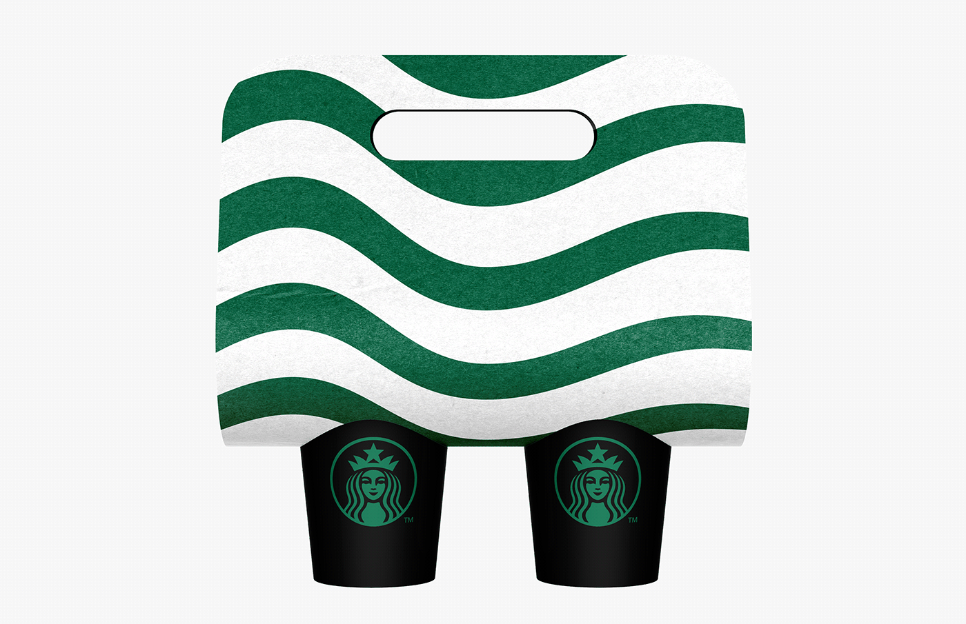
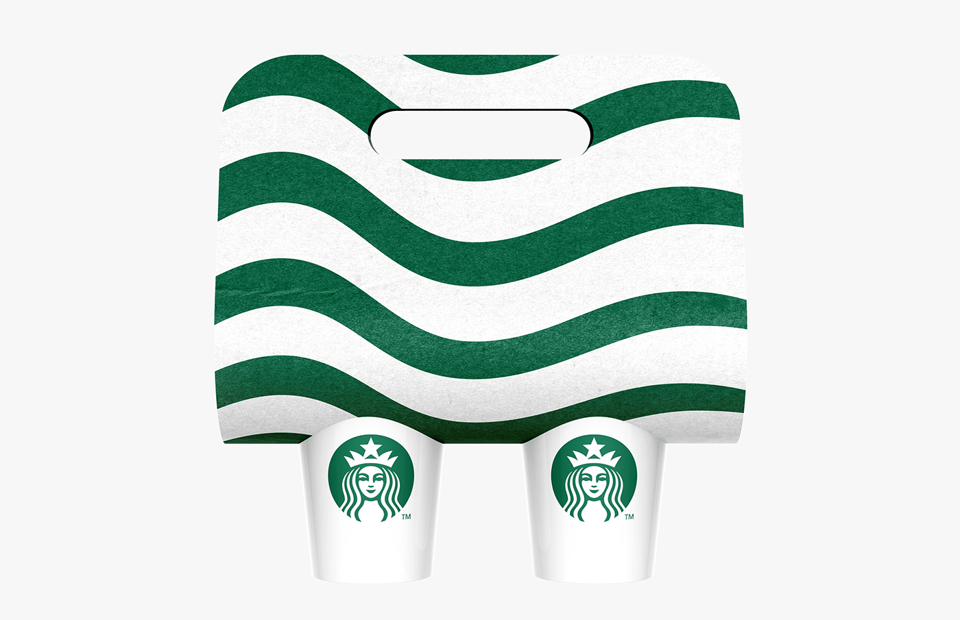
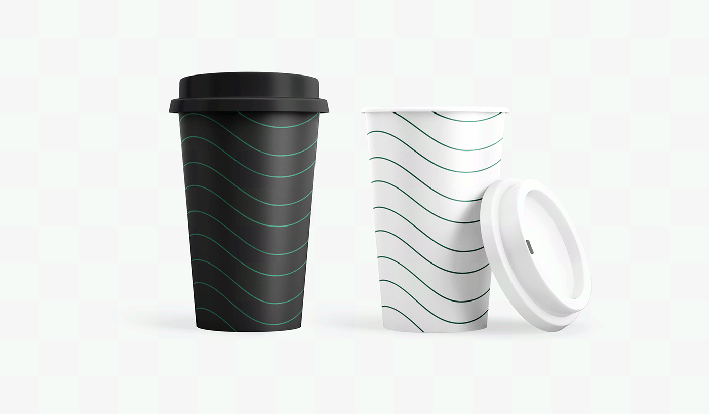
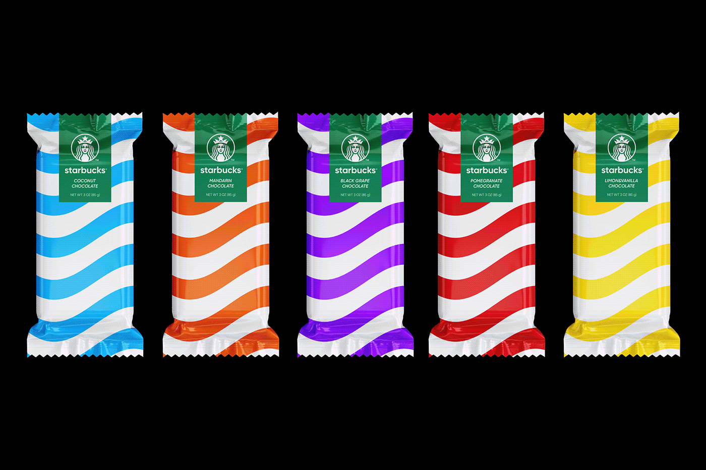
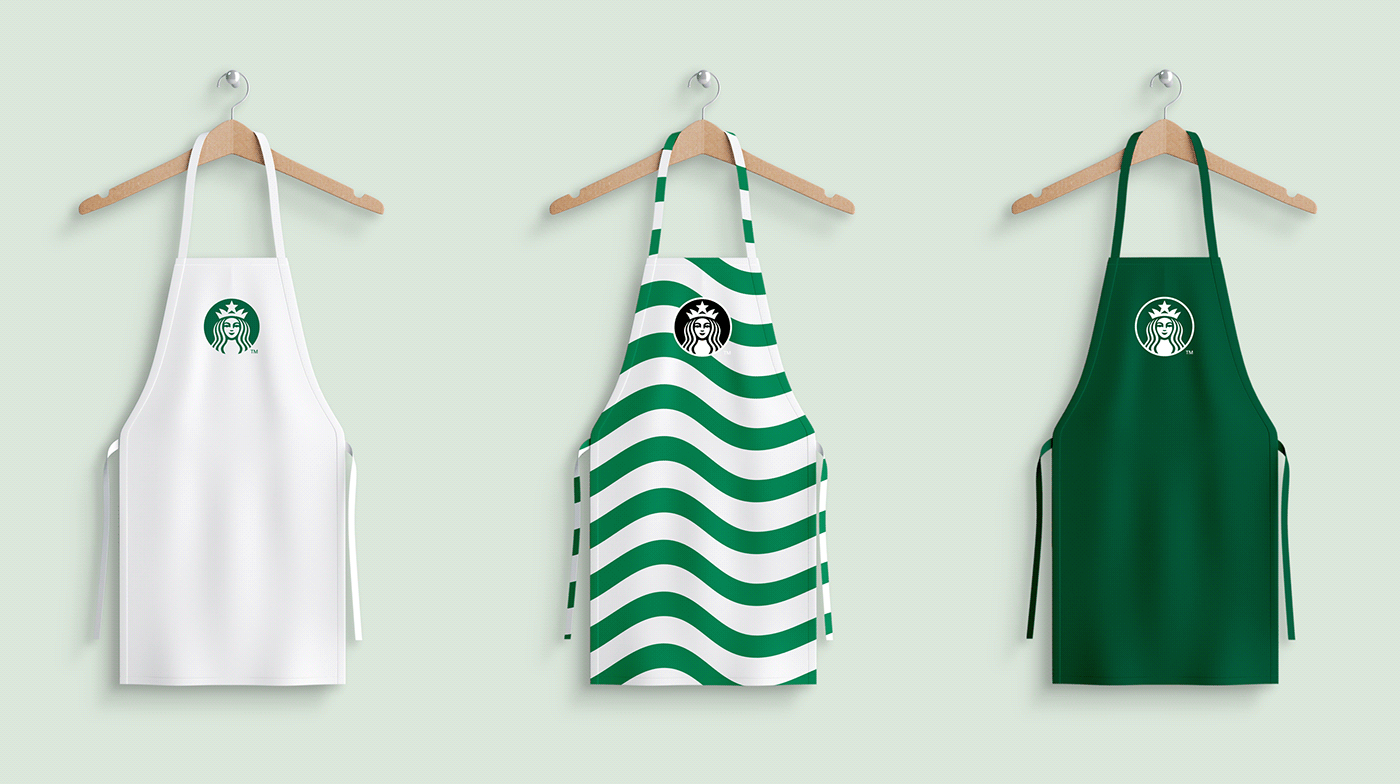
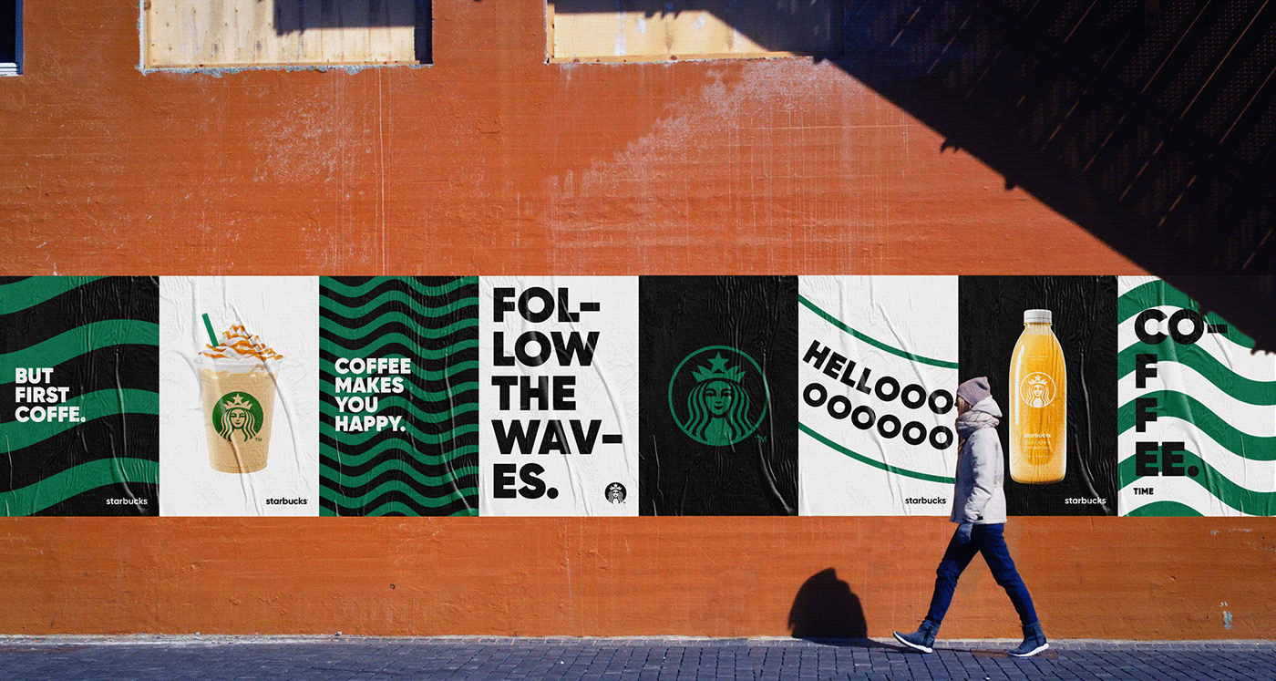
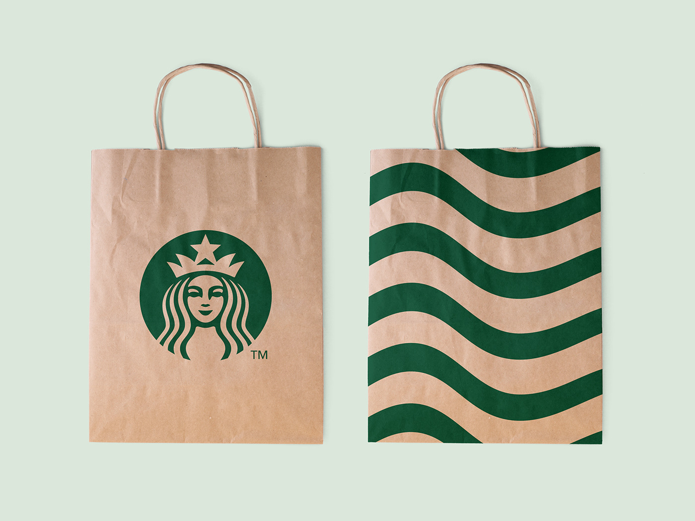
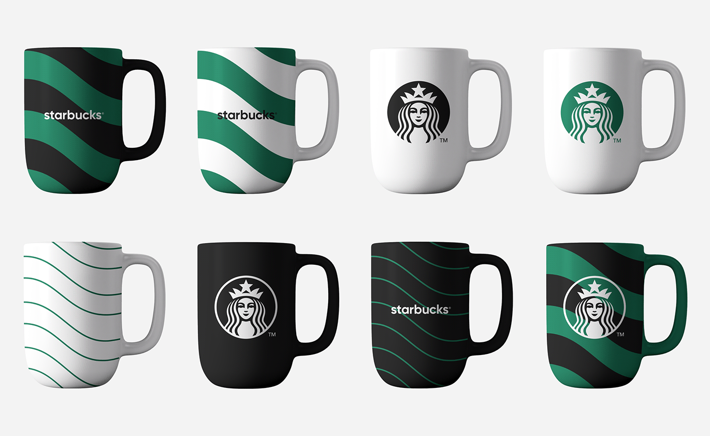
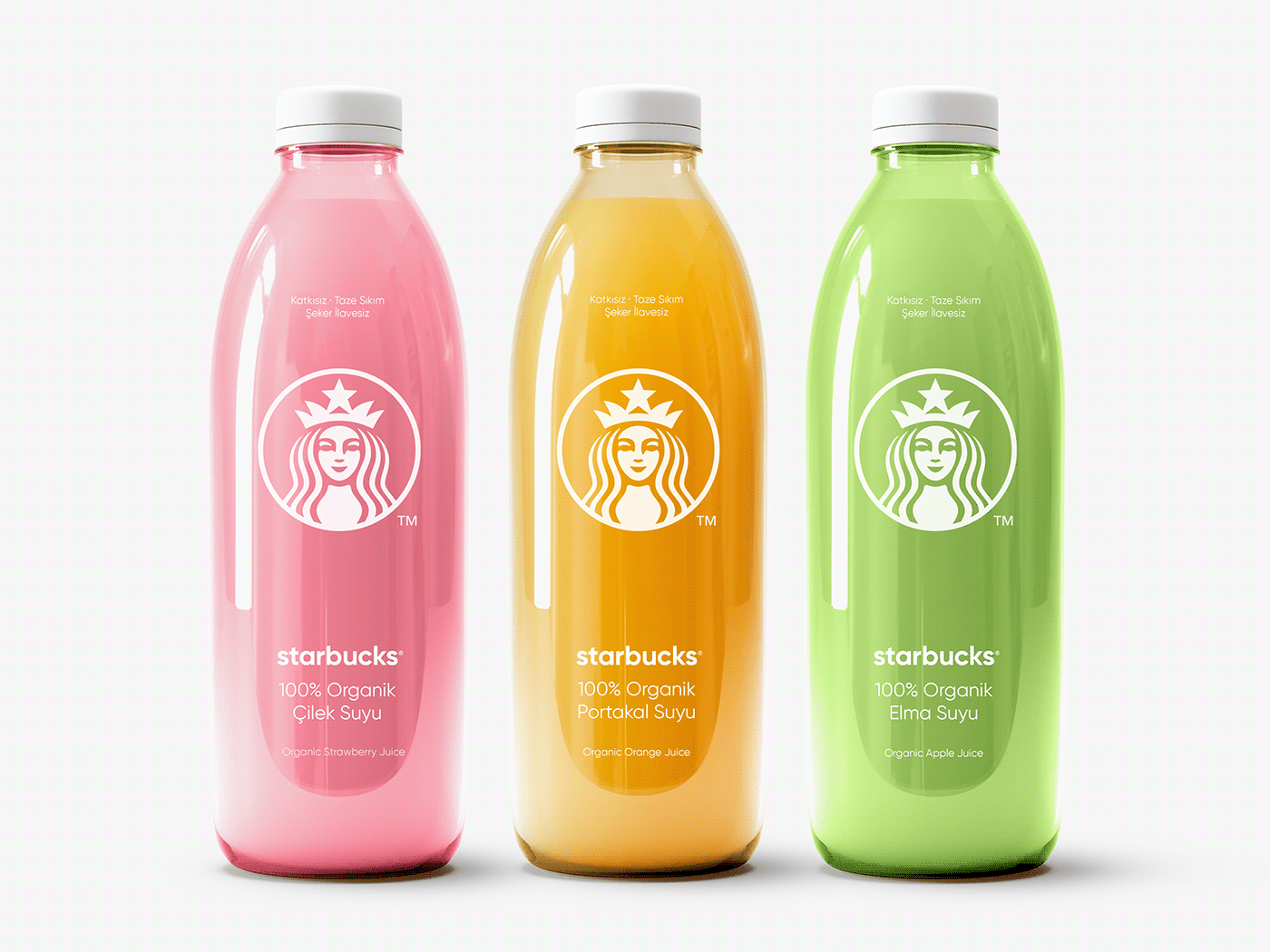
In this context, a roadmap was created for Starbucks corporate identity design using the shredding method.
It is important to use facial detail while cutting the logo into pieces. However, the crown of Siren is a piece integrated with the logo. Because it adds value to it. In this sense, adhering to the face and crown, with the principle of reaching the essence of the concept of Minimalism and staying true to its essence, it has been tried to minimize by reducing the correct parts in the design.
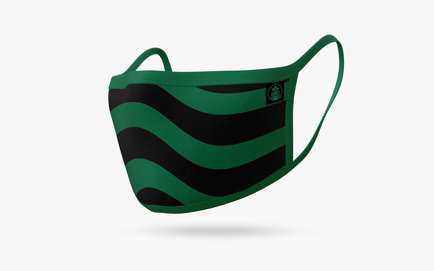
The fact that Siren's hair is wavy may remind of being a mermaid. In order to strengthen this meaning and create a whole with the logo, a concept has been created with the wave pattern expressing the sea and the mermaid.


Thanks for watching.


