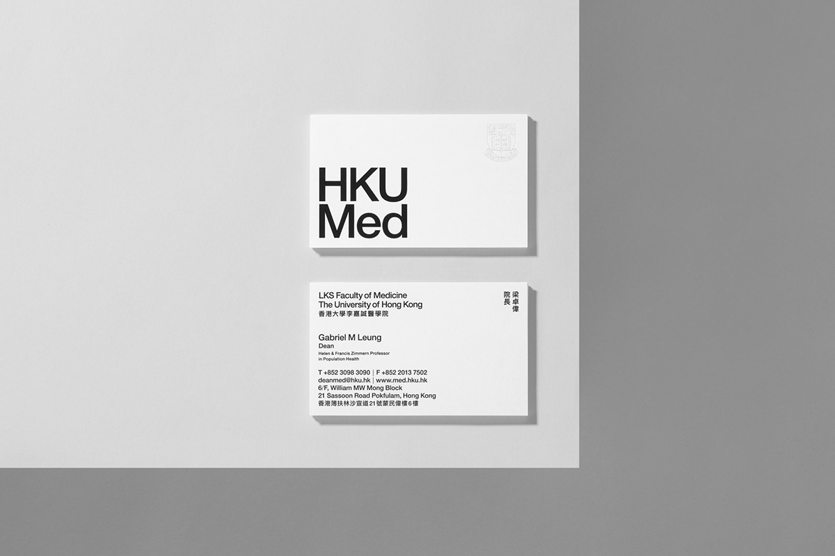
HKUMed
As the most established institution at The University of Hong Kong, the HKU LKS Faculty of Medicine sought to refresh and unify their brand. Their previous logo had posed a series of typographic issues along with incoherent variations as schools and departments under the faculty had different adaptations of the logo.
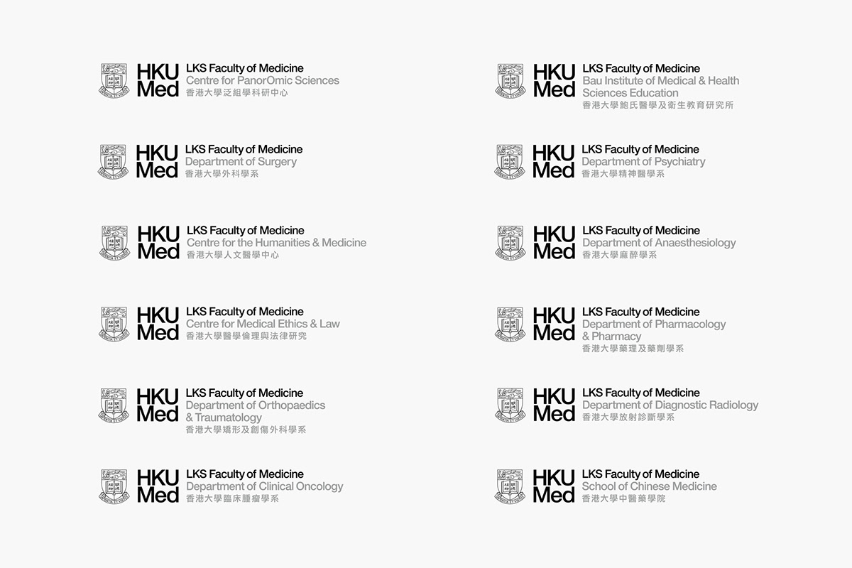
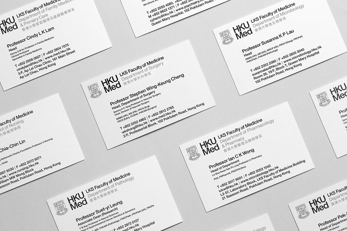
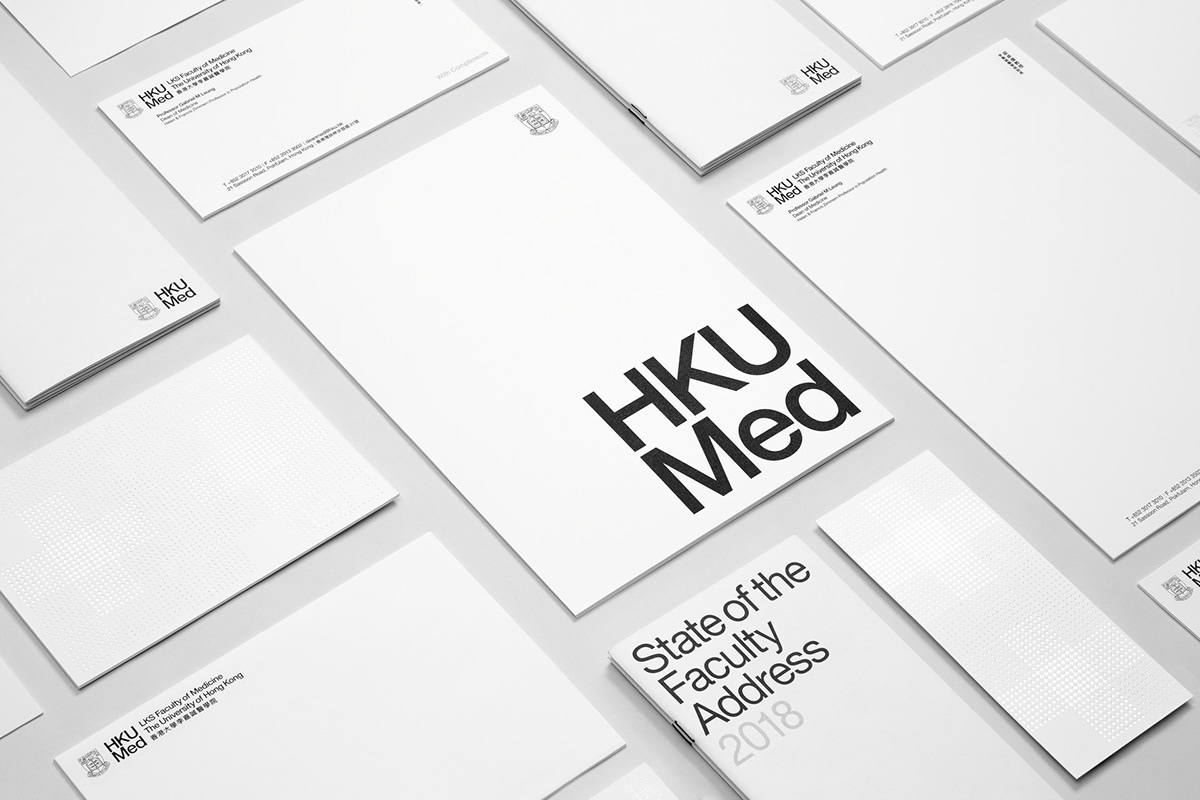
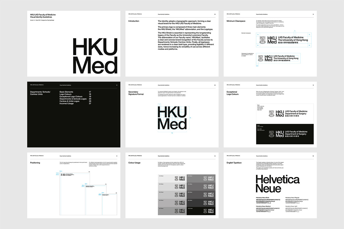
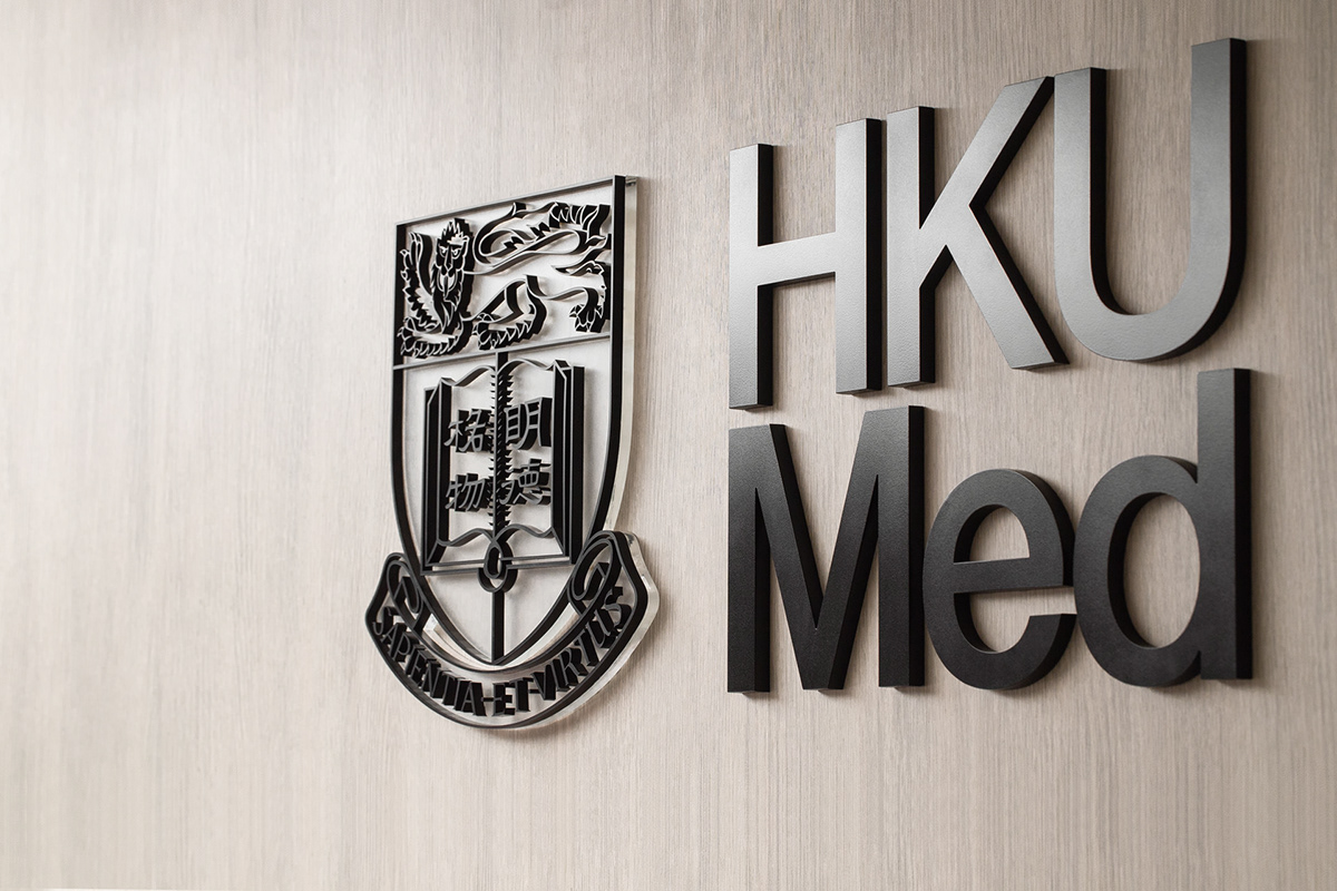
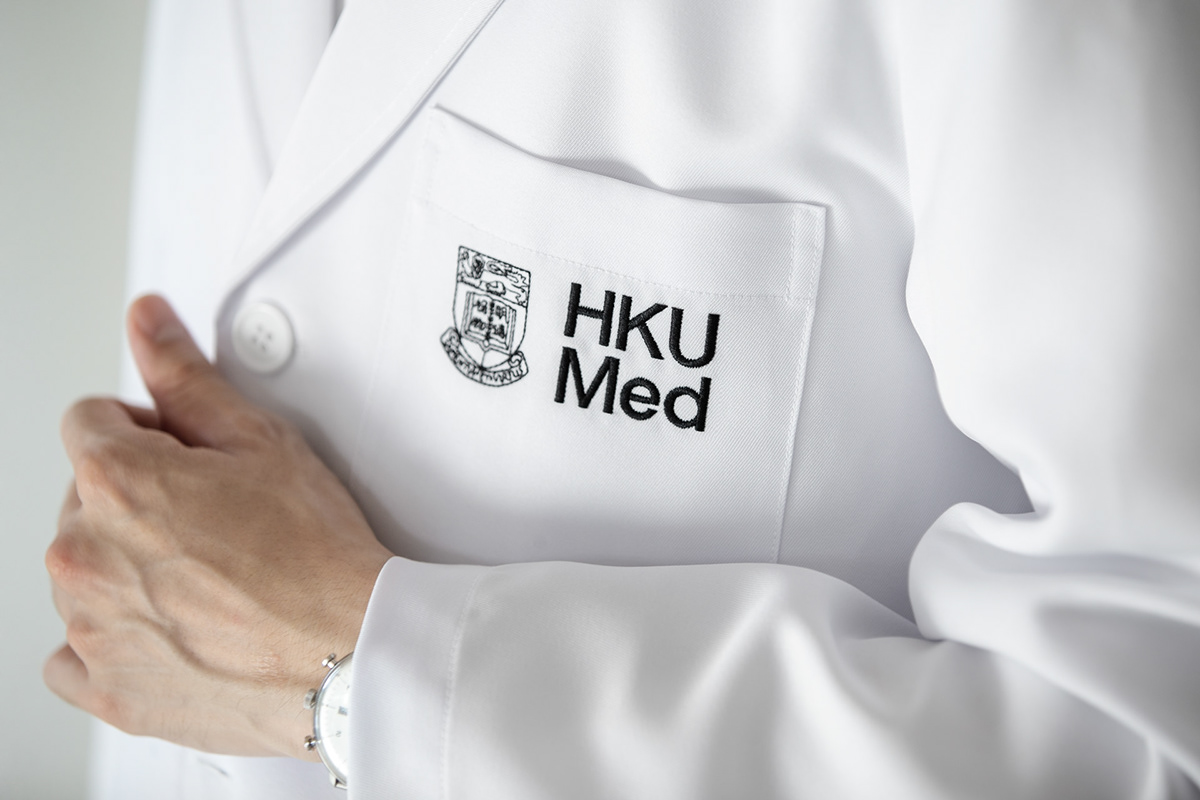
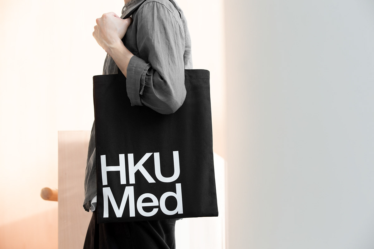
Addressing the complications of the old logo, the new identity adopts a concise and contemporary typographic approach. A consistent and rational system is established by abbreviating the faculty name into an acronym that can be used alone in short form or bold type in full form accompanying the names of different schools and departments. The new identity maintains strong legibility in all scenarios large and small, making it easily applicable across both print and digital usage. Embodying the notion of clinical cleanliness and technological advancement in the medical world, the rebranding is formed from a simple colour palette of black, white and silver. Additional to the logo, a logical geometric pattern constructed of the medical crosses in varied sizes represent the myriad scope of fields and people that compose the faculty. The branding is applied across a wide range of applications from printed material such as stationary sets to digital web and physical signage.