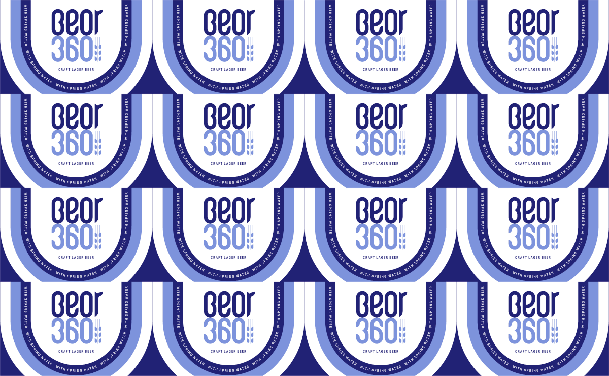
Beor360 is a new brand of craft beer. They are experimental in their approach to beer making and use only the finest ingredients available. With their packaging, they wished to attract beer connoisseurs while still being approachable to a mass audience. Keeping this in mind, the main focus of the design was to stand out on the shelves and attract first time buyers while keeping the feeling of superior, finely crafted beer intact.
The photographic essay above shows the chaos and challenging lighting conditions that the beer would face at retail; from the darkest to the brightest spaces, sitting and surviving between a myriad of competitive product graphics. To combat this, the label is kept refreshingly clean and minimal — A bold yet refined Beor360 written with a lot of white space around it.
Subtle tactile elements like the gold foiling, raised graphics, pearl-finish on the crown and textured substrate cue the brand characteristics and add to the charm of the design.
In its essence, the entire packaging design system is highly adaptive, resonating with the brands experimental and innovative outlook. New variants can be easily added while maintaining the integrity of the design, keeping it recognisable and ownable as Beor360 expands.
The brand recently launched in the Delhi NCR region and so far, the response to the packaging has been extremely positive.