
Incidental
Introduction
Incidental is an app that helps independent dentists manage their appointments. Due to the Coronavirus pandemic in 2020, independent dentists have found it challenging to schedule appointments with their patients due to the lack of a staff presence.
The Design Challenge
To create a solution that allows independent dentists to easily manage their day-to-day responsibilities easily without the need for extra staff or manpower.
Requirements
-Create a target user/persona to better understand the target audience.
-Create scenarios for the user's needs.
-Design usable, relevant, and engaging solutions for those requirements.
-Create a mockup that would give momentum for app developers.
Research
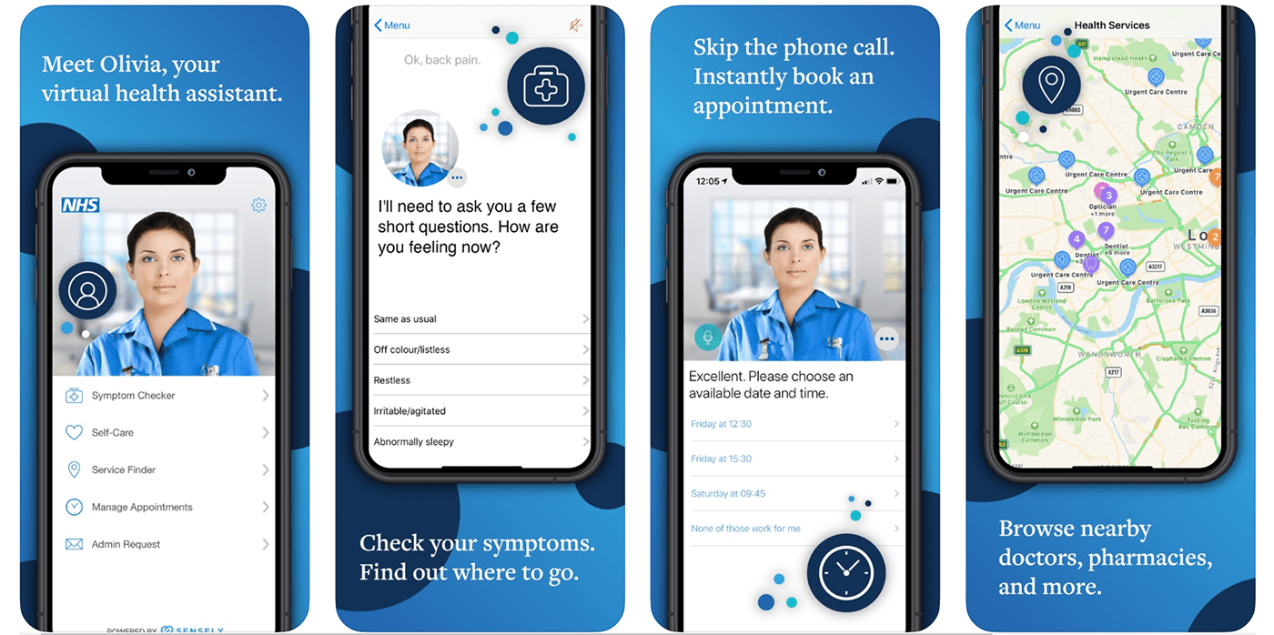
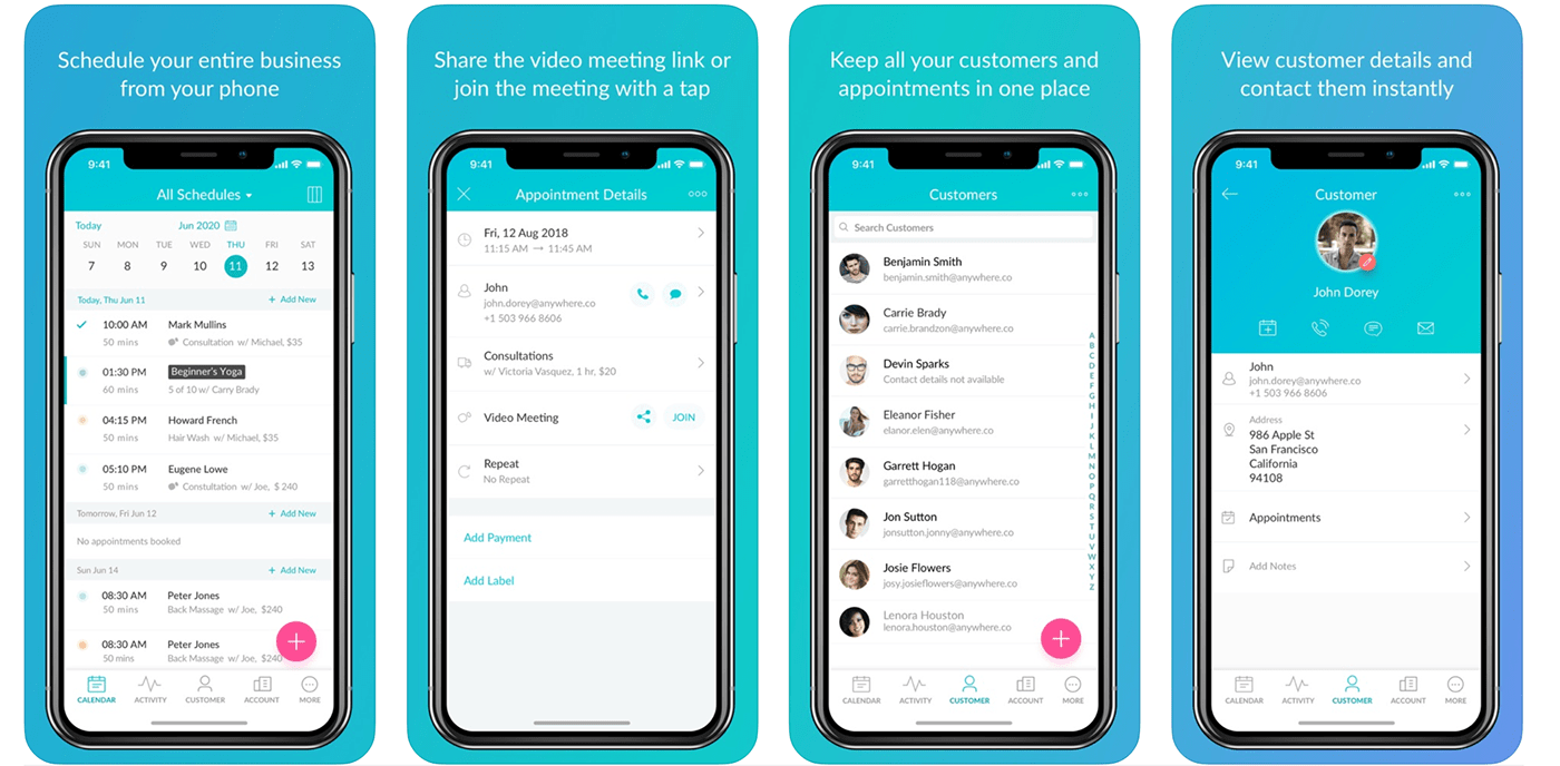
To get a head start on designing an app for dentists, a bit of internet research on both the Apple App Store and Google Play Store was done to see what kind of medical and scheduling apps were already available. This would give a good initial place to start brainstorming for ideas and concepts and would generate a foundation for how the app could look like.


Noteworthy Details
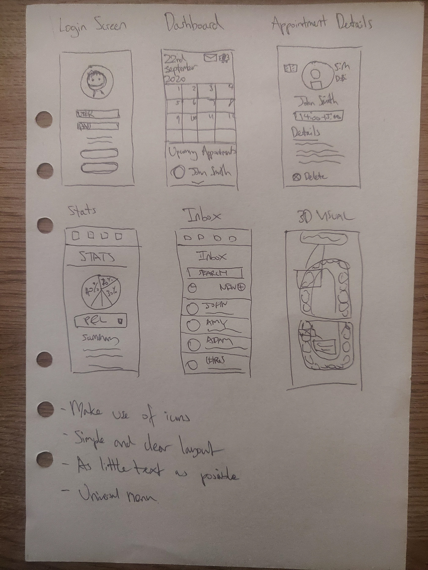
Universal
-Use of icons to reduce user reading time.
-Clean and uncluttered layout that allows for a good use of white space.
-Heavy use of the color blue (potentially to promote trust, professionalism, and cleanliness)
-Integration with other social media.
Scheduling App
-Interactive calendar.
-Layout that shows all clients.
-Layout that shows individual client details and history.
-Account details.
-Activity to track and monitor business growth/decline.
-Payment gateway.
-Call and messaging service.
Identifying the Target User
The target user will ideally be dentists who operate independently and have trouble managing their appointments. They run a practice but are low on manpower due to the pandemic and constantly have to spend time managing their own appointments through email and/or telephone.

Scenario
To also get a good understanding of how the app should function, it was important to put myself in the position of the end-user.
As an example:
Oli is a dentist that operates an independent practice in the county of Cambridge. He used to have a steady flow of clients in the past, but due to the coronavirus pandemic, he had to lay off a number of staff helping him and limit the amount of patients that he could see in a day.
The pressure has mounted due to the lack of support and Oli has had to resort to managing everything himself including managing his appointments, liasing with and attending to his patients. He wants to have an app that can easily manage his time on the go. He wants something easy to use as he is getting old and wants it to be quick and efficient in managing bookings and speaking to his patients.
Oli currently uses his business email on Gmail to speak with his patients and Whatsapp to contact them directly through text message or telephone. He has also been using Excel to manage his finances and check the statistics of the business. Oli has a number of different folders on his desktop with regards to patient information that he must upkeep on a daily basis. He has been quite stressed due to the amount of software that he must go back and forth from and wishes he had an alternative way to collate all this information in a more simple and effective way.
Preliminary Sketches
To get started on the concept, some drawings were made to explore ideas and potential designs for the final product. The plan was to make the app grant clear access to different information for the end user. The design had to be familiar and easy to understand.
Designing a Logo
After a bit of brainstorming on paper, it was time to bring the ideas to life in the digital space. Starting in Adobe Illustrator, I wanted to design a logo that would set the tone for the app in terms of colour scheme and style. This was a very important step as it would dictate how the entire app would look like.
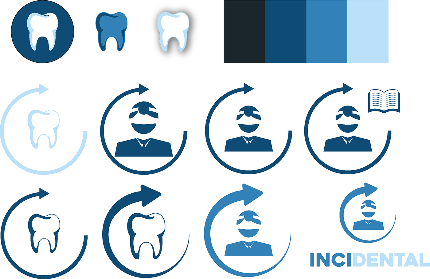
In the end, I went with the top left design as it stood out the most and was the easiest to understand. I coined the name "Incidental" as the name of the app with the idea being that managing your time should be seen as auxiliary and secondary to the end user as their primary focus should be their practice.
Designing the App
The first stage in designing the app was to do a login screen that would enable users to register their details on the app. Features such as Facebook or Google sign in were extremely important as the opportunity for users to migrate their email history with their clients to the app would be extremely valuable. A mockup of a phone screen was downloaded from the internet to give a more realistic visual of how the app would look like on someone's phone.

The creation of the toolbar was the next step afterwards as it helped me to plan what information would be available on the app and the way the user would navigate the app. Creation of icons was extremely important as it would be more memorable and less cluttered than simple text. From left to right, the icons used were calendar, statistics, inbox, profile, and settings.
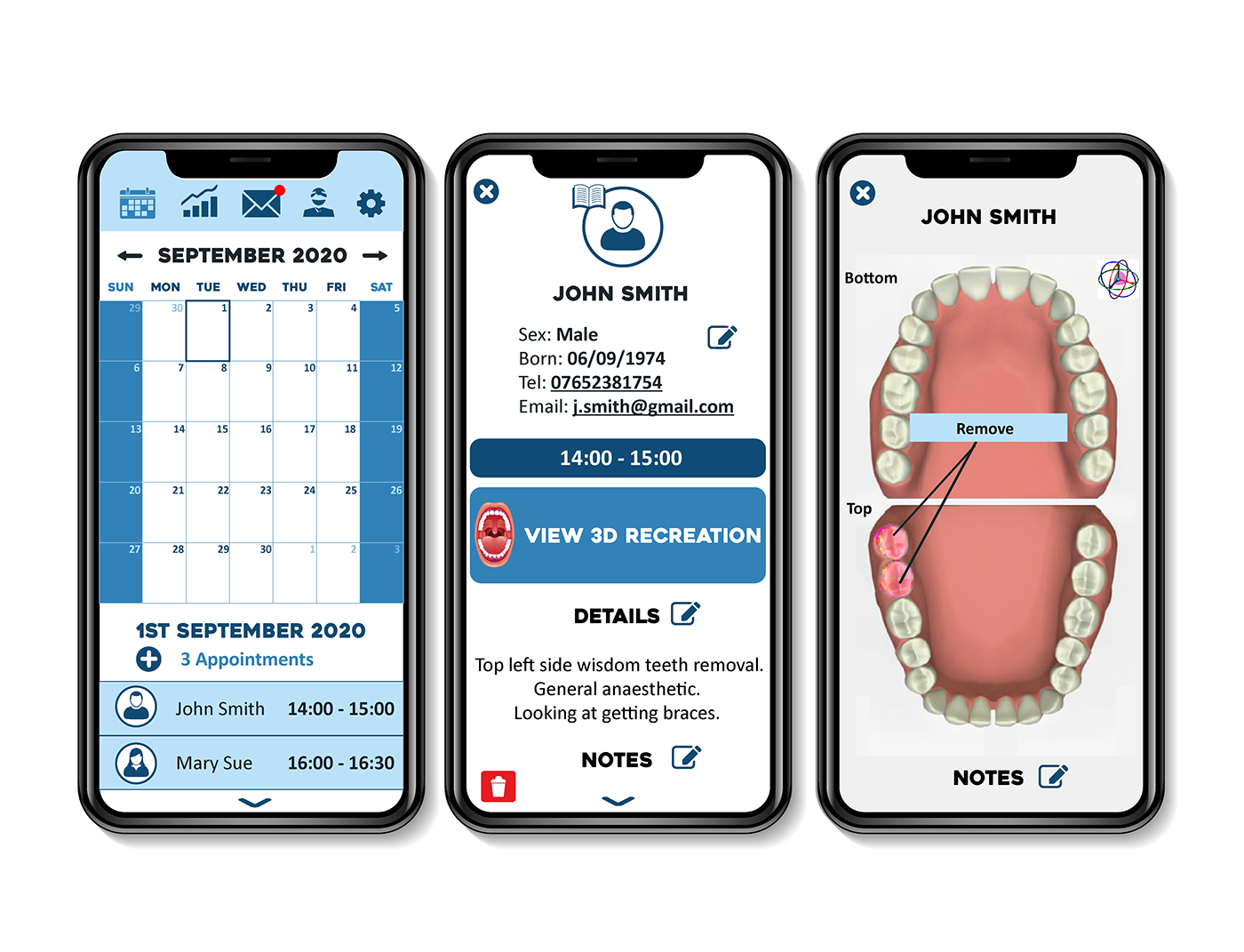
Customization and variety was an extremely important aspect of this design as every dentist might care about different information. Things such as filters, options, and drop-down menus allowed users to see exactly what they wanted to see without being subjected to an overwhelming amout of information all at once.

Having this feature meant that new options and filters could always be added or removed to adjust to the user's needs.
Additional Features
There is a lot more that could be added to give more depth and usability to the app.
Namely:
-Tutorial on how to use the app.
-FAQ for users to see common frequently asked questions by other users.
-Community forum to interact with other users.
-Help and support section.
-Customizability with different add-ons.
-Email marketing tools.
-Social media integration.


