

BLACKBOUGH:
DESIGNED FOR THE TROPICAL SOUL
DESIGNED FOR THE TROPICAL SOUL
OVERVIEW
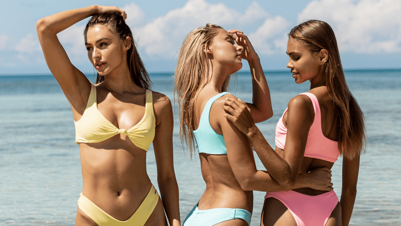
Blackbough is a swimwear brand for girls who love the beach. Its swimsuits are as bold as the women who wear them—and rightfully so—and are worn along beachsides and poolsides all over the world. After all, every day is a beach day when you're wearing the right bikini.
WHAT WE DID
Brand Strategy
Brand Identity
Copywriting
Packaging Design
Brand Identity
Copywriting
Packaging Design

THE CHALLENGE
Blackbough, already a leading brand in swimwear, wanted to push its brand further. This was because in such a highly saturated market, even the best brands can find themselves stuck in a pool of similar competitors and lookalikes. Most brands, after all, offer the same thing: the promise of a great bikini and picturesque photos of pretty girls enjoying life by the beach.
Luckily for Blackbough, the brand already had a compelling message: designed for the tropical soul. It just needed to be communicated more effectively through proper visuals and storytelling. That's where we came in. With a more discerning set of customers, constantly changing market needs, and a competitive retail landscape, we wanted to give this brand a platform that properly communicates its value and stand out.

THE SOLUTION
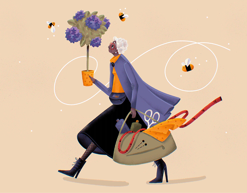
Before we began crafting the brand's identity, we wanted to focus on the idea of the tropical soul and use this angle as a means to tell the brand's story. Every Blackbough girl has a tropical soul. They spend days dreaming about the beach—basking in the sun, dipping their toes in the water, and taking in the sea salt breeze. She is a girl with an inner sunshine, and it shows.
With this in mind, we wanted the brand to be able to bring the beach to each Blackbough girl, no matter where she is. We saw Blackbough as a means to transport you to your beach vacation daydream by crafting an entire brand experience that visually communicates the tropical lifestyle the brand promotes. In that sense, Blackbough is your ticket to the tropics.
With this in mind, we wanted the brand to be able to bring the beach to each Blackbough girl, no matter where she is. We saw Blackbough as a means to transport you to your beach vacation daydream by crafting an entire brand experience that visually communicates the tropical lifestyle the brand promotes. In that sense, Blackbough is your ticket to the tropics.


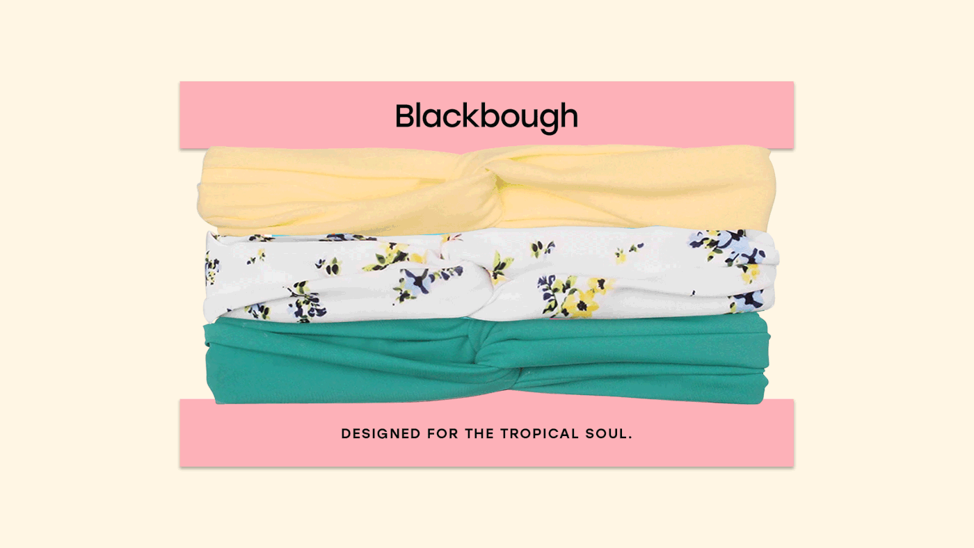
As a brand refresh, we wanted to keep the integrity of the Blackbough brand by just giving it an update to fully highlight the brand's personality and character. In terms of overall look and feel, the direction we stuck with was very clean and minimal, but made fun with the color palette and brand assets.

The original color palette was comprised of pink and black, which is something we kept because there was already a strong brand association with the color pairing. The usage of black also made sense because of the Blackbough name. We chose to add bold tropical tones as secondary colors to add a fresh and youthful appeal, which has brightened up the visuals of the brand as a whole.


We kept the letter mark approach for the logo icon, highlighting a strong letter B as the main visual cue. To add personality to it, we experimented with various tropical cut-outs and found ourselves drawn to the sun because it immediately communicated the idea of the beach, summer, and the tropics. The bottom half of the letter mark is interchangeable with any element to keep it fun and playful, but its main lockup features the palm tree because of the word "bough" in the brand's name which refers to a branch of a tree. As a whole, the logo icon embraces the idea that you can take your Blackbough swimwear anywhere under the sun.

The illustrations follow the brand's clean and minimal direction, and in doing so, the elements were made to be modular which the brand can easily mix and match to fit any collateral.


Being a brand with a presence felt most strongly in the digital space, the packaging was where we felt Blackbough could shine because it was something customers could experience in person. We took the concept of Blackbough being a ticket to the tropics and applied it to the design.
The box, although outwardly very clean and simple, has an illustration of a tropical scene on the inner cover. The same is true for the packaging of the headbands and scrunchies, which look seemingly plain until taking off the products reveals a surprise. We wanted to make the unboxing experience special to give people a taste of the tropics.

This extends to the packaging of the swimwear pieces to also have a touch of tropical flair, which is why is it's designed as a clear ziplock bag with an illustrated print insert that could change depending on the season.


The product tags were also given a fun touch, which come in two separate pieces: one with a tropical illustration and the other a cut-out that acts as a window.