


This job was done long distance from Guadalajara, Mexico for a client in Toronto Canada!
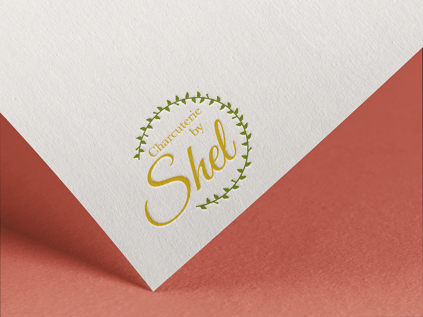
The client had started a business in Charcuterie platters and asked for a minimalist and feminine logo. She gave me examples of the type of logo she likes and from there i noticed she wanted a presence of plants as well as a round circular logo.
The color green was a staple for the client, and from there i went on to choose a gold color to complement each other, as well as to enhance elegance and royalty vibes.
I knew i wanted to use a Script type for the logo as it is a very feminine and elegant type on it's own, but while i was experimenting with the logo i chose to add a serif font to complement the script font in a way that it looks very refined and stylish. Still the most important part of the logo was to keep it feminine and minimalist, so i opted to make the word "Shel" in script stand out more than the others, making the differentiator in her business name (Shel) stand out and catch everyone's eye.
For her business card i added gold textures to make it look very tasteful and eye catching, still keeping it clean, minimalist and feminine.
Lastly, i added a mockup of some sticker designs i made for her. These stickers are meant to be added on a thank you note that she likes to hand out when delivering the charcuterie platters, and the stickers will give more value and will add to her branding concept.


