

Webdesign of the home page
GreenAlp is an energy distributor. As part of their website redesign, they launched a public tender to appoint their future partner. I was commissioned by a web agency to integrate their response.
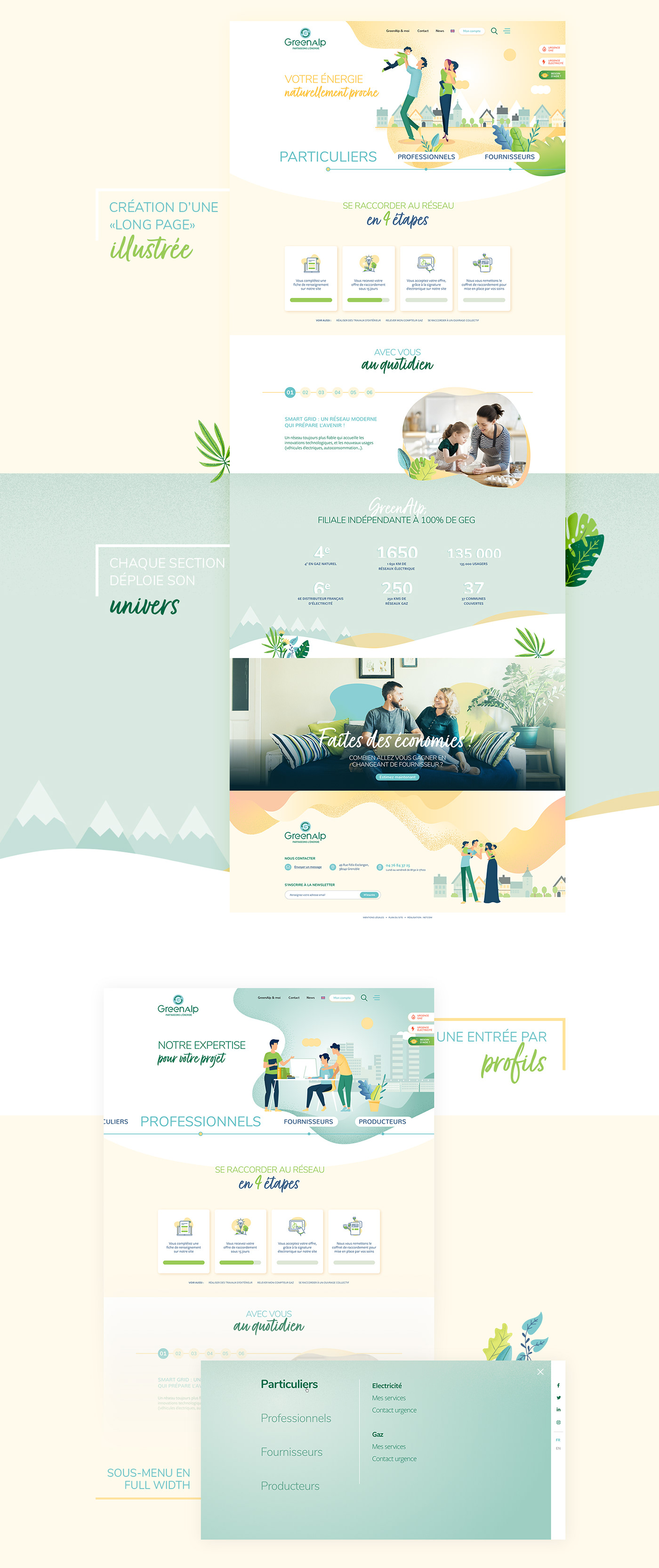
I was responsible for creating the graphic charter for the home page. Tenders often requested a preview of the future home page only. We went further by imagining a complete user journey, animations and a story.
I was responsible for creating the graphic charter for the home page. Tenders often requested a preview of the future home page only. We went further by imagining a complete user journey, animations and a story.
The privileged colorimetric atmosphere is that of yellow and green: Alliance of the sun, the main source of energy, and green for nature. The visuals used put people first, and mainly future users, so that the Internet user can identify himself immediately.
The round and fluid shapes used symbolize the ease and simplicity of GreenAlp services. This proximity is also visible in the typography set used. The first typography of the titles with its rounded shapes blends perfectly with the logo. As for the handwritten font, it brings this touch of proximity.
The round and fluid shapes used symbolize the ease and simplicity of GreenAlp services. This proximity is also visible in the typography set used. The first typography of the titles with its rounded shapes blends perfectly with the logo. As for the handwritten font, it brings this touch of proximity.
The home page, divided into different slides, offers a complete graphical unit, with natural elements scattered throughout the page.
The objective of this graphic charter was to make an impression.
The objective of this graphic charter was to make an impression.
My portfolio : https://www.hypaepa.com/green-alp-webdesign-ecologie/
The website : https://www.hypaepa.com/projets/greenalp


