


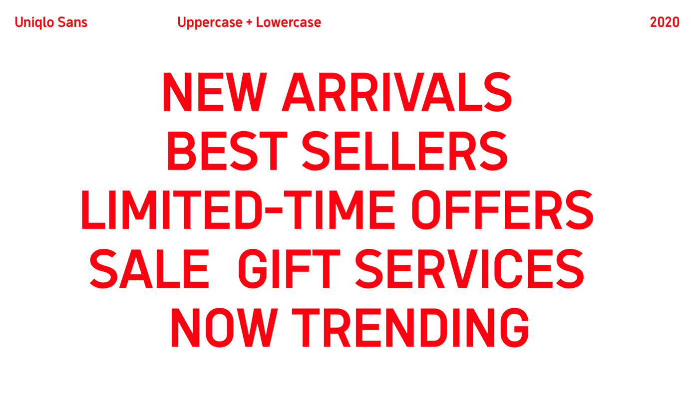

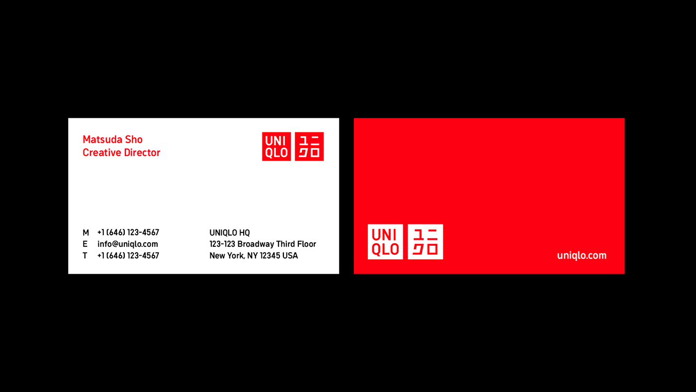
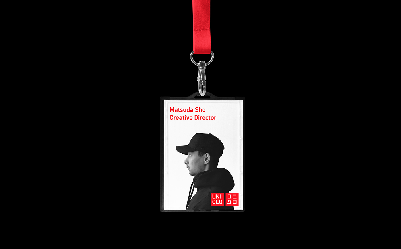


As a designer, I love the brand, Uniqlo, but I always felt uncomfortable to look at its ugly and terribly-kerned typeface. Since it is not usable as a brand typeface, Uniqlo is currently using an ambiguous combination of fonts, which makes the overall brand experience unsolid.
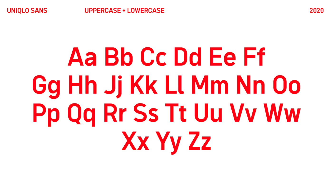
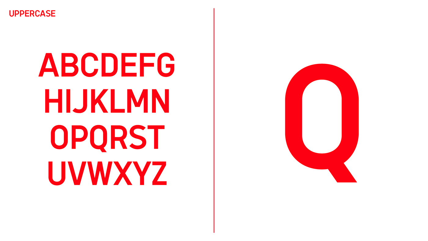
Through this project, I aimed to clarify the brand image of Uniqlo by redesigning its typeface by going through the optical adjustment to make it more versatile.
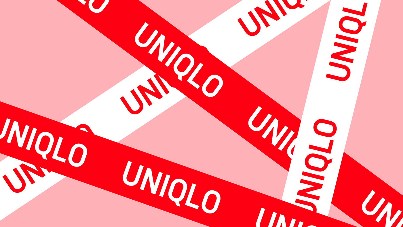
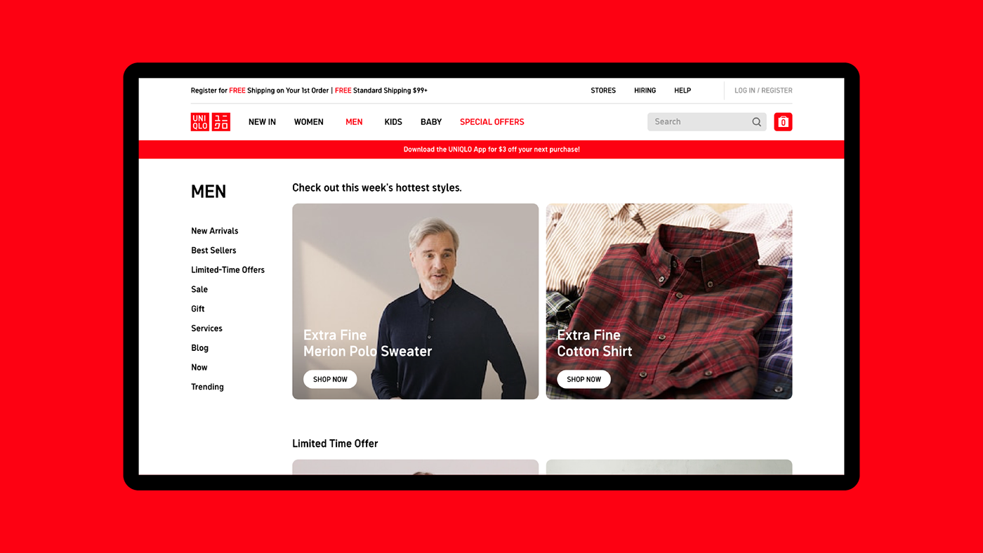
(Please be sure that this is not an official project and all the resources are from www.uniqlo.com)
-
Uniqlo라는 브랜드를 좋아하기는 하지만, 항상 Uniqlo의 끔찍한 폰트를 볼때마다 디자이너로서 안타까우면서도 불편함을 느껴왔습니다. 이번 프로젝트는 통해 기존 Uniqlo 폰트 활자들의 특징들을 유지하면서도 개선하여, 브랜드 전체의 인상을 명확하게 만드는 것을 목표로 하였습니다.


