


[pt] Projeto desenvolvido para uma nova agência de comunicação com foco Performance e Criação em Fortaleza, Ceará, Brasil.
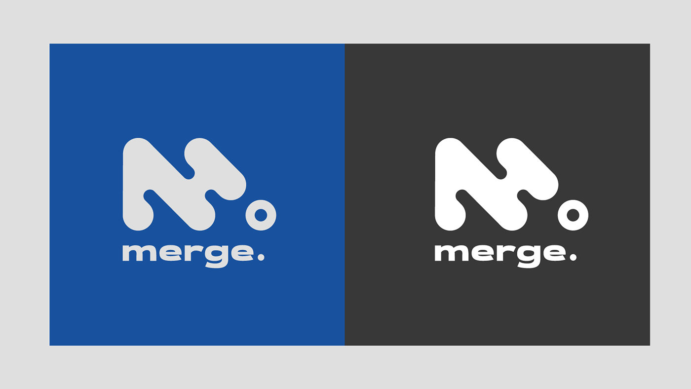
Para a marca e seu nome, que representa junção, fundição, mistura, foi criado um logo geométrico a partir de um grid que comunicasse a ideia de combinação de elementos que levam a uma solução/ponto comum formando a letra "m".
Com o logotipo definido, todos os demais componentes gráficos do universo visual da marca nasceram.
-
[en] This project was developed for a new communication agency with a focus on Performance and Creation in Fortaleza, Ceará, Brazil.
To represent the brand and its name, which represents joining, casting, mixing, a geometric logo was created from a grid that gives an idea of a combination of elements that leads to a common solution/point forming the letter "m".
With the logo defined, all the other graphic components of the brand's visual universe were born.


✦ thank you for scrolling.
__________________________
✸ leave your like if you appreciate this project and some love on the comments section.
__________________________


