RYABINA — российский бренд домашнего текстиля европейского качества. В основе бренда — простота и изящество. Первая ассоциация, когда речь заходит о рябине, связана с защитой. Символика этого дерева оберегающая, хранящая и успокаивающая. Рябина предстает символом мира, доброй жизни и крепкой семьи. В заглавной букве заключена метафора «под крылом и защитой», а само дерево отражено через фирменную типографику. Наш подход к проекту олицетворяет домашний уют и семейную гармонию.
RYABINA – is a Russian brand of home textiles of European quality. The brand is based on simplicity and elegance. The first Association, when it comes to Rowan, is related to protection. The symbolism of this tree is protective, preserving and soothing. Rowan tree is a symbol of peace, good life and a strong family. In the capital letter contains the metaphor “under the wing and protection”and the symbolism of the tree itself is reflected through the company’s typography. Our approach to the project is the embodiment of home comfort and family harmony.


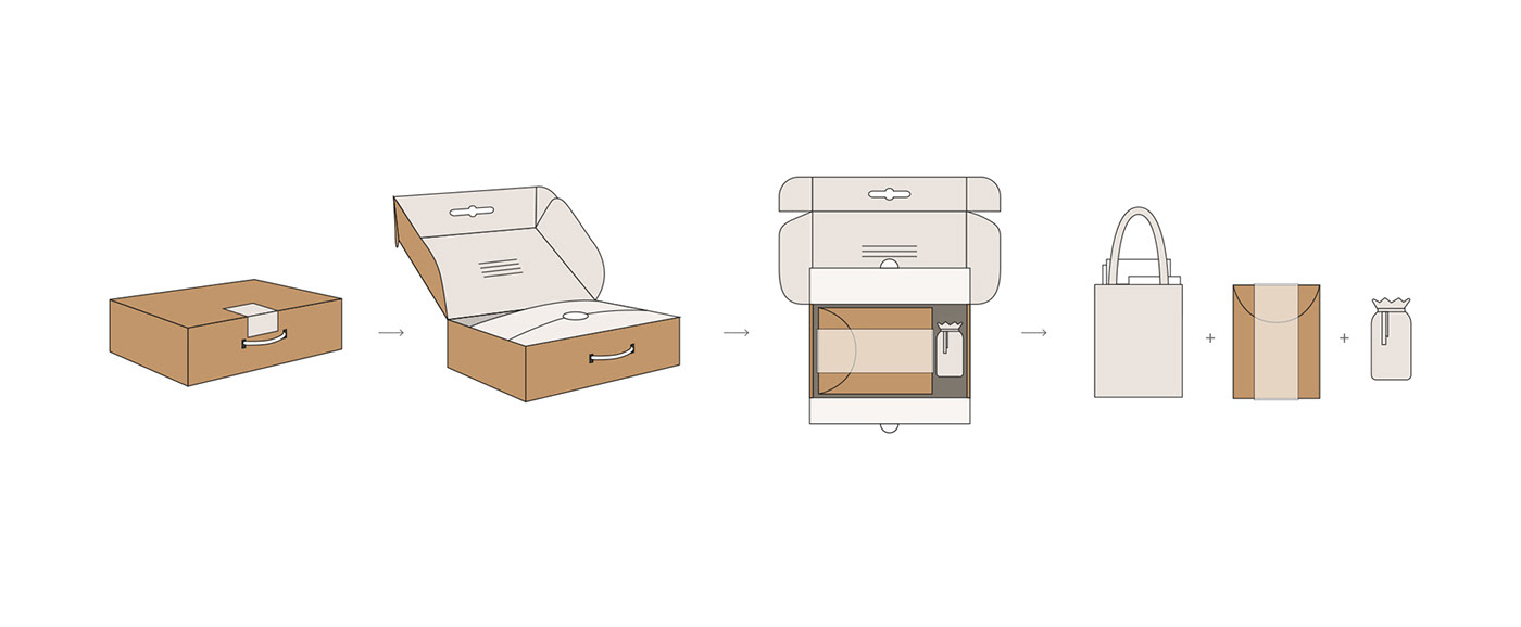

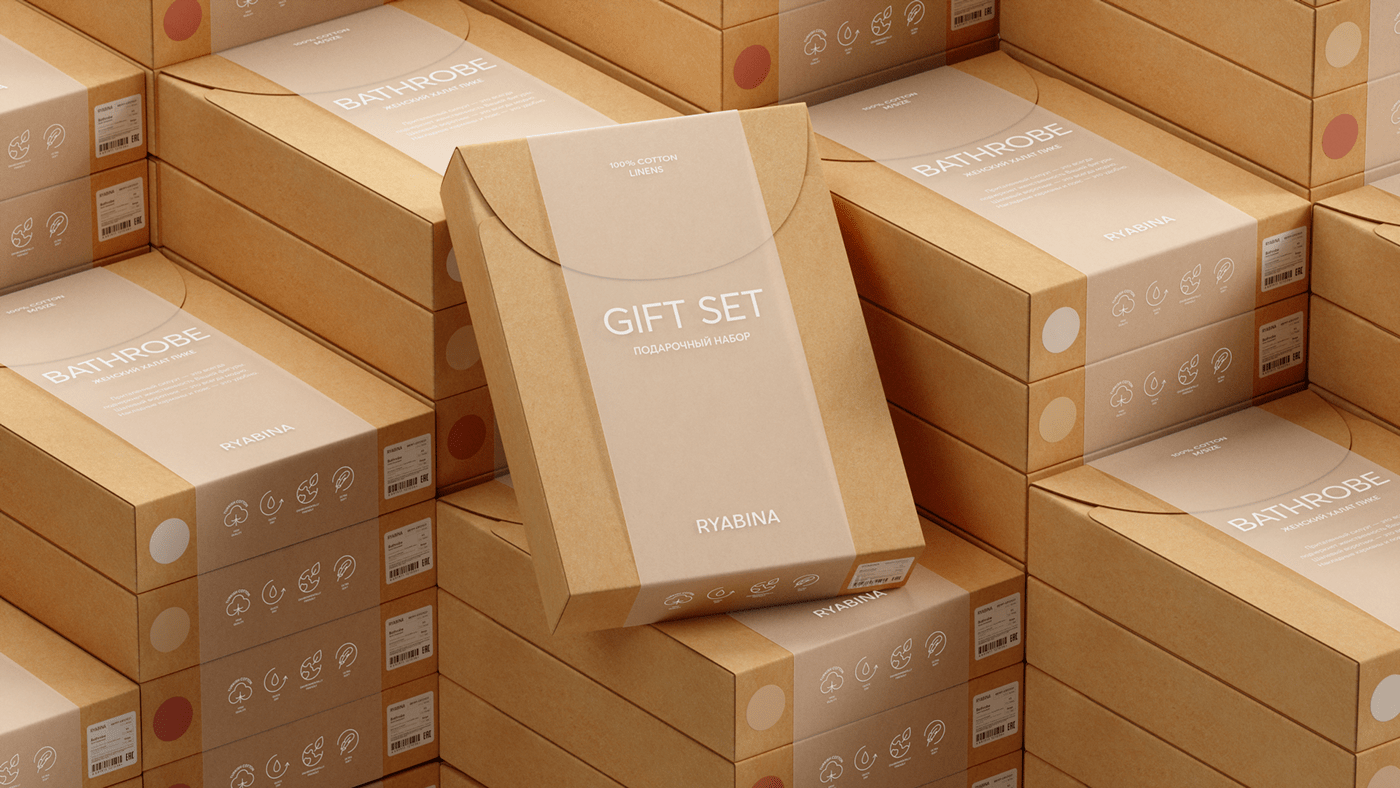
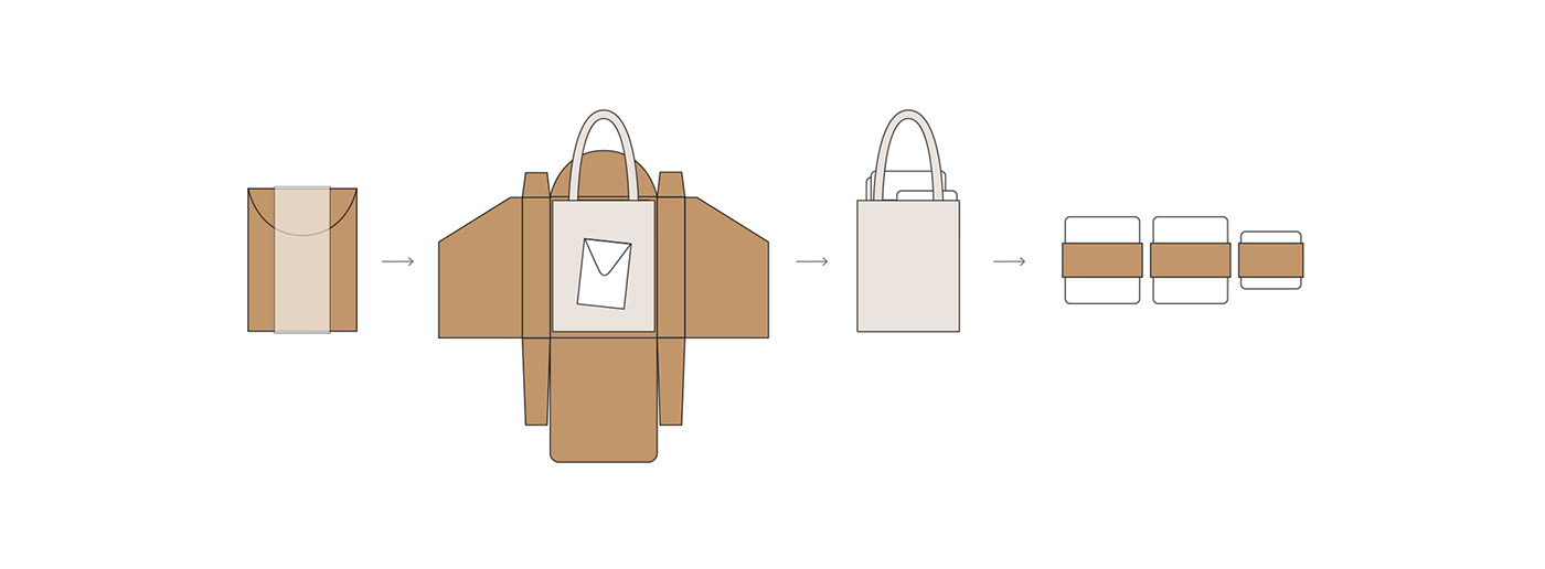
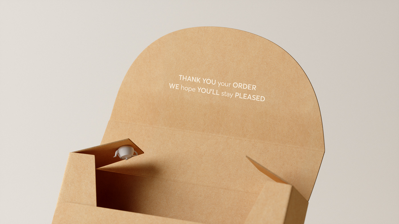
Для халата и комплектов постельного белья разработана универсальная крафтовая упаковка с тематическим полупрозрачным рукавом. Всю информацию о продукте расположили по фирменной сетке. Для создания дружелюбного тона (архетип бренда — любовник) были добавлены тематические надписи-пожелания, при распаковке продукции каждый клиент найдет для себя важный посыл и будет чувствовать себя уникальным.
A universal craft package with a thematic semi-transparent sleeve has been developed for dressing gowns and bed linen sets. All information about the product
is placed on the corporate grid. To create a friendly tone (the archetype of the brand — lover), also were added thematic labels-wishes, when unpacking products, each customer will find an important message and feel unique.


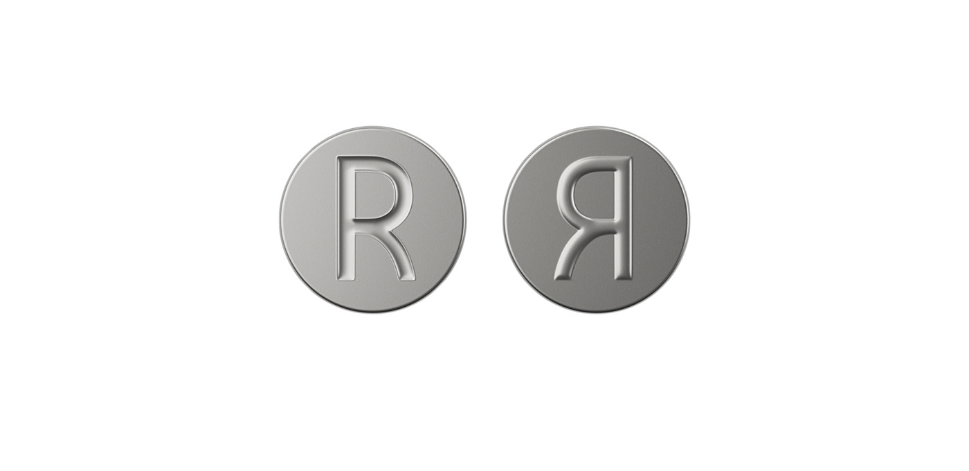
В заглавную букву заложен смысл оберега и защиты. В зеркальном отражении, которое мы встречаем в таких мелочах как бумага тишью и дополнительные элементы брендирования, считывается буква “Я”, что подчеркивает индивидуальное отношение.
In the capital letter contains the meaning of the talisman and protection. In the mirror image that we find in such simple thing like tissue paper and additional branding elements the letter “Я” is read which emphasizes the individual attitude.


PROJECT TEAM
Creative Director: ERIK MUSIN
Art Director: ALEKSEY ZADOROZHNY
Identity&Concept: ELENA ASTAKHOVA
CGI: TIMOFEI POPANDOPULO
Choice Studio © 2020


