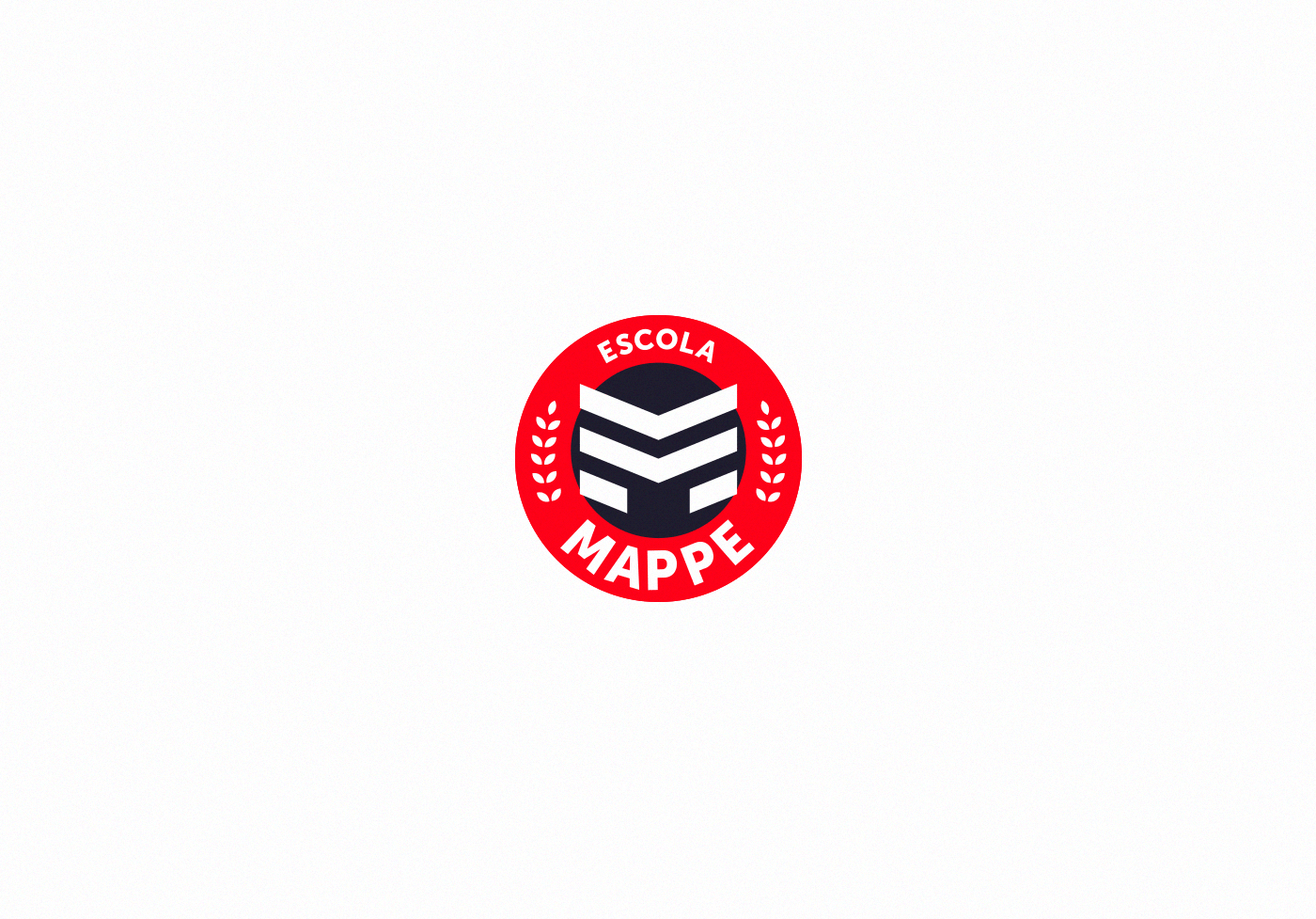
Escola Mappe
Brand Design
EN
_
_
Mappe School is located in Ponta Porã/MS, a city that has a dry border with Pedro Juan Cabalerro/PY.
So, in the immersion and research phase, I understood the need for a logo and a visual identity that represented the cultural mix of the region, today they share their trade, education and cultures, and it was necessary that the "hermanos" also represented.
PT
_
_
A Escola Mappe fica localizada em Ponta Porã / MS, cidade que possui fronteira seca com Pedro Juan Cabalerro / PY.
Então, na fase de imersão e pesquisa, entendi a necessidade de uma logo e de uma identidade visual que representassem o mix cultural da região, afinal hoje as cidades compartilham seu comércio, educação e culturas, e era necessário que os “hermanos” também representados.
EN
_
_
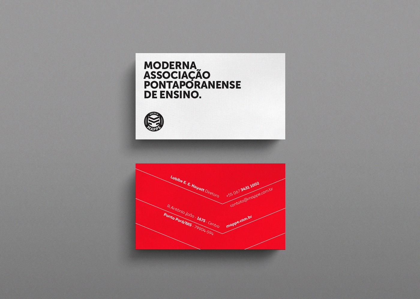
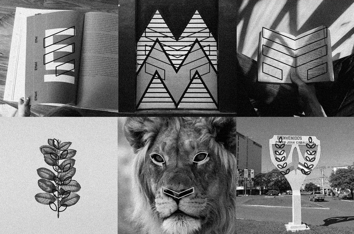
Inside the coat of arms I used the branches, as both cities have their origins in the cultivation of yerba mate.
I took advantage of the letter "m" to represent an open book and thus build a versatile brand, which can be mutant and animated, without falling into the clichés of the category.
PT
_
_
Por isso, no interior do brasão utilizei os ramos, pois ambas as cidades têm origem no cultivo da erva-mate.
Aproveitei a letra “m” para representar um livro aberto e dessa forma construir uma marca versátil, que pode ser mutante e animada, sem cair nos clichês da categoria.
EN
_
_
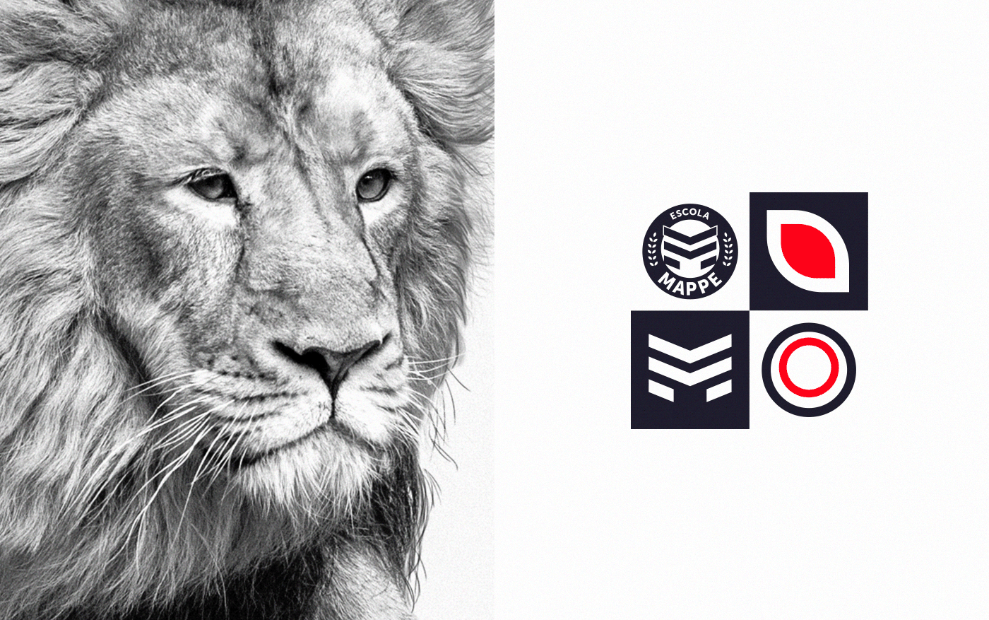
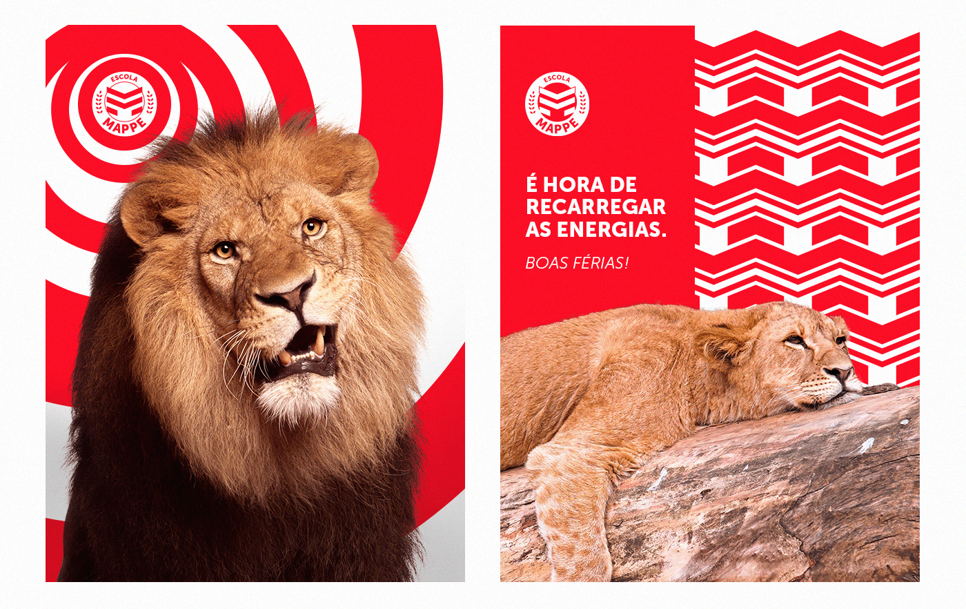
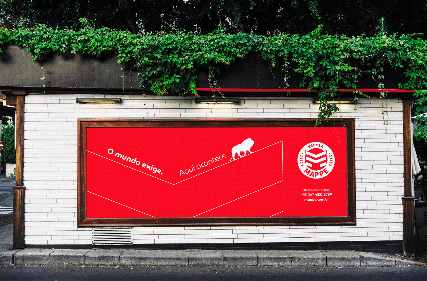
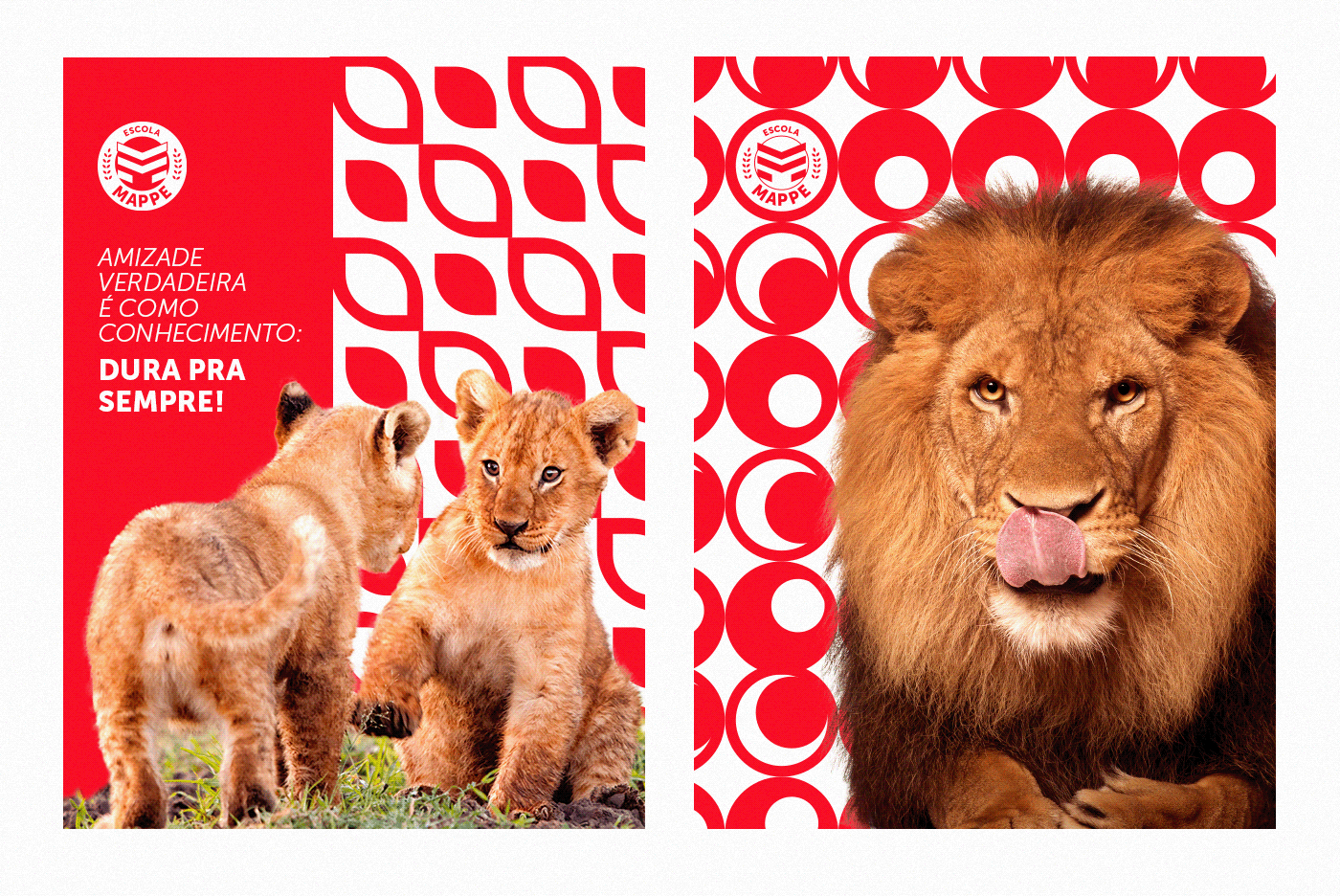
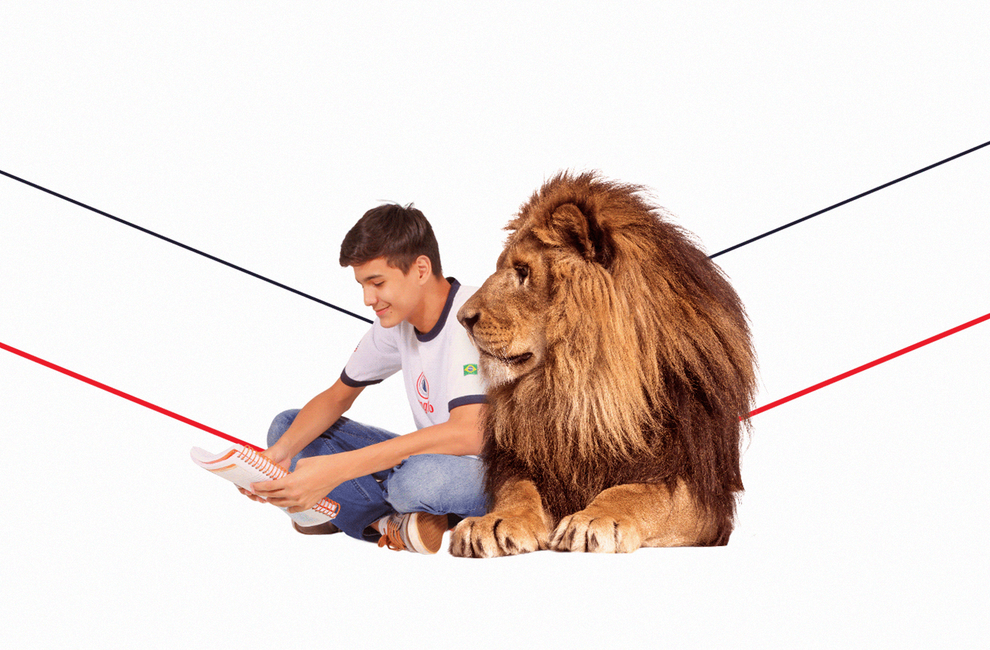
As a strong point in the brand identity and intrinsic to the company's culture - due to the partner education system for many years -, the lion is a key point for the strategy in a market with little differentiation and with competitors based on an approved territory (something cold and distant). The lion acts as a guide and companion on the journey, bringing confidence to families and students on the path to be followed.
Use the lion, combined with vibrant and versatile graphics, which adapts to different needs, bringing to the Mappe School brand a unique and proprietary territory.
PT
_
_
Como ponto forte na identidade da marca e intrínseco à cultura da empresa - devido ao sistema de ensino parceiro a muitos anos -, o leão é ponto-chave para a estratégia em um mercado com pouca diferenciação e com concorrentes pautados em um território de aprovação (algo frio e distante). O leão funciona como guia e companheiro de jornada, trazendo confiança a famílias e alunos no caminho a ser seguido.
Utilizar o leão, aliado a grafismos vibrantes e versáteis, que se adapte a diferentes necessidades trazendo à marca da Escola Mappe um território único e proprietário.