


Featured Projects


The photoshoots were art directed, again, with the family and primary colours as the prerequisite (primary colours are used to identify the different offerings and bundles). These populated the site and were also used for internal communications material.


The page had to work in a modular way in that as different functionalities became available to the customer they would be surfaced on the page and push less relevant content lower down the page. As with any non-english site, steps were made to ensure that all designs created could accommodate Swedish words (on average about 30 - 50% longer than the UK).

Working with a local copywriter a set of guidelines were developed to elaborate what was already being used and applying it to web.
Scandic Hotels
Stockholm
Scandic hotels ( part of the larger Hilton group) , popular in the Nordics but less so in the rest of Europe, were looking to update their online presence. This piece of work that I was involved in was a strategic project to target their room booking process to make the user experience more intuitive and give the right information to the customer during the decision making stage of their journey. The opportunity was also taken to update some of the entry pages to compliment the updates to the journey itself.

A new booking module was designed in an accordion style with the most popular choice (booking a room) left open. New button styles and colourway were developed to draw the eye as opposed to the older monochrome buttons that blended in with the other elements on the page.

Hotel listings were kept more or less the same but with the addition of larger prices and clearer purchase buttons the experience was simplified.


More of an update than a redesign of the Scandic guidelines, extra iconography, title styles and button treatments were added as an appendix to the original document. The challenge was to do a complete a site audit and map how these stylistic changes could potentially affect the browsing experience outside of the booking flow.
Singapore Airlines
Singapore
Singapore Airlines is held in high regard by the vast majority of those that fly with them. Consistently appearing in the top three airlines in terms or service and overall quality the carrier prides itself as the most awarded airline currently in operation.
The task of taking the existing site and injecting it with more aspects of the brand without deserting its core business ( Senior Manager level frequent flyers) was challenging on a number of levels. To a large extent the main challenges were cultural in terms of educating the client about how brands are perceived online and their importance in the digital space.


The Singapore Girl as a concept is what drives the entire offline brand and so there were definite calls to have her feature heavily in the site. As a compromise to avoid having a smiling lady on every single page of the site, the decision was taken to add the Batyk (traditional Singaporean patterning found on the cabin crew uniforms) as a backdrop to the page effectively anchoring it to the brand.


With the multi city page and seat selection the idea was to give the customer an easy journey through the booking flow but allow for extra information that becomes critical on long haul flights (choosing the right seat is counted as the highest priority in-cabin).
The multi city page was simplified and made into a “builder” type app that could be used to drag and drop destinations into place to build a multi stop itinerary.
The multi city page was simplified and made into a “builder” type app that could be used to drag and drop destinations into place to build a multi stop itinerary.
Qatar Airways
Doha/Qatar
Typically viewed as Dubai’s little brother, Doha (capital of Qatar) has been on a global charm offensive to educate the rest of the world on what is has to offer. With the lead up to the World Cup, it has become critical to create an environment that promotes inclusion and prosperity.
Qatar’s flagship airline has paved the way for these activities with a strong focus on service and growing out their fleet to accommodate more passengers on more routes. As a result, there has been an effort to improve the online presence with an updated look and added functionality that reflects the company’s global reach, whilst still maintaining the traditional aspects of hospitality and superior service.

Being the second airline website I had worked on within a 12 month period the personal challenge was to bring new ideas to the table without defaulting to the tried and tested methodology set out whilst working with Singapore. The issue was compounded by the fact that both airlines are operating in a similar space brand-wise and product-wise so again this was where visual design would come into its own to differentiate the experience. An exercise to gain both quantitative an qualitative feedback on design direction from the client. Stakeholders were invited to define an index of values that could be attributed to the 3 directions: Luxury, Editorial and Showroom. The end result was something of a combination of the showroom aspect (utilising depth) and Editorial (bold use of type and strong grid).
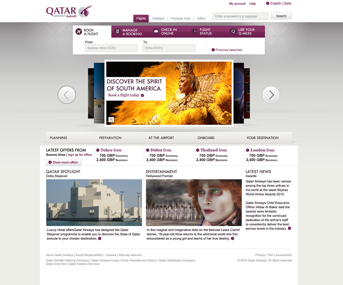
The concept of the new site was to marry an interactive campaign approach with appropriate functionality required of a booking engine. The aim was to provide the customer with an easy to use site which would not only improve the ticket purchase process but also promote the quality and service of Qatar Airways as a brand. As a result the design had to work in both spheres, not being overtly ostentatious or be seen to be pandering to the low-cost carrier market.

Privilege club ( Qatar airways’ frequent flyer program) was designed for the frequent user but needed to feel different enough from the rest of the site whilst being able to handle a lot of tabled information. Clean typography plays an important role in the overall execution with futura being the font of choice.

This would allow customers to view routes available and possible stopover options. The promotions at the bottom of the screen were set to auto-update, based on the route travelled, providing another path into the purchase funnel.

A very distinct family of icons were developed as part of a design toolkit, which could be applied to promotions, key information and external banners.
...And now, something completely different
Incase you thought I was all boxes and buttons, some illustration
Incase you thought I was all boxes and buttons, some illustration


Contact me at:
...or you can do the social web thing and find me on Linkedin
...or you can do the social web thing and find me on Linkedin


