PT
_
A Campestry é uma marca com visão de alcance nacional no segmento de vestuário e acessórios para um público sertanejo, country, ou até mesmo, caipira. Sua atuação se dará, a princípio, por meio de loja online e parceiros na internet.
Esse projeto nasceu já na criação do nome. O nome Campestry surgiu de uma análise sobre o estilo, público e visão da empresa, sendo observado também questões de viabilidade de registro de marca.
Foi feito um levantamento sobre pontos fortes e fracos dos principais concorrentes, tanto no sentido estético quanto no sentido estratégico, comercial, e daí, foram levantadas algumas possibilidades junto ao cliente de diferenciação no produto e na comunicação.
EN
_
Campestry is a brand with a national reach in the clothing and accessories segment for a country audience. Its performance will be, in principle, through online store and partners on the internet.This project was born when the name was created. The name Campestry arose from an analysis of the style, audience and vision of the company, while also observing issues of viability of trademark registration.A survey was made on the strengths and weaknesses of the main competitors, both in the aesthetic sense and in the strategic, commercial sense, and from there, some possibilities were raised with the customer for product differentiation and communication.


PT
_
Para a criação do logotipo, foram levadas em consideração algumas premissas básicas, criadas através de um escopo alimentado por um briefing feito com o cliente.
O logotipo deve ser funcional em todas as mídias que irá utilizar, tanto online quanto offline, e deve levar consigo a mensagem da marca, de forma emocional.
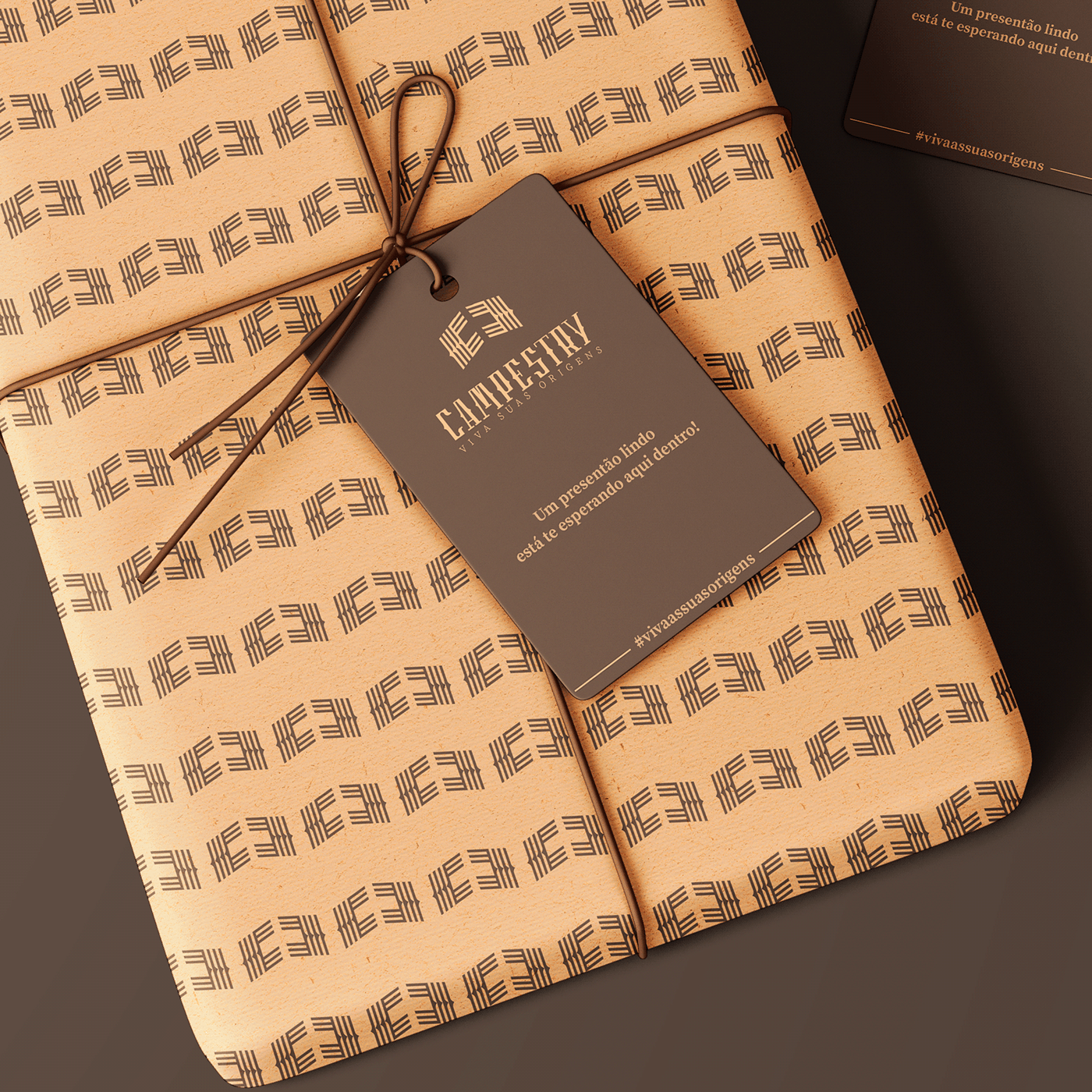
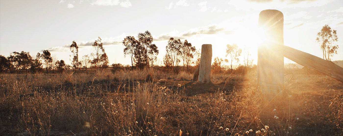
O público-alvo da marca são homens e mulheres que tem forte ligação com o campo, que moram ou trabalham em áreas rurais, e que tem contato direto com a natureza. São pessoas que frequentam tanto o campo quanto a cidade. Desse modo, através de definição de persona, foi criado um conceito global antes da criação do logotipo. O conceito é ” VIVA AS SUAS ORIGENS”.
Esse público cresceu no campo, em fazendas, sítios, em áreas rurais de toda espécie, e foram criados com os valores de seus pais e avós, em meio à simplicidade e à natureza. O retorno às origens, nesse sentido, é nunca esquecer de onde se veio, e o que se aprendeu nesse ambiente.
Depois de definido o conceito – que acabou virando uma tagline que compõe o logotipo, foi iniciado a criação dos desenhos em sí. Primeiramente, a tipografia foi desenvolvida do zero, com características que lembram o estilo country. Uma tipografia que pretende se impor e ter uma personalidade forte.
Após isso, foi criado o símbolo. Esse símbolo representa duas letras C espelhadas e que formam uma porteira, sempre aberta para quem vive indo do campo para a cidade e vice-versa. Os traços que compõe esse símbolo também representam os campos arados, simbolizando a terra e o trabalho do povo campestre.
EN
_
For the creation of the logo, some basic premises were taken into account, created through a scope fed by a briefing done with the client.
The logo must be functional in all the media that it will be used, both online and offline, and must carry the brand's message, emotionally.The brand's target audience is men and women who have a strong connection with the countryside, who live or work in rural areas, and who have direct contact with nature. They are people who frequent both the countryside and the city. Thus, through the definition of a persona, a global concept was created before the logo was created.
The concept is "LIVE YOUR ORIGINS".This public grew up in the countryside, on farms, in rural areas of all kinds, and were raised with the values of their parents and grandparents, amid simplicity and nature. The return to the origins, in this sense, is never to forget where it came from, and what was learned in that environment.After defining the concept - which ended up becoming a tagline that makes up the logo, the creation of the drawings began. First, the typography was developed from scratch, with features that resemble country style. A typography that intends to impose itself and have a strong personality.After that, the symbol was created. This symbol represents two mirrored letters C that form a gate, always open for those who live going from the countryside to the city and vice versa. The lines that make up this symbol also represent plowed fields, symbolizing the land and the work of the rural people.