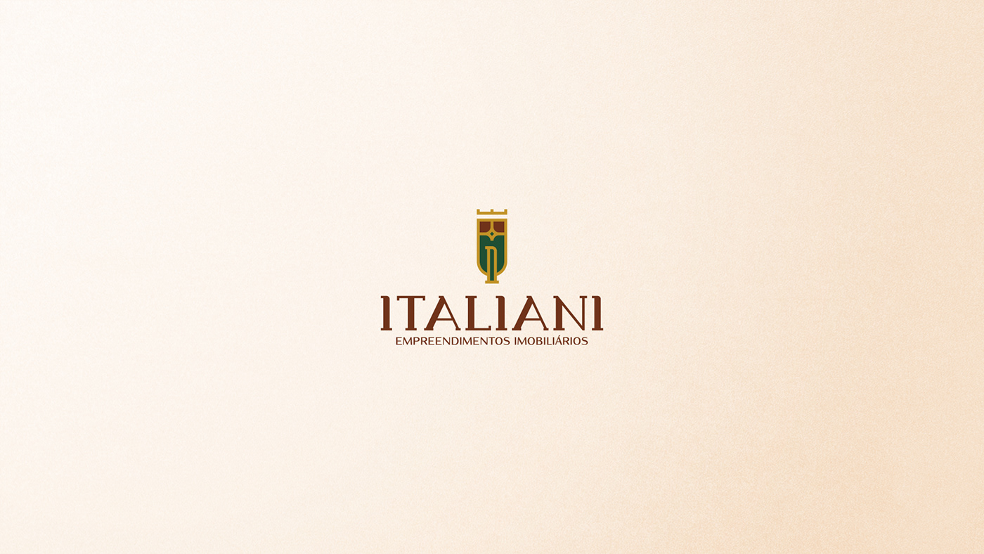
Italiani - Empreendimentos Imobiliários
[pt-br]
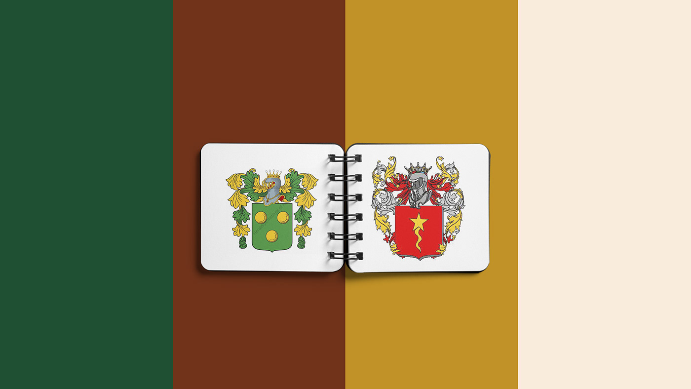
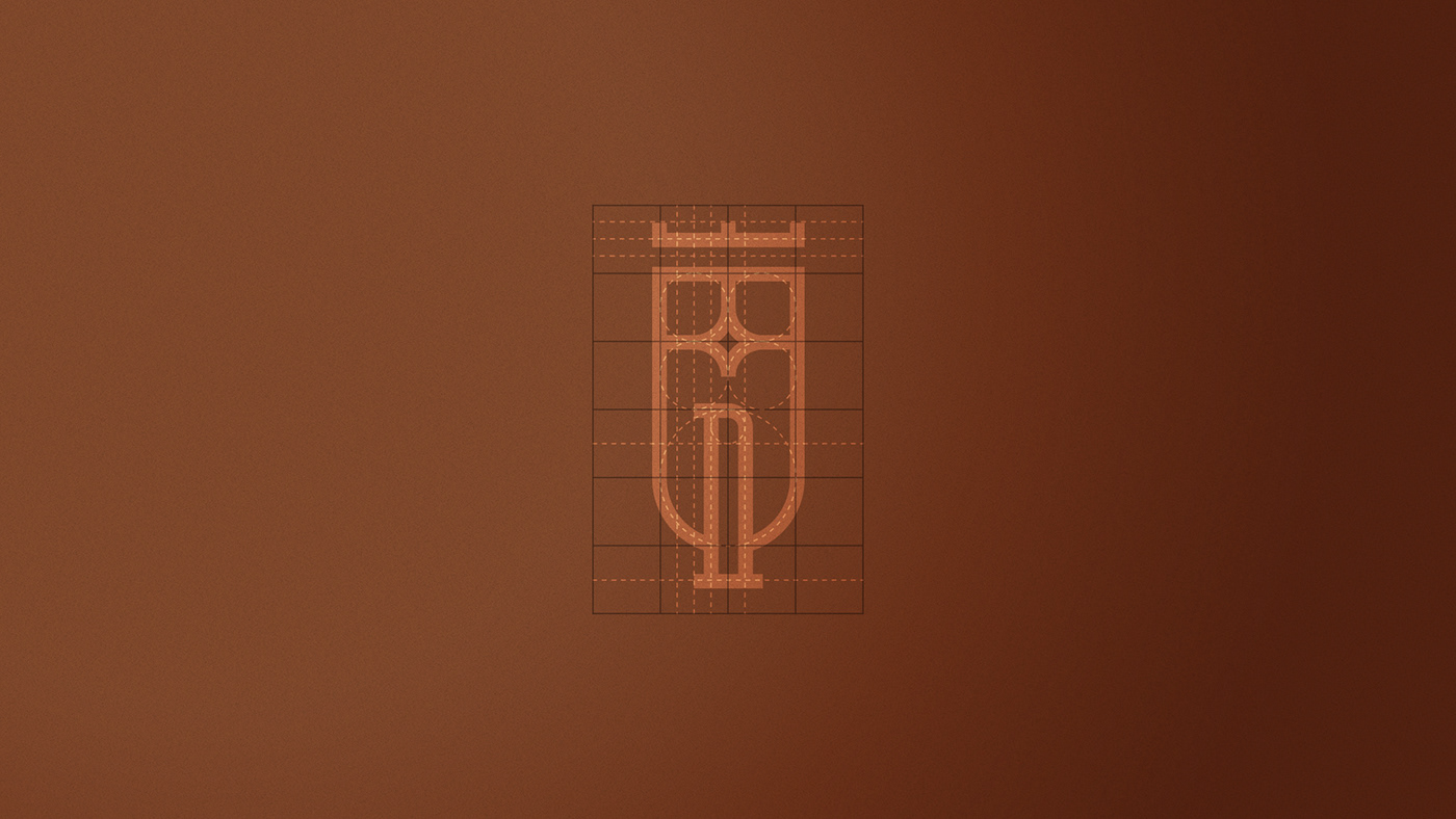
Esse projeto foi um dos mais desafiadores esse ano para mim, a junção de alguns conceitos sintetizados em um único símbolo. O conceito do projeto foi desenvolver uma marca que remetesse a Itália, assim como os sobrenomes dos dois sócios e os brasões das duas famílias e que fosse séria, elegante, sofisticada e moderna. Analisando os dois brasões, usei como base o escudo (proteção) e a coroa (soberania e nobreza) que estão presentes nos dois brasões e a letra “I” inicial de Italiani dentro de um grid geométrico. Trazendo uma harmonia entre os elementos e remetendo a arquitetura gótica da Itália.
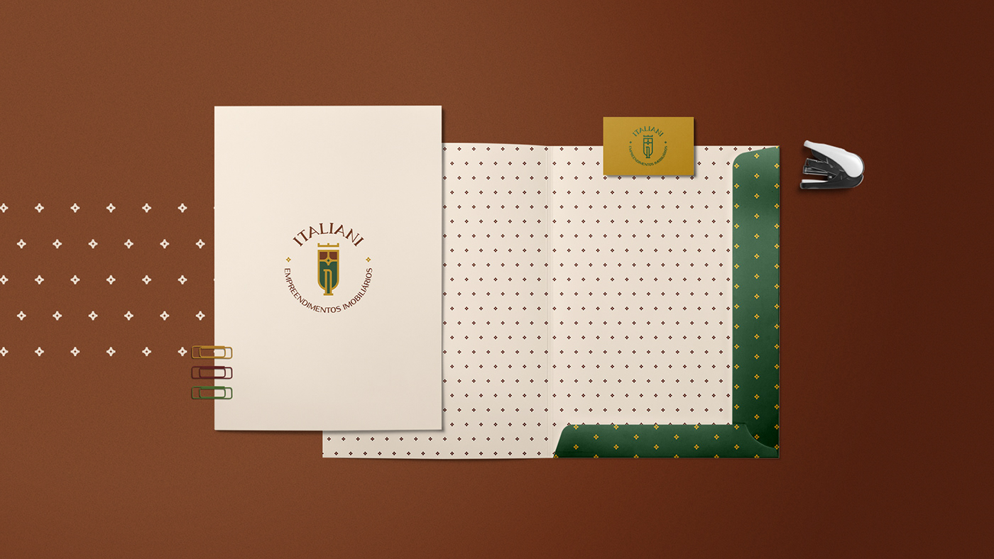
A tipografia foi representada por um arquétipo de Governante, no controle e no comando. Resumindo em termos de responsabilidade, competência e soberania. Nela foi alterada em seus espaçamentos (kerning) e as letras “I” para fazer uma conexão com o símbolo.
Esse projeto foi um dos mais desafiadores esse ano para mim, a junção de alguns conceitos sintetizados em um único símbolo. O conceito do projeto foi desenvolver uma marca que remetesse a Itália, assim como os sobrenomes dos dois sócios e os brasões das duas famílias e que fosse séria, elegante, sofisticada e moderna. Analisando os dois brasões, usei como base o escudo (proteção) e a coroa (soberania e nobreza) que estão presentes nos dois brasões e a letra “I” inicial de Italiani dentro de um grid geométrico. Trazendo uma harmonia entre os elementos e remetendo a arquitetura gótica da Itália.
A tipografia foi representada por um arquétipo de Governante, no controle e no comando. Resumindo em termos de responsabilidade, competência e soberania. Nela foi alterada em seus espaçamentos (kerning) e as letras “I” para fazer uma conexão com o símbolo.
[en-us]
This project was one of the most challenging for me this year, the combination of some concepts synthesized in a single symbol. The project's concept was to develop a brand that would refer to Italy, as well as the surnames of the two partners and the coats of arms of the two families and that would be serious, elegant, sophisticated and modern. Analyzing the two coats of arms, I used as a base the shield (protection) and the crown (sovereignty and nobility) that are present in the two coats and the initial letter "I" of Italiani inside a geometric grid. Bringing a harmony between the elements and referring to the Gothic architecture of Italy.
This project was one of the most challenging for me this year, the combination of some concepts synthesized in a single symbol. The project's concept was to develop a brand that would refer to Italy, as well as the surnames of the two partners and the coats of arms of the two families and that would be serious, elegant, sophisticated and modern. Analyzing the two coats of arms, I used as a base the shield (protection) and the crown (sovereignty and nobility) that are present in the two coats and the initial letter "I" of Italiani inside a geometric grid. Bringing a harmony between the elements and referring to the Gothic architecture of Italy.
The typography was represented by an archetype of Governor, in control and in command. Summing up in terms of responsibility, competence and sovereignty. It was changed in its spacing (kerning) and the letters "I" to make a connection with the symbol.