Farrow
A modern Montessori material and resource brand.
In Summer 2020, I challenged myself to expand my branding design abilities by making up a company and creating a name, a cohesive visual language, and a website design.
The Challenge
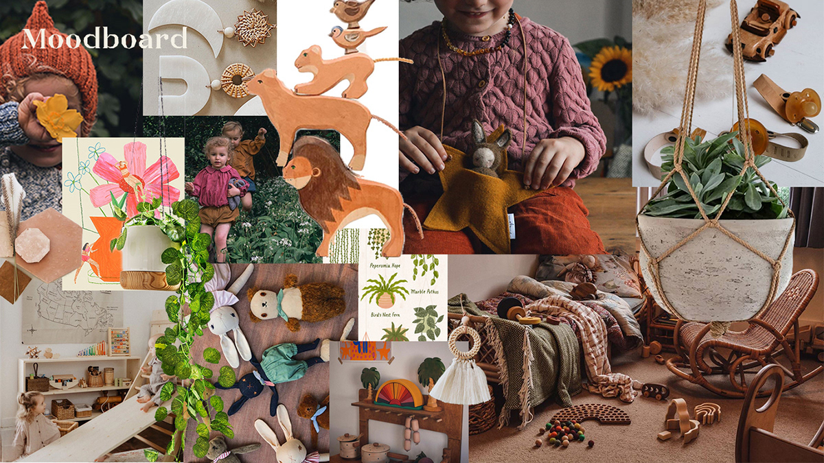
Farrow is an online resource hub and material store for parents of children aged from birth to 36 months who are seeking the tools to raise their little ones using Montessori and unschooling techniques. Farrow aims to be environmentally conscious, with most of the products sold being made from natural materials such as wood and cotton, and the brand identity needed to reflect this, as well as conveying a feeling of timeless childhood nostalgia to appeal to Millennial parents.
Deadline: 5 days
Farrow (verb) - (of a sow) to give birth to a litter of piglets
The Brand
The idea for the name Farrow stems mostly from a misspelling; I was imagining fields of farro, a type of hulled wheat, when thinking about colour schemes that resonate with the idea of timeless childhood nostalgia. Though when I found out farrow meant to bear a litter of piglets, I thought it was so cute to describe your babies as your little piglets that I took the idea and ran with it.
The colour scheme is mostly inspired by warm and muted natural tones, much like a field of farro spelt, to reflect the natural materials used in the toys that Farrow sell. Many Montessori learning toys use less saturated colours in their materials, to encourage the use of imagination in the young children using them, in comparison to their very bright plastic counterparts.