Spot is a regional provider that offers internet solutions, being one of the first
companies in the state to work with the latest technology in fiber optic cabling.

The previous logo had a wifi symbol directed downwards, which represented a weak signal or poor
quality in the emission. The English tagline (solution) is also not interesting for a regional provider.
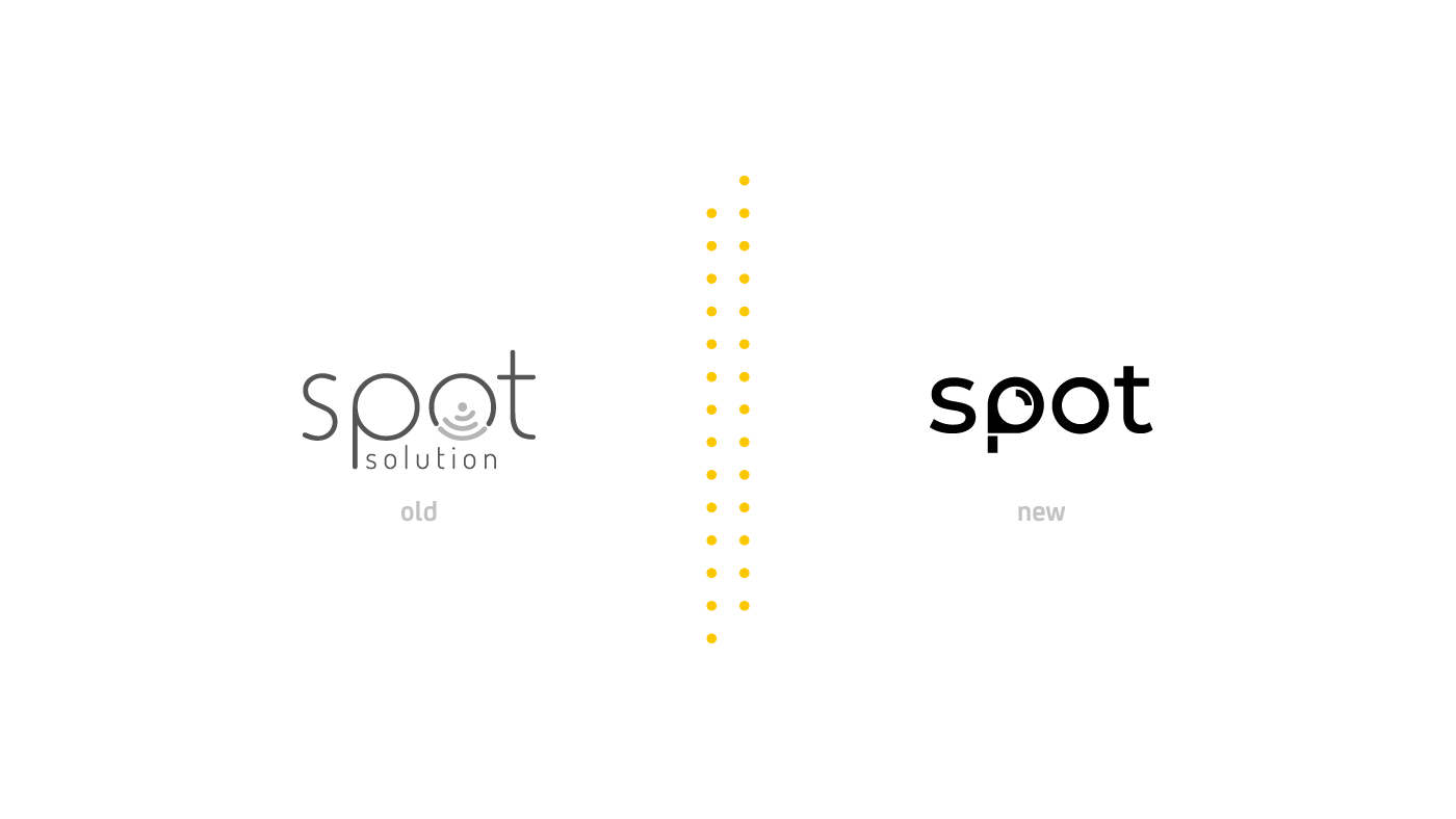


Symbol construction
The symbol was built based on the semantic connection of naming, correlating with the company's segment.
The pin represents the location, the speedometer represents speed and power, and the
wifi signal refers to the point and focus, which together represent a strong symbol.