


Overview
Allowance is a great way to help children learn the basics of budgeting and money management, encourage independence, patience, and goal setting. PiggyB is an app that helps parents teach their kids about the value and importance of money and encourage saving through the concept of allowance.
My Role: User research / Prototyping / UI design
Timeline: 8 weeks
My Role: User research / Prototyping / UI design
Timeline: 8 weeks
Challenge
Design an easy to use product that helps parents manage allowance money and chores for their kids, track their spending and savings and helps kids manage incoming money, set financial goals and track their progress towards set goals.
Research
INTERVIEW
To gather in-depth qualitative data, I conducted 30-minute in-person and video semi-structured interviews with parents who give pocket money to their kids (ages from 4 to 16). During the interview, I used an interview script as a guide and asked follow-up questions based on the participants' answers.
SURVAY
I followed the research by sending out Google Form questionnaires to members of multiple parenting groups on Facebook. The purpose of the survey was to collect more quantitative data.
Affinity Diagram
After completing the interviews, I transferred my notes into digital sticky notes miro.com to identify common behaviors and needs of the users that existed in collected data.

Key Findings
1. The majority of interviewed parents find allowance an excellent tool for teaching kids money management and responsible spending from a young age.
2. 80% of interviewed parents choose to use a hybrid method of allowance: kids get a small amount of money weekly and can earn money by doing chores around the house.
3. 73% of interviewed parents use physical chore charts and cleaning schedules to keep track of what their kids earn. They find it convenient, especially if there is more than one child.
Recommendations
1. The new product should be flexible to support different allowance methods.
Things to consider:
- Parents should be able to set conditional and unconditional allowance
- The app should allow adding paid and unpaid chores
2. The product should be easy to understand even for younger kids; therefore it should have a set of built-in icons to represent different chores, tasks, etc.

Research Synthesis
THEMES AND OPPORTUNITIES
At this stage of analysis, I revisited collected data to find patterns and pain points experienced by multiple users. I grouped the notes by themes to identify design opportunities.

FEATURE IDEATION
I used the same affinity mapping technique for the ideation phase of this project.
My goal was to take many ideas and by performing the same type of clustering as before, narrow them down to just a few ideas.
My goal was to take many ideas and by performing the same type of clustering as before, narrow them down to just a few ideas.

FEATURE PRIORITIZATION
I prioritized product features by evaluating every opportunity based on its business value and its relative complexity to implement using the “Value vs. Complexity Quadrants” framework.

Ideation
When I had a clearer picture of users’ behaviors and needs, I ran an ideation session and sketched out different layouts of the essential screens. I kept the sketches very simple because I wanted to get several different ideas within a short time and not be constrained by details.

Usability Study
LOW FIDELITY PROTOTYPE (ITERATION 1)
To validate my solutions, I developed a low-fidelity clickable prototype using Figma and conducted five remote sessions with potential users over Zoom and in-person to identify usability problems. The goal was to identify pain points that could be improved in future iterations. The participants of the study were asked to complete four tasks:
1. Log in / sign up to the application
2. Create a new profile for a child
3. Create a new task
4. View active financial goals of a child
1. Log in / sign up to the application
2. Create a new profile for a child
3. Create a new task
4. View active financial goals of a child
LOGIN/SIGN UP

CREATE PROFILE

CREATE NEW GOAL

CREATE NEW TASK

Results:
1. All users have been able to log in / sign up for the application without any issues.
2. It wasn’t clear for three users that they need to select a type of account (Child).
3. All users have been able to create a new task without any issues.
4. All users have been able to view active financial goals. Two participants pointed out that the goal cards are small.
LOW FIDELITY PROTOTYPE (ITERATION 2)
After incorporating all of the feedback from the participants, I created the second iteration of the low-fidelity prototype and tested it with four other potential users. They were able to complete all four tasks.

User Interface
STYLE GUIDE
After completing the usability study, I was ready to move forward with the visual design. To ensure a cohesive product design, I created a style guide with crucial design components such as typography, colors, navigation menus, buttons, states of input fields, icons, illustrations, etc.

VISUAL DESIGN
The visual design features a lot of light gray and white colors combined with a bright blue as a primary color and a few other bright secondary and tertiary colors. This combination provides a lot of breathing room for the content while drawing users’ attention to essential elements of the interface and emulates friendly, playful, and trustworthy ethos.
ILLUSTRATIONS
To support the branding of the application and enhance the positive user experience, I developed a mascot for the app, a cute pig character. I chose this animal because it is the most common association with money savings among kids and adults. The mascot is implemented in different parts of the interface, mostly in pop-ups with a motivating text (e.g., “Great Job!”). It features feedback on the user’s actions or interactions with the app.

REWARDS
The app has a reward feature in which kids can earn various badges based on the number of made donations or achieved financial goals. This keeps kids motivated to make progress and encourages them to complete tasks, earn, donate, and save money.
HIGH FIDELITY PROTOTYPE
I created a high fidelity prototype to learn how users feel about the app. A usability testing via online service Lookback helped me to get their opinion on the design and validate it.
Final Product
SIGN UP AND PROFILE SETUP
Before users can proceed to use the app, they have to sign up and complete quick account setup. This process will take just a few minutes as users are asked to fill in only necessary data.
Parents and kids will use the same credentials to log in to the app, but within the account, each of them will have a personal profile protected by a PIN.
Parents and kids will use the same credentials to log in to the app, but within the account, each of them will have a personal profile protected by a PIN.

CREATE PROFILE
The user can create a new profile for a kid in three steps: first, they will be asked to add some basic data (such as kid’s name, date of birth, PIN), and in the next two steps, they can set allowance preferences.

DASHBOARD
Besides just a few features, the app interface is almost identical for both types of users, parents, and kids. Parents' side of the app has more advanced functionality. The main difference is that they can view the profiles of each kid and create tasks for them.
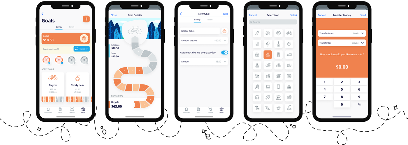
On the app's dashboard screen, users can quickly view the balance of each category (e.g., Spend, Donate, Goals), active tasks, payment history, and details of an upcoming payday. They can also transfer money between different categories or financial goals.
On the app's dashboard screen, users can quickly view the balance of each category (e.g., Spend, Donate, Goals), active tasks, payment history, and details of an upcoming payday. They can also transfer money between different categories or financial goals.

TASKS
Tasks screen allows parents to create, prioritize, and keep track of tasks for their kids. Kids use this screen to view tasks that they can complete to earn an allowance.

DONATION
Donation screen allows kids to choose a cause they are passionate about and complete the donation with the help of their parents via the JustGiving app.

FINANCIAL GOALS
This screen is responsible for giving users a place to track kids’ savings and financial goals.
Goal Details screen provides visualization of the progress which encourages kids to keep going.
Conclusion
Upon completing this project and writing this case study, I am amazed by how much I have learned. My eight-week journey working on this app helped me understand the basics of UX Design.
I learned how to conduct in-depth user interviews and create qualitative surveys to identify the user and their needs. Also, how to analyze the data and translate the findings into a prototype. I realized the importance of usability testing for gaining valuable feedback from users for design iterations.
I have certainly gained much more confidence in my UI/UX design skills, which will inevitably help me in my career growth.


