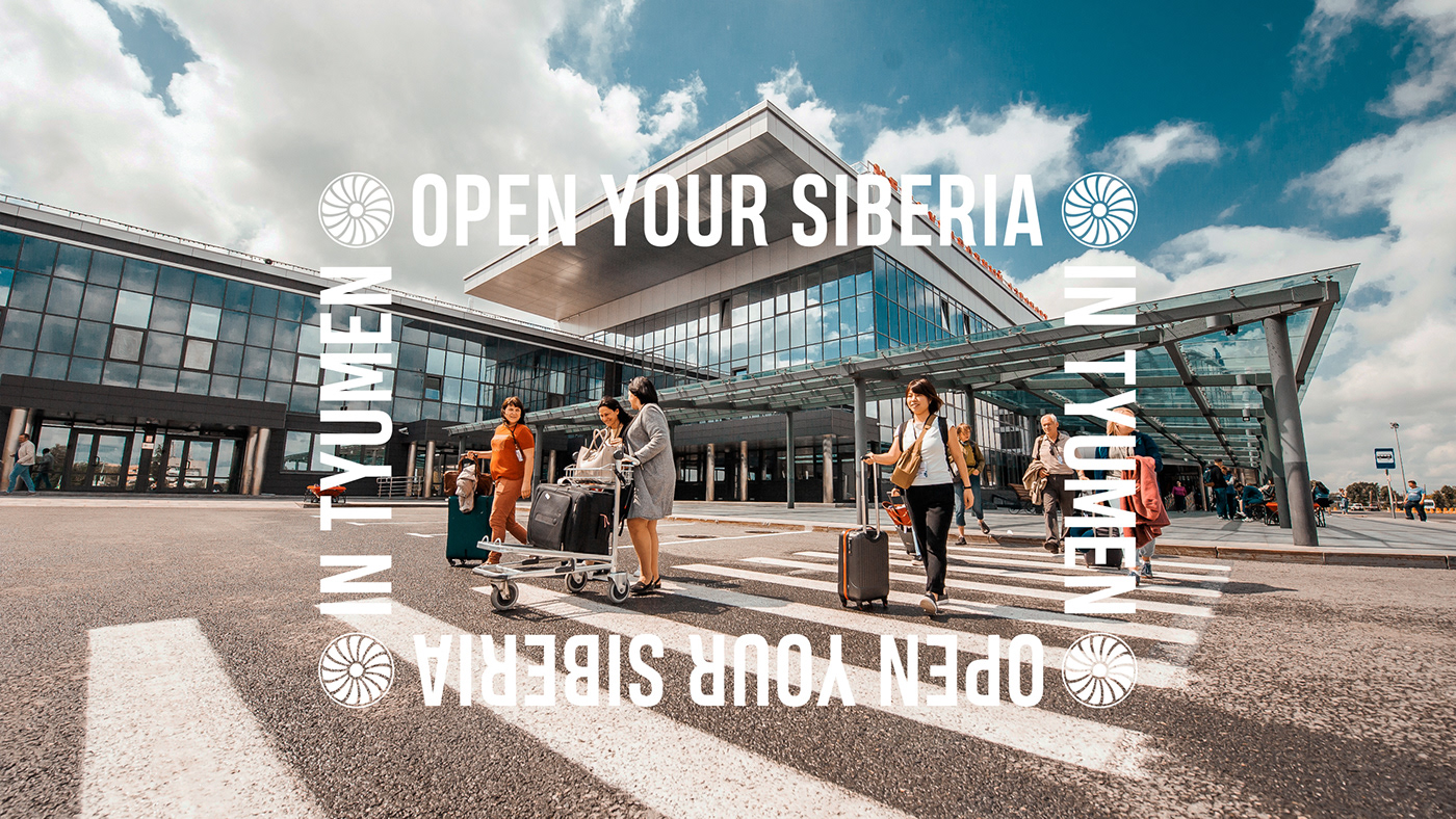
Visit Tyumen
The Tyumen region is a comfortable and comfortable region, who is ready to accept at the highest level that more than once was confirmed.
Tough cold land of Siberia where hospitable and friendly people live. One of the most tolerant regions in Russia. People here are friendly and ready to help their neighbors, on the other hand, they are dynamic, active, ambitious, open to everything new.
Cold outside, warm inside ...
Tough cold land of Siberia where hospitable and friendly people live. One of the most tolerant regions in Russia. People here are friendly and ready to help their neighbors, on the other hand, they are dynamic, active, ambitious, open to everything new.
Cold outside, warm inside ...
Client: Tyumen Region
Naming / Brand Platform / Visual identity
Naming / Brand Platform / Visual identity
Tyumen / 2017–2020


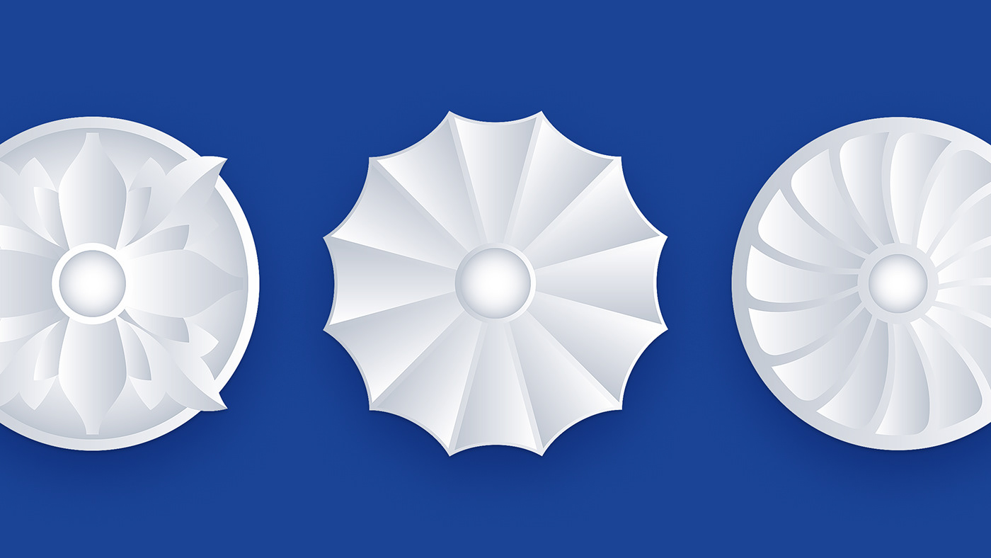
The visual semantics of the Visit Tyumen brand is based on elements of wooden architecture. The main graphics of the visual style were carved details present on the window frames of architectural monuments, which are famous examples of the unique Tyumen carving and have no analogues.
The main symbol of the brand is the sable from the region's coat of arms. It highlights the historical heritage that the inhabitants of the region are proud of. The colors of the brand are blue and red reflecting the core of concept «Сold outside, warm inside».
The main symbol of the brand is the sable from the region's coat of arms. It highlights the historical heritage that the inhabitants of the region are proud of. The colors of the brand are blue and red reflecting the core of concept «Сold outside, warm inside».


One of the main messages «Open a window in the heart of Siberia» gave the visual embodiment of the advertising campaign. Messages take the form of windows supplemented with carving elements.
The brand actively uses photo content. We have developed a basic philosophy that emphasizes the warmth, comfort and hospitality of people, nature, atmosphere.
The warmth of the material.
The use of materials in the content that transmit warmth through tactile sensations: wood, wool, fur, warm drinks.
The warmth of the relationship.
Much attention is paid to the inner warmth of a person, his attitude towards nature, animals, friends, relatives and guests.
Temperature contrast.
The principle of opposing the external visually cold environment and the feeling of internal warmth.
Vivid emotions.
The manifestation of vivid emotions creates a feeling of external and internal comfort, as well as a motivating tool at sports and other mass events.


The Merchendise convey warmth, with special attention to fabrics and materials. «In Siberia on their own will» is a special message designed for street wear collection has become the hallmark of the brand.


Printed media with strict layout and emotional photographs unleash the potential of corporate identity and are printed on quality paper with elements of foil, die-cut and embossing.


We are waiting for your visit. Believe us, it's not cold here.