


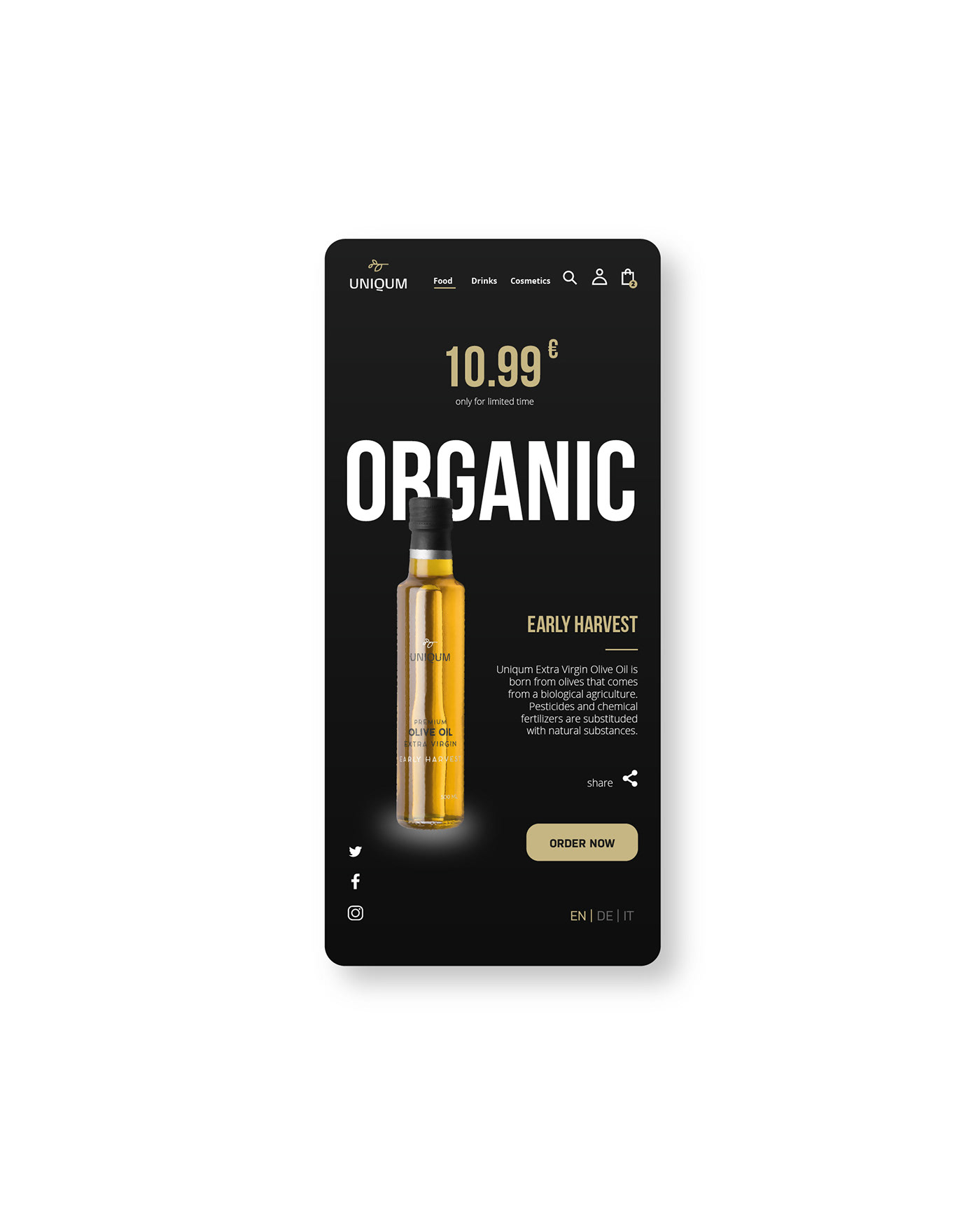


Only the finest olive oils are selected to create the precious blends of Uniqum; the raw material comes from the Mediterranean basin and is imported to Australian and Southeast Asian markets.
Part of the branding project involved coming up with the name. I was looking for a link between the Latin language and the unique oil blends. UNIQUM was born from this combination. The outline of an olive branch was chosen as an icon for this logo. The colours chosen range from the shades of green which represent the leaves and the unripe olives, to the dark brown which represents the earth and the barks, all characterised by the golden yellow highlights from the freshly squeezed oil. I wanted to make the design of the labels modern by relying on a screen printing technique; the use of black stands out on the bottle thanks to the intensity of the oil, while white is used in contrast on the dark bottles.
Thanks For Watching
work enquiries | hi@giacomourgeghe.com