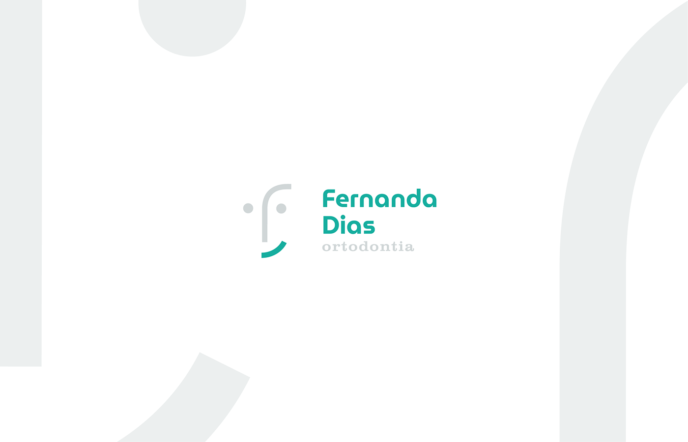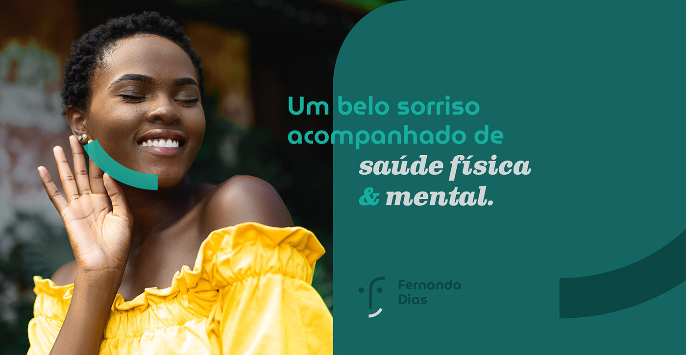
Ortodontia é uma especialidade odontológica que corrige a posição dos dentes e dos ossos maxilares posicionados de forma inadequada, contribuindo para um sorriso mais bonito, alinhado e saudável. Pensando nisso, desenvolvemos uma marca que transmite a estética do belo. Para isso utilizamos formas limpas e bem definidas que transmita a beleza do rosto humano em um símbolo sem gênero, representando tanto a Dra. Fernanda Dias quanto seus pacientes.
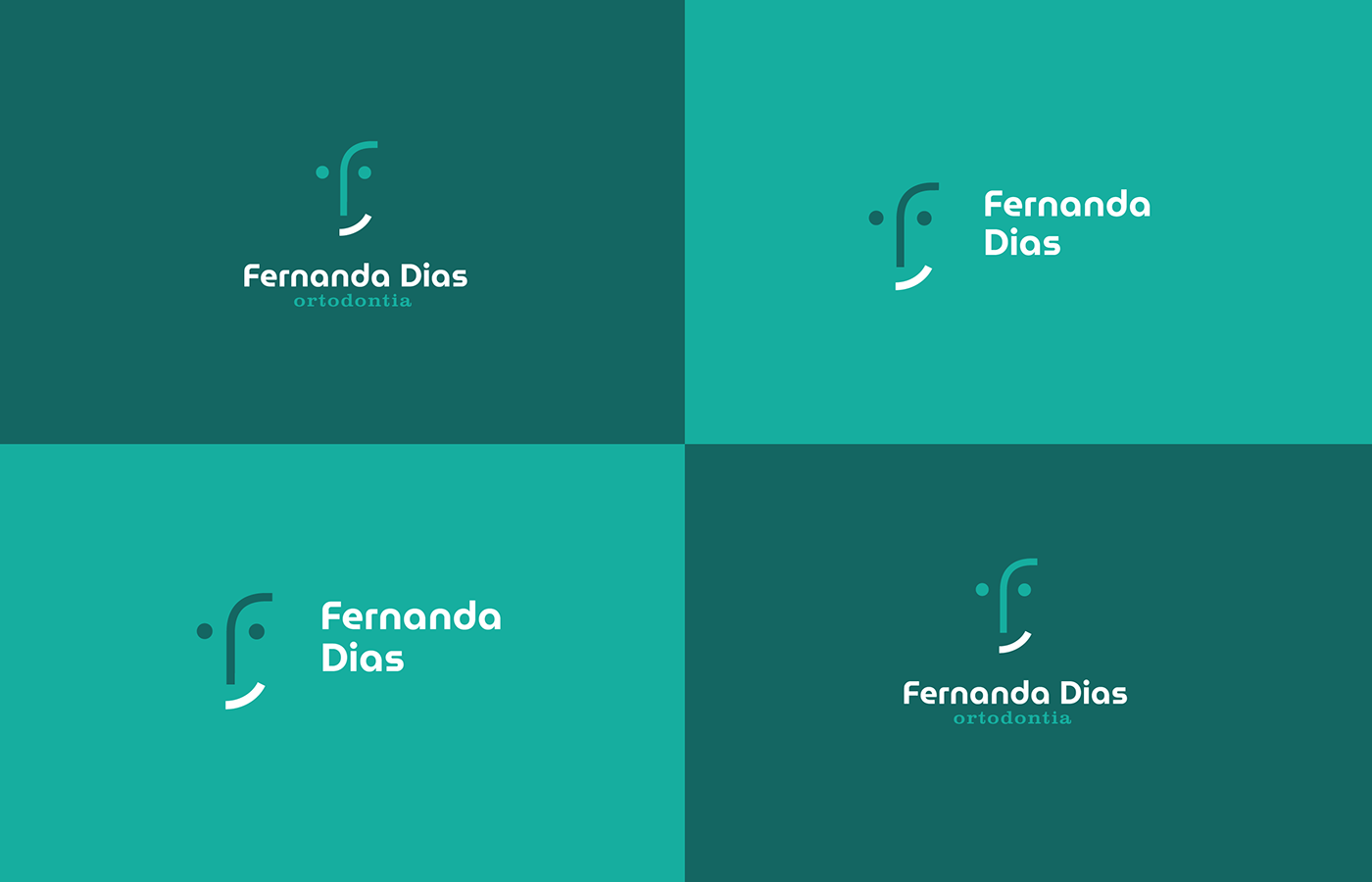
Outro ponto que achamos interessante explorar para a marca é o fato de muitas pessoas terem medo de ir ao dentista (3º maior medo das pessoas segundo pesquisas). Isso nos motivou a construir uma identidade alegre, limpa e que transmita segurança.
-
Orthodontics is a dental specialty that corrects the position of improperly positioned teeth and jaws, contributing to a more beautiful, aligned and healthy smile. Orthodontics is a dental specialty that corrects the position of the teeth and bones of the jaw inappropriately, contributing to a more beautiful, aligned and healthy smile. With that in mind, we have developed a brand that conveys beauty aesthetics. For this, we use clean and well-defined shapes in a symbol that conveys the beauty of the human face in a genderless symbol, representing Dr. Fernanda Dias and her patients.
Another interesting point that we explored is the fact that many people are afraid to go to the dentist (the third biggest fear of people, according to the research). This motivated us to build a happy, clean and security-transmitting identity.

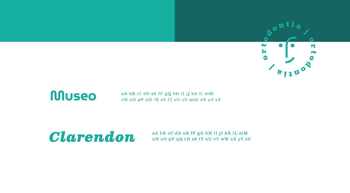
As cores foram selecionadas para oferecer calma e conforto, além de manter os padrões clínicos que encontramos no mercado, evitando estranheza por parte dos pacientes e parceiros. A tipografia é leve e alegre, sendo assim, reforçamos as características mencionadas anteriormente. Possuem contrastes entre si e são de boa leitura em diferentes tamanhos.
-
The colors were selected to offer tranquility and comfort and maintain the usage patterns that can be detected in the market, avoiding strangeness. The typography is light and cheerful, reinforcing the characteristics mentioned above.