


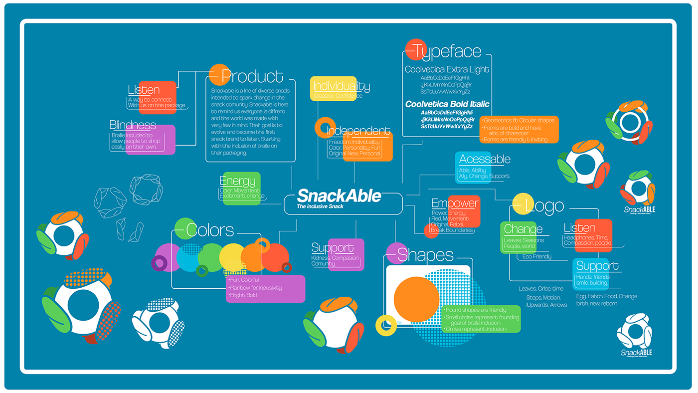
I created stackable to question the current retail market and its accessibility. As a person without a close connection to those with a disability, it is easy for us to forget there is a huge percentage of people living with some form of limitation which can easily be traversed should it be addressed by designers. While it is easy to think of city planners such as those involved in Joy Rosse's video in which she shows how tactile pavement installed due to her near-death experience can change lives, I believe graphic designers are also responsible to remind the world up to 15% of people are disabled in some way. These people are consumers, they are creatives, they are important, and we must make a way for them to interact with the world equally as they do have the means to do so just perhaps not in the same way as every person is different.

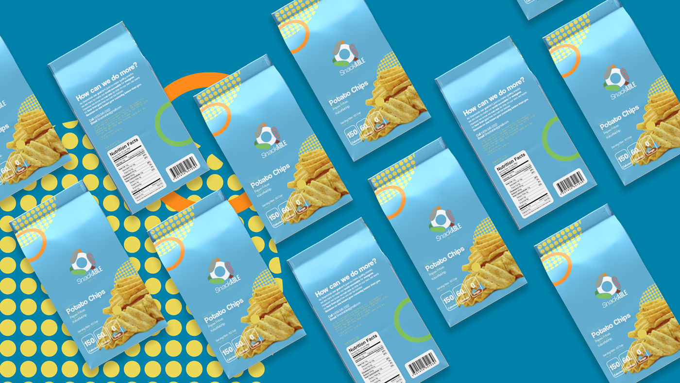
I wanted the brand to be bright and exciting. I've found a lot of my knowledge of disability over the years has come from an influencer named Molly Burke and something she has taught me as a designer is blindness does not mean lack of design. It does not mean a lack of color or fun. I also choose to give the braille in the design color, I wanted to use the forms and expand on them in the design so they are apart of the design, not an afterthought. I want even the sighted users to recognize this as something they should see more of. This lead to the use of circular forms in the designs & logo. Lastly, I choose to go for bold rainbow colors as I felt they showed a sort of fun and bold creativity. I see them as showing independence through self expression. I feel they also show diversity, that anyone is welcome regardless of color, sexuality, or anything else.


See more on my website Daniellekraus.com. This is a passion project, so it is always open to change! Feel free to contact me with any thoughts on the project.
(Contact information available on my website or linked in https://www.linkedin.com/in/daniellefkraus/)


