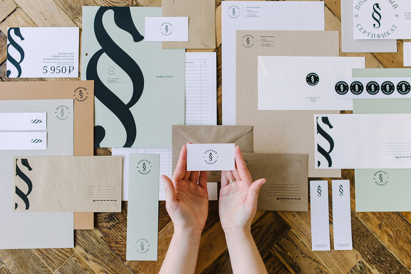
TASK: To develop a logo concept for a bookstore, which is located in Moscow - district Konkovo. To exclude all typical and popular elements that are often used in the logo development in the similar sphere. To make the logo simple and convenient to use.
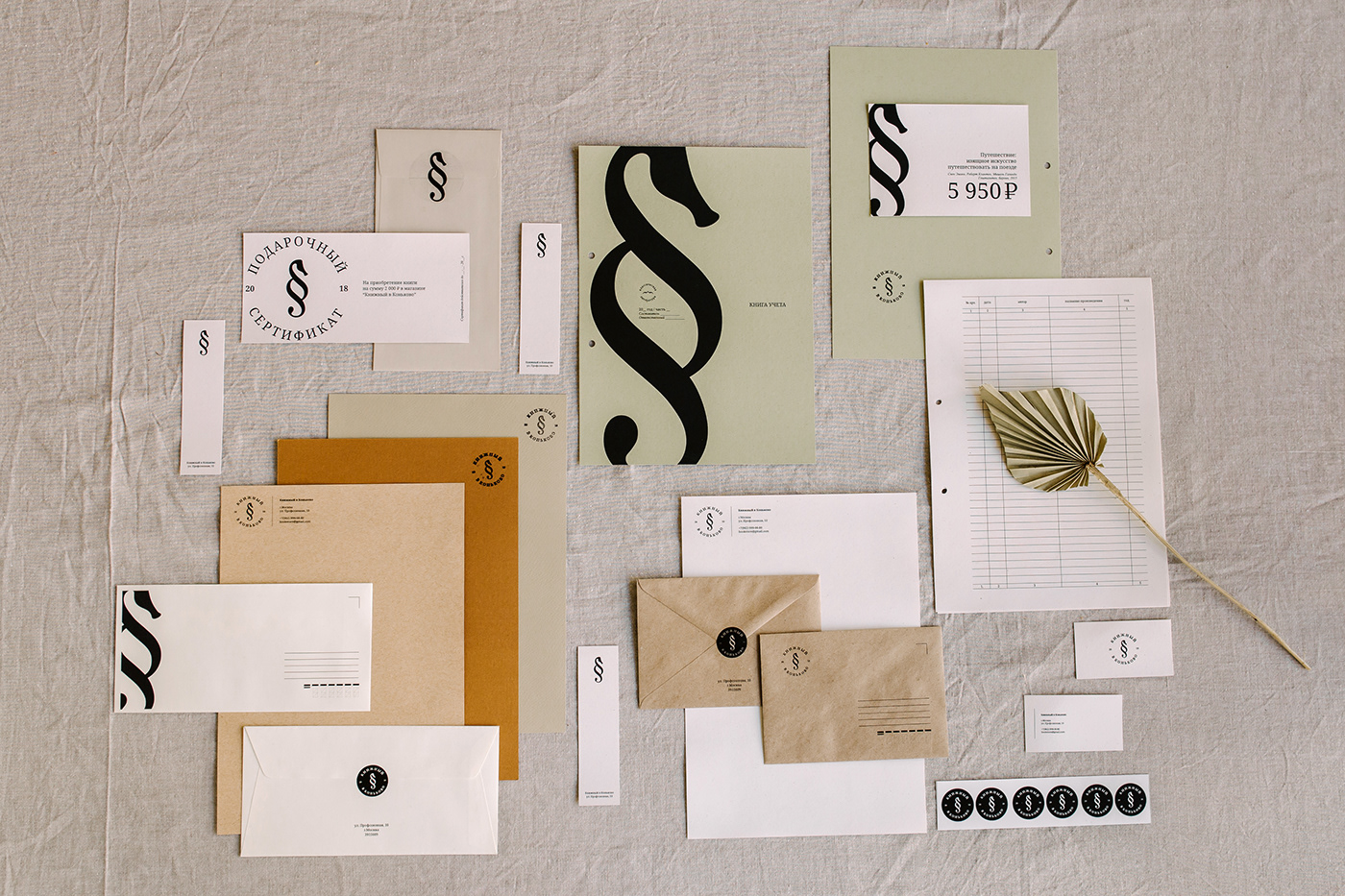
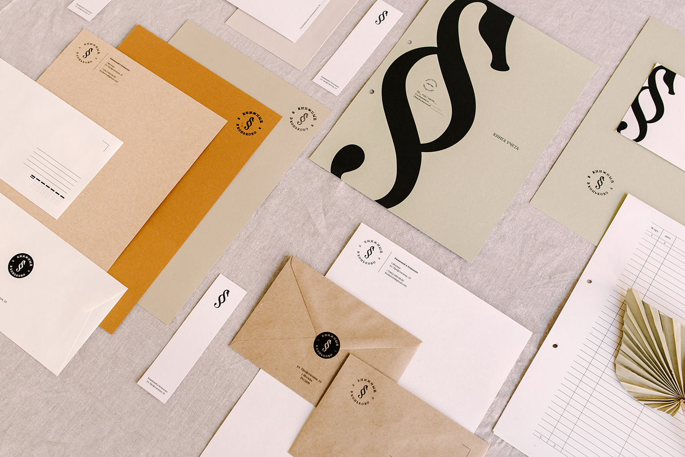
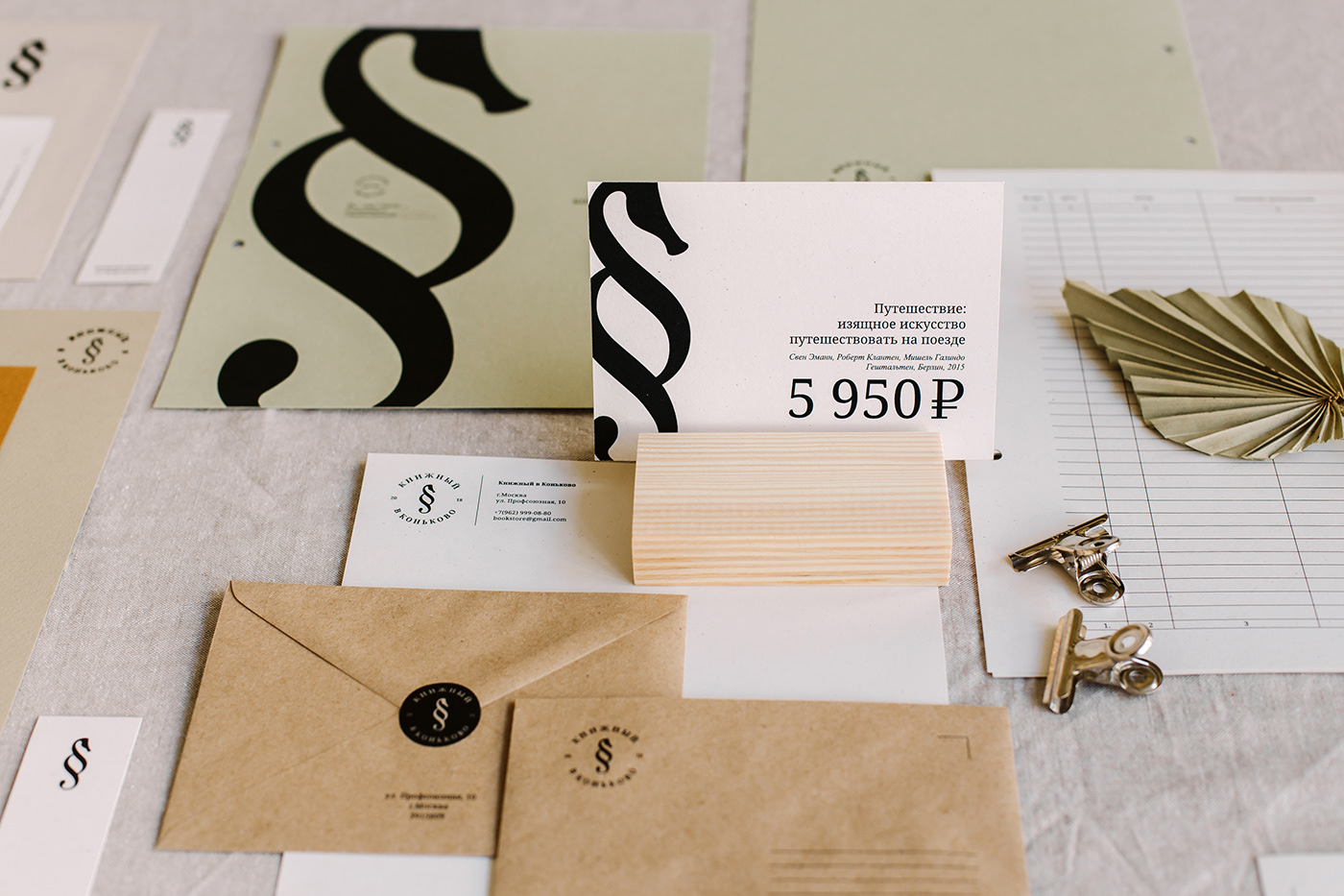
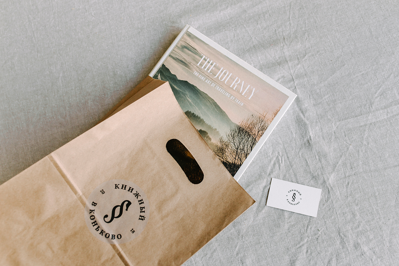
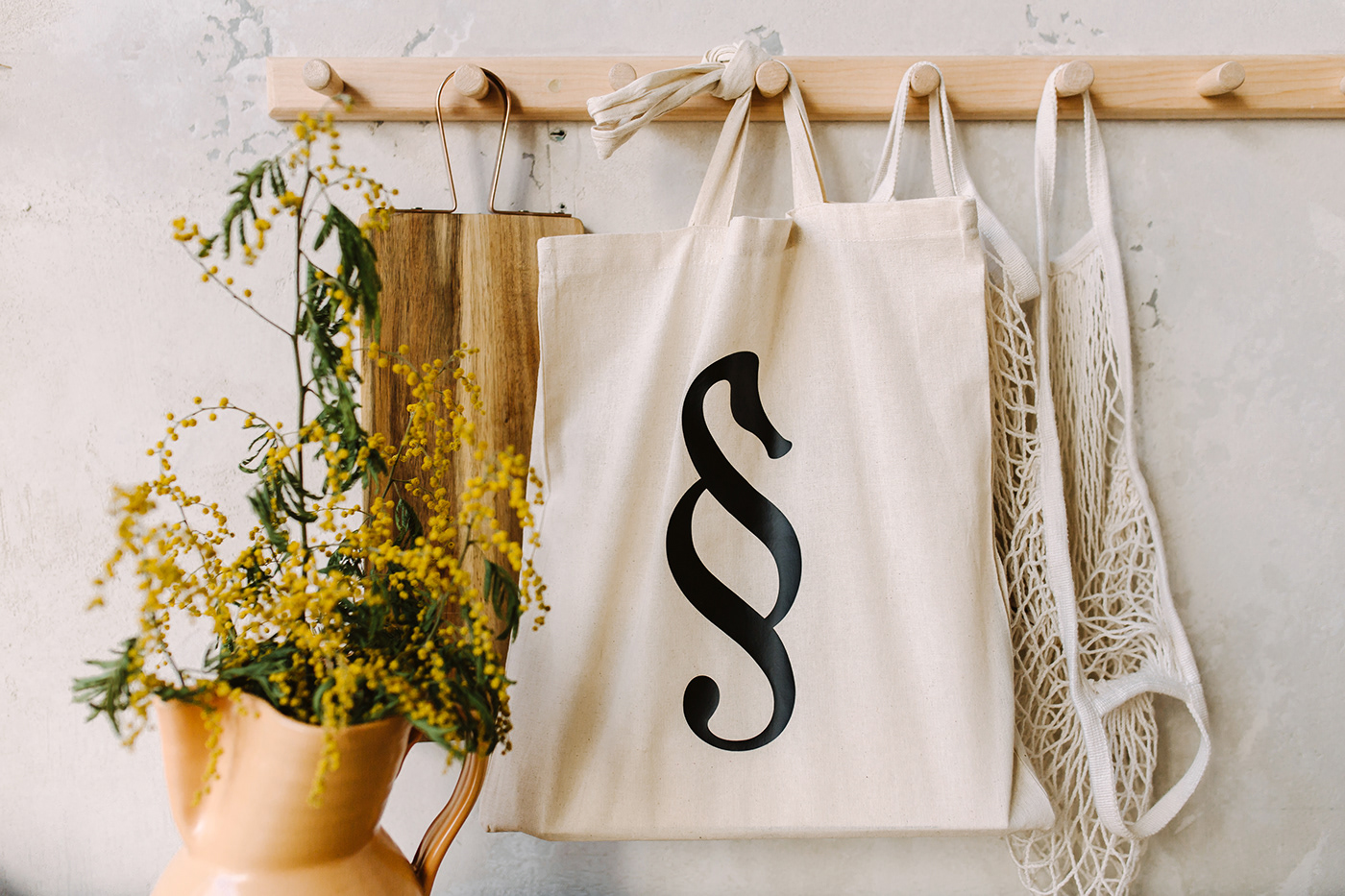
DECISION: The logo image is made with merging one of the typographic marks - a paragraph and the image of a seahorse. Why did I use precisely seahorse? If you read “Konkovo” in Russian, you might notice that the name consists of the word “horse”. That’s why I took the word as a basis, changing it to a seahorse, because in its image and plastic it looks more like a paragraph.
Photo - @polinasharai
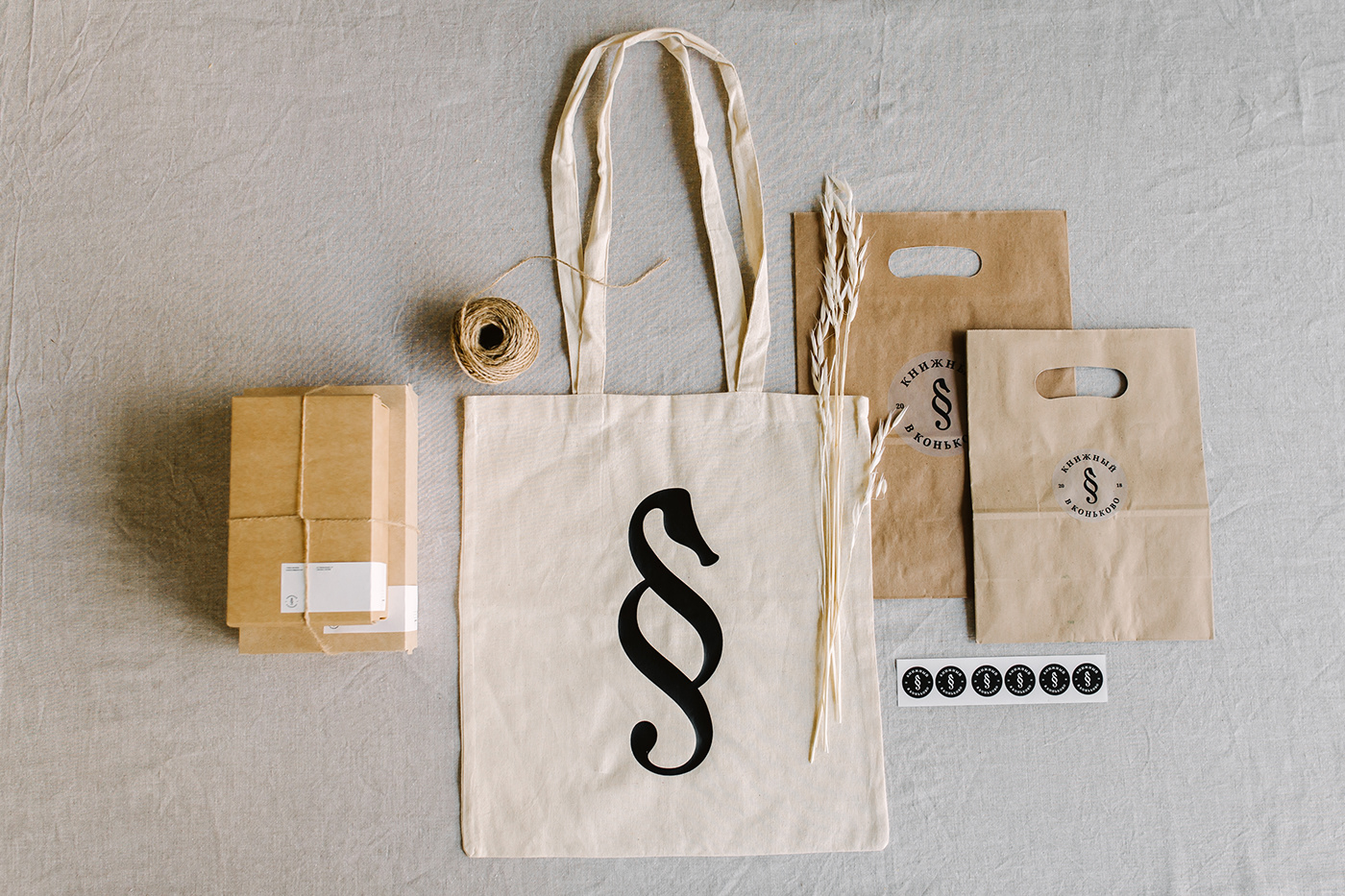