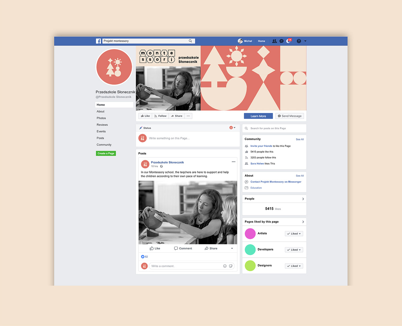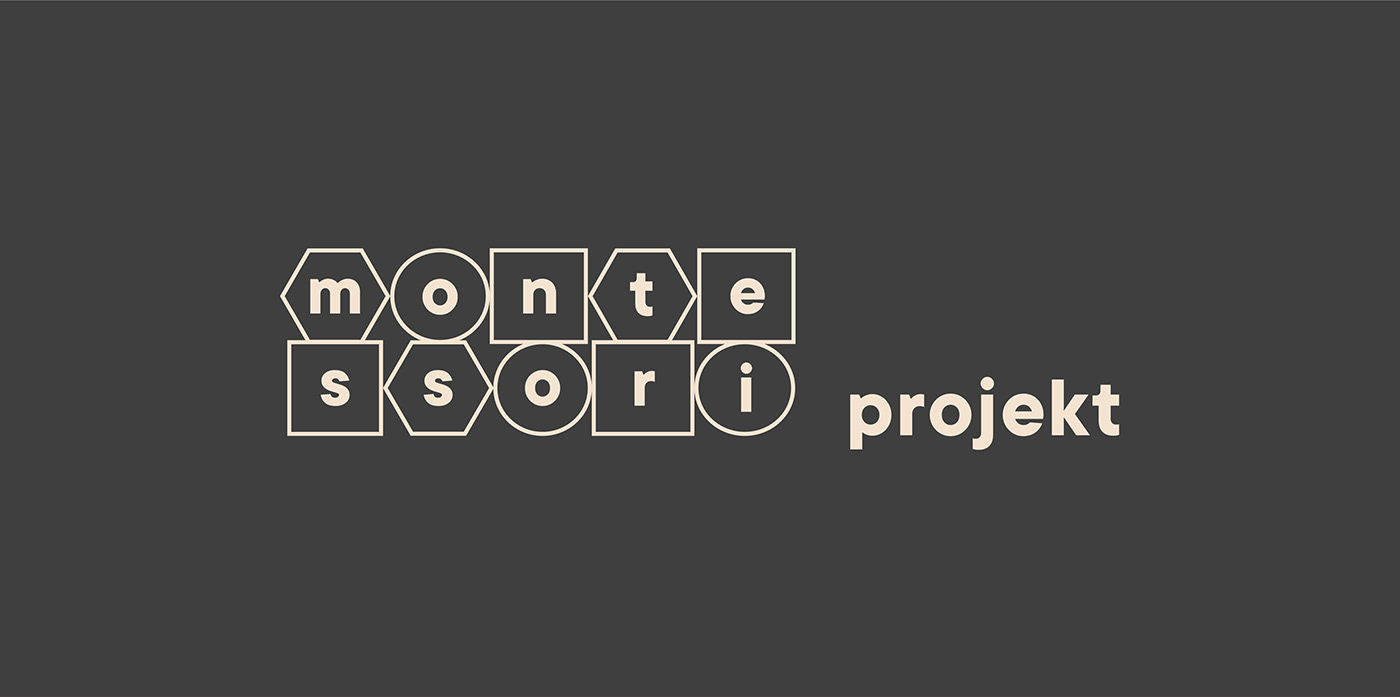
Montessori Projekt Identity
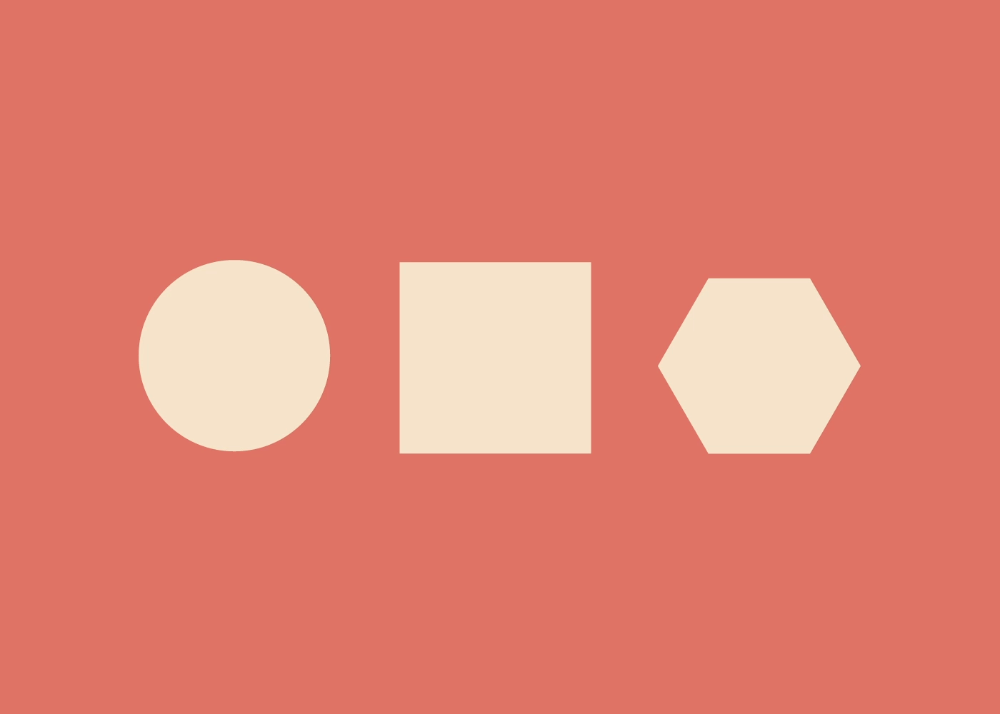
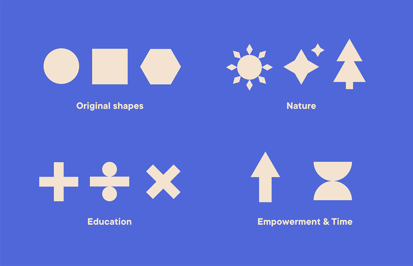
While I was working at Podpunkt, I designed an initial concept for the brand identity of Montessori Projekt, which gathers a primary school & a preschool using the Montessori method. I focused on three main shapes that you can find in the Montessori education tools: the circle, the square and the hexagon. I then deconstructed these shapes in different ones inspired by the Montessori method values: Connection with Nature, Education, Time to learn, and Empowerment.
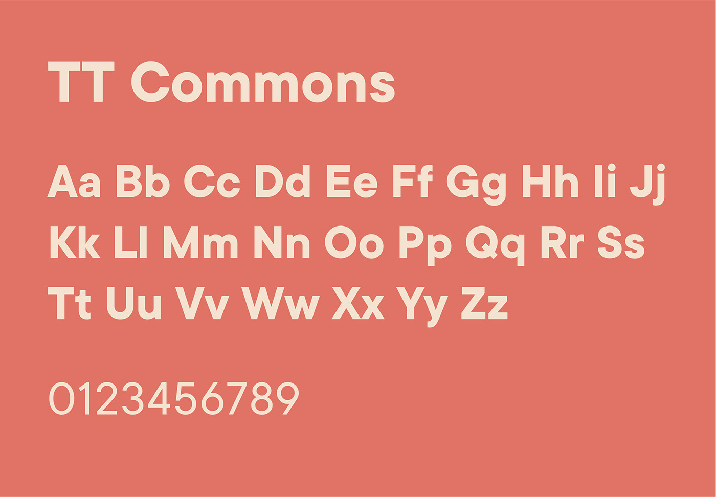
For the colour story, I opted for a cream base complemented by two bright secondary shades which reflect the fun aspect of this education method and the age range of the children. TT Commons being a rounder sans-serif font, it was fitting a project with children as well as the the institutional aspect of the schools.