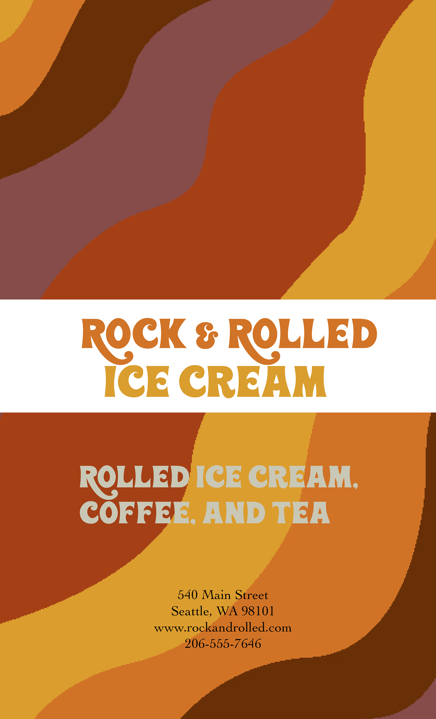
Rock and Rolled Ice Cream - Menu Design


Rock and Rolled Ice Cream takes you back to a simpler time, the Seventies, the "Me" Decade. Rock and Rolled Ice Cream catches your eye with vibrant colors and a groovy typography. You will find muted colors of red, purple, yellow, orange, and brown. Using Wonderbar, created by Dennis Ludlow. I choose this font because I believed it played into the roll of the 70s era. Rock and Rolled Ice Cream specializes in creating rolled ice cream, which is where the name of the brand stems from, rolled ice cream. Rock and Rolled Ice Cream is the fun and bright ice cream shop everyone needs near them.
Style Guide

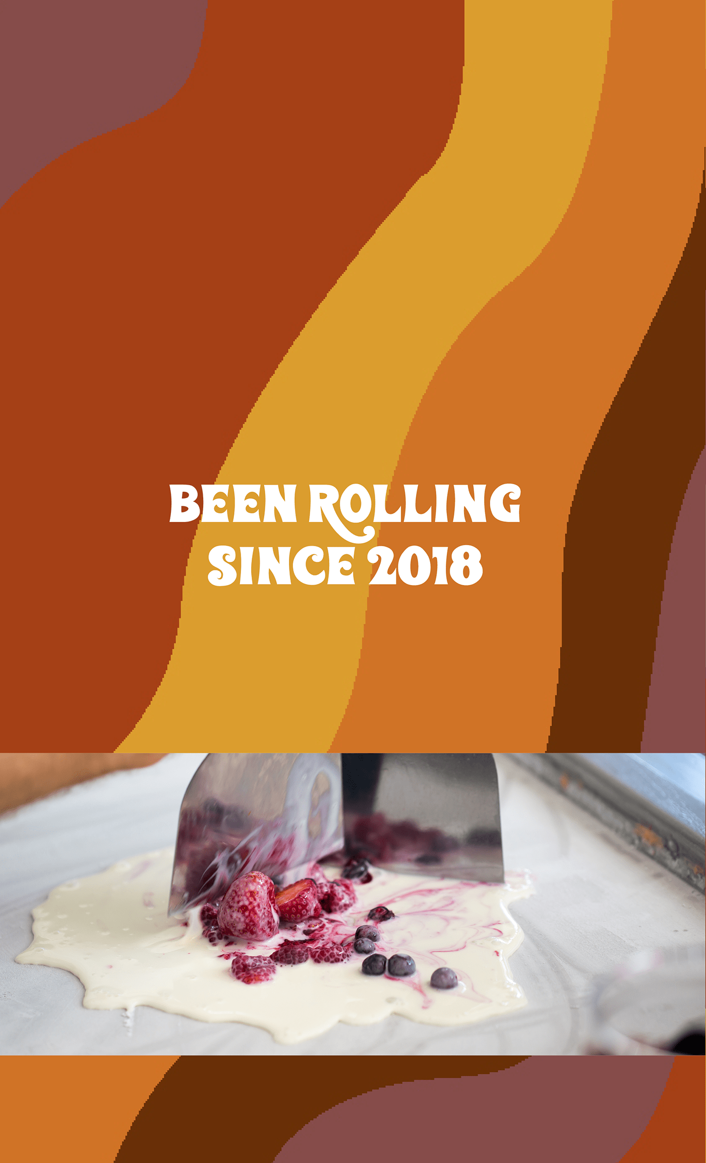
Another thing the 70s were known for was the legendary rock and roll that came from the 70s. Which is where the name stems from, that and rolled ice cream. Also known as Thai stir-fry ice cream, this south-asian fun and creative way of making ice cream is as simple as it sounds, rolled cream that turns into ice cream.
Menu Brochure


Product Design
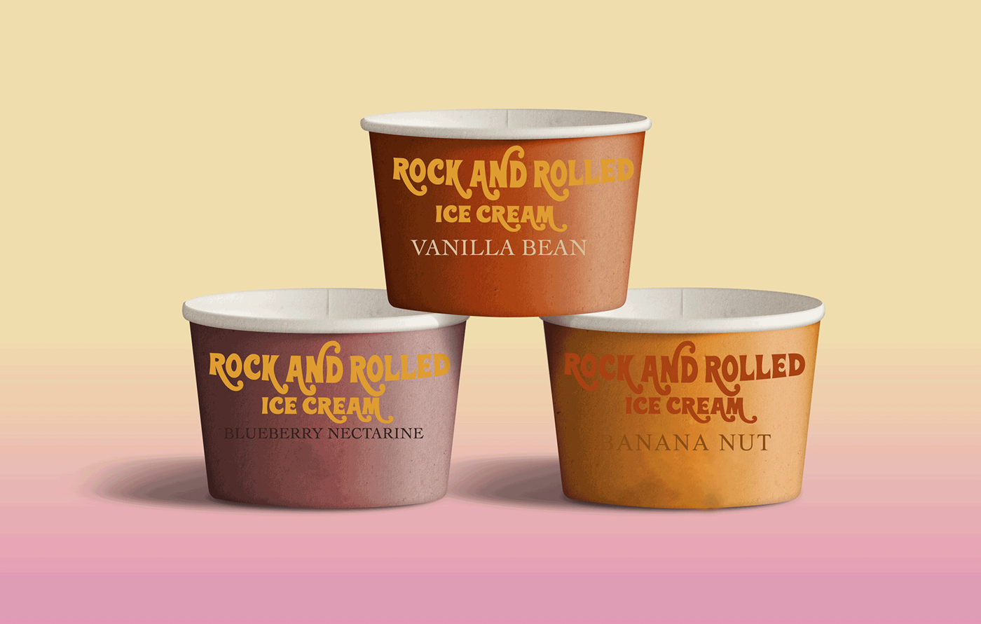
The product design for Rock and Rolled Ice Cream is your typical promotional coffee cups as well as pints of ice cream. Which includes flavored inspired ice cream. All items are consistent with the color scheme and the typography which can be seen more in the style guide.


The design concept behind the fun organic lines is the fun 70s. The 70s were all about muted and warm colors, along with chunky, for example platforms and chunky heels.