Kitchen App Design
One night while looking for something interesting in my recipe app to make on short notice, I became frustrated. I needed to make something now, and I had no idea what was in my pantry and hence what recipes I could make without a trip to the store.
My app had a pantry section for everything I had in my cupboards, but it was never up to date because I wasn't constantly pruning it -- so I certainly couldn't rely on it.
I was also looking at a set list of recipes which I had put in the app. I loved this bit, but that night I wanted something a little different.
To correlate any recipes (new or existing) with ingredients I had on hand was not going to happen without an hour of digging on the web and in my cupboards. A trip to the store it was.
The next day I did some research on other apps that offered the full functionality that I was looking for, but none of them really fit the bill.
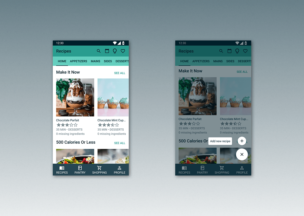
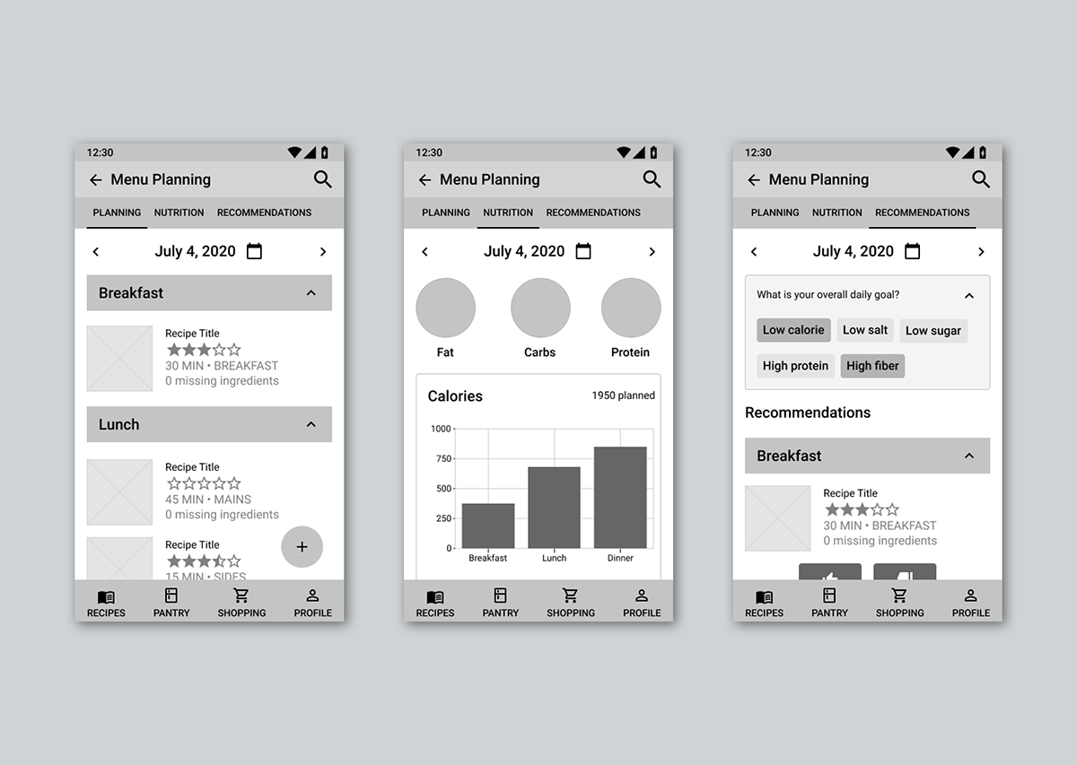
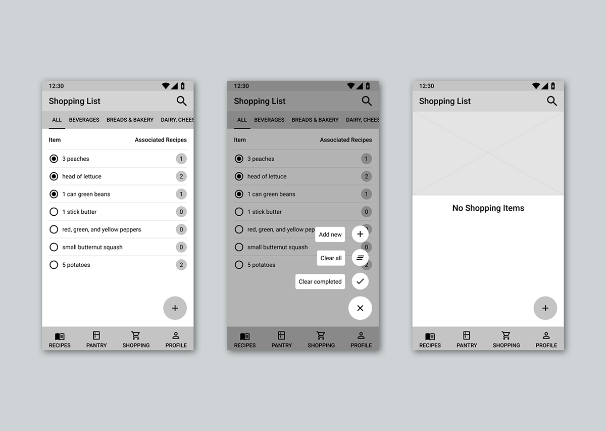
From this was born the idea of my Kitchen App. It had to have a section for recipes - which is the primary focus - a section for new recipe ideas that are pulled from my favorite recipe sites, a section for meal planning, a section for what's in my pantry, and a shopping list feature. What makes my app different is how all of these sections function together.
The basic functionality that I came up with started with the essential premise that the recipes section and the pantry section must have a tight integration.
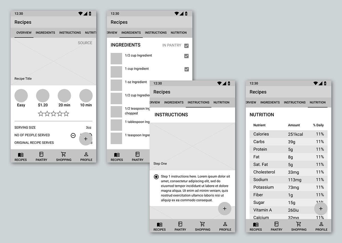
• When a recipe is made the appropriate amount of ingredients are pulled from the pantry so you can keep a tight accounting of what’s available
• Recipes should have a list that shows how many/which ingredients in your pantry are and are not available so if you want to make something now you can easily choose something
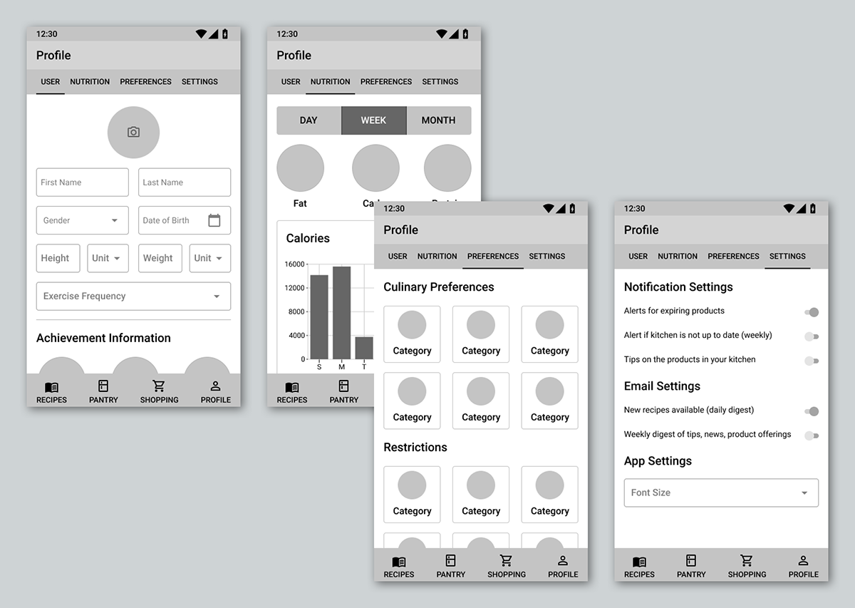
• Every recipe should have nutrition information specifically pulled from the items in your pantry that you will be using, rather than just generic information, which will enable the user to more tightly control elements that they are interested in (calories, salt, sugar, fat, etc.)
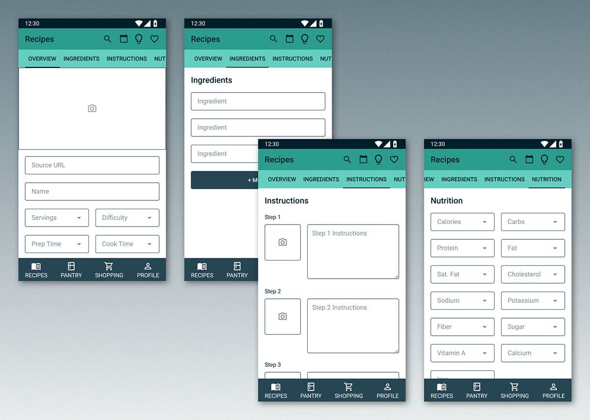
• The pantry section must enable the user to scan a barcode, look up an item, or select from a list of previously added items so the user doesn’t have to “guesstimate” very much (if at all)
• Recipes should have a list that shows how many/which ingredients in your pantry are and are not available so if you want to make something now you can easily choose something
• Every recipe should have nutrition information specifically pulled from the items in your pantry that you will be using, rather than just generic information, which will enable the user to more tightly control elements that they are interested in (calories, salt, sugar, fat, etc.)
• The pantry section must enable the user to scan a barcode, look up an item, or select from a list of previously added items so the user doesn’t have to “guesstimate” very much (if at all)
Because this was going to be mostly used in the kitchen I wanted to start with a mobile first design. I also wanted the design to be fairly simple to let the recipes shine, so I decided to use Material Design.
I first completed the wireframes, then moved to the UI.

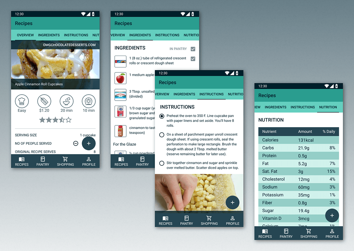


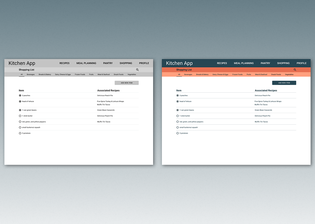
Once the mobile version of the site was fleshed out I decided to create the desktop version for each of the main section's landing pages.


And there you have it! There are plenty of other screens that can be built out to help describe functionality but these give a good idea of how the app works.


