LOUVEN BRANDING
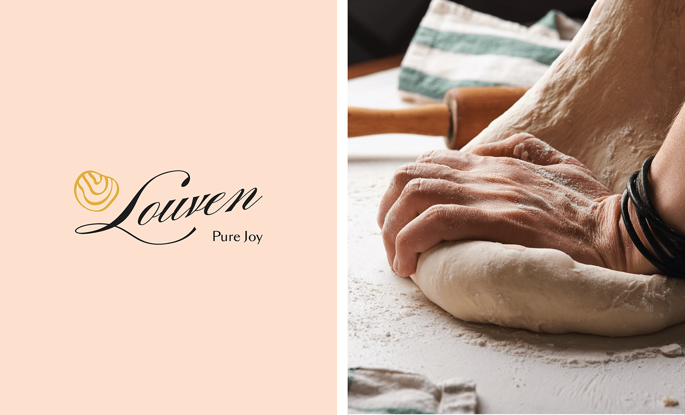
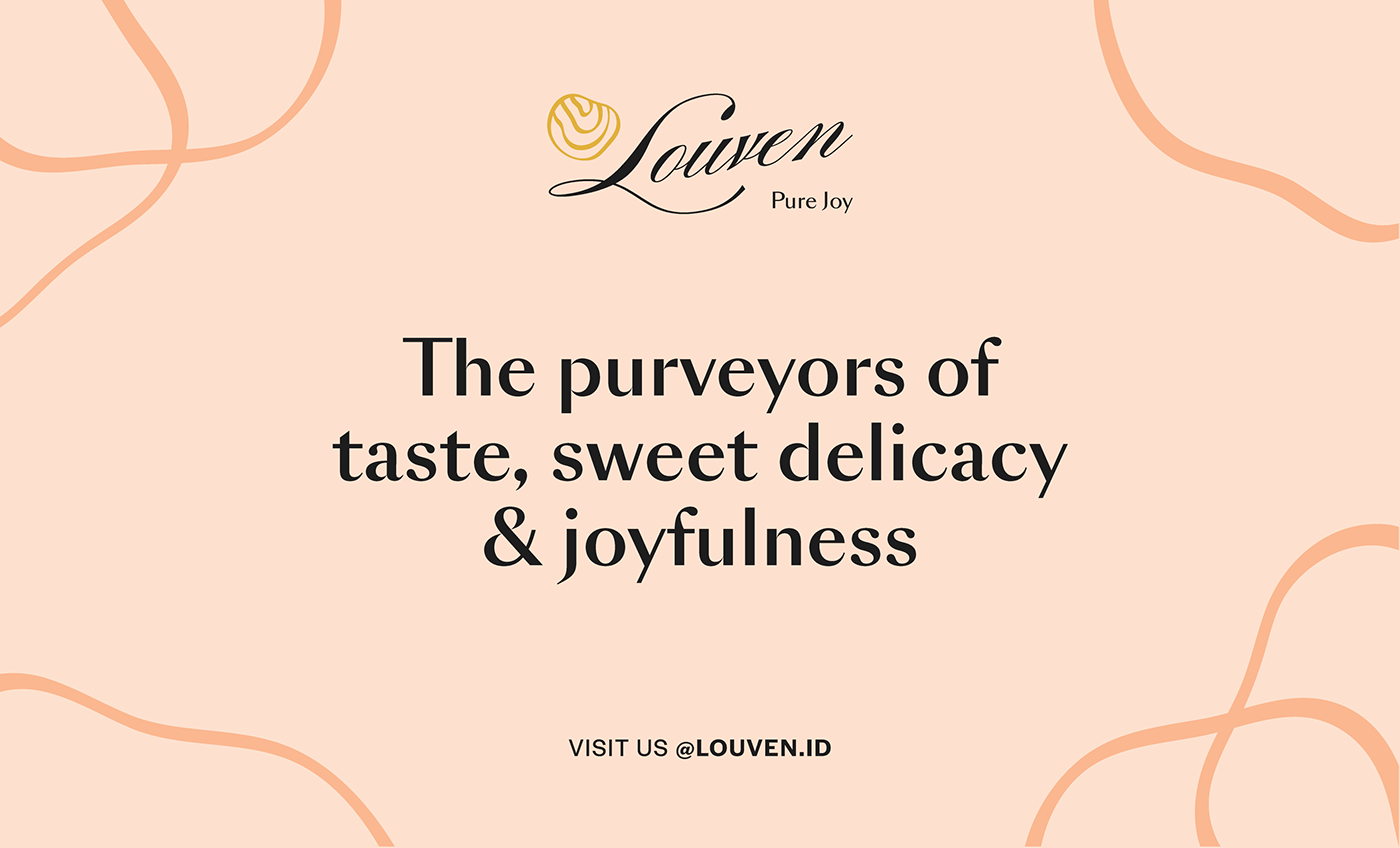
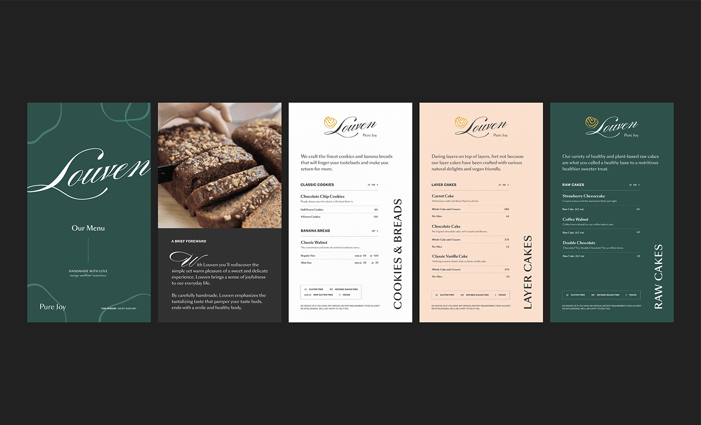
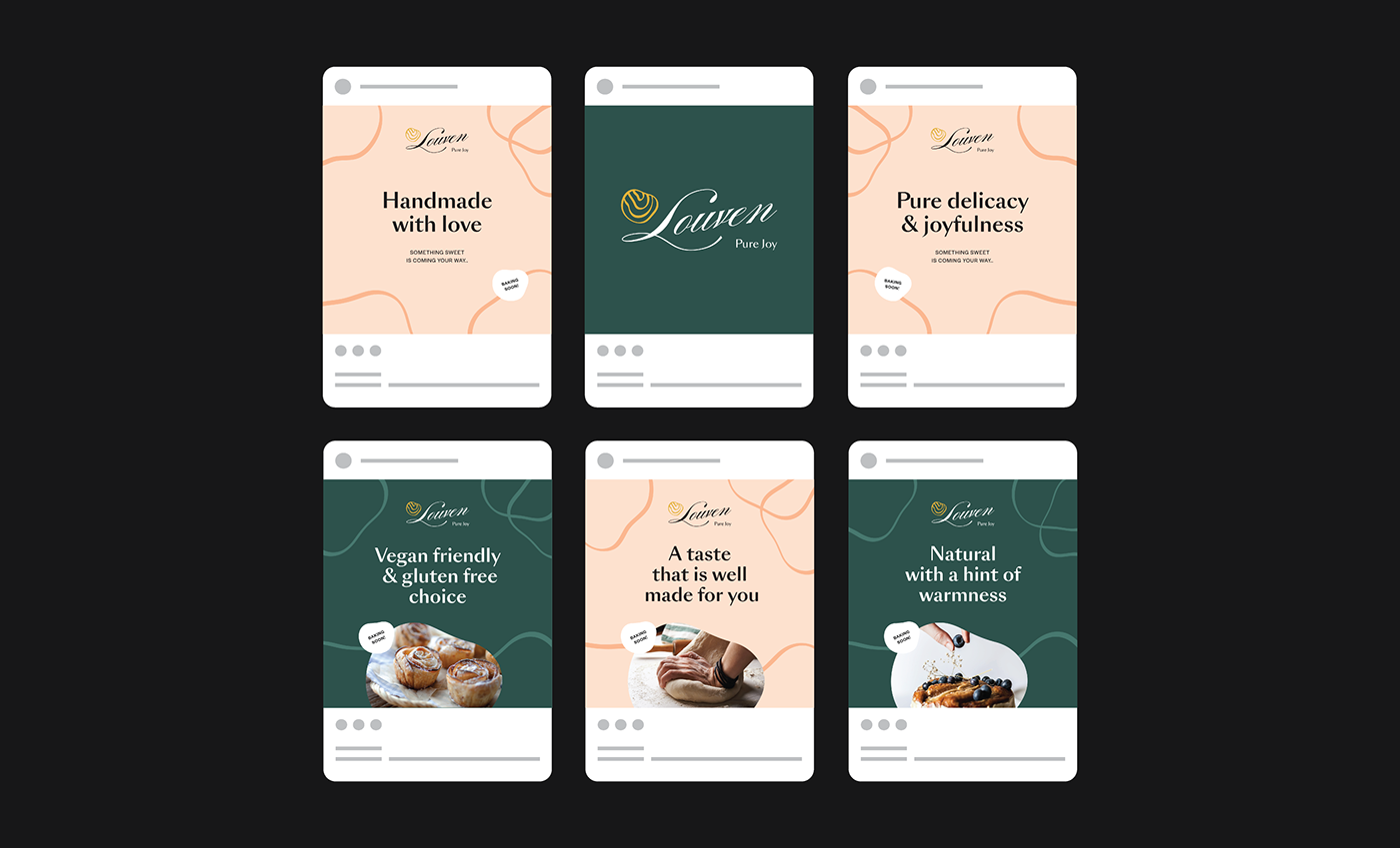
Louven is a pastry business that offers a variety of delicious cakes that are safe for anyone to consume, including those with diabetes. With the philosophy ‘love from the oven’, By learning healthy ingredients and recipes that are built with passion and love, Louven presents a variety of cakes that can sweeten the days of each connoisseur.
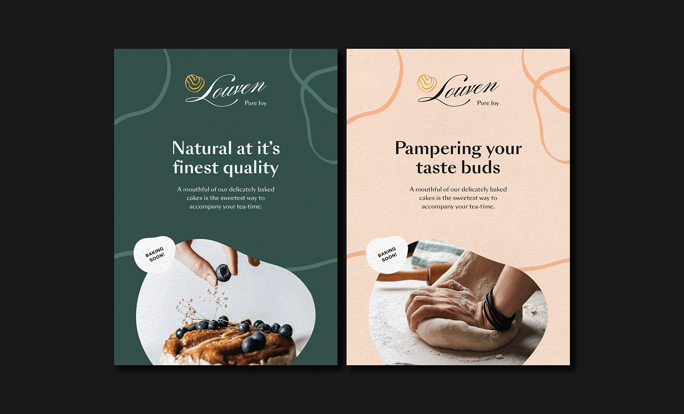
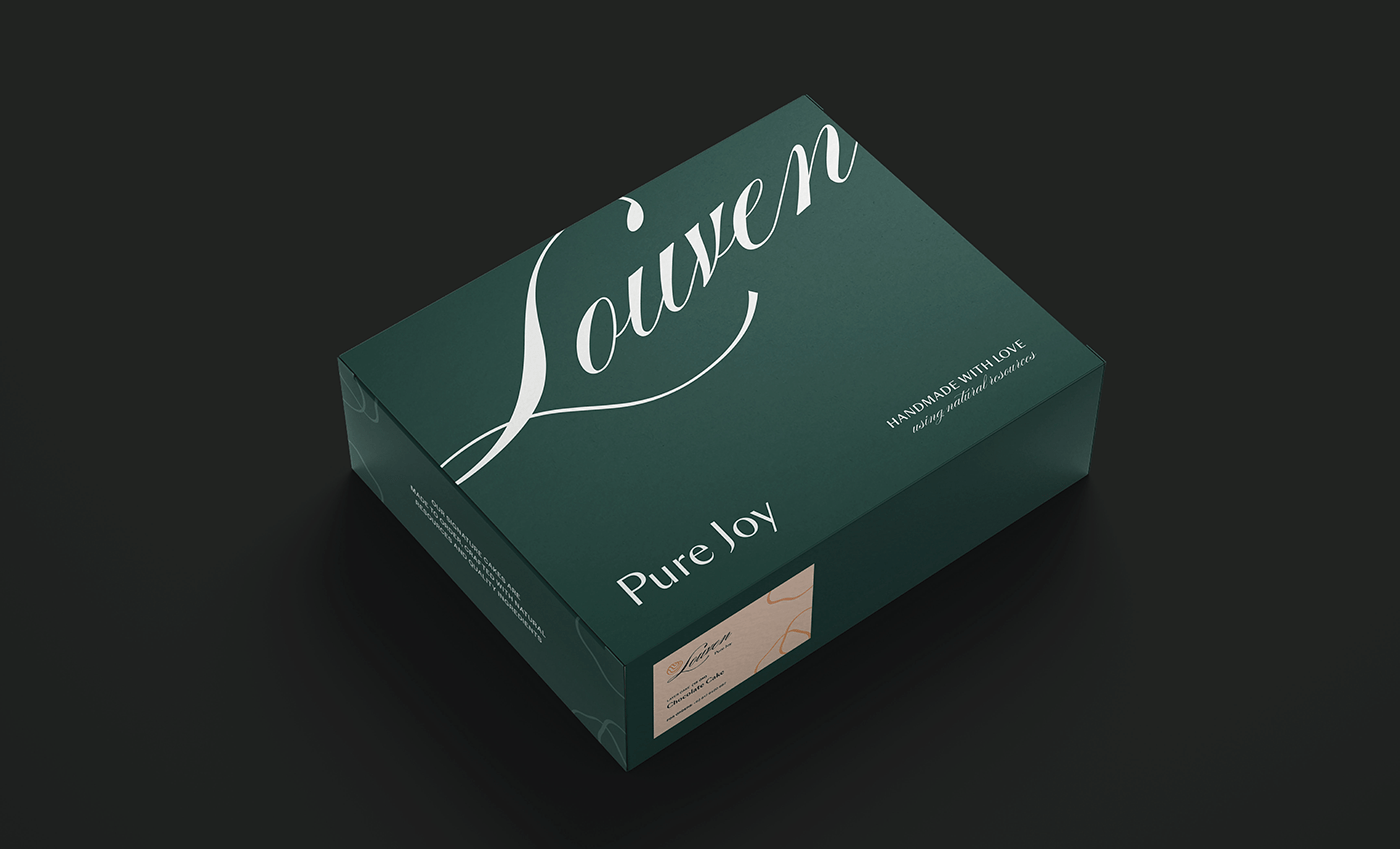
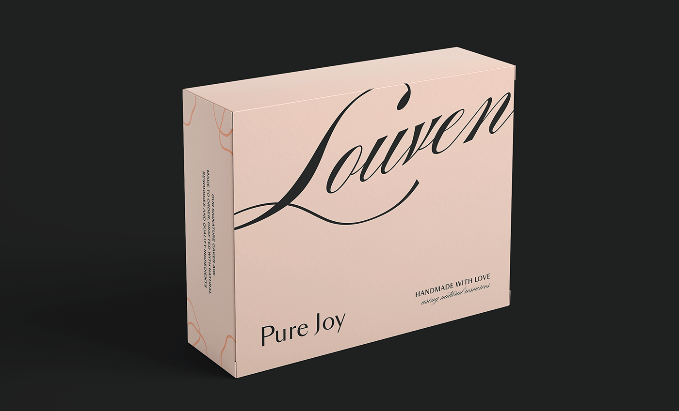
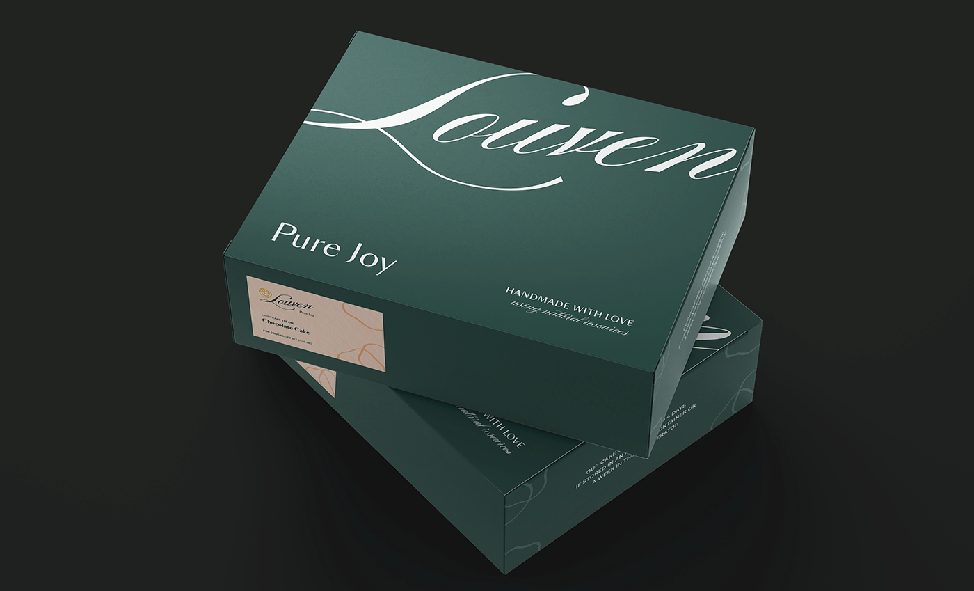
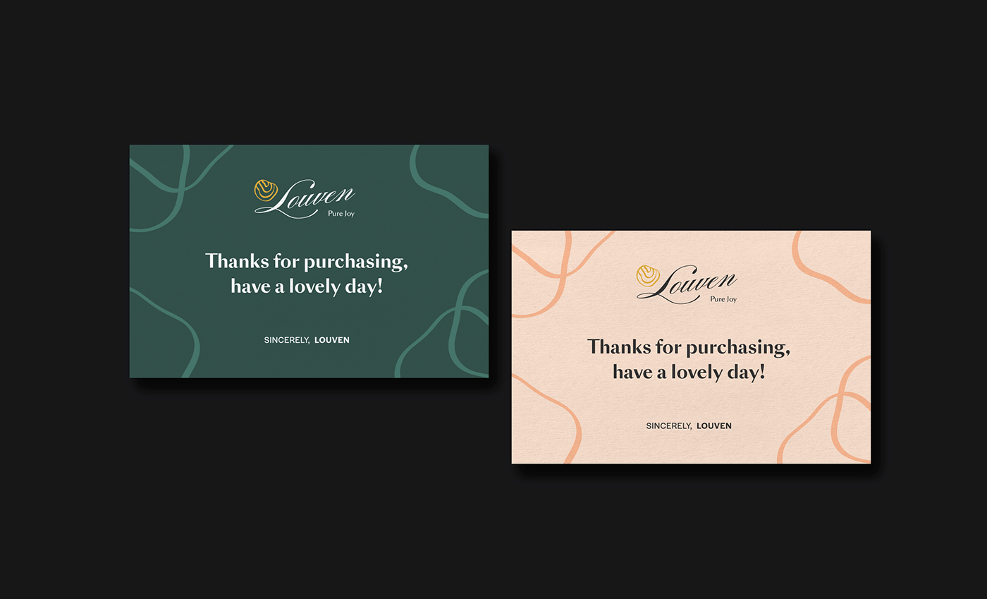
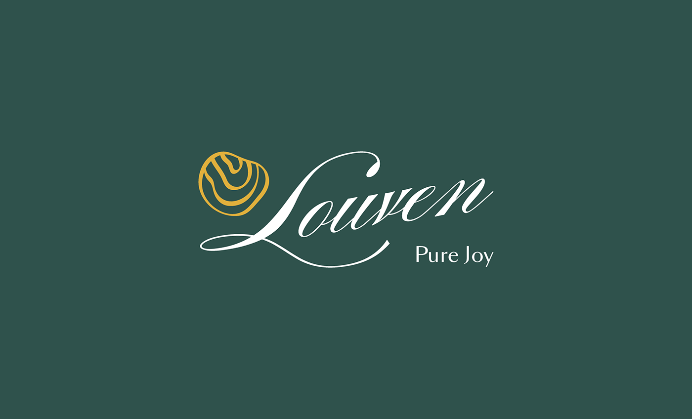
For the branding, We've researched several cake dough processes and found a connecting thread that we decided to apply to the identity. The research shows that there are specific dough patterns that can be taken notice when processing the dough itself. This pattern brings us to the design of Louven’s organic logogram.
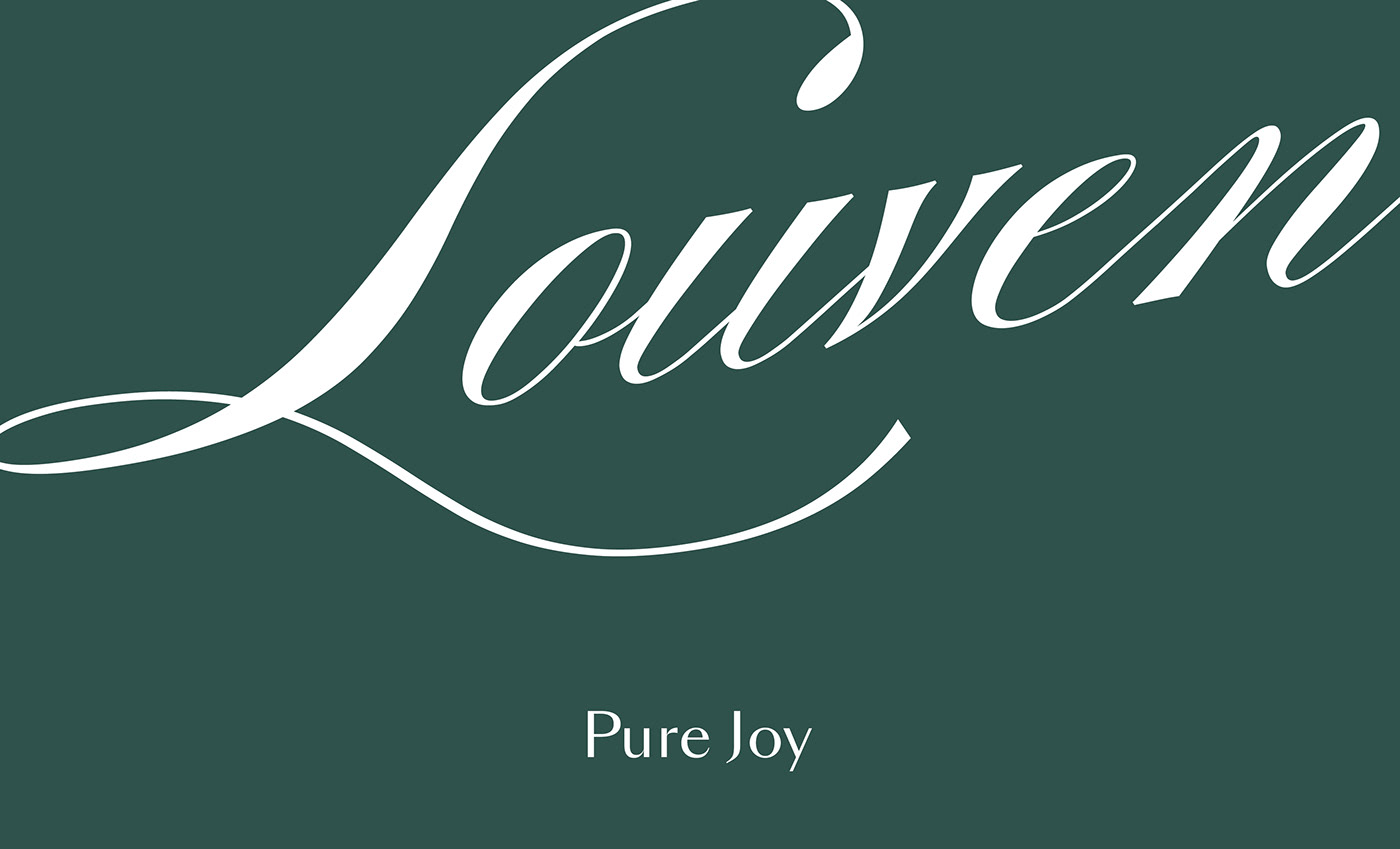
The logogram is then paired with a sleek handwriting custom typeface that adds an elegant and luxurious impression to the brand. If looked closely, the letter ‘L’ of the logo word-mark is custom treated to represent a heart symbol which metaphorically pays respect to the brand’s philosophy. Louven's overall tone of voice plays with simplicity and elegance that symbolises Louven's identity as a quality pastry brand.