
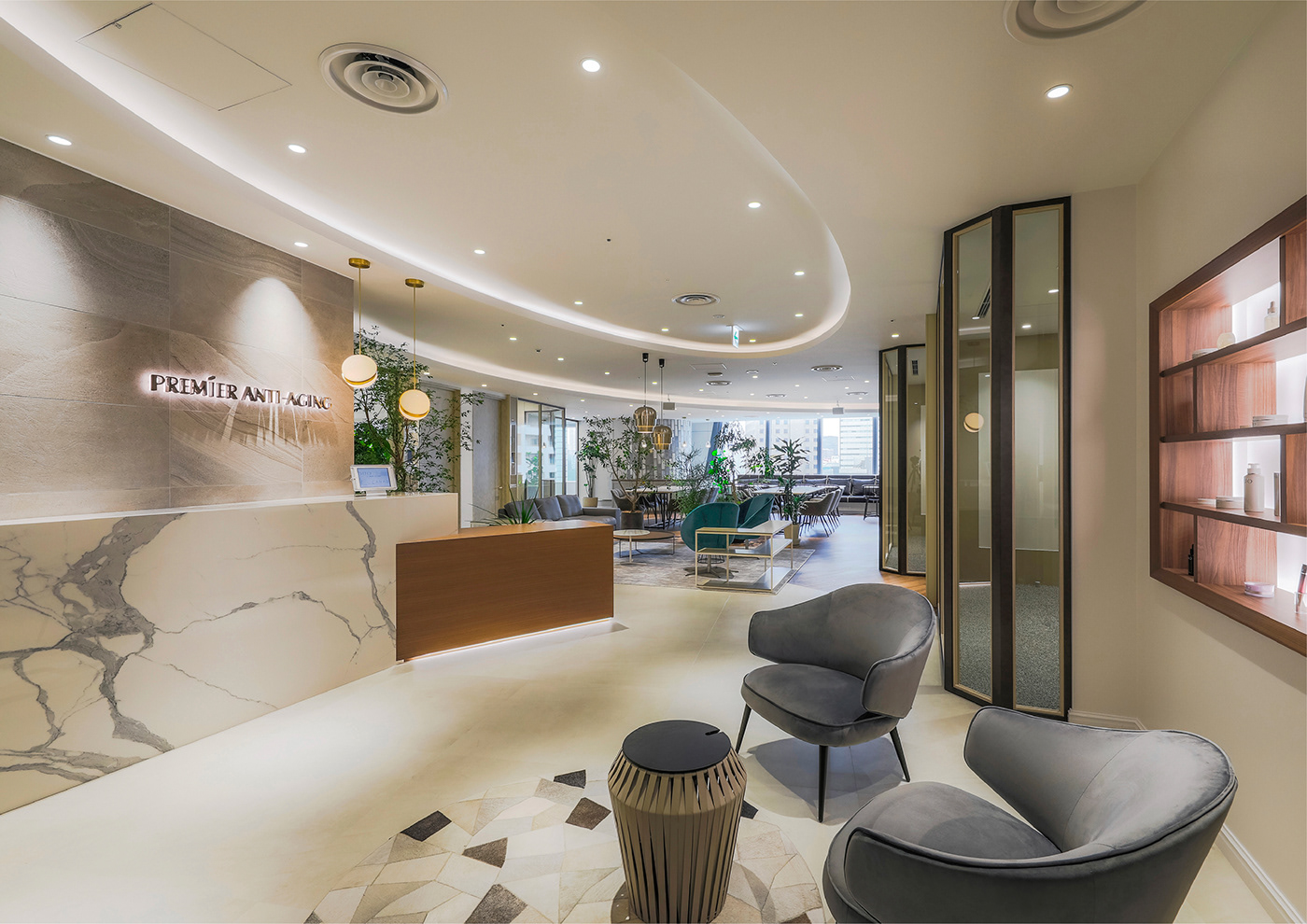
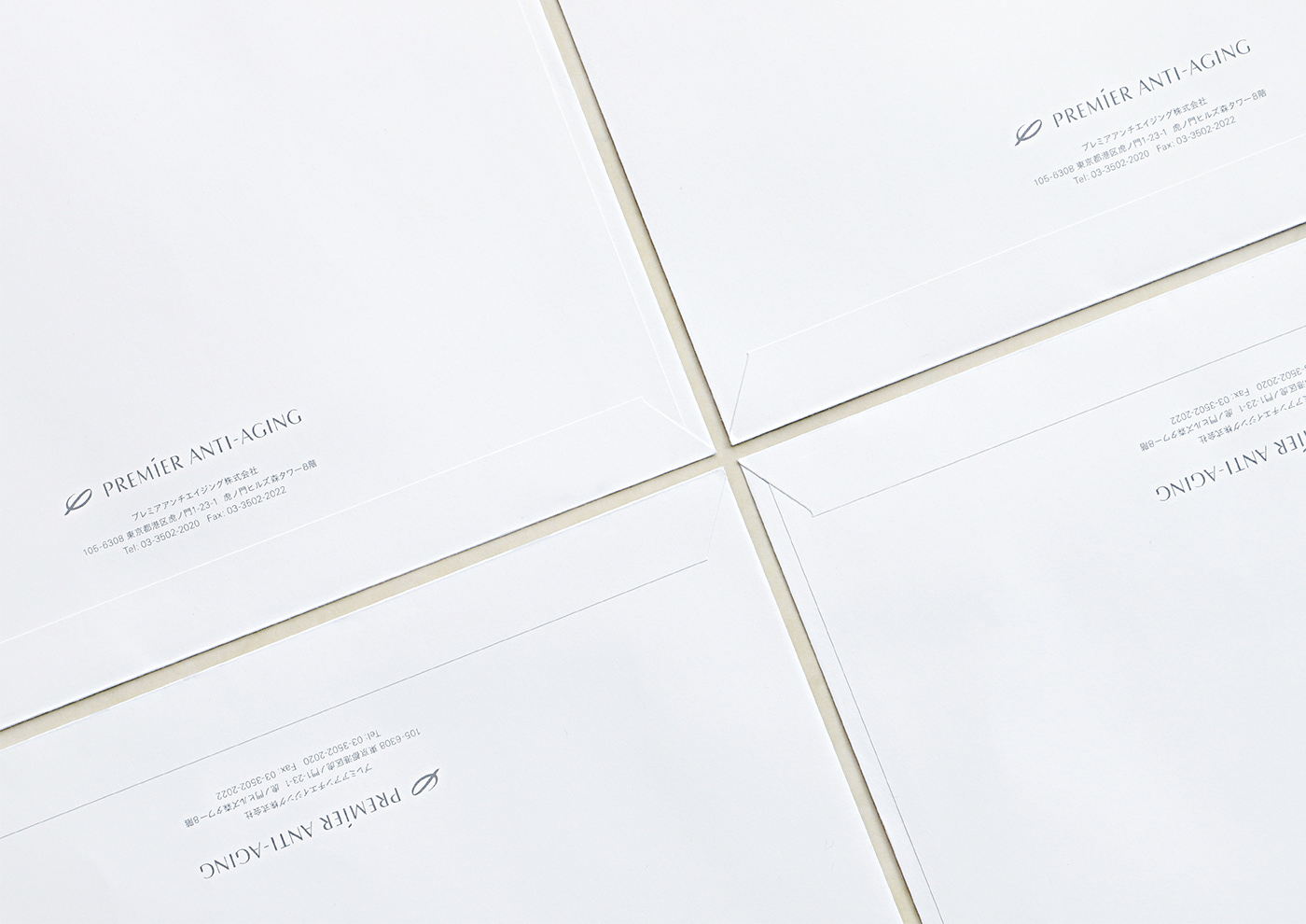
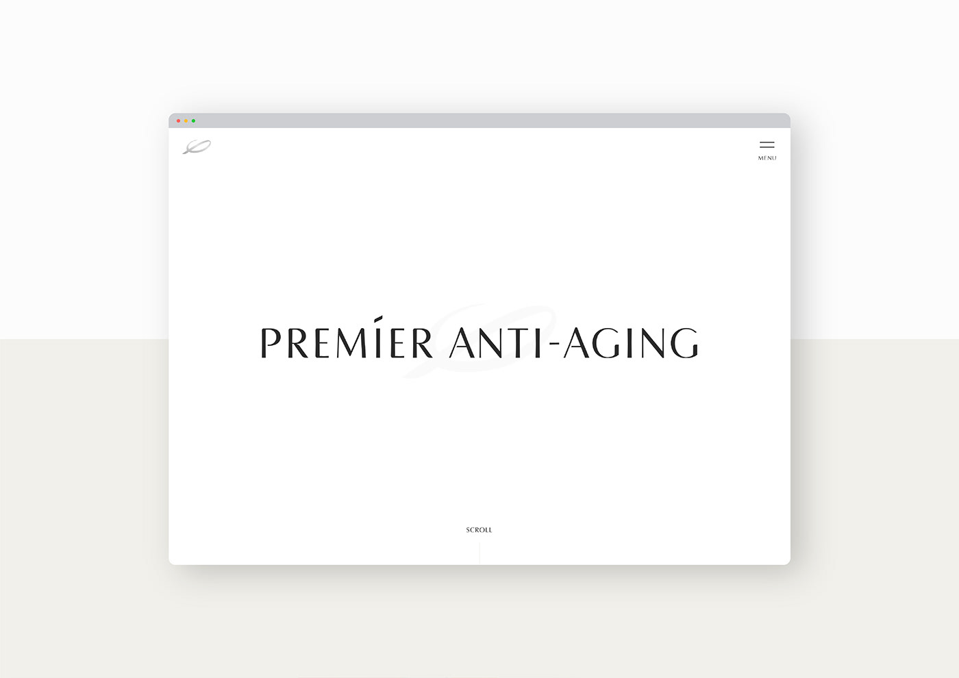
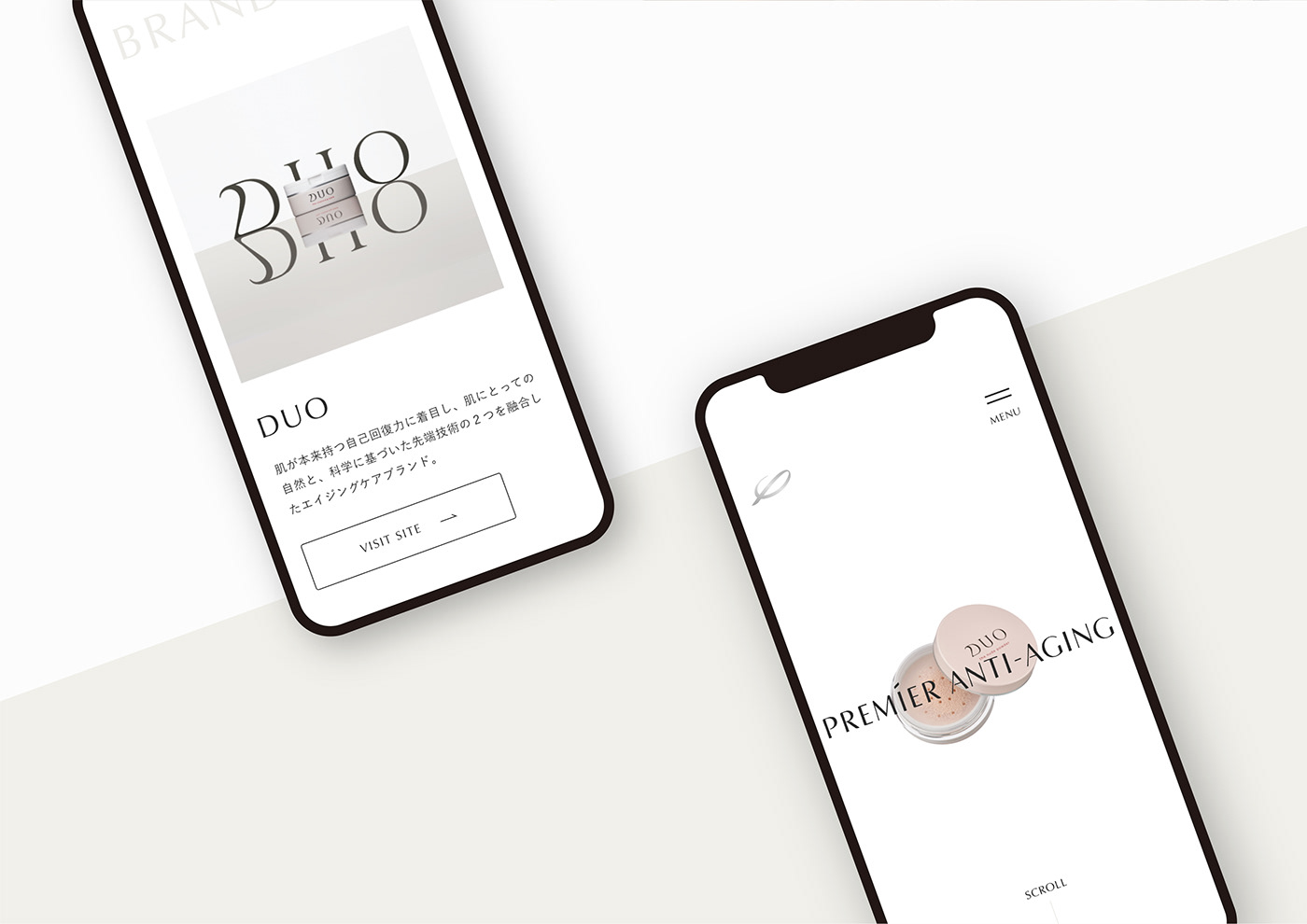
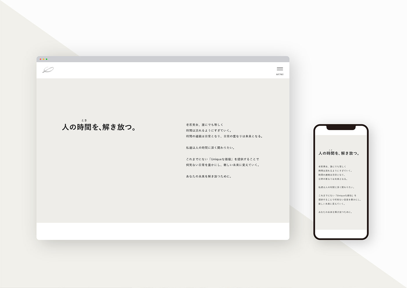
プレミアアンチエイジング株式会社は創業以来、「誰もが自身の可能性へ挑戦できる社会」を目指し、アンチエイジングの考え方を軸とした商品やサービスを提供している総合企業です。 我々はまずヒアリングを重ね、会社の根幹となる企業理念「人の時間(とき)を、解き放つ」を策定いたしました。 その後、ロゴや会社ツール、ウェブサイト制作などのCIを担当し、目に見える全てのツールにおいて企業理念を体現しております。
Since its foundation, PREMIER ANTI-AGING has established itself as a comprehensive company providing products and services centred on the idea of anti-ageing, in order to create a society in which anyone can challenge their own potential.
We created the corporate philosophy based on consumer insights to form a strong company foundation, and then incorporated that philosophy into our corporate identity which includes logo, company tools and website.

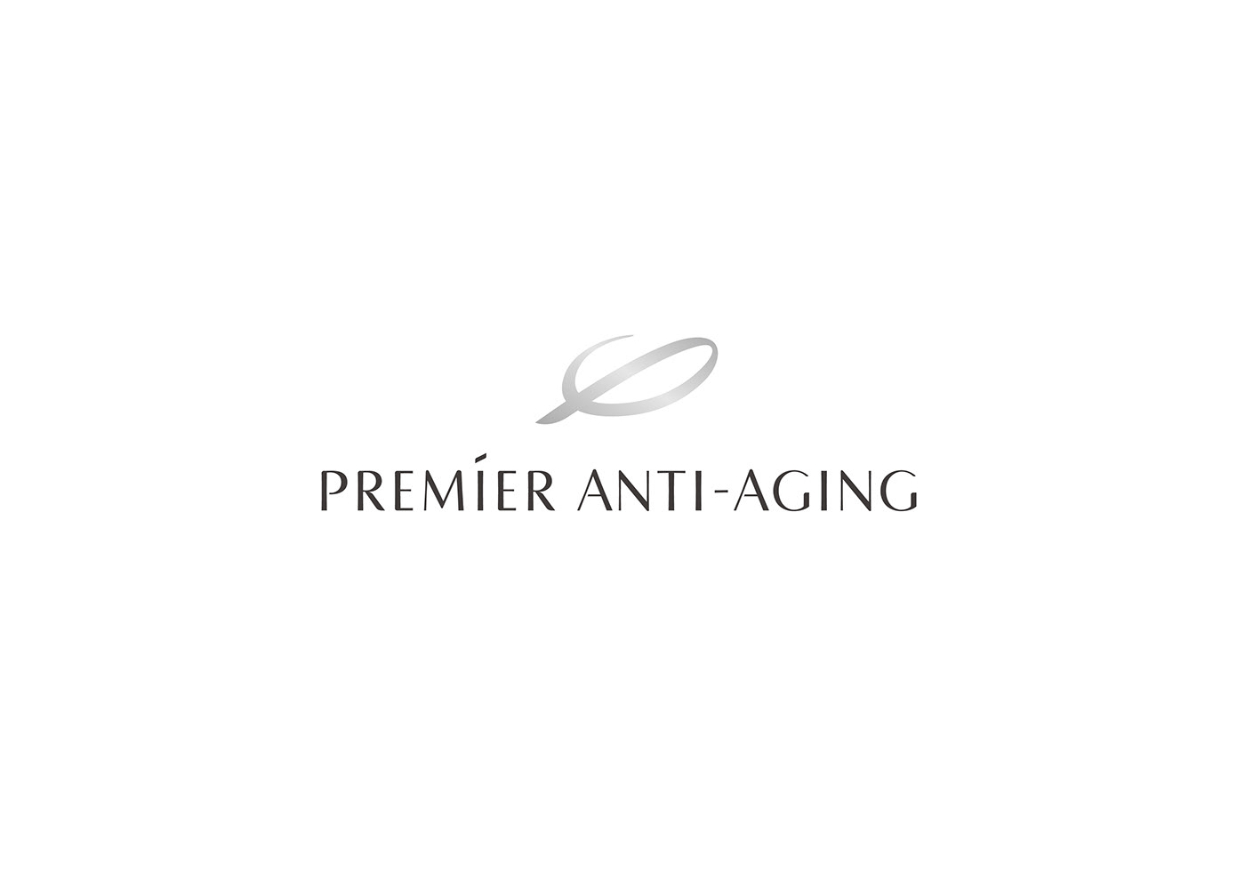
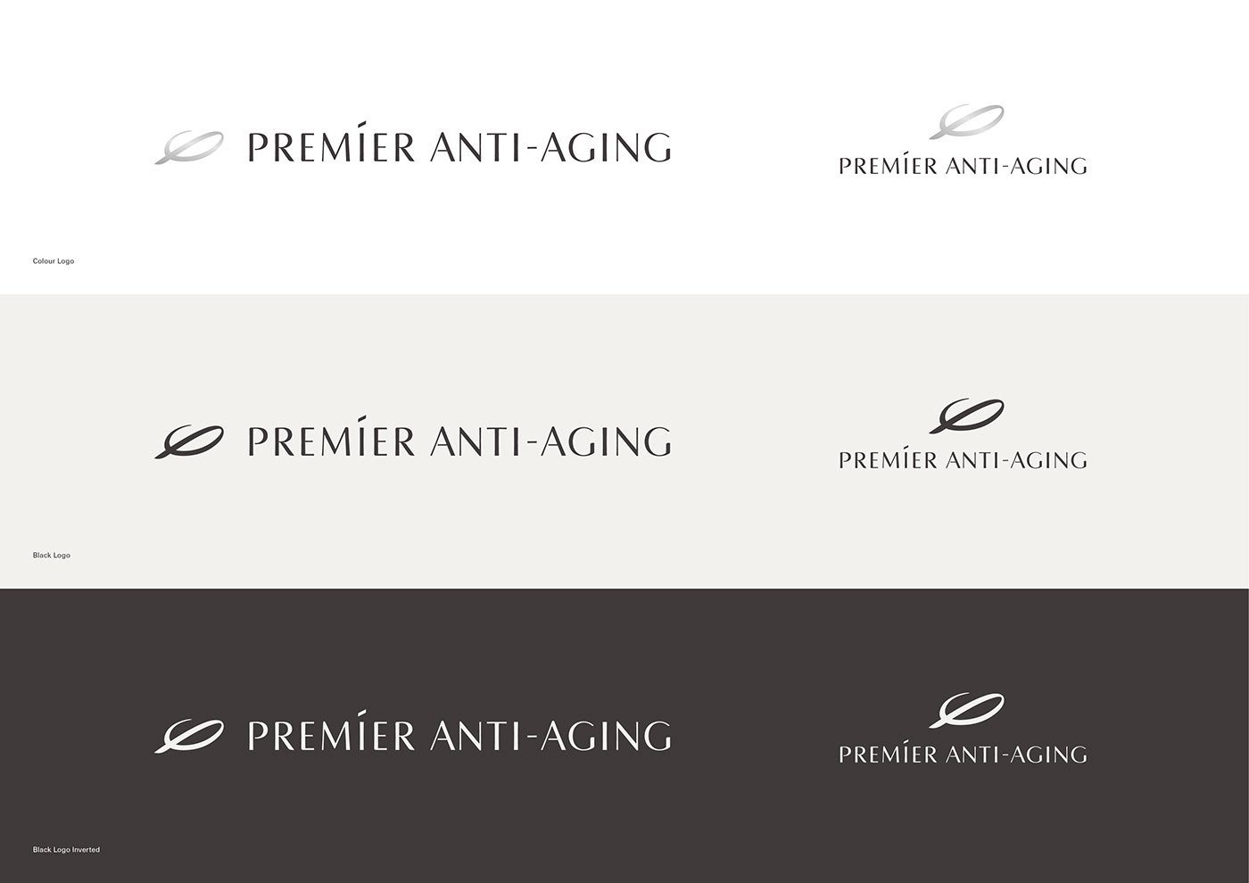
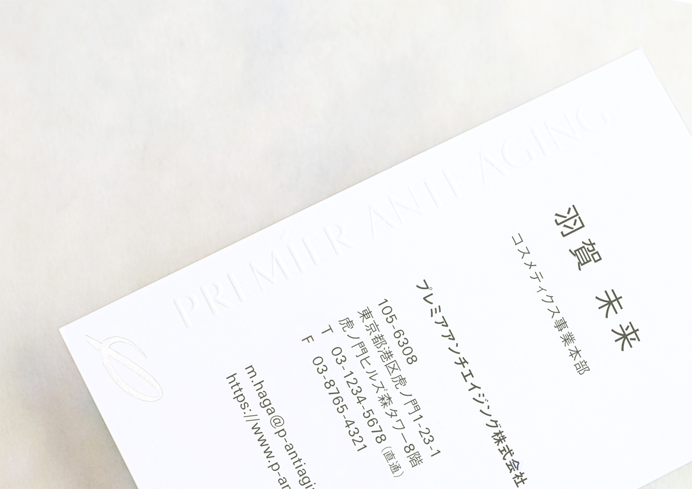
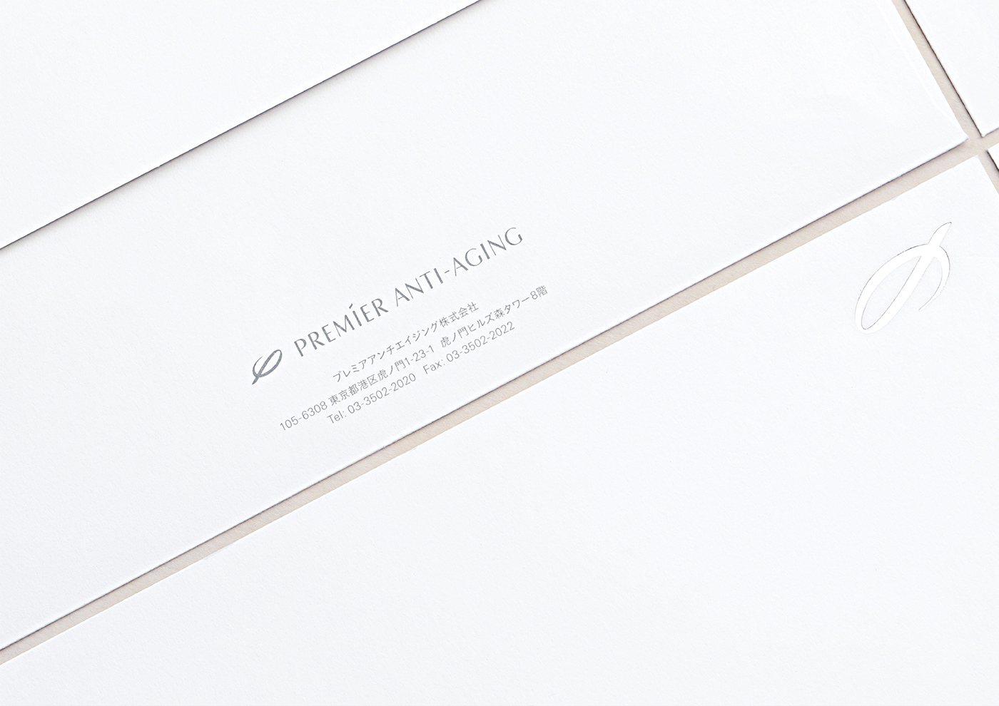
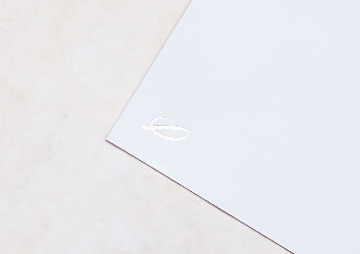
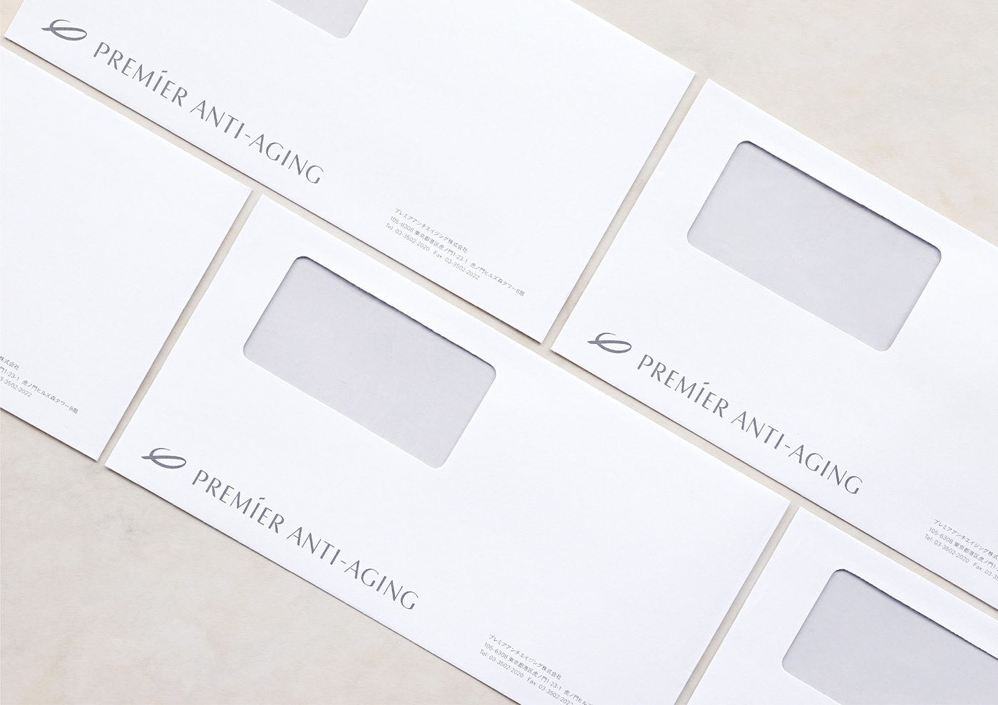
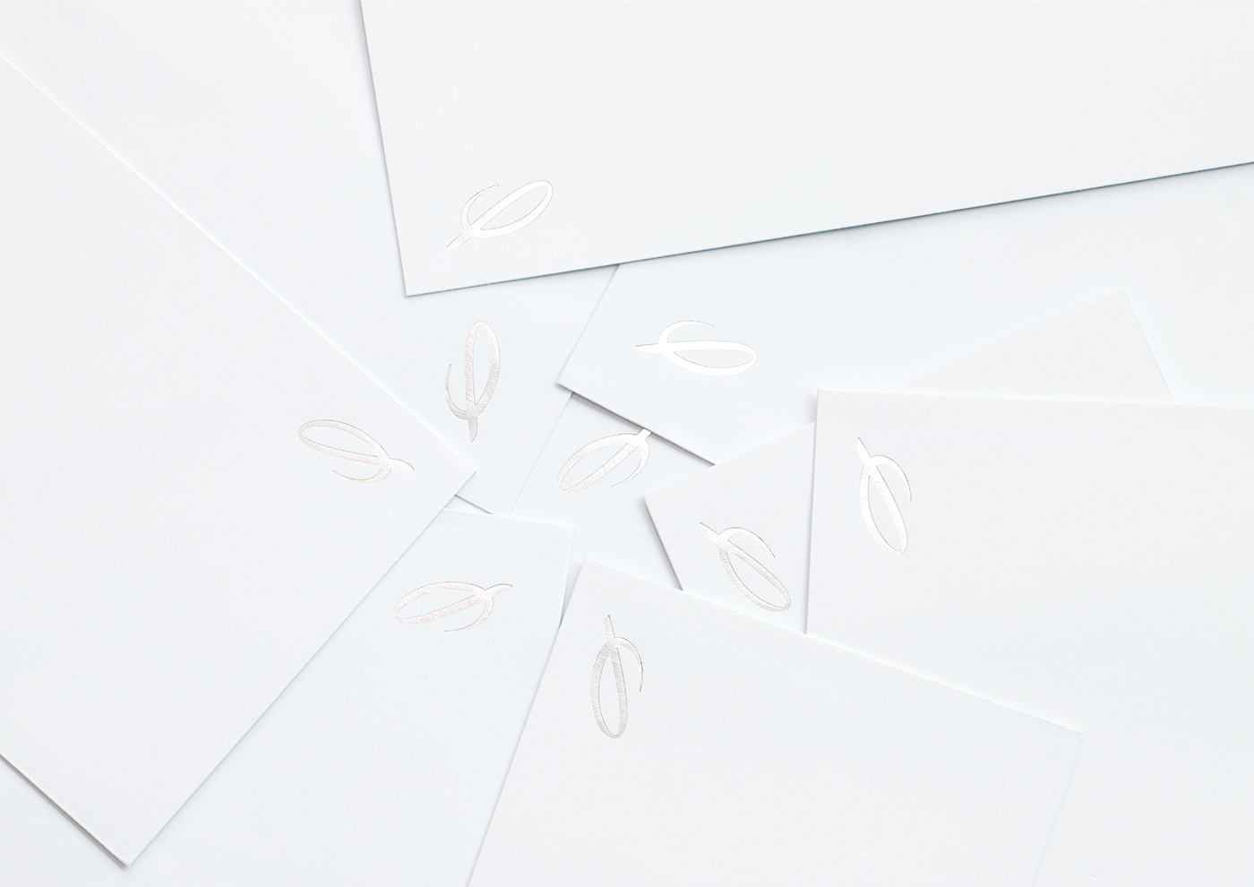
ロゴマークは、解き放たれた鳥(お客様)の羽をモチーフに、そして美しさのシンボルでもある黄金比「φ」の要素も込めながら、プレミアアンチエイジングの頭文字「P」を表現しております。
The logo includes the letter 'P' as a marker of PREMIER, a feather representing the 'freed' consumer and the golden ratio symbol 'φ' which is a representation of beauty.
ロゴタイプは、「年齢の概念を解き放つ」、「誰もが可能性へ挑戦できる社会を創る」といった より良い社会を目指す会社の想いを伝えられるよう、堂々と、そして凛とした佇まいにして表現しております。
The logo type was designed to express our companies aim for a better society which confidently yet sophisticatedly displays the themes of eliminating concepts of age and the creation of a society where we all can challenge our potential.


CL:プレミアアンチエイジング株式会社
Production:シカタ株式会社
Art Direction & Design:北本 浩一郎
Design:木下 塁
CL:PREMIER ANTI-AGING
Production:CICATA, Inc.
Art Direction & Design:Koichiro Kitamoto
Design:Rui Kinoshita