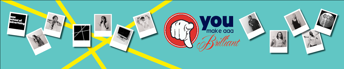
We were asked to make a wall mural for the main long wall that you look at as you walk into the creative facalty of my university. AAA School Of Advertising. As the school had just revamped the schools Corporate Identity- having a very particular look and feel we were told to consider this, and so I made it one of my main goals. A wall with a strong concept and a simple design. The colours being turquios, red, navy blue and yellow ( which all in some way or other feautre in the wall. With the words "YOU make AAA brilliant" as this was my concept: Its the people within AAA that make it what it is. The 'pay-off line' or such is "birthplace of brilliant and thats where that fit in. The faces if the students and people that make up AAA so enphasise the fact that without these faces, AAA wouldnt be what it is. The personal reach is also there as people can relate to it- whether you're a student or a lecturer.

Photoes of the students being brilliant in their own way, scattered around like a photowall. Can be changed to be more relevant from year to year.
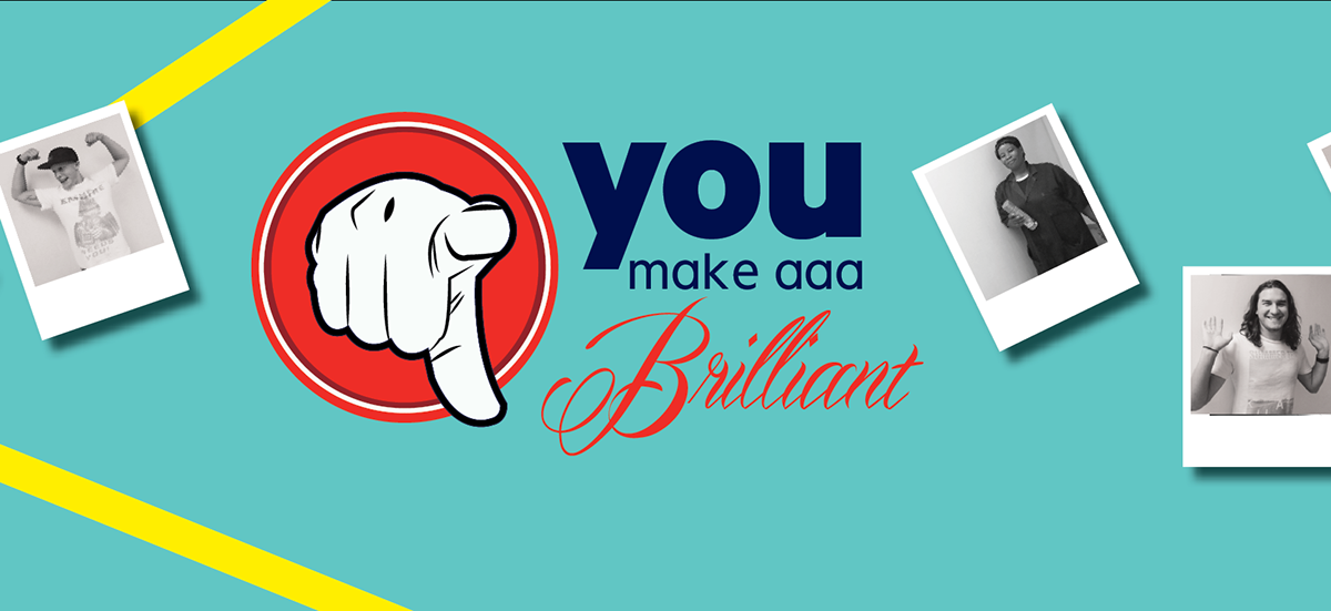
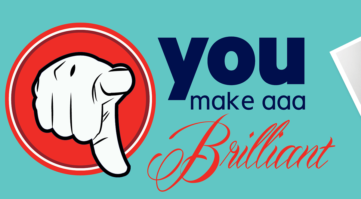
Close up of the main concept of the wall. WE make AAA great.
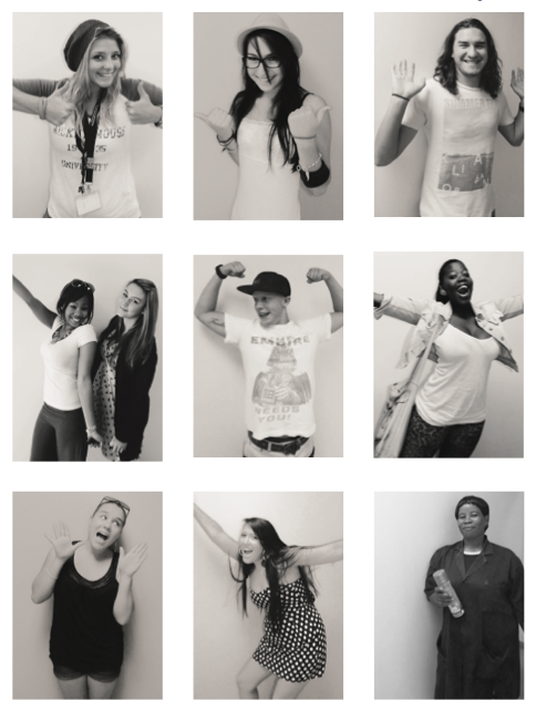
Photo's of the students within the Mural
Part Two of the Mural brief was to create a 'tabloid' where we would be able to feature an article about you mural. This needed to have a relevant name to what the tabloid is about, have a front and a back for tabloid that all matches a particular target market and suit your look and feel.

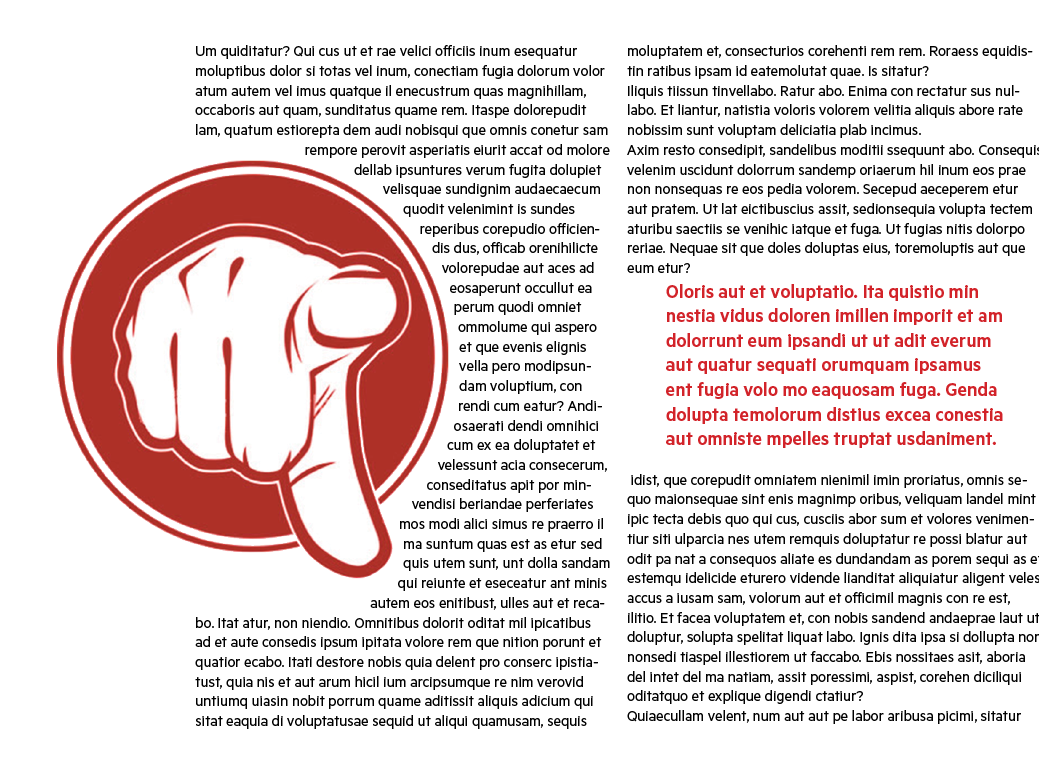
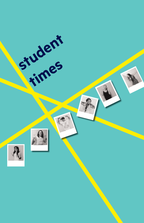
Double page spread to be featured in my tabloid.