
Prugio Brand & Strategy Renewal 2019
SWNA was commissioned by Prugio to develop service designs for not only the residential environment of Prugio apartments, but also the Prugio’s shopping arcades, tenant recruitment and selection processes, and the programming of community facilities. SWNA was also entrusted with the overall designing and master planning of corporate communications, including the BI, advertisements, and marketing activities. As part of the project, SWNA proposed the direction in which Prugio should move towards as a brand, and developed a comprehensive range of tasks to make sure Prugio can indeed affect change in the proposed direction. Also worked with Newpress and STNDRD in brand strategy, brand identity design with S/O Project, editorial design with Araby Studio.
Client : Prugio
Design : SWNA
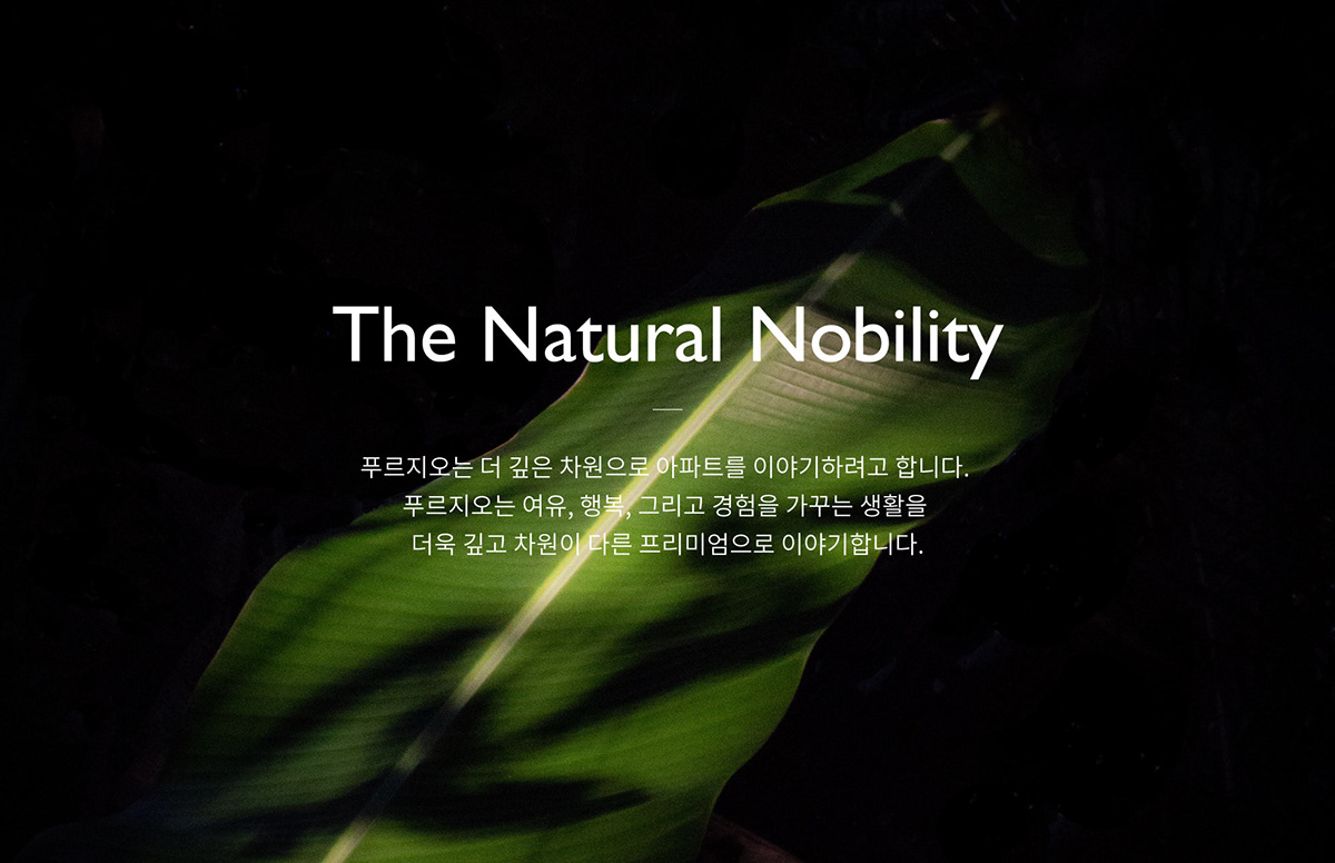

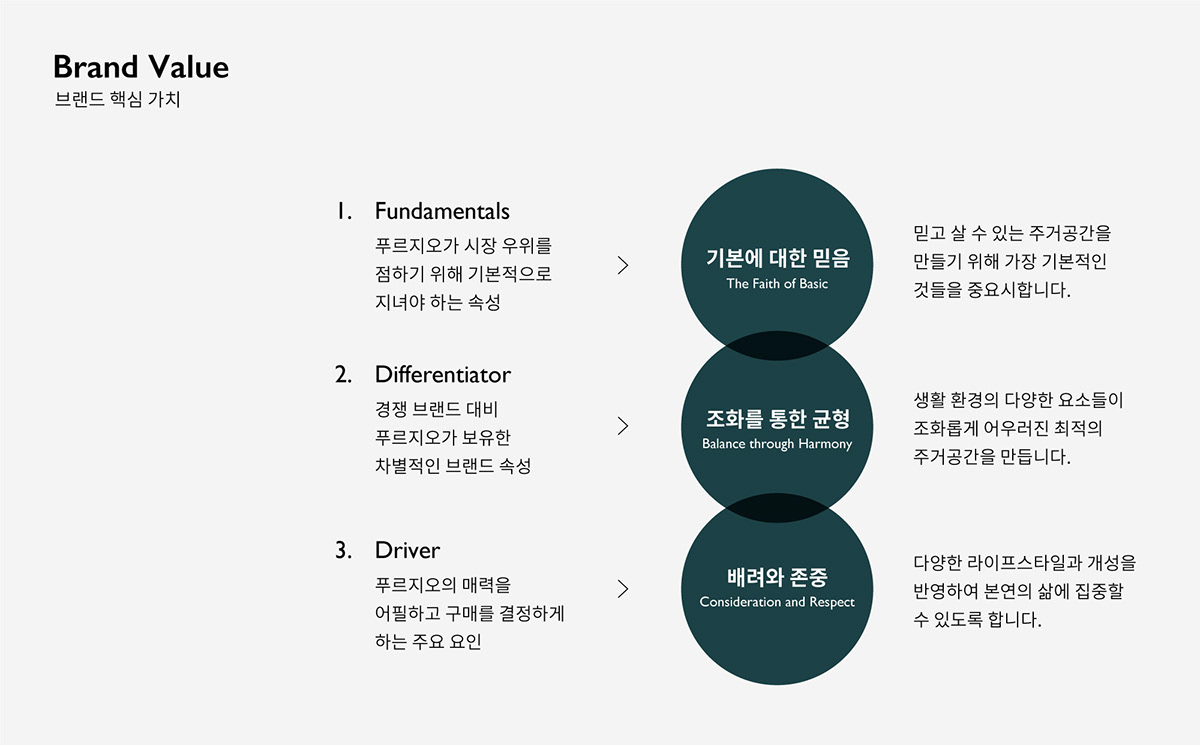
First of all, SWNA created a new narrative aimed at establishing an image for Prugio as a much more sophisticated brand than its previous eco-friendly messaging had depicted in the market.Prugio stood for “Nature” in the past. Under the new direction proposed by SWNA, however, Prugio of the future is expected to stand for “Natural.” Using the key phrase “The Natural Nobility,” SWNA created an evolved image for Prugio.
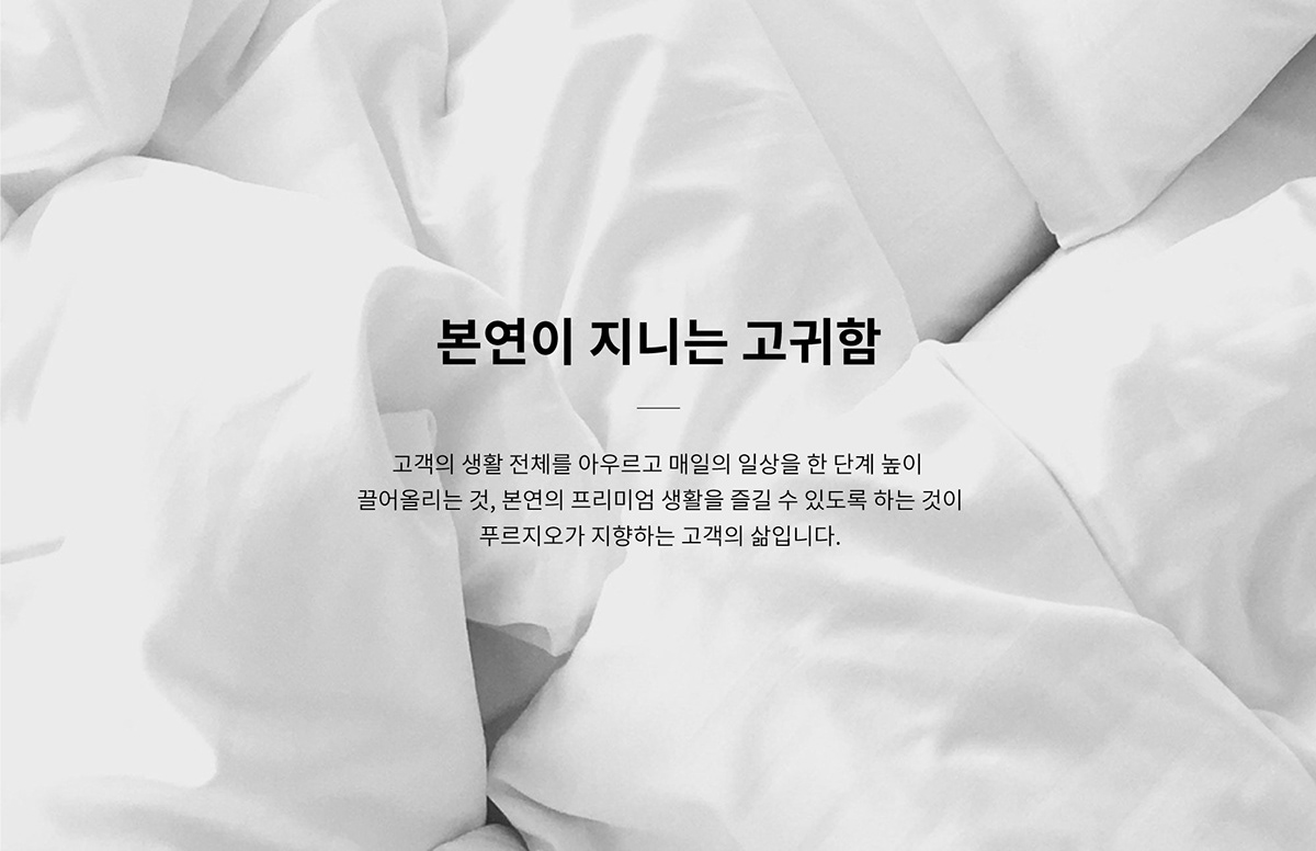
In other words, SWNA developed a new core value for the brand that is much easier to understand intuitively, and it redefined Prugio as a premium brand. Despite these changes, SWNA made sure to link Prugio’s new identity back to the brand’s essential values with a consistent tone and manner to help consumers understand that the new brand is a concept evolved from its previous iteration.


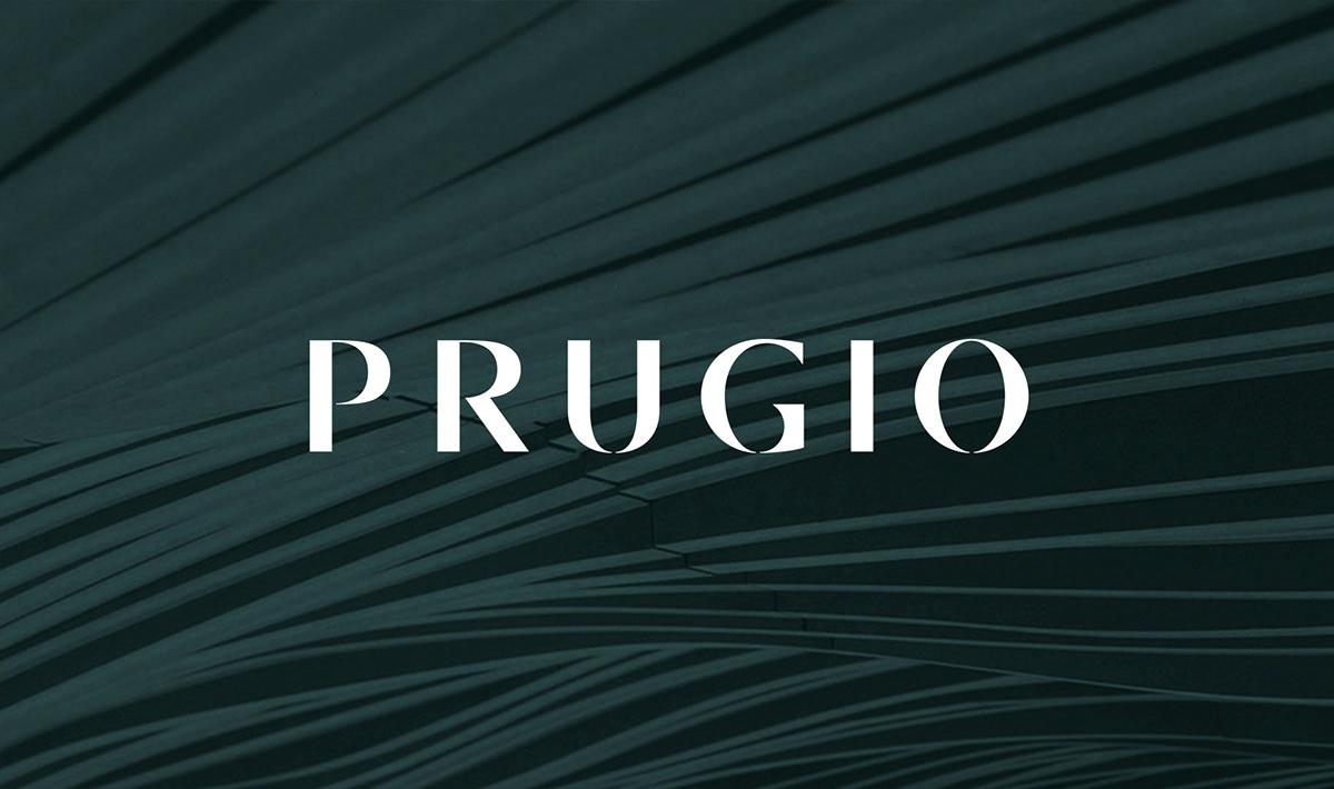
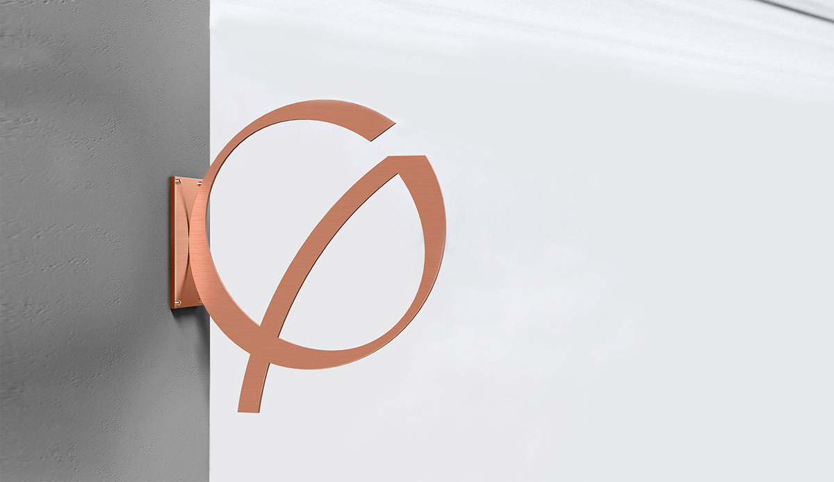
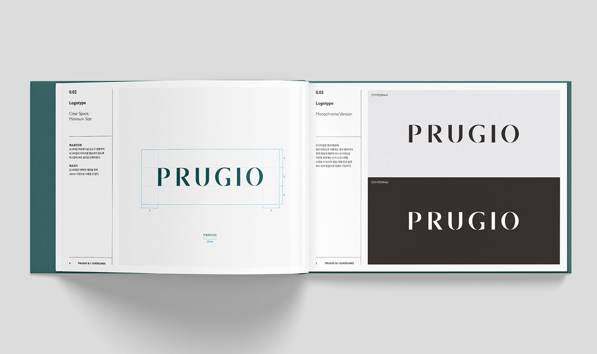
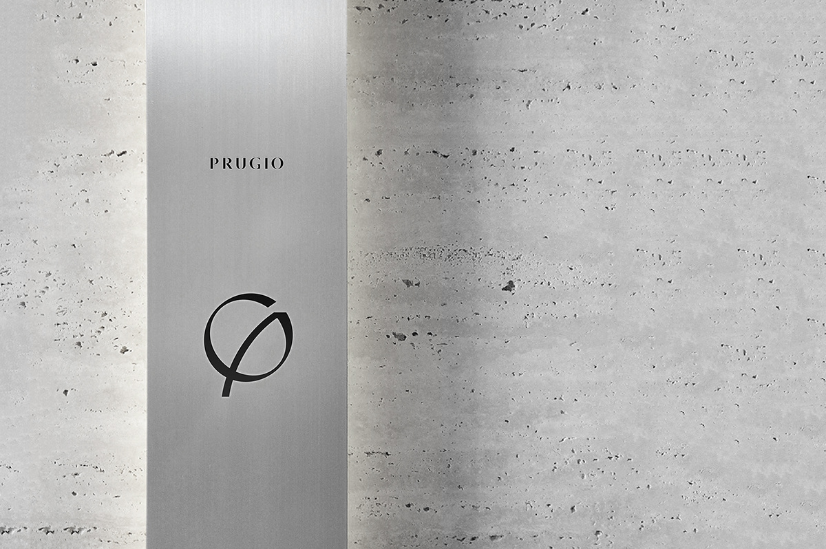
SWNA, along with S/O Project, designed a new BI more suited to “The Natural Nobility” brand language as well. The new BI captures the natural suppleness of reeds swaying in the wind, but symbolizes the strong and sturdy foundations of Prugio at the same time. A new type logo, which looks simple yet intricate, also reflecting the new Prugio, was also developed by SWNA. In terms of color, a drop of luxurious British green mixed in with the existing colors lends its support to the more sophisticated image of the new Prugio.
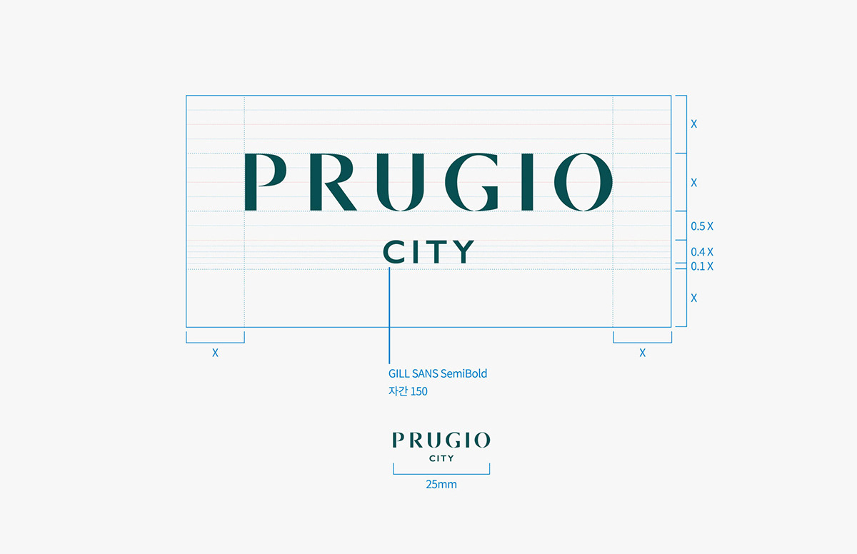
Along with the rebranding of Prugio’s BI and logos, SWNA updated the naming system for apartments under derivative brands of Prugio and offered a revised definition for the brand. In previous versions, the name Prugio was emphasized heavily. In the new version, the word representing the specific apartment complex is expected to be positioned at the end to highlight the individuality of each complex. For derivative brands, a new guideline was established to make sure the names remained consistent in structure under the overarching umbrella of the “Prugio” brand.

In case the type logo could appear lacking in regards to representing the brand when used alone, SWNA designed a “character” representing the image of Prugio. This character was given a shape that could represent the long-held heritage and image of Prugio. As such, it can be used as a visual feature to represent the brand.


Of course, guidelines were developed to make sure the logo and character could be used independently or in tandem. On balance, however, using the combination of two symbols representing Prugio offers more versatility, which means the combination of the logo and character can help present the brand’s image in more ways than they can individually.


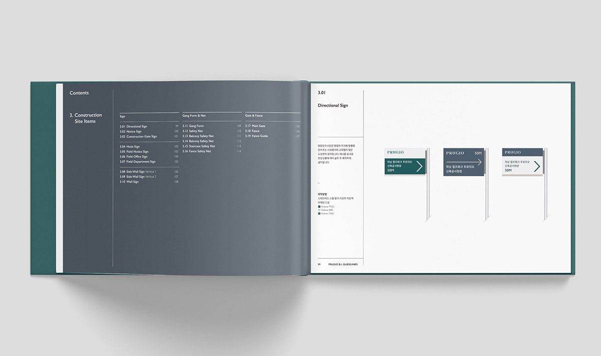
To keep the tone and manner consistent, SWNA developed a BI guideline together with S/O Project. This guideline features standard provisions on how to use the BI and examples depicting actual applications of the BI.

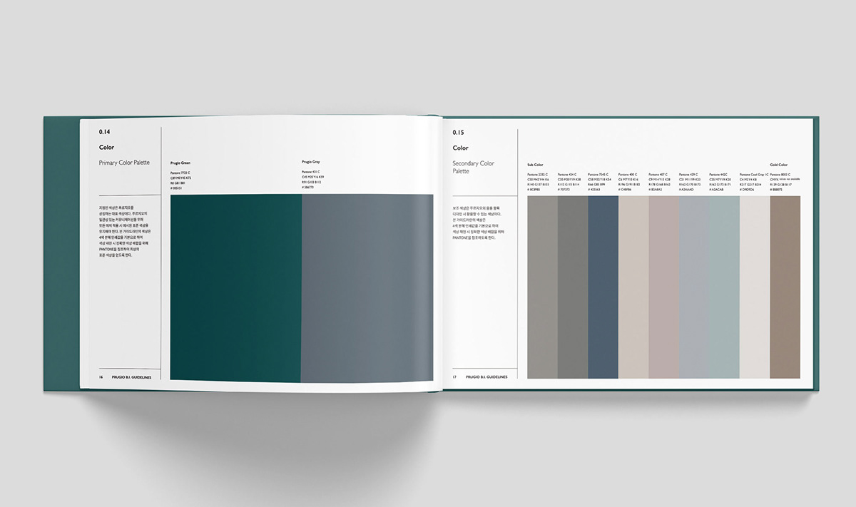
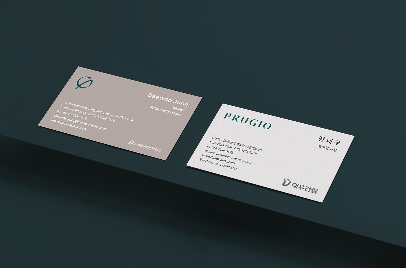
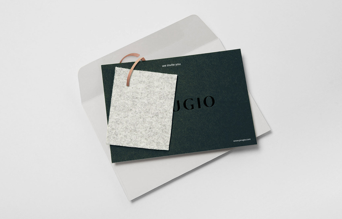
With these provisions governing the use of the brand’s colors and BI in mind, SWNA compiled examples of BI applications capable of creating a lasting image of Prugio in the minds of consumers. From business cards used internally at Prugio to partitions used in model houses and construction sites, SWNA developed designs for every item that could potentially appear in front of the general public. The introduction of British green and other warm monotone colors that can support British green was made based on the decision that the new colors could depict Prugio in a sophisticated, yet consistent way even when used in different formats.

New Prugio apartments are expected to exude a premium feel for its residents everywhere within each complex, not just its residential spaces. SWNA paid attention to even the smallest of items, such as the key box and smart keys given to residents when they first move in to a Prugio apartment complex, and designed them in a such a sophisticated way to make sure residents can feel a sense of pride and joy of living in a Prugio apartment every day.


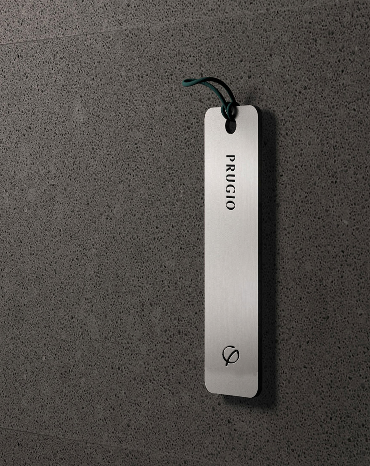
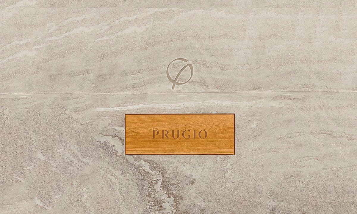
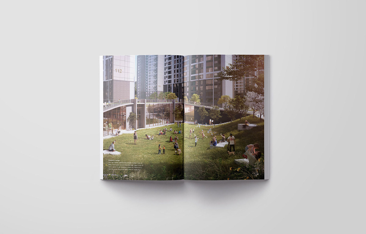
SWNA proposed engraving the Prugio logo and character in various parts of each complex to increase brand awareness. Given the fact that the BI has become much more sophisticated than its previous rendering, Prugio should continue to promote its refreshed image.
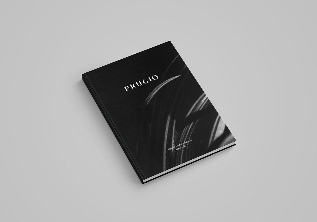
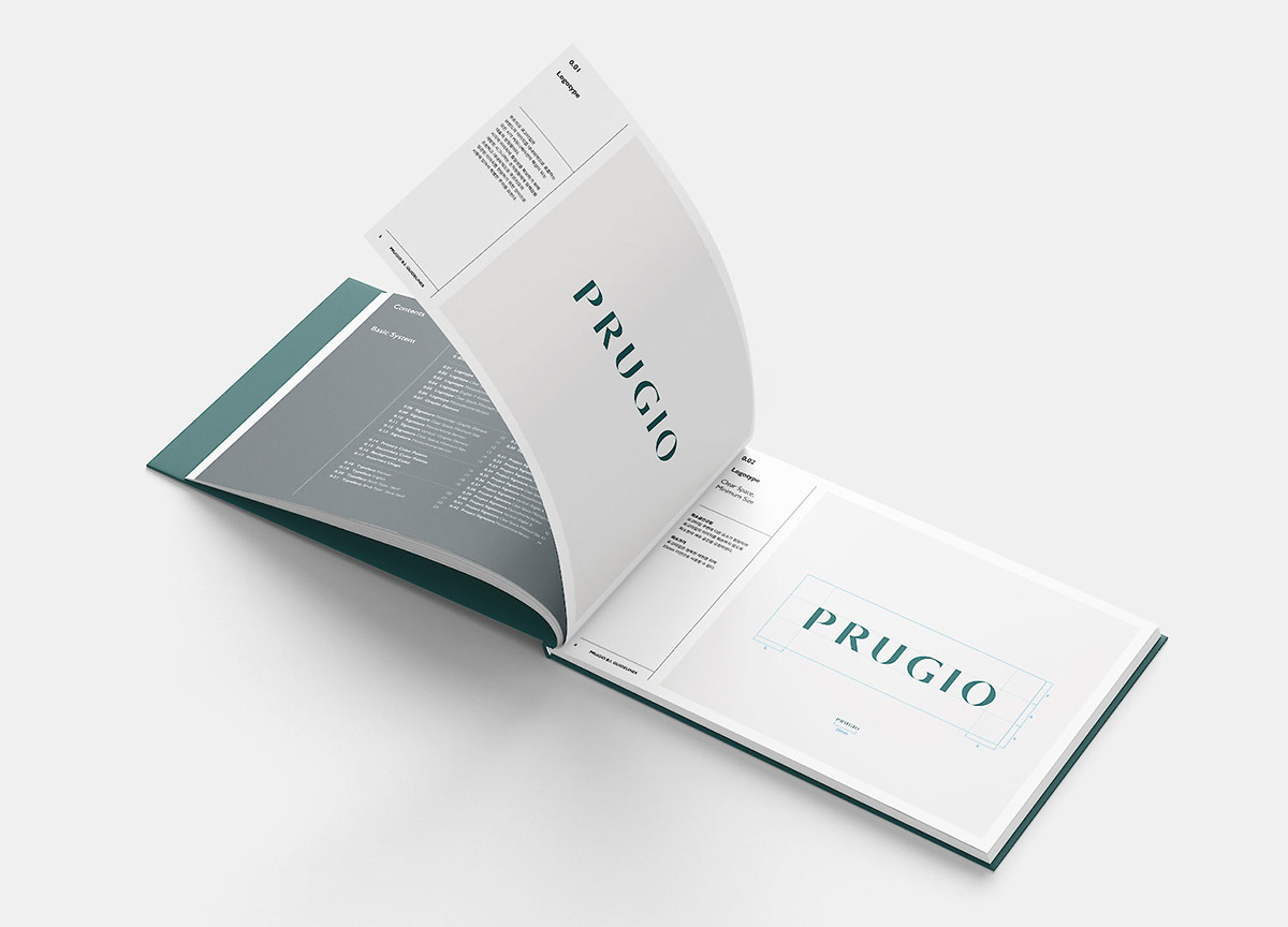
New definitions, brand philosophies, exterior designs, and services for the new Prugio were organized into a booklet. This Brand Book was created to offer a simple summary of the brand image Prugio wants to portray, and changes made to the new Prugio brand.

With the Brand Book, consumers can build awareness on the revised Prugio brand, understand how Prugio hopes to change in the future, and learn about the philosophies and values championed by Prugio in a concise and easy-to-understand way. In summary, the Brand Book was published to promote the new and sophisticated Prugio to the public. It heavily favors images, meaning it is easy to spot the changes without looking too deeply into the Book.


SWNA
-
2F/3F, 31-9, Bukchon-ro, Jongno-gu, Seoul, Korea
+82 2 6380 9881
contact@theswna.com
contact@theswna.com
-


