Brand Elements
Introduction
JYJ is the first Vietnamese wallpaper brand that pioneers in manufacturing Korean-standard wallpaper locally. JYJ aspired to build a new brand identity that marks their new chapter from a high reputation distributor to brand and well-presents the product.

Logo
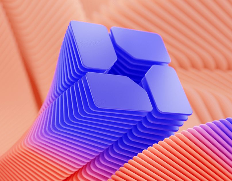
The logo is also the brand name, built by a neat and minimal combination of rectangles. The logo inspires from wallpaper sticking technique, which symbolizes the product and reflects the brand's professional. Though new to the market, JYJ holds steady confidence from their experience, serious investment in technology, and international partnerships.


Color palette
Color choice is consistent with the logo concept – minimalism. Dark blue is the primary color, supplement by two secondary shades of gray. The concept applies to adaptation designs with a clean layout structure that reserves more space to accentuate the solid color area.

Adaptation