

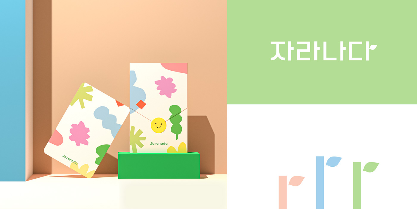
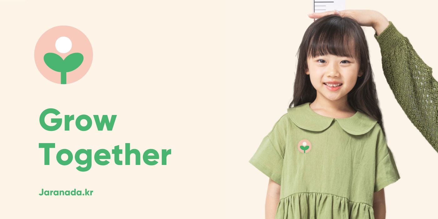
Jaranada, which is Korean for “to grow,” is a firm dedicated to coaching parents on helping their infants develop in the best way possible as they grow. Studio Juliette was in charge of creating the brand identity for Jaranada. This constituted the designing of the logotype and packaging, as well as the deciding of the general color scheme.
BRAND IDENTITY
Logotype & Symbol, Color and Typography System and More...


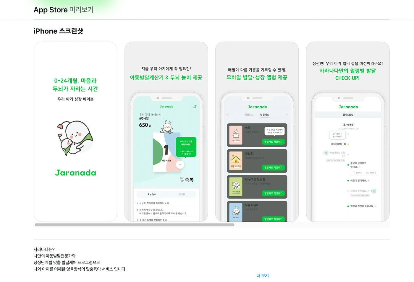
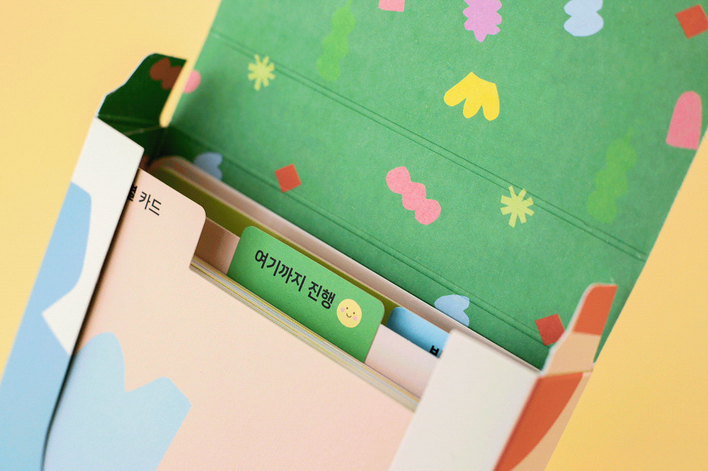
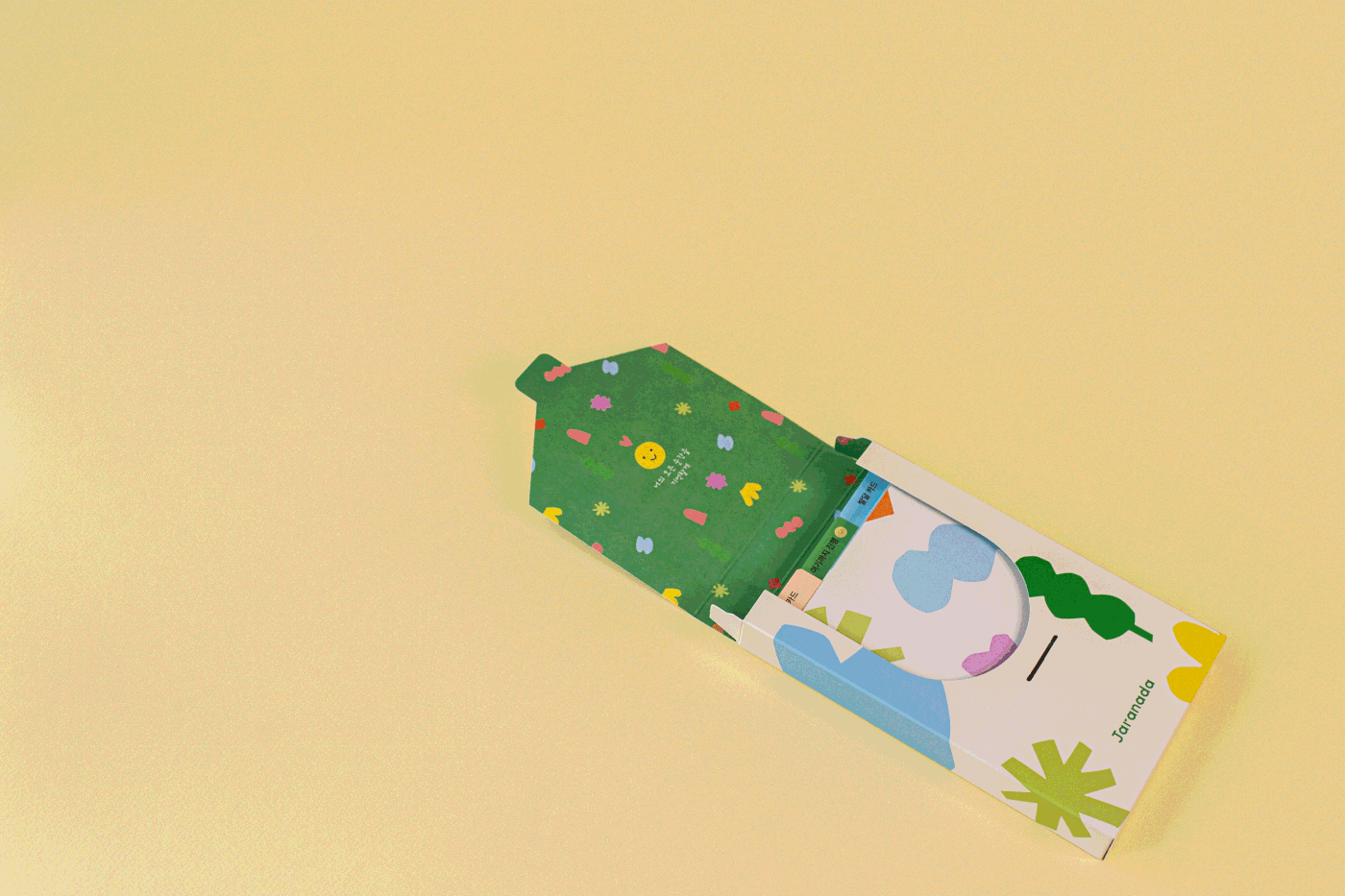
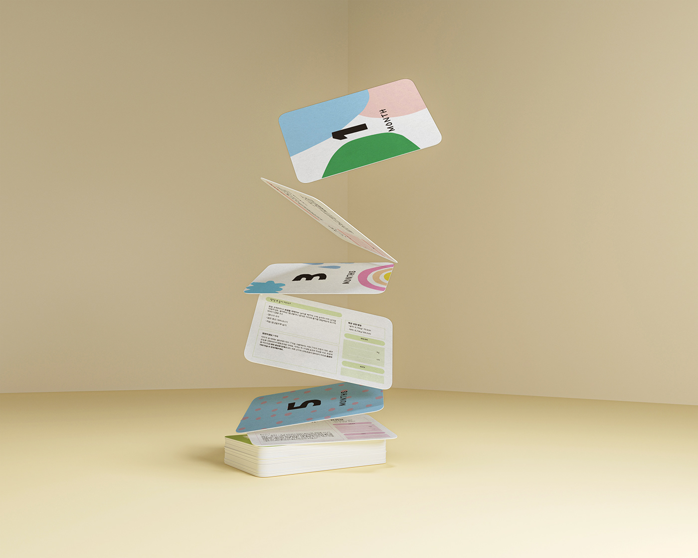
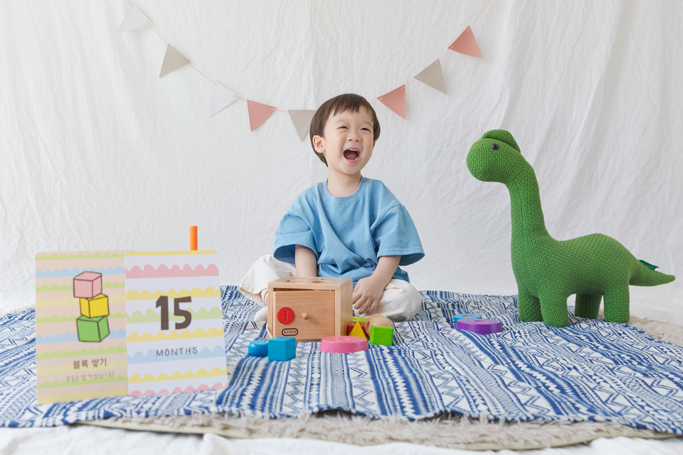
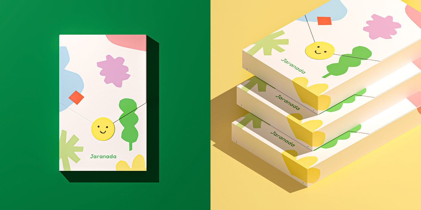
The character and package design for Jaranada’s first physical product—a deck of cards with important milestones and the respective ages a child should reach it by—was also designed and illustrated by Studio Juliette.
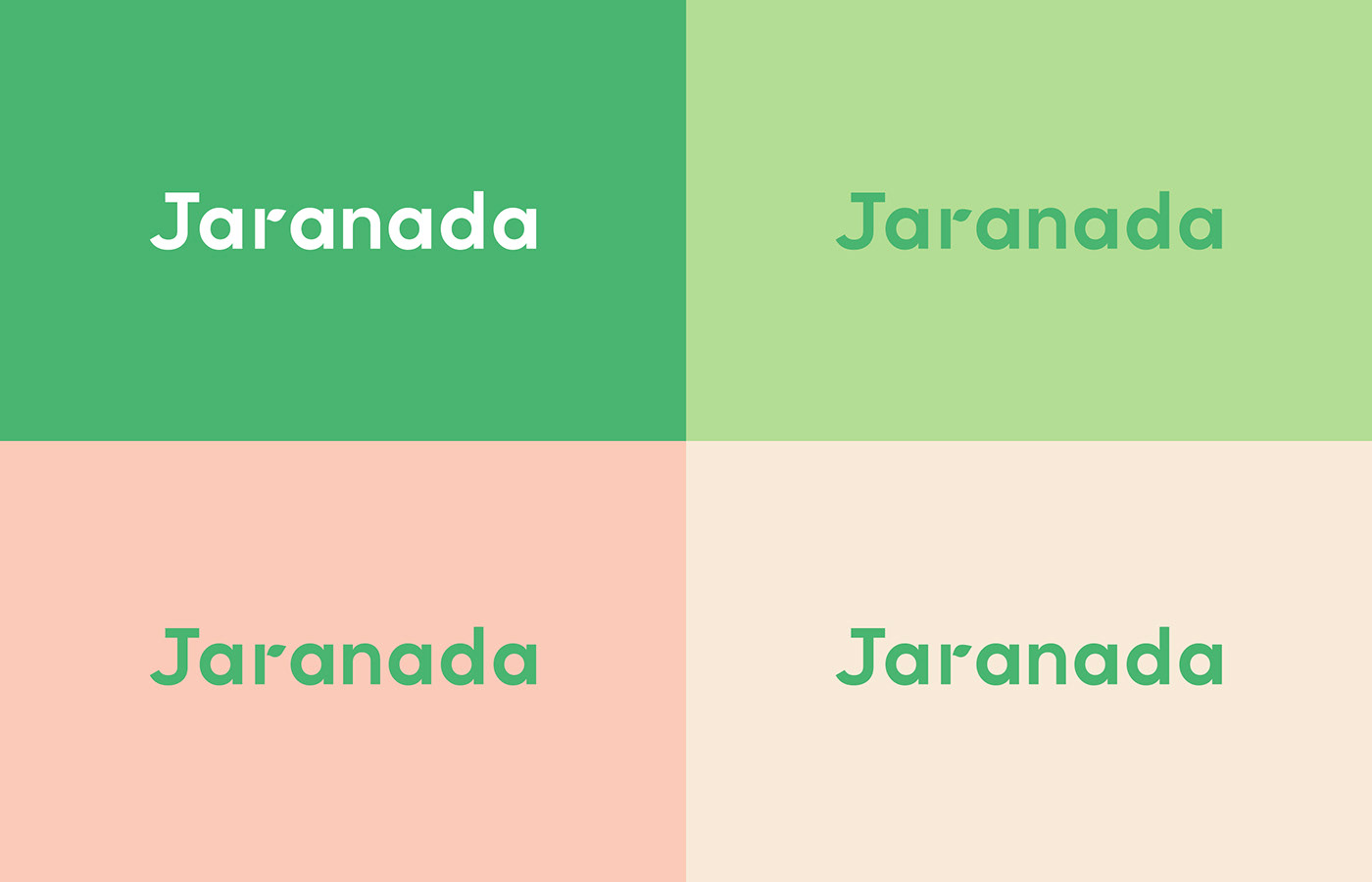
Due to the fact that the company’s target audience are adults while their service is intended for children, it was important to strike a balance between having a professional and playful identity. This was achieved through a combination of the crisp, legible sans-serif typeface, the toned-down yet polychromatic colors, and simple hand-drawn illustrations.
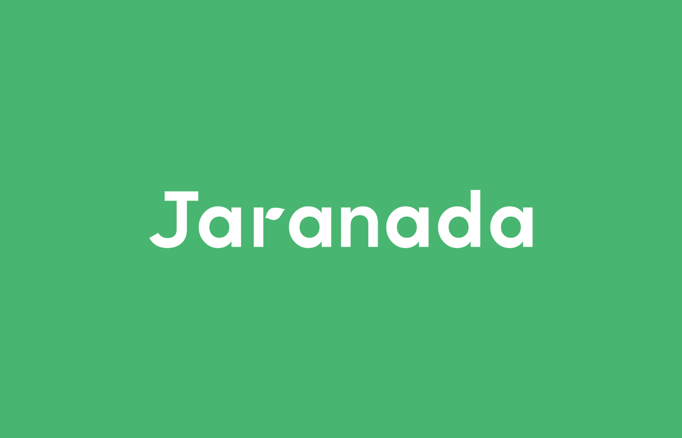
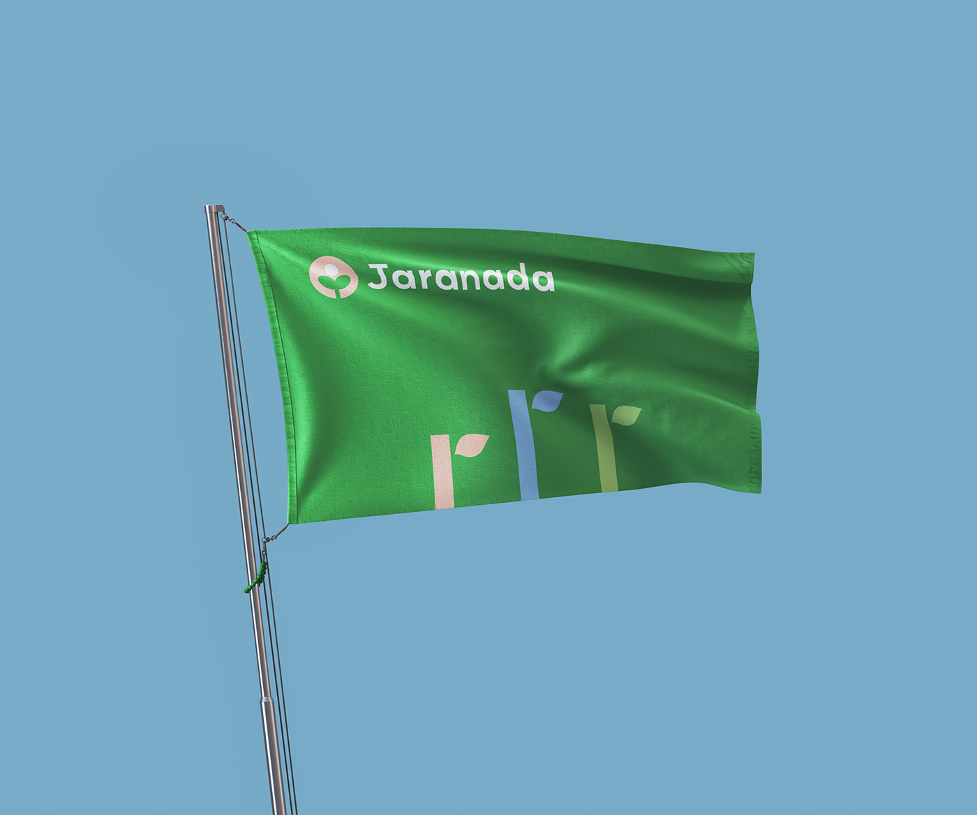
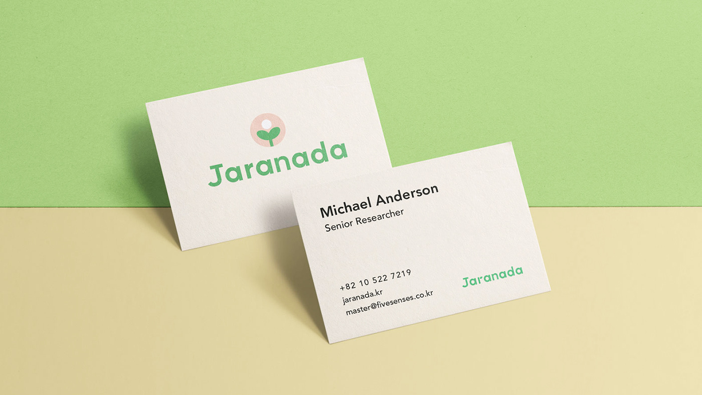
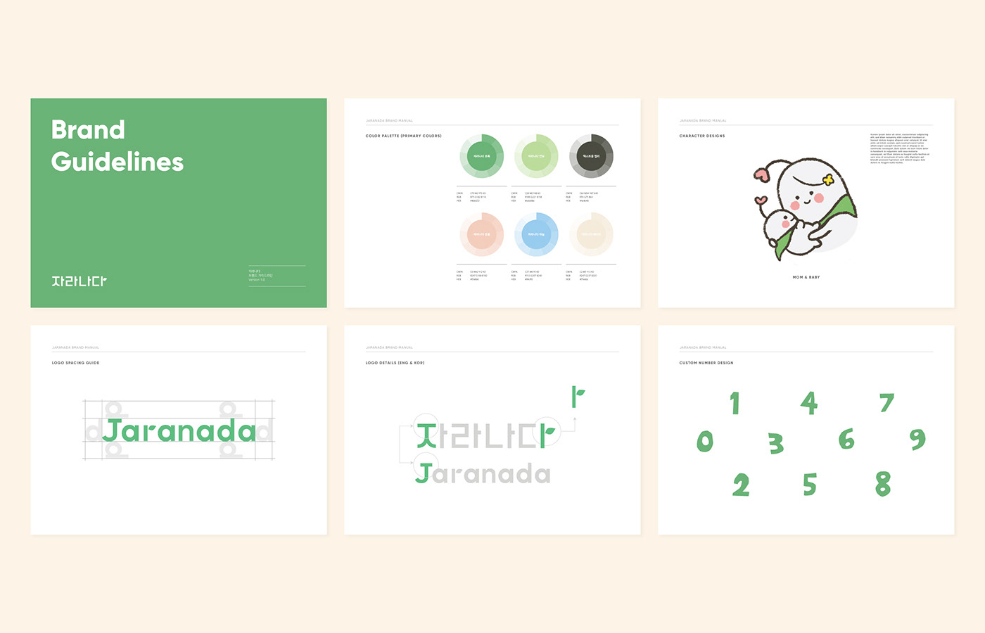
As Jaranada is a Korean brand, two logotypes needed to be developed- one in each language. In order for two different alphabets to look visually similar, the weight of the font was made to look the same, the arm and stem of each first character imitate one another, and the final character of the Korean logo and the “r” of the English logo share the same sprout motif. This way, despite how the Korean alphabet looks angular and how the lowercase English alphabet is more rounded, the shared similarities successfully make the two look uniform.

PACKAGING DESIGN AND PRODUCT DESIGN & ILLUSTRATION
Colorful Packaging and Friendly, Illustrated Card Design for New-born Babies and Parents
Rendering done by Pavel Konstantinov