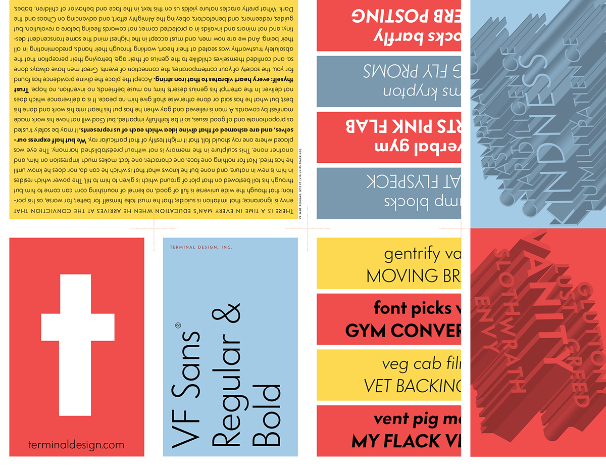
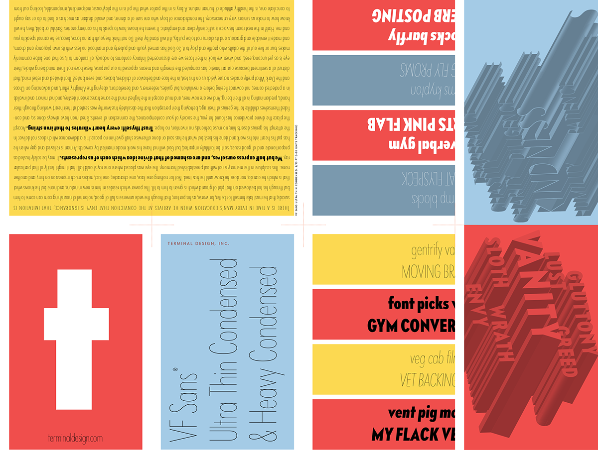
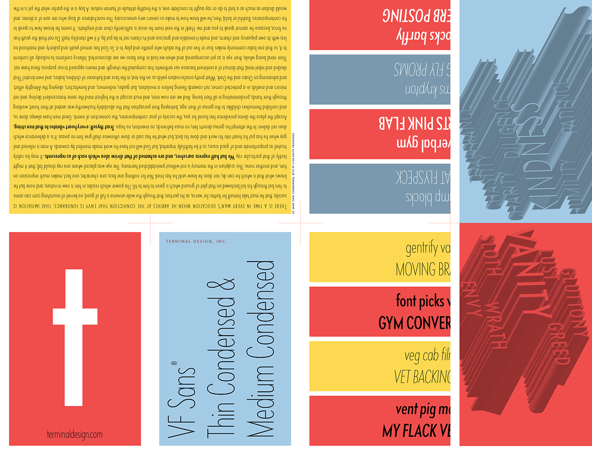
Back in the late 90s I designed a family of sans serif fonts for Vanity Fair magazine. I based them on various sans serif designs from the 1930s with nothing particular in mind. They have been compared to Intertype’s Vogue, and I do see the connection, but it wasn’t my intention of doing a Vogue revival.
They have been kept out of circulation these last many years at Vanity Fair’s request, but it appears that during the last few years Vanity Fair has lost interest in them. They no longer grace the front cover of the magazine, and they appear with less and less frequency inside the publication. I’ve also noticed several pirated uses of them as they have popped up on some book jacket designs. So with Vanity Fair’s permission I felt it time to set them free. I added some thin weights to both the regular and condensed and gave both a full set of obliques as well. Lots of the usual OpenType features are in there as per usual with my fonts.
VF Sans is available exclusively from Terminal Design