


SLIM DOWN LOGO DESIGN
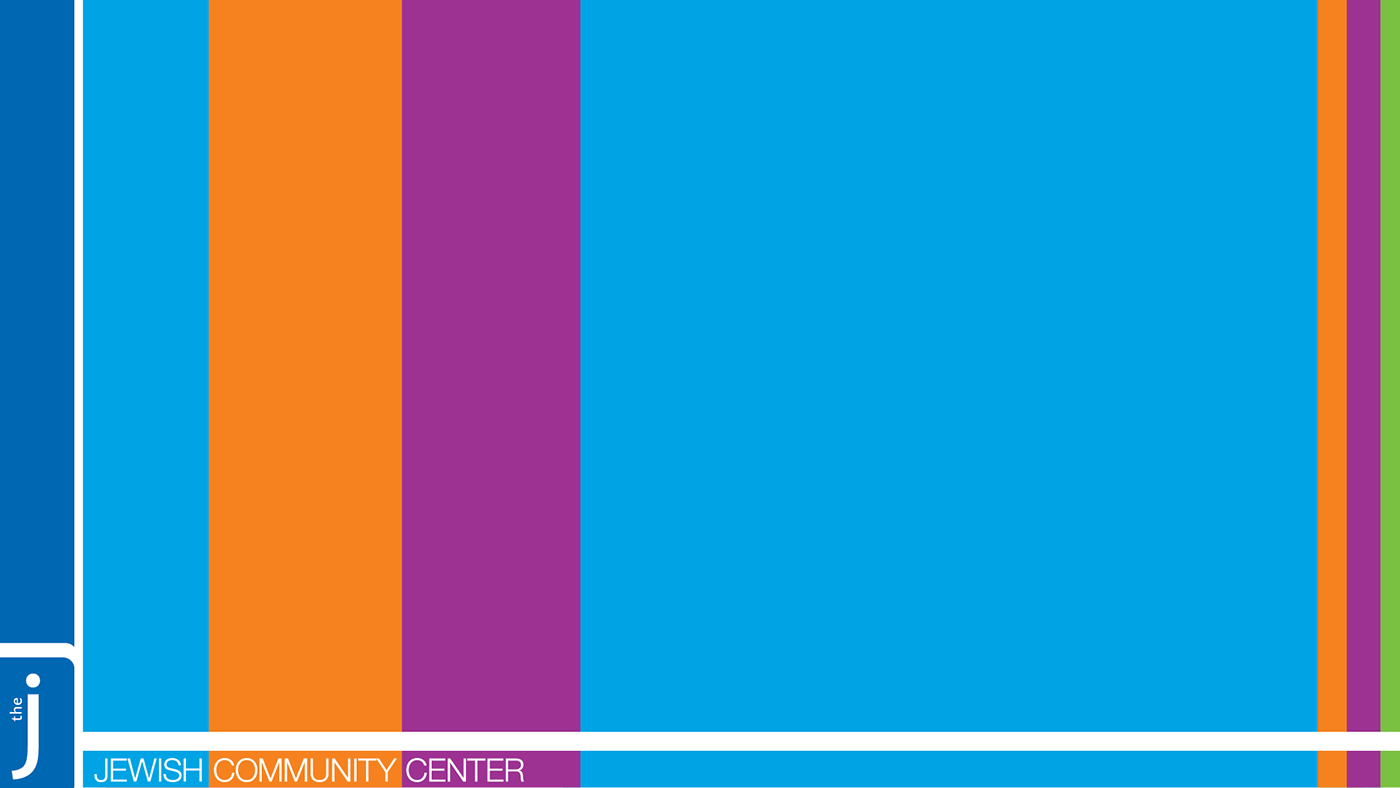
The J’s logo previously had multiple tag lines to the front of the logo bug. Eliminated the extra text allowed for more flexibility in placement of the logo. Further slimmed down the logo for more elegant material. Incorporated the use of a multi colored bar into corporate marketing materials.
The J’s logo previously had multiple tag lines to the front of the logo bug. Eliminated the extra text allowed for more flexibility in placement of the logo. Further slimmed down the logo for more elegant material. Incorporated the use of a multi colored bar into corporate marketing materials.

Social Media


Letterhead, Business Card, Thank You Card


Rack Card, Gift Card, Poster/Flyer


