
[EN]
Brand positioning
My collaboration with Guillaume Brochet started with the design of the logo.
The objective was to create a new brand that would stand out from the existing Brochet Teambuilding logo, fresh and modern, which was representative of the look and feel of the company. To do this, we started from the beginning.
During the first exchanges, we discussed the main aspects of the company, collected values and prepared mood boards to find the right feeling and inspiration for the next steps.
[FR]
Positionnement de la marque
Ma collaboration avec Guillaume Brochet a commencé par la conception du logo.
Dans cette optique, l’objectif était de créer une nouvelle marque qui se démarque du logo existant Brochet Teambuilding, fraîche et moderne, qui était représentatif de l’aspect et de la convivialité de l’entreprise. Pour ce faire, nous avons commencé par le début.
Au cours des premiers échanges, nous avons discuté des principaux aspects de l’entreprise, recueilli les valeurs et a préparé des tableaux d’ambiance pour trouver la bonne sensation et l’inspiration pour la suite des travaux.

[EN]
Brainstorming
For positioning his brand and know the company's background, I collected a list of words that seemed to best describe the company.
Brainstorming
For positioning his brand and know the company's background, I collected a list of words that seemed to best describe the company.
[FR]
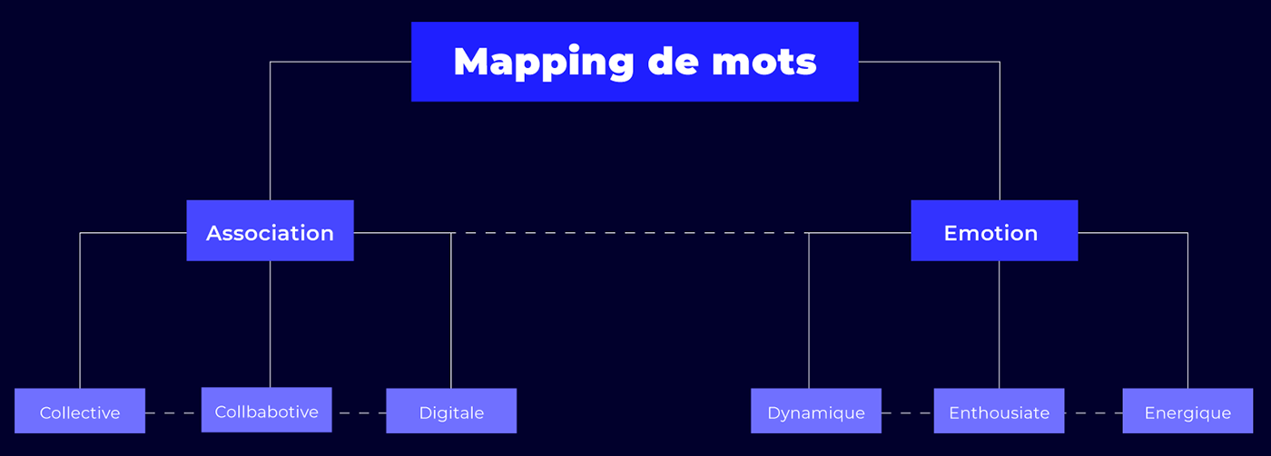
Brainstorming
Pour positionner sa marque et connaître le background de l’entreprise, j’ai recueilli une liste de mots qui semblaient décrire au mieux l’entreprise.
[EN]
Sketches
From these words, I started working on sketches. At this stage, it is mostly about working with simple shapes and objects, drawing by hand and combining various names and metaphors.
Sketches
From these words, I started working on sketches. At this stage, it is mostly about working with simple shapes and objects, drawing by hand and combining various names and metaphors.
[FR]
Croquis
A partir de ces mots, j’ai commencé à travailler sur des croquis. À ce stade, il faut surtout travailler avec des formes et des objets simples, dessiner à la main et combiner divers noms et métaphores.


[EN]
Color palette
As far as colours were concerned, the choice of different shades of blue seemed obvious. This bright and modern colour range is perfectly suited for VSE/SMEs and reflects the digital look.
[FR]
Couleurs
En ce qui concerne les couleurs, le choix de différents tons de bleu semblait évident. Cette gamme de couleurs vives et moderne s’adaptent parfaitement pour les TPE/PME et retranscrit l’aspect digital.


[EN]
Website
In a design thinking process, the legibility of content and images can be appreciated on 4k screens, in order to obtain a unique visual experience.
[FR]
Site internet
Dans un process de design thinking, la lisibilité du contenu et des images peuvent être appréciés sur des écrans 4k, afin d’obtenir une expérience visuelle unique.

[EN]
Layouts
The design of a website requires great attention to detail, as well as maintaining consistency throughout the interface elements. In order to provide a better experience, each page has been checked on different devices to improve the readability of the main layout elements and reinforce the overall design hierarchy.
The design of a website requires great attention to detail, as well as maintaining consistency throughout the interface elements. In order to provide a better experience, each page has been checked on different devices to improve the readability of the main layout elements and reinforce the overall design hierarchy.
[FR]
Une mise en page adaptée
An adapted layout
The design of a website requires great attention to detail, as well as maintaining consistency throughout the interface elements. In order to provide a better experience, each page has been checked on different devices to improve the readability of the main layout elements and reinforce the overall design hierarchy.
The design of a website requires great attention to detail, as well as maintaining consistency throughout the interface elements. In order to provide a better experience, each page has been checked on different devices to improve the readability of the main layout elements and reinforce the overall design hierarchy.


