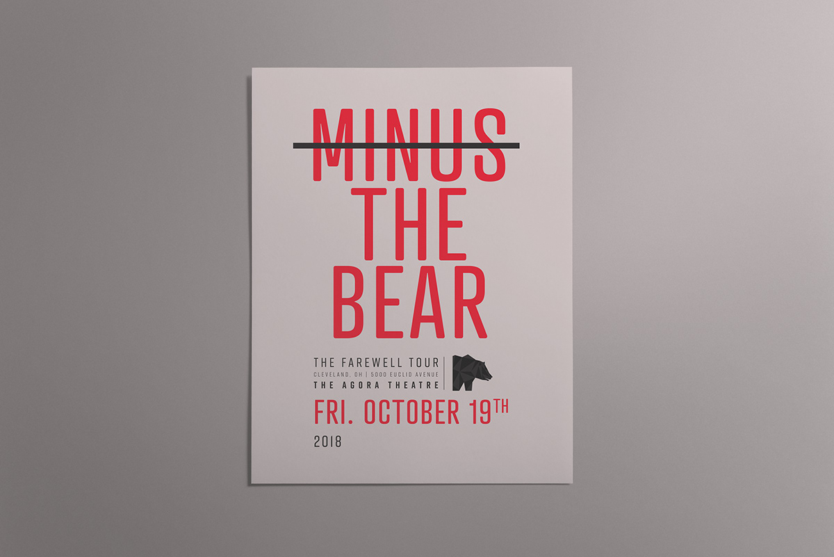
GIG POSTER
An Advertising project for an unofficial Minus The Bear gig poster. The aim here was to solely use typography and color to grab attention and advertise successfully. It stands out well, from afar and gets the message across.
This was for their Farewell Tour. So after researching the band I had decided on going with a clean geometric theme. Their albums and website had a series of those
themes themselves.
themes themselves.

The clean and sleek look lets me use typography to let a viewer visually scan the poster with ease while still have a strong visual presence void of any noise that might go crazy with the visuals.