Moxie Protein
Brand identity and packaging
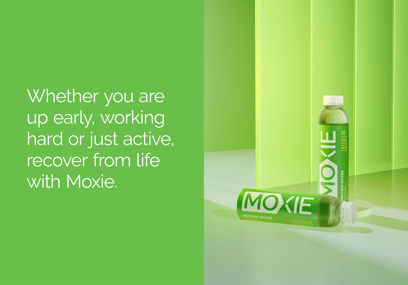
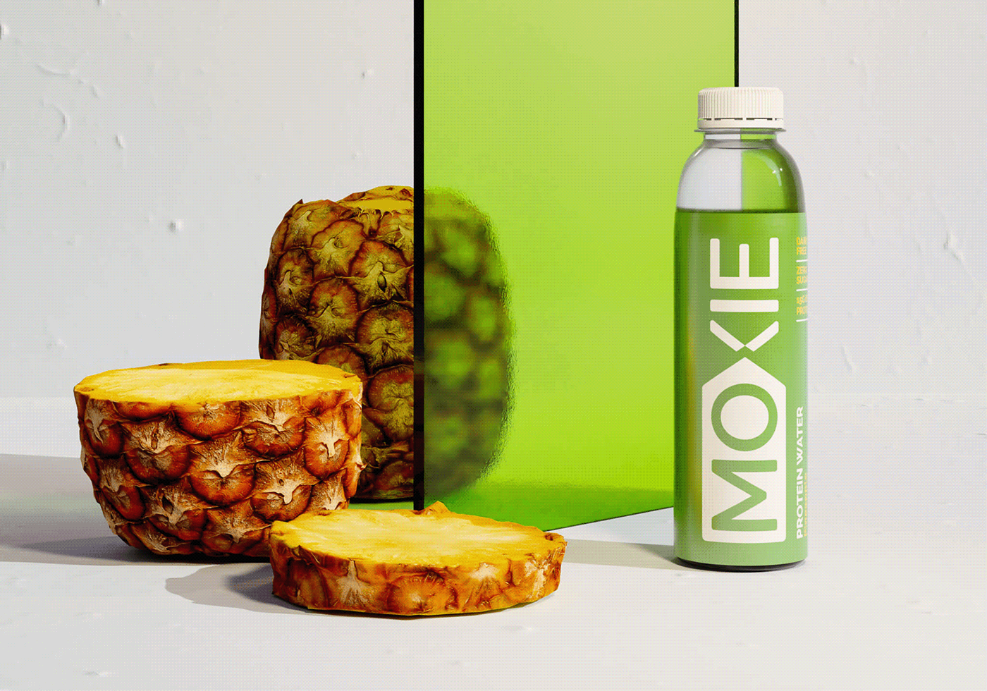
Moxie is the latest protein water and powder to hit the market. The product range has been developed for wide range or consumers from professional athletes to anyone who believes that they deserve the best for their body. The perfect blend of high quality protein along side the convenience of having a premixed protein water makes it the perfect workout or supplement drink.
The meaning of Moxie (force of character, courage and determination) inspired the logo by creating a basic arrow shape that represents the determination towards a goal. In a heavily saturated protein market that primarily targets males, Moxie steps outside of this typical go to protein aesthetic. Moxie identify with any one who seeks a healthy and balanced lifestyle.
Client
Hatched Ltd
Service
Brand identity
Packaging design
Art Direction
Packaging design
Art Direction