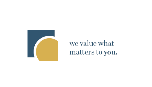
The creation of the signature began as the conversion of D and K (Kirsten Dueck initials) into basic abstract forms to provide the original signature. Also, the aforementioned love of research for Kirsten, led me to the idea that through the logo it was “magnified” as a representation of research and careful reflection on the client’s wishes, as the slogan itself says “we value what matters to you”.
The sign was made using a gold ratio, one of the most important ratios in art, aestetics and the world in general.
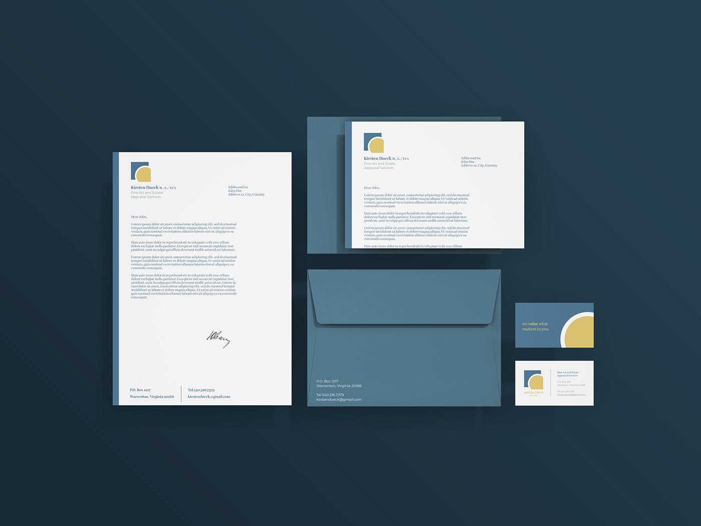
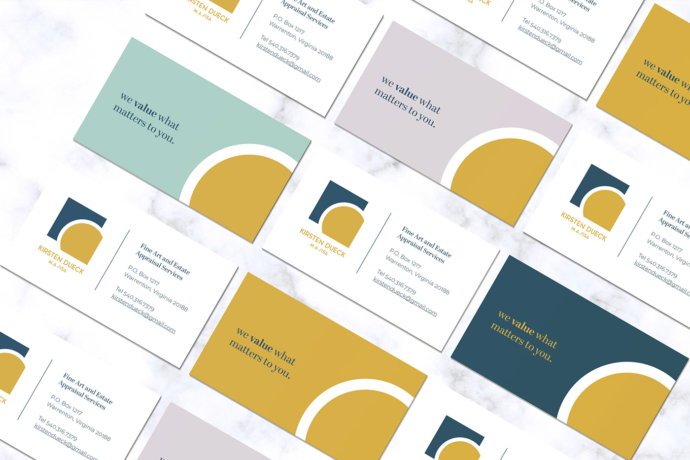
Using the suggested color palette, navy blue and warm yellow were used as the primary elements as two primary colors that further emphasize the major elements of the art.
Aqua Groteskque and Abril Display were used for typography.