Design for SKAAL’s visual identity, the real estate agency in your pocket!
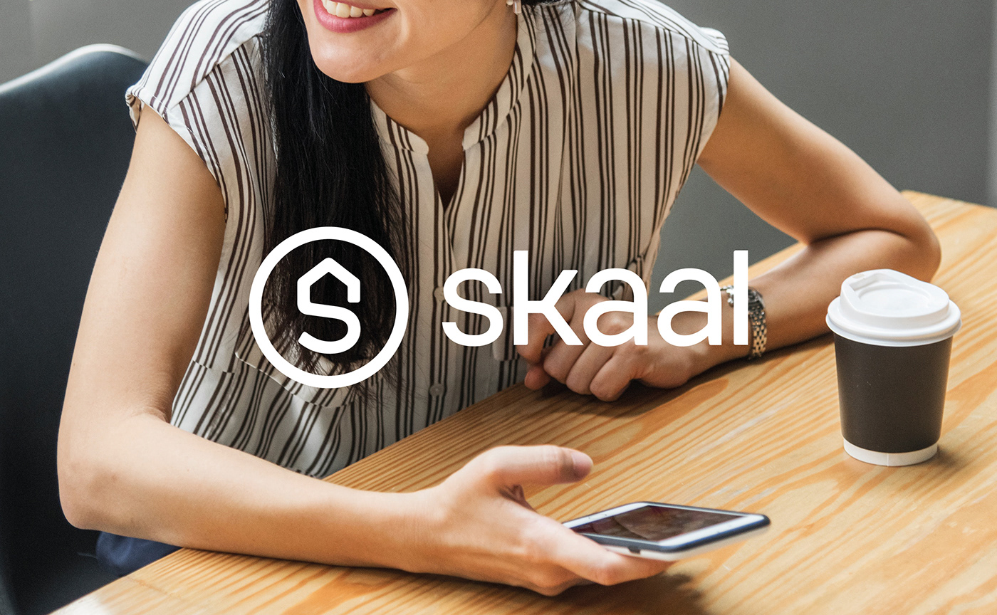
The lifestyles of real estate agents and buyers are changing. Everyone is looking for flexibility, immediate access to information and fewer middlemen. As a connected real estate agency, SKAAL offers a 100% digital real estate service adapted to these expectations.
Its current concept stands out thanks to highly competitive fees and a 360° service offer. Following a first contact at the agency, the buyer is accompanied through all the key stages of his purchase via the online application SKAAL.
The services are presented in the form of packages that range from the estimate to brokerage support, from carrying out diagnostics to finding a tradesman or a professional photographer, to home staging advice and finding a notary.
The services are presented in the form of packages that range from the estimate to brokerage support, from carrying out diagnostics to finding a tradesman or a professional photographer, to home staging advice and finding a notary.
For this brand new service in the property market, we assisted SKAAL in the creation of its brand name, visual identity and its tagline. It was essential to maintain the warm image of a conventional real estate agency in this online service offering.

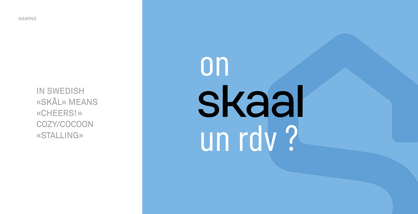
A powerful, smart and warm new name
SKAAL comes from the Danish "Skål". It is a celebratory exclamation said while toasting and means "Cheers!".
This reference to the Scandinavian region is not superficial. Countries in this region are famous for their interior design and furniture. This exotic connotation creates a "cosy cocoon" atmosphere and by extension a feeling of well-being that everyone is looking for in their home.
The invigorating "-SK-" sound is a testament to the dynamic qualities of the service.
The central double "AA" forces an articulation that requires a wide opening of the mouth when pronouncing it. This evokes a feeling of greatness and openness.
The name also refers to the French expression "se caler" — meaning ‘to set up/to settle in comfortably’. ‘On se cale’ an appointment to sell or buy real estate just as comfortably as one may ‘se cale’ on the couch to watch a show.
To say "SKAAL" is to wish for good things.
It is reminiscent of the sound of glasses clinking to celebrate a successful real estate deal.
It is reminiscent of the sound of glasses clinking to celebrate a successful real estate deal.

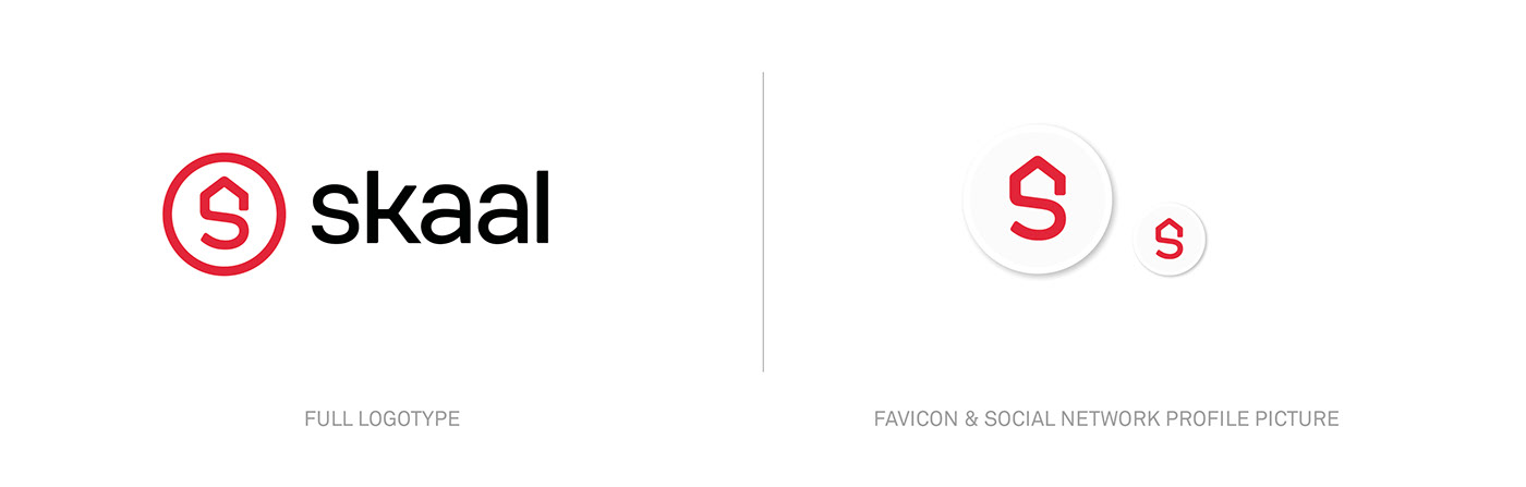
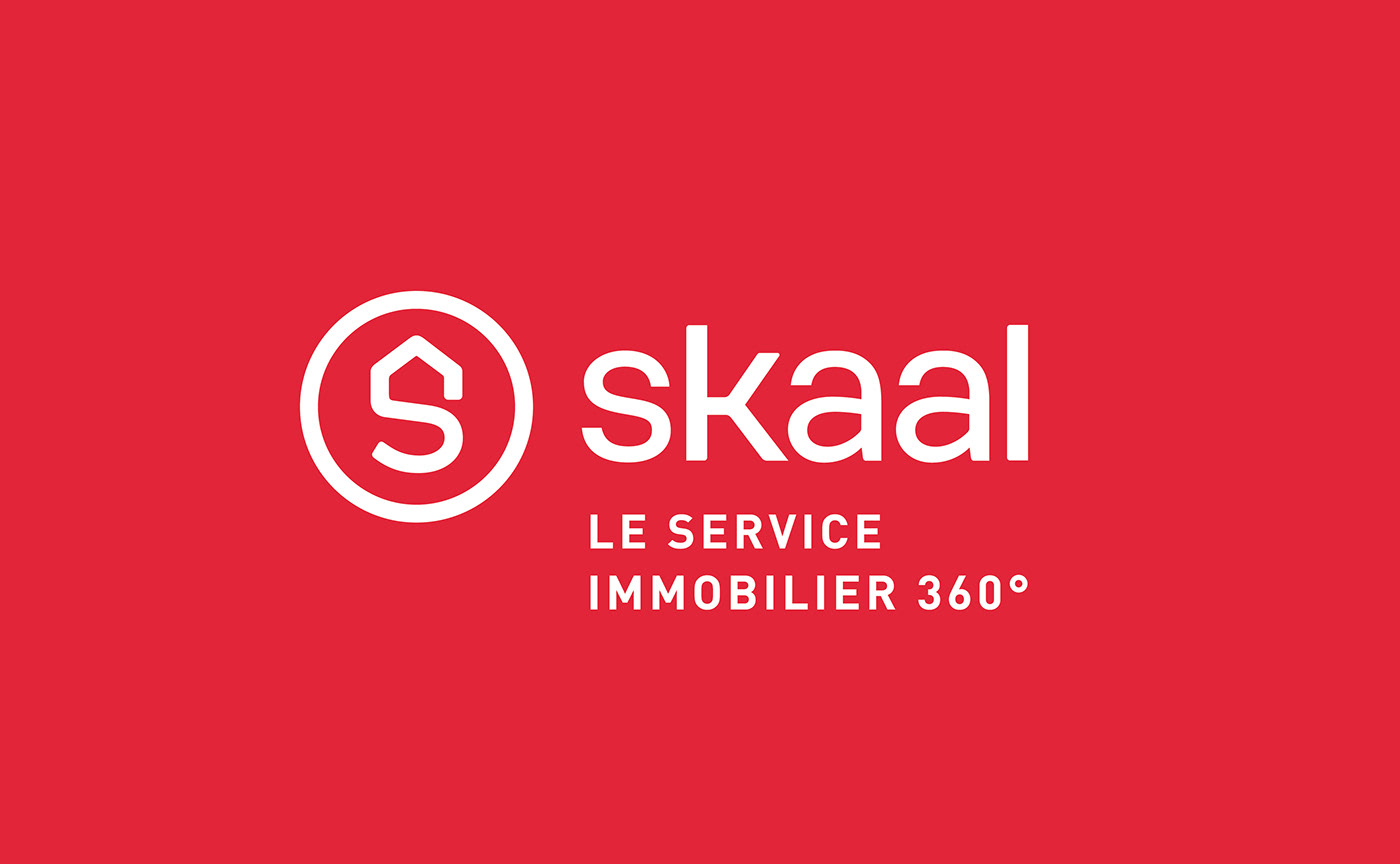
A logo to symbolize easier access to the home of your dreams
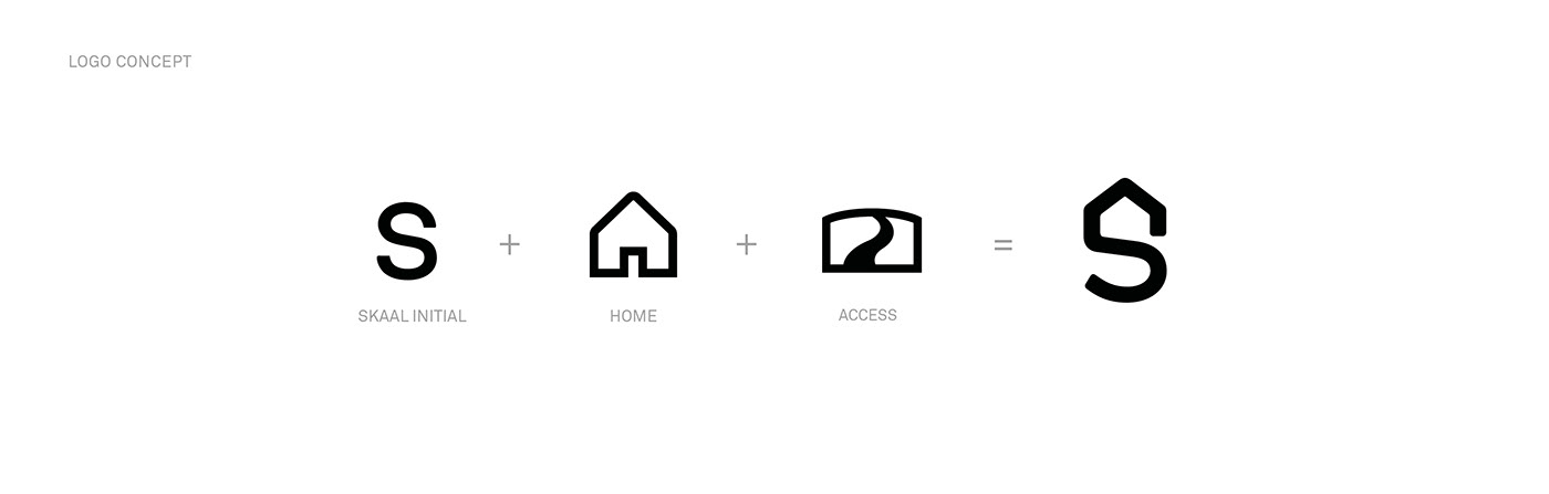
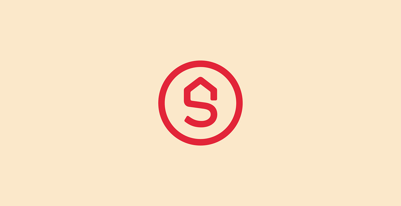
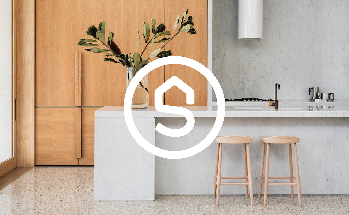
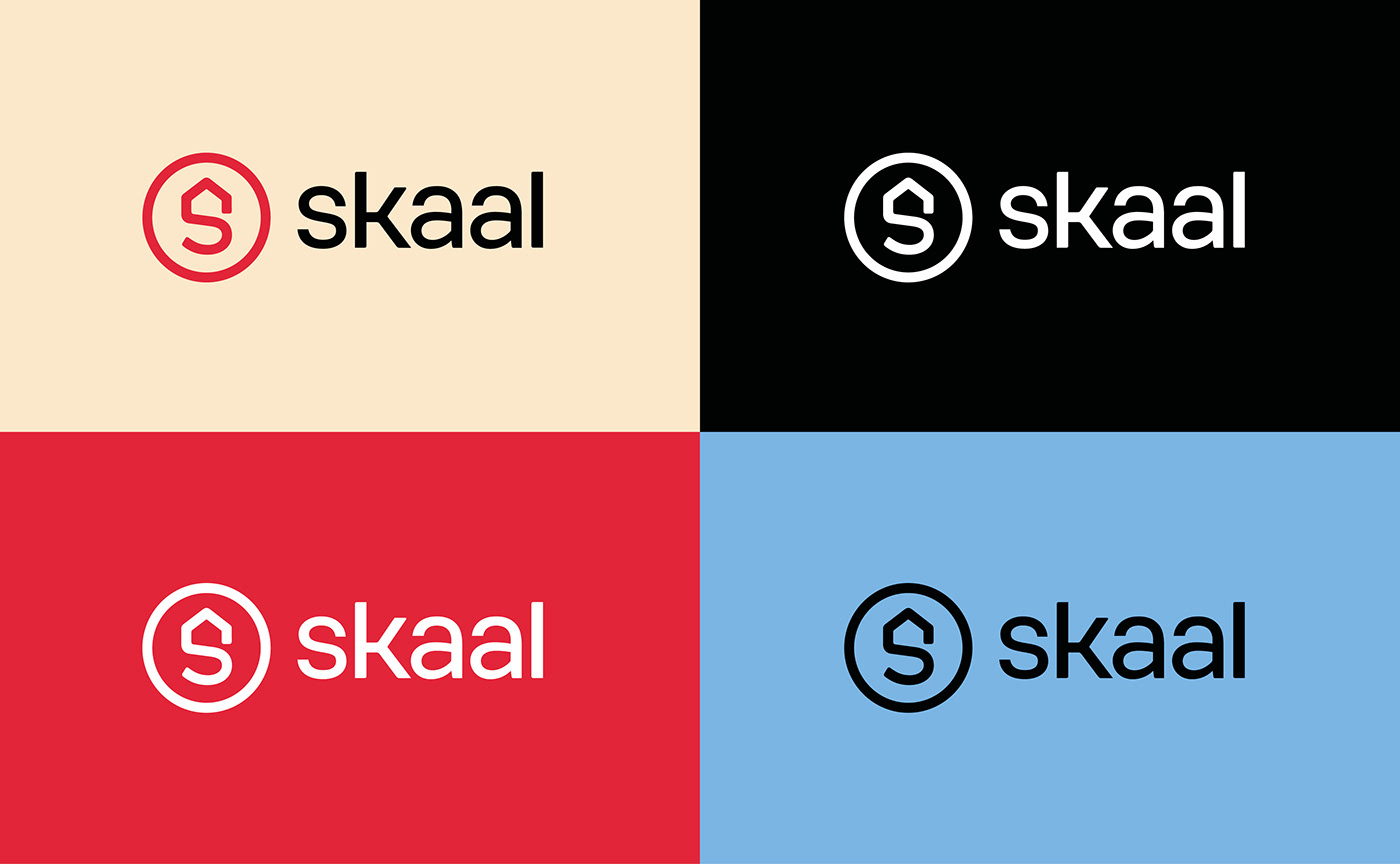
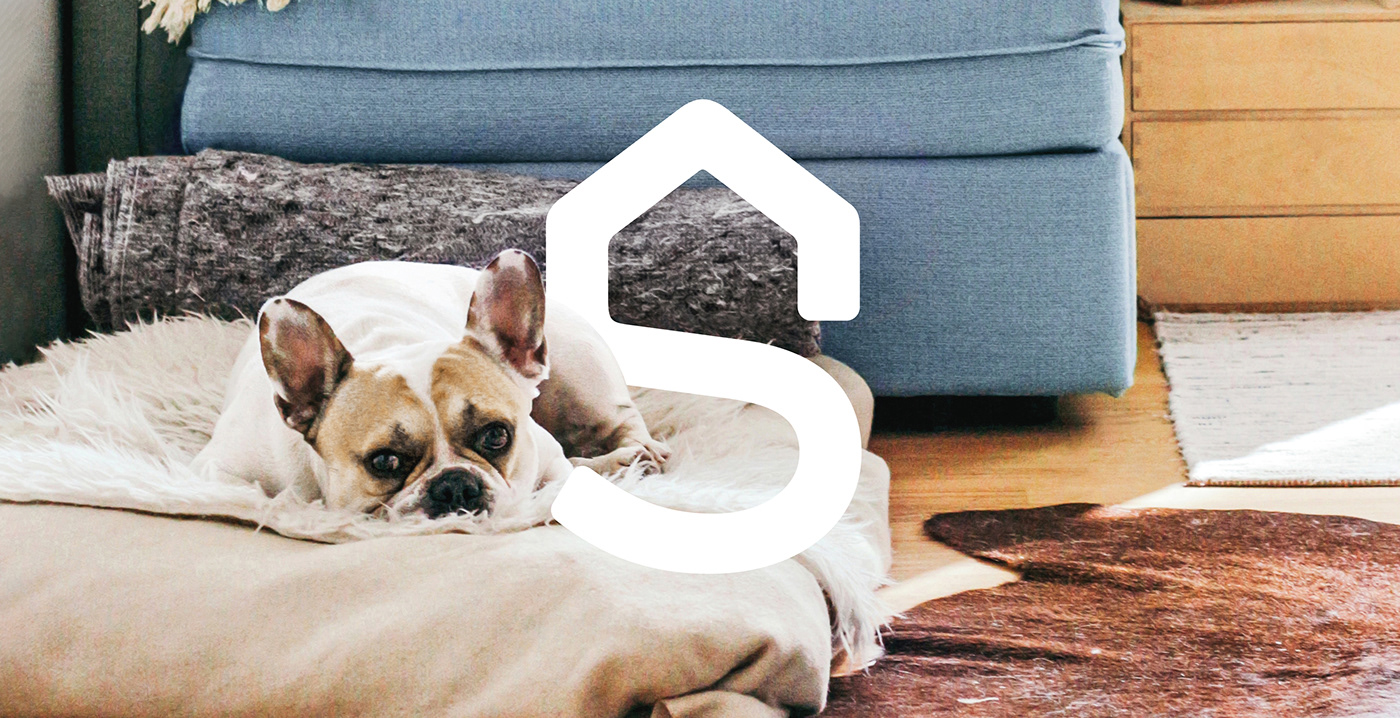
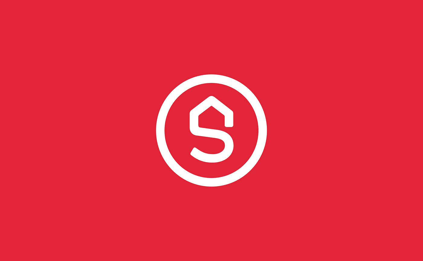
The emblem of the brand was built around the initial "S" of "SKAAL". Simultaneously typographic and pictographic, the design of the letter represents a path that fluidly transforms itself into a silhouette of a house. This visual discovery allowed us to cleverly represent SKAAL’s brand vision: Allowing you to find the house of your dreams as easily as possible and without a hitch.
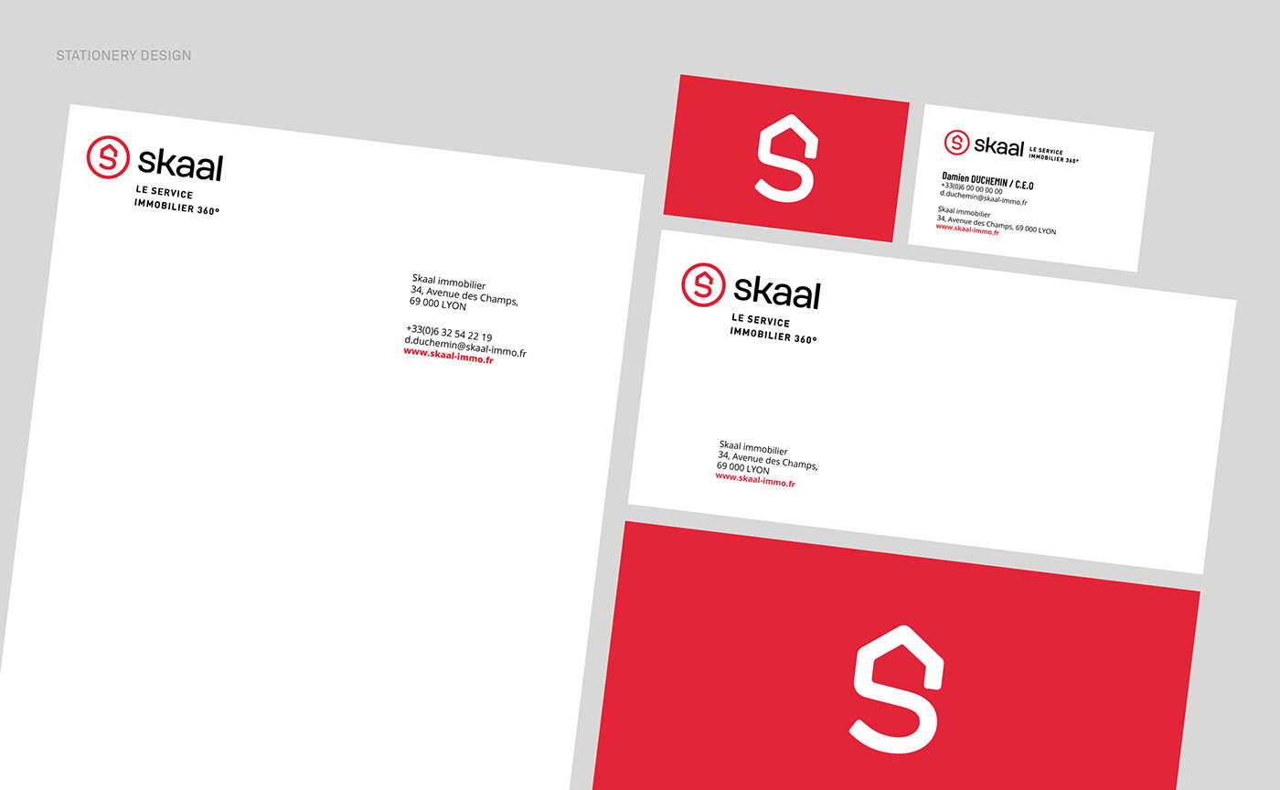
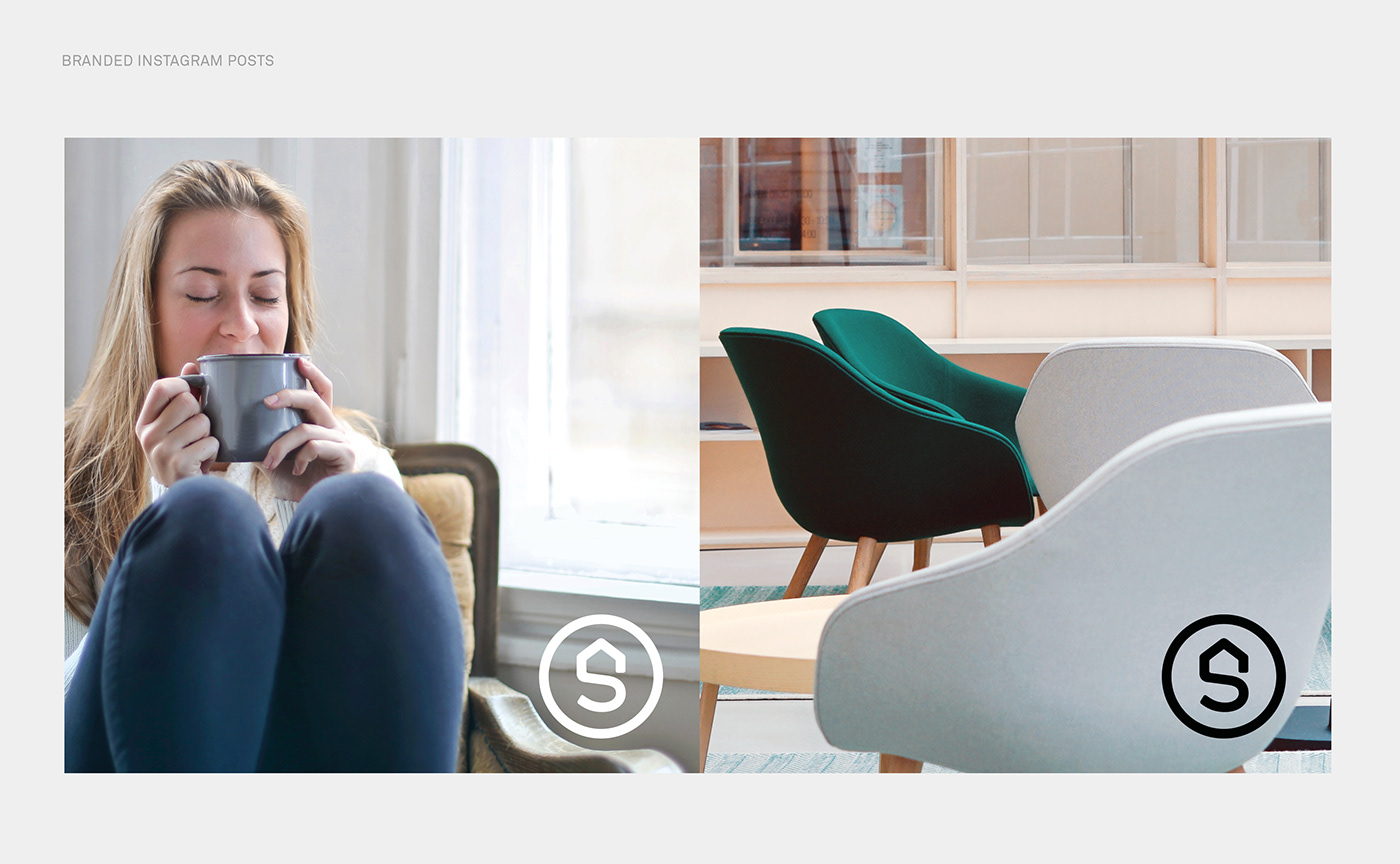
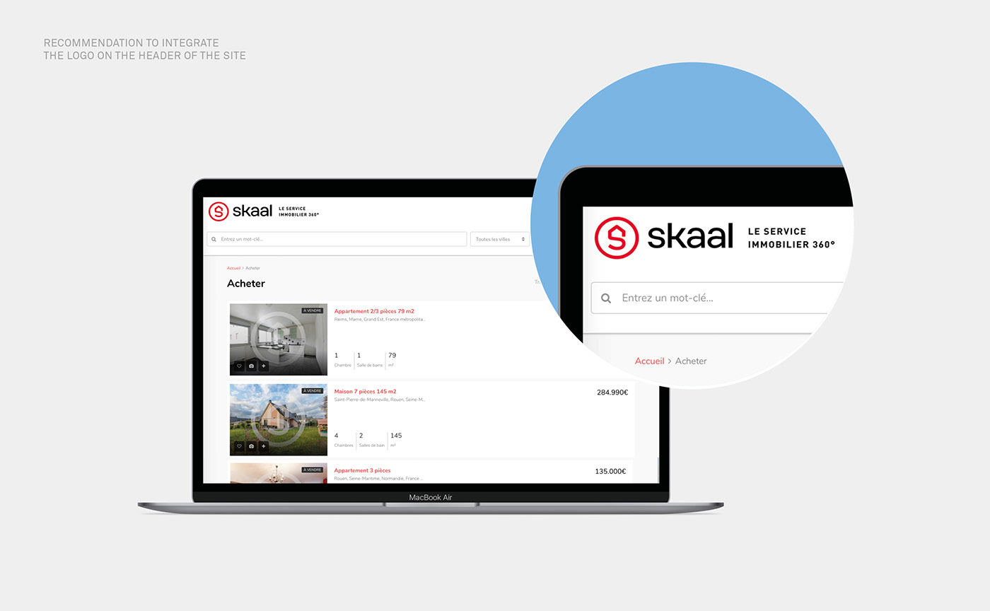
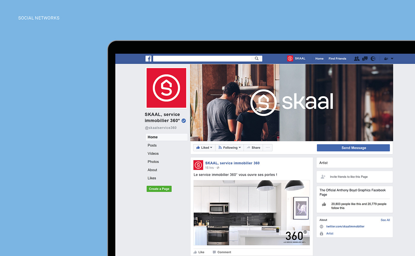
The symbol is completed with an enclosing circle that asserts the logotype as a mark of quality. The form of this symbol allows it to be a distinctive watermark that can be used on the photographs of the property listings put online. This symbol is also highly visible on outdoor signage, which is an asset for communicating the brand on ‘for sale’ signs used in real estate.
The symbol is completed with an enclosing circle that asserts the logotype as a mark of quality. The form of this symbol allows it to be a distinctive watermark that can be used on the photographs of the property listings put online. This symbol is also highly visible on outdoor signage, which is an asset for communicating the brand on ‘for sale’ signs used in real estate.
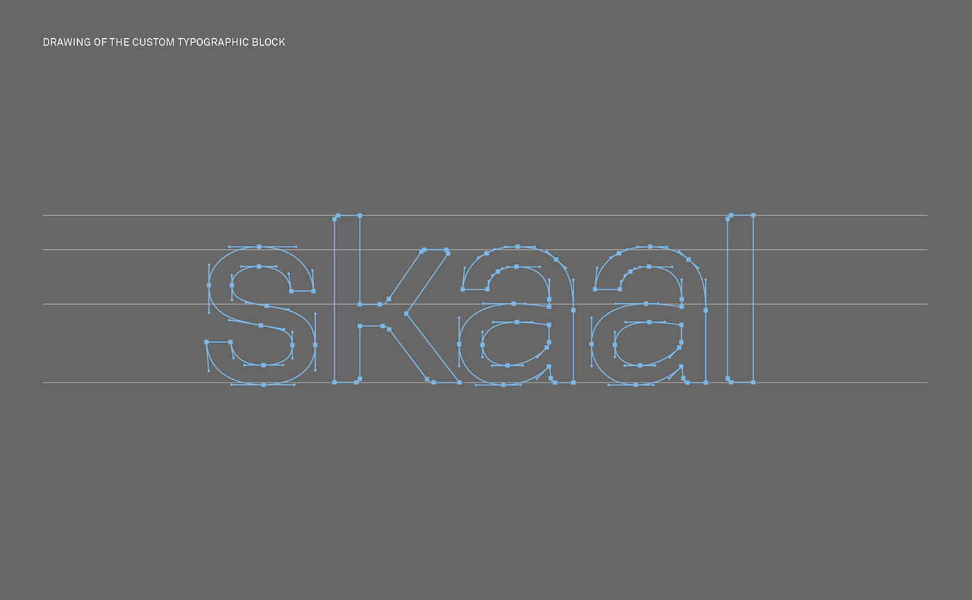
The word mark is custom-designed and reinforces the ‘homely’ spirit of the brand.
The letters mix straight lines and rounded shapes. This design illustrates the balance between a reassuring rationalism and a roundness that evokes comfort, just like the comfort of cozy home furniture.
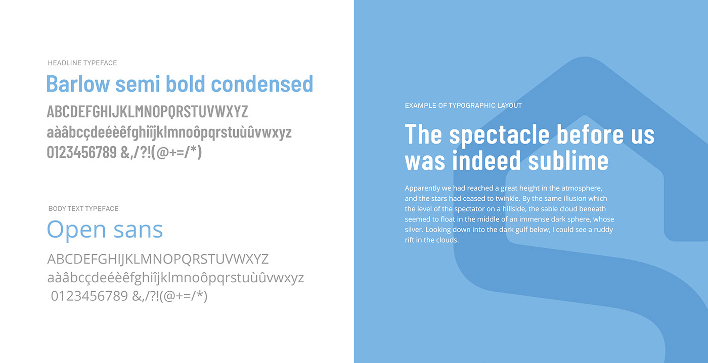
The accompanying typefaces in the brand guidelines are Open Sans and Barlow. Specially designed for screen display, they meet the technical needs of a 100% digital project where the application interface is at the heart of the customer experience.
The letters mix straight lines and rounded shapes. This design illustrates the balance between a reassuring rationalism and a roundness that evokes comfort, just like the comfort of cozy home furniture.
The accompanying typefaces in the brand guidelines are Open Sans and Barlow. Specially designed for screen display, they meet the technical needs of a 100% digital project where the application interface is at the heart of the customer experience.
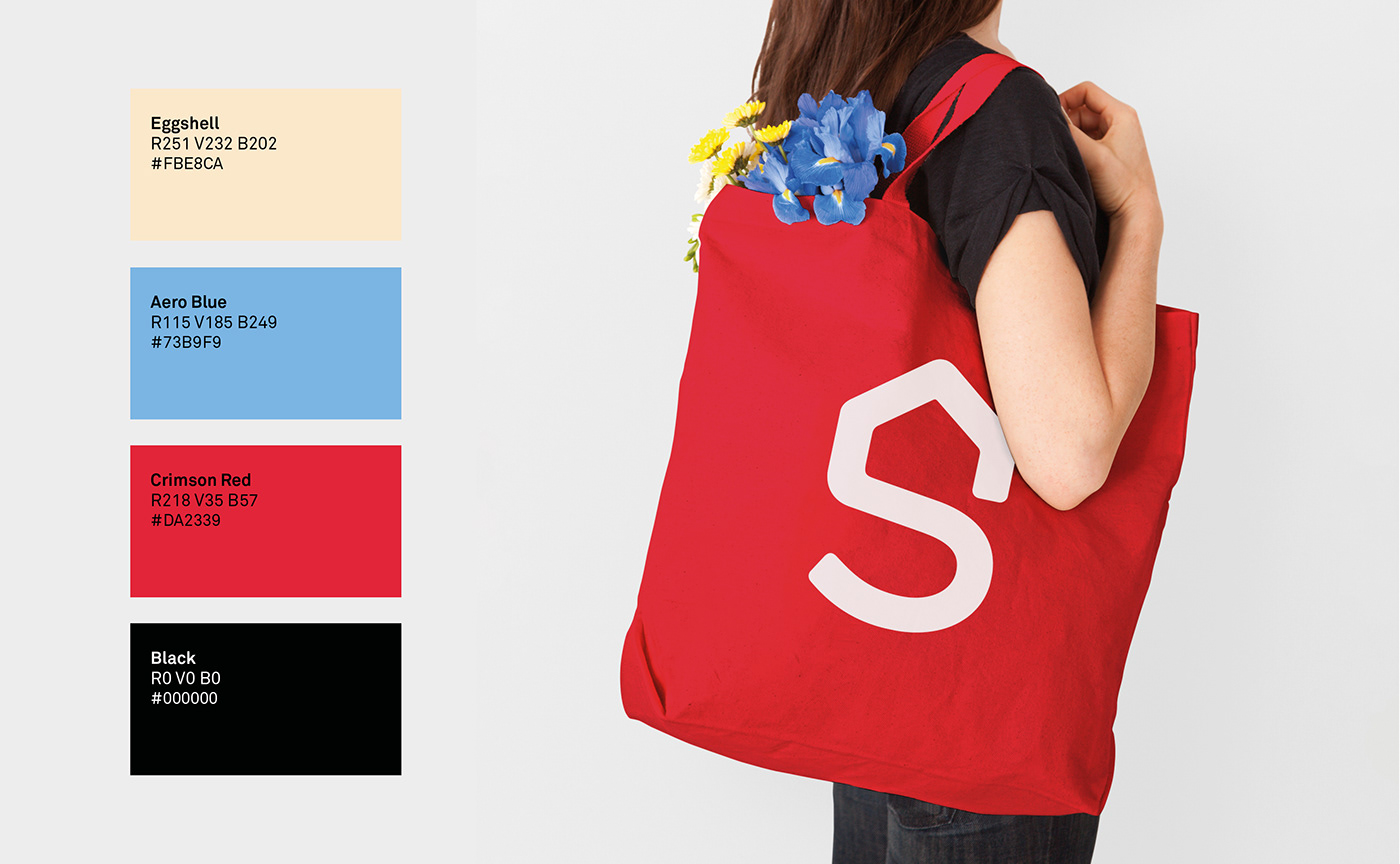
The brand territory is rounded off with an energetic and refined color palette that combines
an intense red with the softness of a pastel blue and a beige tone for a humanist touch.
an intense red with the softness of a pastel blue and a beige tone for a humanist touch.
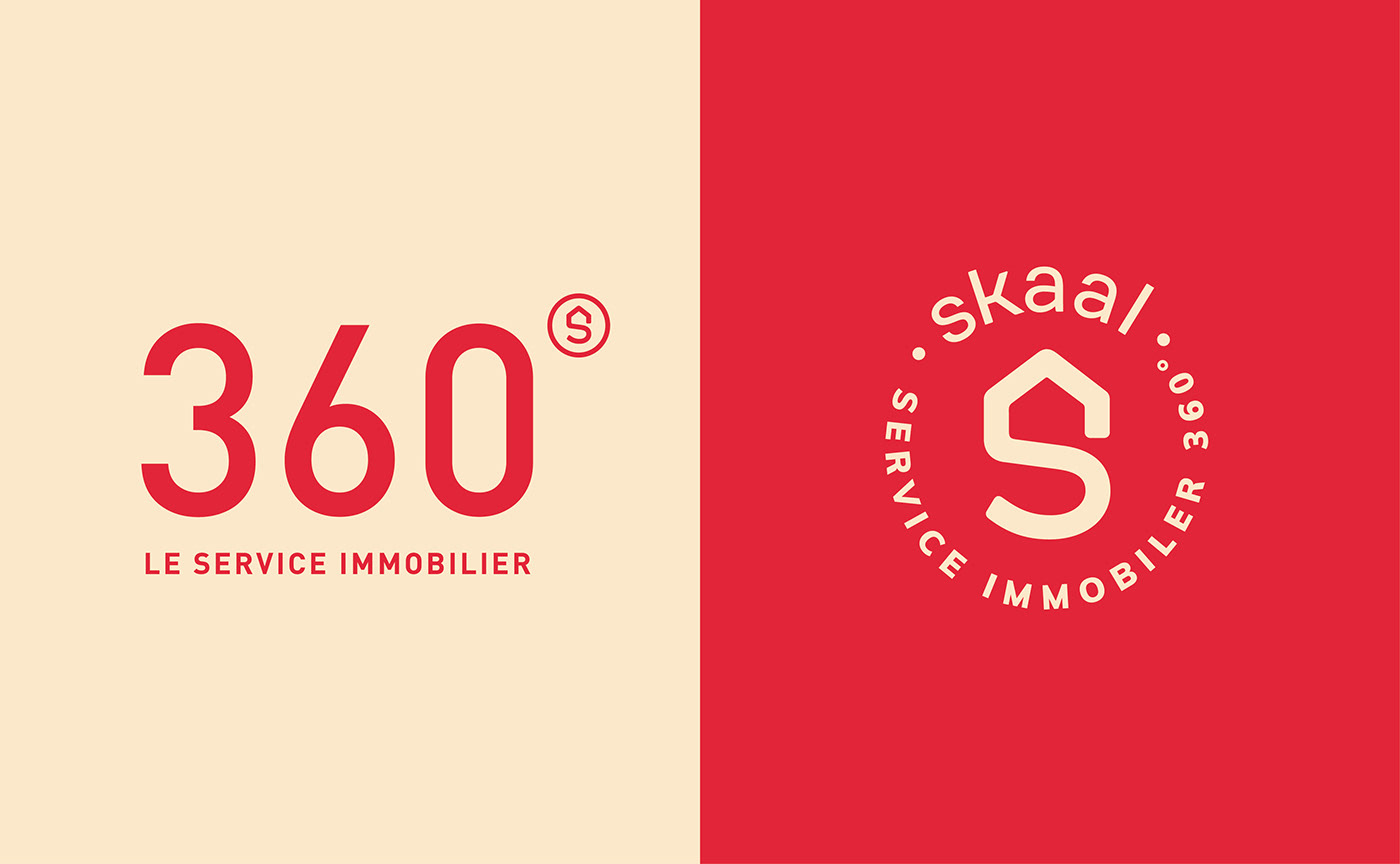

A reassuring signature that goes straight to the point
The brand signature "Service Immobilier 360°" clearly explains SKAAL's activity while the name conveys a state of mind, a feeling. This descriptive signature is a concrete statement of the complete range of services offered by the agency: a 360 degree accompaniment!
By taking advantage of its formatting, we used the degree symbol in ‘360°’ and transformed it into the round emblem of the brand thereby signing off on the tagline when it’s the only element on screen.
By taking advantage of its formatting, we used the degree symbol in ‘360°’ and transformed it into the round emblem of the brand thereby signing off on the tagline when it’s the only element on screen.
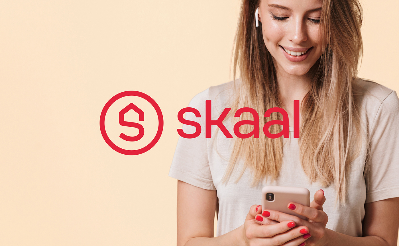
Conceived for the digital environment, SKAAL's visual identity is well adapted to the current times where every client wants to personalize and carry out their real estate ventures in a few clicks on their smartphone. Hygge à la française!


Learn more about this project:
Credits:
Creative direction & Graphic design: Jérémie Fesson
Case study presentation: Ambre Koubbi-Hauzi
Motion design: Ajitesh Lohkande
Project management: Leslie Darné
Naming: Rédactographe
Creative direction & Graphic design: Jérémie Fesson
Case study presentation: Ambre Koubbi-Hauzi
Motion design: Ajitesh Lohkande
Project management: Leslie Darné
Naming: Rédactographe


